Rullningsbara sidor och listvyer
Kirigami.ScrollablePage
Kirigami.ScrollablePage är en sida som innehåller rullningsbart innehåll, såsom en ListView. Rullning och rullningsindikering hanteras automatiskt.
Kirigami.ScrollablePage {
    id: root
    //Rektangeln är automatiskt rullningsbar
    Rectangle {
        width: root.width
        height: 99999
    }
}
På nästan alla andra sätt är en rullningsbar sida likadan som en normal sida.
Varning
Placera inte en ScrollView inne i en Kirigami.ScrollablePage. Underliggande objekt i enKirigami.ScrollablePage är redan inne i en ScrollView.Listvy på en rullningsbar sida
När direkt underliggande objekt i en Kirigami.ScrollablePage sträcks ut bortanför sidans egen storlek, visas en rullningslist vid högerkanten på sidan och sidan blir rullningsbar.
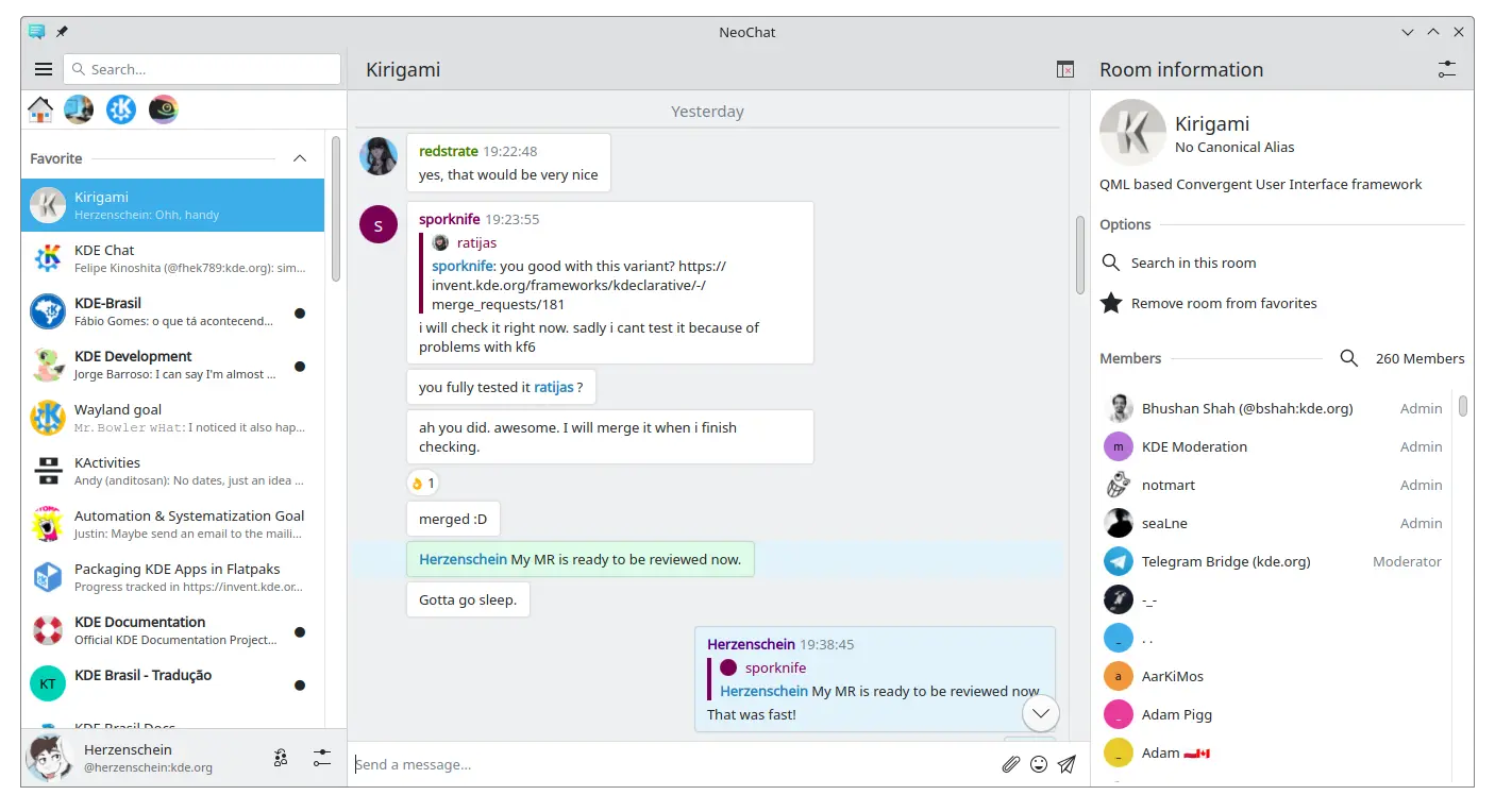
Två rullningsbara sidor, som båda innehåller en listvy med eget innehåll (skärmbild av NeoChat)
Ofta har man mer än ett underliggande objekt i en Kirigami.ScrollablePage, och det kan vara knepigt att positionera objekten, särskilt i kombination med en ListView.
- För icke synliga komponenter, ändras inte sidans utseende om de finns inne i komponenten ListView, så vi kan flytta dem in i listvyns omgivning. Samma sak för element förankrade på sidans mitt, såsom platsmarkeringsmeddelanden för en tom listvy.
- För andra objekt kan det vara vettigt att flytta dem till ett sidhuvud eller en sidfot i Kirigami.ScrollablePage. Det gäller ofta sökrader.
PlaceholderMessage
Det är möjligt att lägga till Kirigami.PlaceholderMessage med några instruktioner i fallet då listvyn är tom.
Kirigami.ScrollablePage {
    ListView {
        id: listView
        Kirigami.PlaceholderMessage {
            anchors.centerIn: parent
            width: parent.width - (Kirigami.Units.largeSpacing * 4)
            visible: listView.count === 0
            text: i18n("No data found")
            helpfulAction: Kirigami.Action {
            text: i18n("Load data")
                // Mer kod...
            }
        }
        model: // Modellkod...
    }
}
Söka i listvyn
A search field is often added to a Kirigami.ScrollablePage to filter the ListView. This can be done by changing the default titleDelegate to use a Kirigami.SearchField instead.
Kirigami.ScrollablePage {
    titleDelegate: Kirigami.SearchField {
        Layout.topMargin: Kirigami.Units.smallSpacing
        Layout.bottomMargin: Kirigami.Units.smallSpacing
        Layout.fillHeight: true
        Layout.fillWidth: true
        onTextChanged: mySortFilterModel.filterText = text
        KeyNavigation.tab: listView
    }

    ListView {
        id: listView
        // Resten av listvyns kod
    }
}
Tips
You can use KSortFilterProxyModel from KItemModel to easily add filtering capability directly in QML without any need for C++ code.Dra för att uppdatera
An annan funktion som tillhandahålls av komponenten är åtgärden "dra för att uppdatera". För att göra det, aktivera den på följande sätt:
Kirigami.ScrollablePage {
    id: view
    supportsRefreshing: true
    onRefreshingChanged: {
        if (refreshing) {
            myModel.refresh();
        }
    }
    ListView {
        // Observera: MyModel kommer inte från komponenterna, det är ett rent exempel på hur den kan
        // användas tillsammans med någon programlogik som kan uppdatera listmodellen och signalerar
        // när den är klar.
        model: MyModel {
            onRefreshDone: view.refreshing = false;
        }
        delegate: BasicListItem {}
    }
}
Genom att dra neråt, kan du också aktivera ett specialläge med en större övre marginal, som gör det enklare att använda programmet med en hand.