Förloppsrader och indikatorer
När programmet än gör något som tar en märkbart lång tid, bör du använda ett visuellt element som talar om för användaren att någonting händer i bakgrunden.
QtQuick Controls tillhandahåller två användbara komponenter som du kan använda i detta syfte.
Förloppsrad
Controls.ProgressBar är en komponent som enkelt låter dig inkludera förloppsrader i programmet. Det finns fyra huvudegenskaper som du behöver använda:
- from: Det minsta värdet som representeras av förloppsradens början
- from: Det maximala värdet som representeras av förloppsradens slut
- value: Det aktuella värdet för åtgärden som pågår (t.ex. 50 % inläst)
- indeterminate: om åtgärden som för närvarande pågår har inget klart förloppsvärde, kan du ställa in den här egenskapen till
trueför att visa för användaren att någonting händer men att förloppet inte ännu är klart (men snart är det).
import QtQuick
import QtQuick.Layouts
import QtQuick.Controls as Controls
import org.kde.kirigami as Kirigami

Kirigami.ApplicationWindow {
    title: "Progressbar App"
    width: 400
    height: 400
    pageStack.initialPage: Kirigami.Page {
        ColumnLayout {
            anchors.left: parent.left
            anchors.right: parent.right
            Controls.ProgressBar {
                Layout.fillWidth: true
                from: 0
                to: 100
                value: 50
                indeterminate: false
            }
            Controls.ProgressBar {
                Layout.fillWidth: true
                from: 0
                to: 100
                // värde: 50
                indeterminate: true
            }
        }
    }
}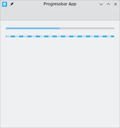
Ovan: förloppsrad vid 50 %, nedan: obestämd förloppsrad
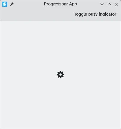
Upptagetindikering
I fallen där inläsningstider är kortare eller det inte är möjligt att mäta förloppet, kan du använda Controls.BusyIndicator istället. Komponenten tillhandahåller ett enkelt spinnande hjul som visar att något händer för användaren.
Om du vill att indikatorn ska sluta köra, kan du göra det genom att ställa in egenskapen running till false, i vilket fall .
import QtQuick
import QtQuick.Controls as Controls
import org.kde.kirigami as Kirigami

Kirigami.ApplicationWindow {
    title: "Progressbar App"
    width: 400
    height: 400
    pageStack.initialPage: Kirigami.Page {
        actions: [
            Kirigami.Action {
                text: "Toggle busy indicator"
                onTriggered: indicator.running ? indicator.running = false : indicator.running = true
            }
        ]
        Controls.BusyIndicator {
            id: indicator
            anchors.centerIn: parent
        }
    }
}