Meddelanden på plats
Meddelanden på plats tillhandahåller ett omedelbart sätt för dig att underrätta användare om någonting som hände medan programmet användes.
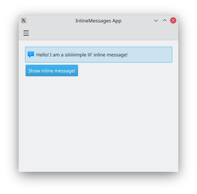
Grundläggande meddelande på plats
Kirigami.InlineMessage komponenter har två viktiga egenskaper att vara medveten om:
- visible: Normalt är den inställd till
false, så att meddelandet bara visas när du explicit vill det. Det kan överskridas om du vill genom att ställa in den tilltrue. När ett dolt meddelande på plats ställs in att vara synligt, får du en snygg animering. - text: here is where you set the text of your inline message.
import QtQuick
import QtQuick.Layouts
import QtQuick.Controls as Controls
import org.kde.kirigami as Kirigami

Kirigami.Page {

    ColumnLayout {
        Kirigami.InlineMessage {
            id: inlineMessage
            Layout.fillWidth: true
            text: "Hello! I am a siiiiiiimple lil' inline message!"
        }

        Controls.Button {
            text: "Show inline message!"
            onClicked: inlineMessage.visible = !inlineMessage.visible
        }
    }
}
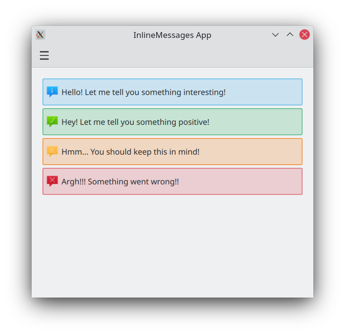
Olika typer
Standard inline messages are like the ones above: they have a blue background and a default icon. We can change that with the type property, which lets us set our inline message to a different type. There are four types we can choose from:
- Information (
Kirigami.MessageType.Information): förval. Har en blå bakgrund, en 'i' ikon, och används för att kungöra ett resultat eller tala om något generellt för användaren. Det är inte nödvändigt att ställa in det manuellt. - Positiv (
Kirigami.MessageType.Positive): har en grön bakgrund, bockikon, och anger att något gick bra. - Varning (
Kirigami.MessageType.Warning): har en orange background, en utropsteckenikon, och kan användas för att varna användaren för någonting de bör vara medvetna om. - Fel (
Kirigami.MessageType.Error): har en röd bakgrund, en korsikon, och kan användas för att tala om för användaren att någonting har gått fel.
ColumnLayout {

    Kirigami.InlineMessage {
        Layout.fillWidth: true
        text: "Hello! Let me tell you something interesting!"
        visible: true
    }

    Kirigami.InlineMessage {
        Layout.fillWidth: true
        text: "Hey! Let me tell you something positive!"
        type: Kirigami.MessageType.Positive
        visible: true
    }

    Kirigami.InlineMessage {
        Layout.fillWidth: true
        text: "Hmm... You should keep this in mind!"
        type: Kirigami.MessageType.Warning
        visible: true
    }

    Kirigami.InlineMessage {
        Layout.fillWidth: true
        text: "Argh!!! Something went wrong!!"
        type: Kirigami.MessageType.Error
        visible: true
    }

}
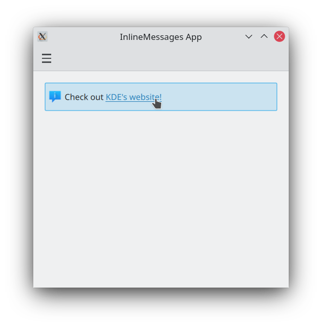
Anpassa text och ikoner
Meddelande på plats stöder rich text, som kan definieras med enkel HTML-liknande taggar. Det låter oss lägga till viss formatering i dina meddelandetexter eller till och med inkludera en extern webblänk om du vill.
Kirigami.InlineMessage {
    Layout.fillWidth: true
    // Observera att när du använder citationstecken i en sträng måste de undantas.
    text: "Check out <a href=\"https://kde.org\">KDE's website!<a/>"
    onLinkActivated: Qt.openUrlExternally(link)
    visible: true
}
You can also customise the icon that appears on the top left of your message by providing a system icon name for the icon.source property. These icon names should correspond to icons installed on your system; you can use an application such as Cuttlefish provided by plasma-sdk to browse and search the icons available on your system, and see what their names are.
Kirigami.InlineMessage {
    Layout.fillWidth: true
    text: "Look at me! I look SPECIAL!"
    icon.source: "actor"
    visible: true
}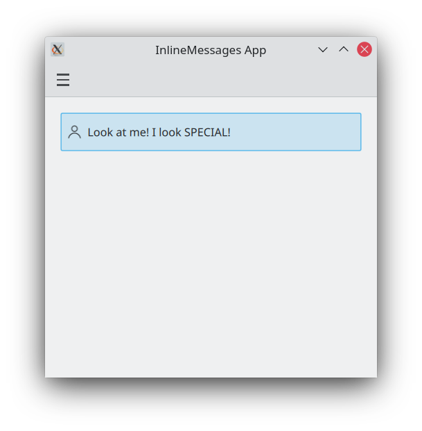
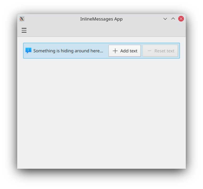
Använda åtgärder i meddelanden på plats
If your messages need to be interactive, you can attach Kirigami actions to your inline messages. Like with pages, you can do this by setting the InlineMessage.actions property to either a Kirigami.Action or an array containing Kirigami.Action components.
ColumnLayout {

    Kirigami.InlineMessage {
        id: actionsMessage
        Layout.fillWidth: true
        visible: true

        readonly property string initialText: "Something is hiding around here..."
        text: initialText

        actions: [
            Kirigami.Action {
                enabled: actionsMessage.text == actionsMessage.initialText
                text: qsTr("Add text")
                icon.name: "list-add"
                onTriggered: {
                    actionsMessage.text = actionsMessage.initialText + " Peekaboo!";
                }
            },
            Kirigami.Action {
                enabled: actionsMessage.text != actionsMessage.initialText
                text: qsTr("Reset text")
                icon.name: "list-remove"
                onTriggered: actionsMessage.text = actionsMessage.initialText
            }
        ]
    }
}
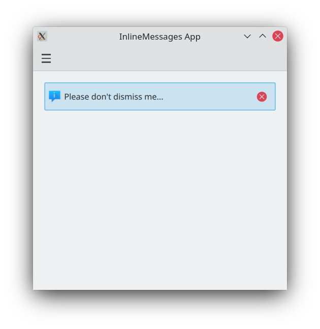
Stängningsknappar
Meddelanden på plats tillhandahåller en stängningsknapp som kan användas för att enkelt avfärda dem.
By default, this close button is hidden, but this can be overridden by setting the showCloseButton property to true.
Kirigami.InlineMessage {
    Layout.fillWidth: true
    text: "Please don't dismiss me..."
    showCloseButton: true
    visible: true
}