Formulärlayouter
Kirigami.FormLayout komponenter gör det enkelt för dig att skapa formulär som uppfyller KDE:s Human Interface Guidelines. De är optimala för inställningsdialogrutor och för stora grupper av kontroller och inmatningsfält som är relaterade till varandra.
När tillräckligt utrymme tillhandahålls, upptar formulärlayouter två kolumner. Kolumnen till vänster upptas av beteckningarna tillhandahållna för formulärets underliggande komponenter, medan den högra upptas av själva de underliggande komponenterna själva. I mer utrymmesbegränsade fönster (eller på en mobil), består formulär av en enda vertikal kolumn med de underliggande komponenternas beteckningar placerade ovanför deras respektive komponent.
Enkelt formulär
Kirigami.FormLayout komponenter har liknande användning som QtQuick Layout komponenter såsom ColumnLayout eller RowLayout. De underliggande komponenterna arrangeras automatiskt enligt storleken tillgänglig för formulärlayouten.
Children of a Kirigami.FormLayout have a property named Kirigami.FormData.label. This property lets you set the label that will be provided for the child component in question.
import QtQuick
import QtQuick.Layouts
import QtQuick.Controls as Controls
import org.kde.kirigami as Kirigami

Kirigami.ApplicationWindow {
    pageStack.initialPage: Kirigami.Page {

        Kirigami.FormLayout {
            anchors.fill: parent

            Controls.TextField {
                Kirigami.FormData.label: "TextField 1:"
            }
            Controls.TextField {
                Kirigami.FormData.label: "TextField 2:"
            }
            Controls.TextField {
                Kirigami.FormData.label: "TextField 3:"
            }
        }
    }
}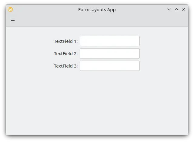
En enkel formulärlayout på skrivbordsdator
Sektioner och avskiljare
FormLayouts can also be divided into sections. Setting where a section starts is as easy as setting a child component's Kirigami.FormData.isSection to true. This will provide the component with some extra margin at the top to demarcate the start of the new section.
Kirigami.Separator components are best suited for starting new sections. Separators are used to draw a thin horizontal line, demarcating the end of a section. If you would rather not have a line drawn between sections, you can use a standard QML Item property. Alternatively you could use the Kirigami.FormData.isSection property on any other component.
However, this is not recommended. On components where Kirigami.FormData.isSection is set to true, the label text provided for this component's Kirigami.FormData.label property will be displayed as the section's header text.
Varning
Det gäller inte för alla komponenter, därav rekommendationen att du använder komponenterna Kirigami.Separator eller Item på ställen där du vill använda en sidhuvudtext.Sidhuvudtexten är större än normal beteckningstext och tillhandahåller användare med en snygg visuell ledtråd om vad formulärets layoutsektion handlar om.
Kirigami.FormLayout {
    anchors.fill: parent

    Controls.TextField {
        Kirigami.FormData.label: "TextField 1:"
    }
    Controls.TextField {
        Kirigami.FormData.label: "TextField 2:"
    }
    Controls.TextField {
        Kirigami.FormData.label: "TextField 3:"
    }
    Kirigami.Separator {
        Kirigami.FormData.isSection: true
        Kirigami.FormData.label: "New Section!"
    }
    ColumnLayout {
        Kirigami.FormData.label: "Radio buttons"
        Controls.RadioButton {
            text: "Radio 1"
            checked: true
        }
        Controls.RadioButton {
            text: "Radio 2"
        }
        Controls.RadioButton {
            text: "Radio 3"
        }
    }
    Item {
        Kirigami.FormData.isSection: true
        Kirigami.FormData.label: "Another Section! (lineless though)"
    }
    Controls.TextField {
        Kirigami.FormData.label: "TextField 4:"
    }
    Controls.TextField {
        Kirigami.FormData.label: "TextField 5:"
    }
    Controls.TextField {
        Kirigami.FormData.label: "TextField 5:"
    }
}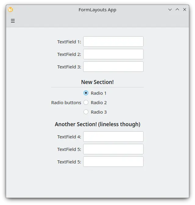
En formulärlayout med sektioner
Tvinga skrivbords- eller mobillayout
If you would rather have your form layout stay consistent regardless of your application's environment, you can use the wideMode property of the Kirigami.FormLayout component:
- När den är inställd till
true, struktureras formulärlayouten för en skrivbordsoptimerad bred (med dubbla kolumner) skärmlayout. - När den är inställd till
false, struktureras formulärlayouten som en mobillayout (enstaka kolumn)
Kirigami.FormLayout {
    anchors.fill: parent
    wideMode: false

    Controls.TextField {
        Kirigami.FormData.label: "TextField 1:"
    }
    Controls.TextField {
        Kirigami.FormData.label: "TextField 2:"
    }
    Controls.TextField {
        Kirigami.FormData.label: "TextField 3:"
    }
}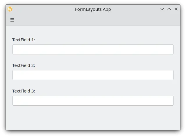
En formulärlayout med tvingande mobillayout
Justera beteckningar
There are instances when you want a label to be assigned to components that have more than one line or to a list of components. This can be achieved by putting the Kirigami.FormData.label in the ColumnLayout, as you might have noticed in Sections and Separators. By default the label is positioned in the vertical center of the layout, which is not always desirable. We can change this with help of Kirigami.FormData.labelAlignment.
Kirigami.FormLayout {
    anchors.fill: parent

    ColumnLayout {
        Kirigami.FormData.label: "This is a label:"
        Kirigami.FormData.labelAlignment: Qt.AlignTop

        Controls.Label {
            text: "This is some rather long text \nthat should elide to multiple lines \nto show how the label gets aligned."
            elide: Text.elideLeft
        }
    }
}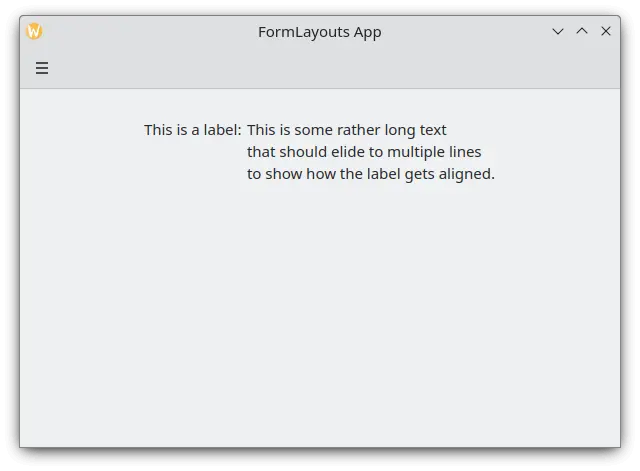
En formulärlayout med beteckning justerad längst upp
Att ställa in beteckningens justering är särskilt bekvämt för att hantera komponenter eller listor över komponenter vars storlek du inte känner till i förväg. Elisa är ett mycket bra exempel på det:
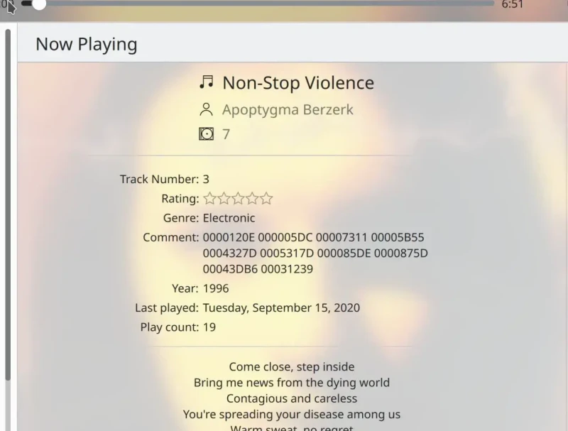
Kommentarbeteckningen är bara justerad längst upp när motsvarande komponent har mer än en rad
Vi kan göra någonting liknande med en Javascript ternär operator:
Kirigami.FormLayout {
    anchors.fill: parent

    ColumnLayout {
        Kirigami.FormData.label: "This is a label:"
        Kirigami.FormData.labelAlignment: labelText.text.lineCount > 1 ? Qt.AlignTop : Qt.AlignVCenter

        Controls.Label {
            id: labelText
            text: "This is some rather long text \nthat should elide to a new line \nso it appears below the Form Label."
            elide: Text.elideLeft
        }
    }
}