Lådor
Lådor är paneler som glider ut från programfönstrets sidor. De kan befolkas med interaktiva element som Kirigami åtgärder, knappar, text, med mera.
Lådor har olika typer, skepnader och former. På den här sidan går vi igenom alla typer och ger en översikt över deras karaktärer.
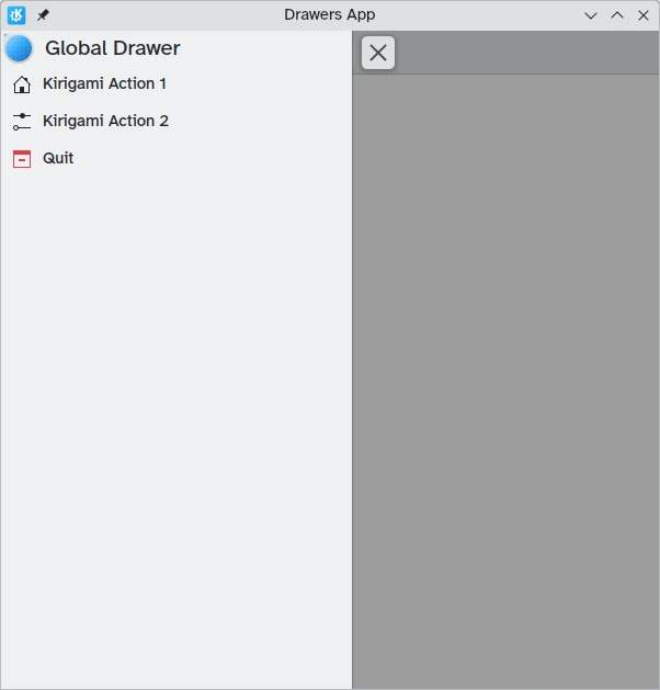
Global låda
Den globala lådan är en standardfunktion i KDE:s mobilprogram och kan ibland också finnas i deras skrivbordsinkarnationer. Den innehåller programmets huvudmeny: här ingår alla funktioner som inte är specifika för den nuvarande sidan men ändå signifikanta för allmän navigering eller interaktion med programmet.
Den kan aktiveras genom att röra vid hamburgermenyn eller genom att svepa från vänster kant till mitten av skärmen i vänster till höger-läge eller från höger kant i höger till vänster-läge.
Kirigami.GlobalDrawer komponenter är vad vi använder för att skapa sådana lådor. De ställs in till egenskapen globalDrawer från Kirigami.ApplicationWindow som utgör basen för vårt Kirigami-program.
import QtQuick
import org.kde.kirigami as Kirigami

Kirigami.ApplicationWindow {
    title: "Drawers App"
    width: 600
    height: 600
    pageStack.initialPage: Kirigami.Page { /* Page code here... */ }

    globalDrawer: Kirigami.GlobalDrawer {
        title: "Global Drawer"
        titleIcon: "applications-graphics"
        actions: [
            Kirigami.Action {
                text: "Kirigami Action 1"
                icon.name: "user-home-symbolic"
                onTriggered: showPassiveNotification("Action 1 clicked")
            },
            Kirigami.Action {
                text: "Kirigami Action 2"
                icon.name: "settings-configure-symbolic"
                onTriggered: showPassiveNotification("Action 2 clicked")
            },
            Kirigami.Action {
                text: i18n("Quit")
                icon.name: "application-exit-symbolic"
                shortcut: StandardKey.Quit
                onTriggered: Qt.quit()
            }
        ]
    }
}
Anmärkning
Egenskapen titleIcon använder namn på systemomfattande ikoner enligt FreeDesktop-specifikationen. Ikonerna och ikonnamnen kan visas med KDE:s program CuttleFish som levereras med plasma-sdk, eller genom att besöka FreeDesktops specifikation för namngivning av ikoner.Sidhuvud
Sidhuvud kan användas för att placera orörliga komponenter längst upp i din globala låda. Sidhuvudkomponenter förblir på plats även om din globala låda innehåller nästlade Kirigami-åtgärder som ersätter det nuvarande lagret i den globala lådan.
Din valda sidhuvudkomponent kan anges med den globala lådans egenskap header , och den ersätter den globala lådans titel. Det är användbart för att lägga till Kirigami.SearchField, till exempel:
import QtQuick
import org.kde.kirigami as Kirigami

Kirigami.ApplicationWindow {
    title: "Drawers App"
    width: 600
    height: 600
    pageStack.initialPage: Kirigami.Page { /* Page code here... */ }

    globalDrawer: Kirigami.GlobalDrawer {
        title: "Global Drawer with searchfield (not visible)"

        header: Kirigami.SearchField {
                id: searchField
        }

        actions: [
            Kirigami.Action {
                text: "Kirigami Action 1"
                icon.name: "user-home-symbolic"
                onTriggered: showPassiveNotification("Action 1 clicked")
            },
            Kirigami.Action {
                text: "Kirigami Action 2"
                icon.name: "settings-configure-symbolic"
                onTriggered: showPassiveNotification("Action 2 clicked")
            },
            Kirigami.Action {
                text: i18n("Quit")
                icon.name: "application-exit-symbolic"
                shortcut: StandardKey.Quit
                onTriggered: Qt.quit()
            }
        ]
    }
}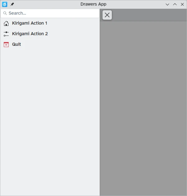
Vår globala låda visar nu sökradskomponenten som vi angav som sidhuvudet
Anpassa till skrivbordet
Medan globala lådor med panelstil kan vara användbara i mobilomgivningar, kan de vara för stora för skrivbordsdatorer, särskilt om programmet har ett fåtal åtgärder.
Som tur är tillhandahåller Kirigami globala lådor egenskapen isMenu. När den är inställd till true, förvandlas vår globala låda till mer traditionella menyer på skrivbordsdatorer.
Anmärkning
I menyläget är inte sidhuvuden och baner synliga.globalDrawer: Kirigami.GlobalDrawer {
isMenu: true
actions: [
// Kirigami-åtgärder här ...
]
}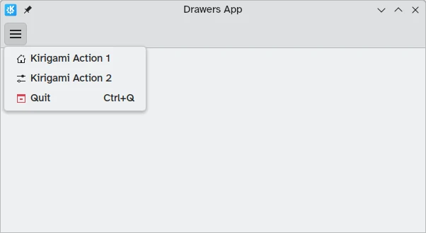
Global låda i menyläge, utan sidhuvud eller baner
Sammanhangslådor
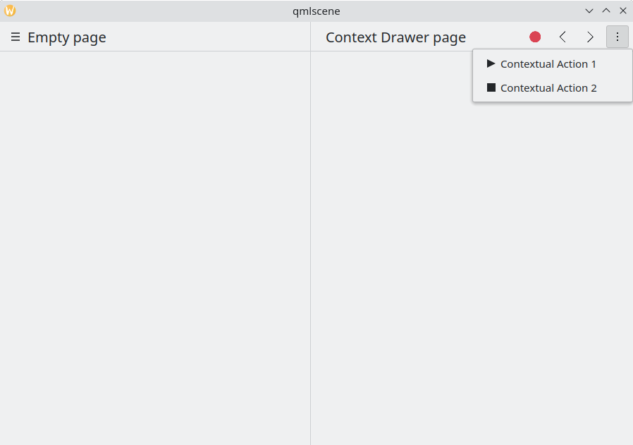
Medan en Kirigami.GlobalDrawer visar globala åtgärder tillgängliga överallt i programmet, ska en Kirigami.ContextDrawer användas för att visa åtgärder som bara är relevanta i vissa sammanhang. Det används oftast på separata sidor.
En sammanhangslåda beter sig olika beroende på om den används på en mobil plattform eller på en dator.
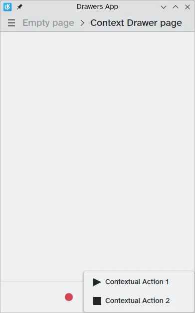
På en skrivbordsdator, när ett fönster har tillräckligt med utrymme, visas sammanhangsberoende åtgärder som en del av gruppen actions på det övre verktygsraden. När utrymmet är begränsat, till exempel på en mobil eller i ett smalt fönster, döljs sammanhangsberoende åtgärder bakom en hamburgermeny på höger sida. Det skiljer sig från andra åtgärder i gruppen actions, nämligen actions.main, actions.left och actions.right; de göms inte i fönster med begränsat utrymme, utan dras istället ihop till sina respektive ikoner.
| |
Sammanhangslåda med sammanhangsberoende åtgärder dolda
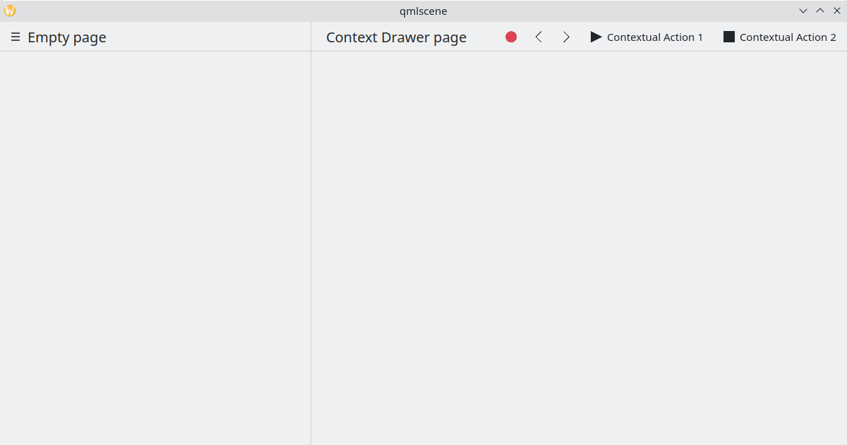
Sammanhangslåda som visar alla sammanhangsberoende åtgärder
På en mobil består lådan alltid av åtgärder dolda bakom en hamburgermeny. Den kan aktiveras genom att röra vid hamburgermenyn eller genom att svepa från vänster kant till mitten av skärmen i vänster till höger-läge eller från höger kant i höger till vänster-läge.
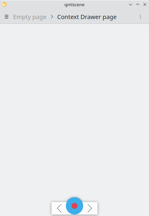
Samma exempel som ovan, men på en mobil
Sammanhangslåda öppen på mobil
Modala lådor och lådor på plats
Kirigami erbjuder två ytterligare sorters lådor, modala lådor och lådor på plats. De är mycket lika varandra: båda fyller hela programmets bredd eller höjd och kan placeras vid programfönstrets kanter. Dock reagerar de olika på användarinteraktion.
- Modala lådor gör resten av programmet mörkare och avfärdas vid klick på ett mörkare område.
- Lådor på plats visas normalt och låter användaren fortfarande interagera med resten av programmet utan att de avfärdas, och gör inte andra områden mörkare.
Den här typen av låda är öppen och flexibel, men allmänhet kanske man vill använda den här typen av låda när man vill att en liten lista med alternativ ska visas med ett långt tryck eller högerklick.
De två lådorna är så lika eftersom de i själva verket kan implementeras med samma komponent i Kirigami: Kirigami.OverlayDrawer. Här är några viktiga egenskaper i komponenten att hålla i minnet:
- Popup.modal styr om lådan är modal eller på plats beroende på ett Booleskt värde
- Drawer.edge bestämmer vilken kant av programfönstret som lådan dyker upp. Alternativ för egenskapen är
Qt.TopEdge,Qt.RightEdge,Qt.BottomEdgeochQt.LeftEdge - Popup.contentItem innehåller komponenterna som utgör lådans innehåll
import QtQuick
import QtQuick.Layouts
import QtQuick.Controls as Controls
import org.kde.kirigami as Kirigami

Kirigami.ApplicationWindow {
    title: "Drawers App"
    width: 400
    height: 600
    pageStack.initialPage: Kirigami.Page {
        title: "OverlayDrawer at the bottom"
        actions: [
            Kirigami.Action {
                text: "Open bottomDrawer"
                onTriggered: bottomDrawer.open()
            }
        ]
        Kirigami.OverlayDrawer {
            id: bottomDrawer
            edge: Qt.BottomEdge
            // Ställ in modal till false för att göra lådan på plats.
            modal: true

            contentItem: RowLayout {
                Controls.Label {
                    Layout.fillWidth: true
                    text: "Say hello to my little drawer!"
                }
                Controls.Button {
                    text: "Close"
                    onClicked: bottomDrawer.close()
                }
            }
        }
    }
}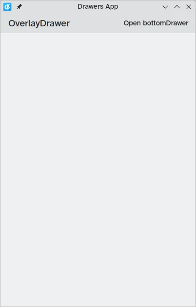
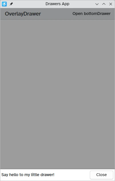
Modal låda inte synlig
Modal låda vid skärmens underkant