Kontroller och interaktiva element
Kirigami erbjuder ett stort urval av olika interaktiva element från Qt som du kan använda i dina program. Varje olika typ har något olika interaktionsstilar, visuella stilar och funktionalitet. Att använda rätt typ av kontroll i programmet hjälper till att göra ditt användargränssnitt mer mottagligt och intuitivt.
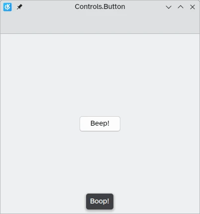
Knappar
In Kirigami apps, we use the QtQuick Controls Button. Using them is pretty straightforward: we set the text property and any action we want it to perform is set to the onClicked property.
import QtQuick
import QtQuick.Layouts
import QtQuick.Controls as Controls
import org.kde.kirigami as Kirigami

Kirigami.ApplicationWindow {
    title: "Controls.Button"
    width: 400
    height: 400
    pageStack.initialPage: Kirigami.Page {
        ColumnLayout {
            anchors.fill: parent
            Controls.Button {
                Layout.alignment: Qt.AlignCenter
                text: "Beep!"
                onClicked: showPassiveNotification("Boop!")
            }
        }
    }
}
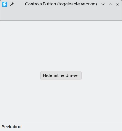
Ändringsbara knappar
Knapparnas beteende kan ändras för att göra dem ändringsbara: i det läget förblir de nedtryckta tills de klickas en gång till. Läget kan aktiveras genom att ställa in egenskapen checkable till true. Vi kan också ställa in knappar till att vara på från början genom att ställa in egenskapen checked till true.
Vi kan få ut så mycket som möjligt av ändringsbara knappar genom att använda signalhanteraren onCheckedChanged som automatiskt genereras från signalen checked. Den fungerar på liknande sätt som onClicked, utom att den tilldelade åtgärden utförs när knappens tillstånd ändras. Den är en Boolesk egenskap, som kan vara praktiskt i specifika användarfall.
I det här exemplet ställer vi in synligheten hos en låda på plats enligt status av en ändringsbar knapp:
import QtQuick
import QtQuick.Layouts
import QtQuick.Controls as Controls
import org.kde.kirigami as Kirigami

Kirigami.ApplicationWindow {
    title: "Controls.Button (toggleable version)"
    width: 400
    height: 400
    pageStack.initialPage: Kirigami.Page {
        ColumnLayout {
            anchors.fill: parent
            Controls.Button {
                Layout.alignment: Qt.AlignCenter
                text: "Hide inline drawer"
                checkable: true
                checked: true
                onCheckedChanged: myDrawer.visible = checked
            }

            Kirigami.OverlayDrawer {
                id: myDrawer
                edge: Qt.BottomEdge
                modal: false

                contentItem: Controls.Label {
                    text: "Peekaboo!"
                }
            }
        }
    }
}
Anmärkning
Med det förvalda temat Breeze i KDE Plasma kan det vara svårt att avgöra om en knapp är på, eftersom knappar är blåfärgade när de är klickade på. Säkerställ att du tar hänsyn till det när du skapar ditt program: en annan kontroll kan vara mer användarvänlig.Verktygsradsknappar
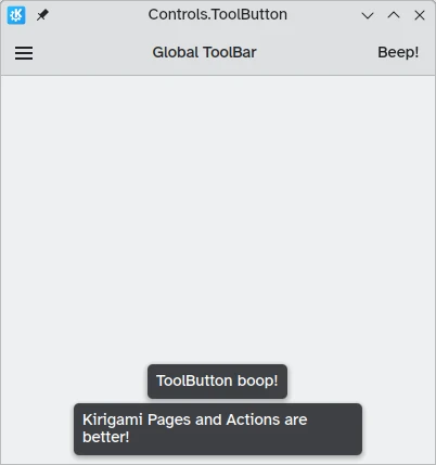
Det finns en specifik knapptyp som är avsedd för att använda i verktygsrader, Controls.ToolButton. Den mest uppenbara skillnaden mellan den och en vanlig Button är stilen, där verktygsknappar är platta (även om det går att ändra med den Booleska egenskapen flat).
import QtQuick
import QtQuick.Layouts
import QtQuick.Controls as Controls
import org.kde.kirigami as Kirigami

Kirigami.ApplicationWindow {
    title: "Controls.ToolButton"
    width: 600
    height: 600

    header: Controls.ToolBar {
        RowLayout {
            anchors.fill: parent
            Controls.ToolButton {
                icon.name: "application-menu-symbolic"
                onClicked: showPassiveNotification("Kirigami Pages and Actions are better!")
            }
            Controls.Label {
                text: "Global ToolBar"
                horizontalAlignment: Qt.AlignHCenter
                verticalAlignment: Qt.AlignVCenter
                Layout.fillWidth: true
            }
            Controls.ToolButton {
                text: "Beep!"
                onClicked: showPassiveNotification("ToolButton boop!")
            }
        }
    }
}
Urvalskontroller
Urvalskontroller låter användare göra ett val eller välja ett alternativ. Det finns olika typer som är bäst lämpade i olika situationer.
Kryssrutor
En Controls.CheckBox är avsedda för alternativ där valen inte är exklusiva och där varje val har ett klart alternativ.
import QtQuick
import QtQuick.Layouts
import QtQuick.Controls as Controls
import org.kde.kirigami as Kirigami

Kirigami.ApplicationWindow {
    title: "Controls.CheckBox"
    width: 400
    height: 400
    pageStack.initialPage: Kirigami.Page {
        ColumnLayout {
            anchors.left: parent.left
            anchors.right: parent.right
            Controls.CheckBox {
                Layout.alignment: Qt.AlignHCenter
                text: "This checkbox is checked!"
                checked: true
            }
            Controls.CheckBox {
                Layout.alignment: Qt.AlignHCenter
                text: "This checkbox is not checked!"
                checked: false
            }
        }
    }
}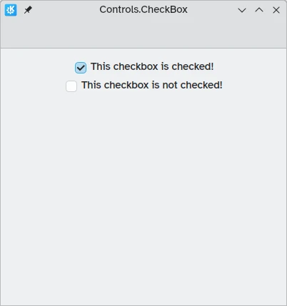
Som du kan se, är de enkla att använda. Egenskapen checked innehåller ett Booleskt värde bestämmer om de har markerats eller inte.
Alternativknappar
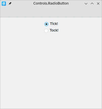
En Controls.RadioButton är konstruerade för situationer där användaren måste välja ett alternativ från en uppsättning av flera alternativ.
Alternativknappar är normalt exklusiva: bara en knapp i samma överliggande objekt kan markeras.
Liksom kryssrutor kan de ställas in att vara markerade eller avmarkerade som förval med egenskapen checked.
import QtQuick
import QtQuick.Layouts
import QtQuick.Controls as Controls
import org.kde.kirigami as Kirigami

Kirigami.ApplicationWindow {
    title: "Controls.RadioButton"
    width: 400
    height: 400
    pageStack.initialPage: Kirigami.Page {

        ColumnLayout {
            anchors.left: parent.left
            anchors.right: parent.right
            Controls.RadioButton {
                Layout.alignment: Qt.AlignCenter
                text: "Tick!"
                checked: true
            }
            Controls.RadioButton {
                Layout.alignment: Qt.AlignCenter
                text: "Tock!"
                checked: false
            }
        }
    }
}
Omkopplare
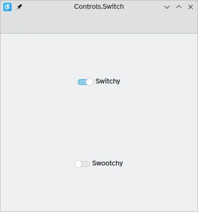
På skrivbordet gäller ändring av inställningar att ändra inställningen och sedan verkställa den genom att klicka på knapparna 'Verkställ' eller 'Ok'. På en mobil kan vi använda en Controls.Switch istället.
Omkopplare kan ändras mellan tillstånden på och av. De kan klickas eller beröras för att ändra dem, eller kan dras mot positionen på eller av. Återigen kan omkopplare ställas in att vara på eller av som förval med egenskapen checked.
import QtQuick
import QtQuick.Layouts
import QtQuick.Controls as Controls
import org.kde.kirigami as Kirigami

Kirigami.ApplicationWindow {
    title: "Controls.Switch"
    width: 400
    height: 400
    pageStack.initialPage: Kirigami.Page {
        ColumnLayout {
            anchors.fill: parent
            Controls.Switch {
                Layout.alignment: Qt.AlignCenter
                text: "Switchy"
                checked: true
            }
            Controls.Switch {
                Layout.alignment: Qt.AlignCenter
                text: "Swootchy"
                checked: false
            }
        }
    }
}
Skjutreglage
Skjutreglage tillåter användare att välja ett visst värde genom att flytta ett grepp längs ett spår. Det finns flera typer som du kan välja bland, beroende på värdena du vill att användarna ska välja i ditt program.
Vanliga och streckmarkerade skjutreglage
En vanligt Controls.Slider ger användaren mycket fin kontroll över valet de vill göra.
I vänster till höger-läge ökar reglagen från vänster till höger i horisontell orientering, medan de i höger till vänster-läge går i motsatt riktning. I båda lägena går reglagen i vertikal orientering nerifrån och upp.
Färgläggningen tillhandahåller en visuell indikering av hur stort värdet du väljer är.
Skjutreglage har några viktiga egenskaper som vi måste ta hänsyn till:
- value: Innehåller värdet där greppet är placerat, och kan också ställas in manuellt för att tillhandahålla ett förvald startvärde
- to: Definierar skjutreglagets intervall genom att ange det maximala värdet den kan gå till
- orientation: Låter skjutreglaget ställas in till en vertikal orientering med Qt.Vertical
import QtQuick
import QtQuick.Layouts
import QtQuick.Controls as Controls
import org.kde.kirigami as Kirigami

Kirigami.ApplicationWindow {
    title: "Controls.Slider"
    width: 400
    height: 400
    pageStack.initialPage: Kirigami.Page {
        ColumnLayout {
            anchors.fill: parent
            Controls.Slider {
                id: normalSlider
                Layout.alignment: Qt.AlignHCenter
                Layout.fillHeight: true
                orientation: Qt.Vertical
                value: 60
                to: 100
            }
            Controls.Label {
                Layout.alignment: Qt.AlignHCenter
                text: Math.round(normalSlider.value)
            }
        }
    }
}
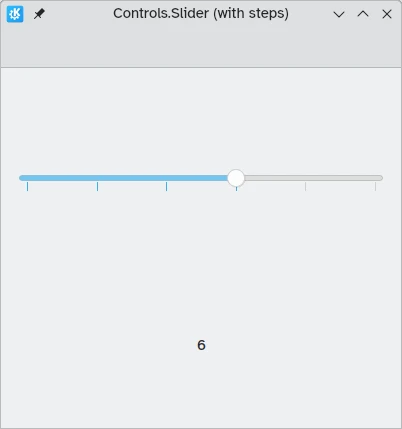
En annan användbar egenskap vi kan använda är stepSize. Att ställa in den till ett numeriskt värde låter oss skapa ett skjutreglage som låser till värden som är multipler av angiven stepSize, där multiplerna anges av streckmarkeringar. Om vi därför ställer in egenskapen till 2.0, när användaren drar skjutreglagets grepp, kan de bara välja 0.0, 2.0, 4.0, etc. upp till värdet angivet i egenskapen to.
import QtQuick
import QtQuick.Layouts
import QtQuick.Controls as Controls
import org.kde.kirigami as Kirigami

Kirigami.ApplicationWindow {
    title: "Controls.Slider (with steps)"
    width: 400
    height: 400
    pageStack.initialPage: Kirigami.Page {
        ColumnLayout {
            anchors.fill: parent
            Controls.Slider {
                id: tickmarkedSlider
                Layout.alignment: Qt.AlignHCenter
                Layout.fillWidth: true
                orientation: Qt.Horizontal
                snapMode: Controls.Slider.SnapAlways
                value: 6.0
                to: 10.0
                stepSize: 2.0
            }
            Controls.Label {
                Layout.alignment: Qt.AlignHCenter
                text: tickmarkedSlider.value
            }
        }
    }
}
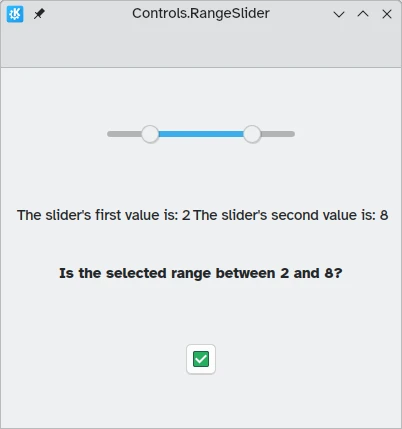
Intervallreglage
QtQuick Controls tillhandahåller också Controls.RangeSliders. De har två grepp, och låter dig därmed definiera ett talintervall mellan de två greppen.
Två nya egenskaper är viktiga att hålla i minnet: first.value och second.value, som innehåller de två greppens värden. Liksom egenskapen value i de vanliga skjutreglagen kan de ställas in i förväg.
import QtQuick
import QtQuick.Layouts
import QtQuick.Controls as Controls
import org.kde.kirigami as Kirigami

Kirigami.ApplicationWindow {
    title: "Controls.RangeSlider"
    width: 400
    height: 400
    pageStack.initialPage: Kirigami.Page {
        ColumnLayout {
            anchors.fill: parent
            Controls.RangeSlider {
                id: rangeSlider
                Layout.alignment: Qt.AlignHCenter
                to: 10.0
                first.value: 2.0
                second.value: 8.0
                stepSize: 1.0
                snapMode: Controls.Slider.SnapAlways
            }
            RowLayout {
                Layout.alignment: Qt.AlignHCenter
                Layout.fillWidth: true
                Controls.Label {
                    Layout.fillWidth: true
                    text: "The slider's first value is: " + Math.round(rangeSlider.first.value)
                }
                Controls.Label {
                    Layout.fillWidth: true
                    text: "The slider's second value is: " + Math.round(rangeSlider.second.value)
                }
            }
            Controls.Label {
                Layout.alignment: Qt.AlignHCenter
                font.bold: true
                text: "Is the selected range between 2 and 8?"
            }
            Controls.Button {
                Layout.alignment: Qt.AlignHCenter
                icon.name: {
                    if (rangeSlider.first.value >= 2 && rangeSlider.second.value <= 8)
                        return "emblem-checked"
                    else
                        return "emblem-error"
                }
            }
        }
    }
}