Kort
Kirigami-typerna AbstractCard och Card används för att implementera den populära komponenten card som används av många mobil- och webbplattformar. Kort kan användas för att visa samlad information eller samlade åtgärder på ett attraktivt och distinkt sätt.
Kirigami erbjuder också tre sorters vyer och positioneringsobjekt för att hjälpa dig presentera kort med vackra och mottagliga layouter.
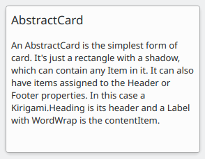
AbstractCard
A Kirigami.AbstractCard is the simplest type of card. It's just a rectangle with a shadow, which can contain any Item in it. It can also have Items assigned to its header or footer properties. In this case a Kirigami.Heading is its header and a Controls.Label is the card's contentItem.
Kirigami.AbstractCard {
    Layout.fillHeight: true
    header: Kirigami.Heading {
        text: qsTr("AbstractCard")
        level: 2
    }
    contentItem: Controls.Label {
        wrapMode: Text.WordWrap
        text: "..."
    }
}
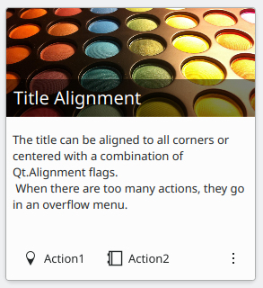
Card
A Kirigami.Card inherits from AbstractCard and provides more features out of the box. Cards inherit the same header and footer from an Abstract Card, but you are encouraged to use a banner and a set of Kirigami.Action in the actions group instead.
Kirigami.Card {
    actions: [
        Kirigami.Action {
            text: qsTr("Action1")
            icon.name: "add-placemark"
        },
        Kirigami.Action {
            text: qsTr("Action2")
            icon.name: "address-book-new-symbolic"
        },
        // ...
    ]
    banner {
        source: "../banner.jpg"
        title: "Title Alignment"
        // Titeln kan placeras i baneret
        titleAlignment: Qt.AlignLeft | Qt.AlignBottom
    }
    contentItem: Controls.Label {
        wrapMode: Text.WordWrap
        text: "My Text"
    }
}
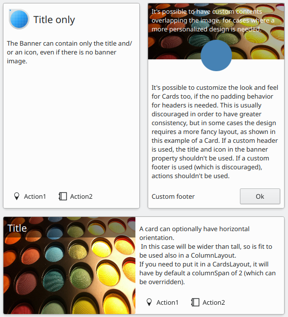
CardsLayout
En Kirigami.CardsLayout är användbarast när korten som presenteras antingen inte instansieras av en modell eller instansieras av en modell som alltid har mycket få objekt. De presenteras som ett rutnät med två kolumner som förblir centrerade om programmet är mycket brett, eller blir en enda kolumn om det inte finns tillräckligt med utrymme för två kolumner, såsom på en mobiltelefonskärm.
Anmärkning
CardsListView är bättre lämpade för stora modeller.A card can optionally be oriented horizontally. In this case it will be wider than tall, and is better suited to being placed in a ColumnLayout. If you must put it in a CardsLayout, it will have a maximumColumns of 2 by default.
ColumnLayout {
    Kirigami.CardsLayout {
        Kirigami.Card {
            contentItem: Controls.Label {
                wrapMode: Text.WordWrap
                text: "My Text2"
            }
        }
        Kirigami.AbstractCard {
            contentItem: Controls.Label {
                wrapMode: Text.WordWrap
                text: "My Text"
            }
        }
        Kirigami.Card {
            headerOrientation: Qt.Horizontal
            contentItem: Controls.Label {
                wrapMode: Text.WordWrap
                text: "My Text2"
            }
        }
    }
}
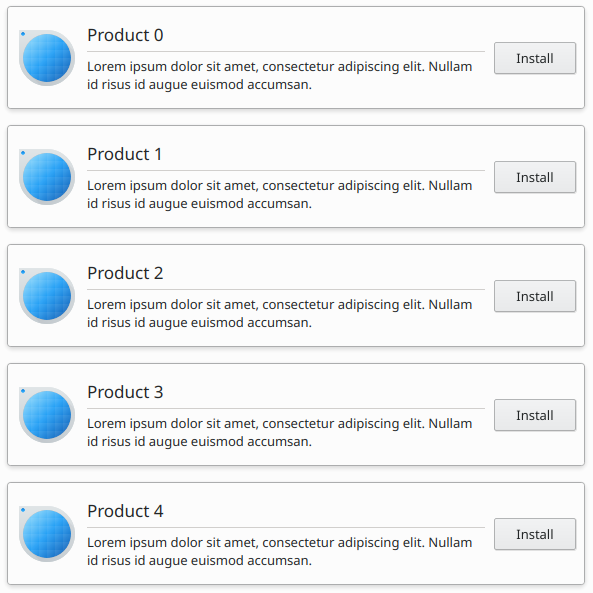
CardsListView
En Kirigami.CardsListView är en listvy som kan användas med AbstractCard komponenter.
A CardsListView will stretch child cards to its own width. This component should therefore only be used with cards which will look good at any horizontal size. Use of a Card component inside it is discouraged, unless it has Qt.Horizontal as its headerOrientation property.
Kirigami.CardsListView {
    id: view
    model: 100

    delegate: Kirigami.AbstractCard {
        //Observera: använd aldrig Layout som contentItem eftersom det orsakar bindningssnurror
        contentItem: Item {
            implicitWidth: delegateLayout.implicitWidth
            implicitHeight: delegateLayout.implicitHeight
            GridLayout {
                id: delegateLayout
                anchors {
                    left: parent.left
                    top: parent.top
                    right: parent.right
                    //Viktigt: ange aldrig undre marginal
                }
                rowSpacing: Kirigami.Units.largeSpacing
                columnSpacing: Kirigami.Units.largeSpacing
                columns: width > Kirigami.Units.gridUnit * 20 ? 4 : 2
                Kirigami.Icon {
                    source: "applications-graphics"
                    Layout.fillHeight: true
                    Layout.maximumHeight: Kirigami.Units.iconSizes.huge
                    Layout.preferredWidth: height
                }
                Kirigami.Heading {
                    level: 2
                    text: qsTr("Product ")+ modelData
                }
                Controls.Button {
                    Layout.alignment: Qt.AlignRight
                    Layout.columnSpan: 2
                    text: qsTr("Install")
                }
            }
        }
    }
}