Åtgärdsverktygsrader
Även om Kirigami låter dig enkelt placera en uppsättning åtgärder i sidhuvuden, finns det tillfällen då man kan föredra att ha någonting flexiblare.
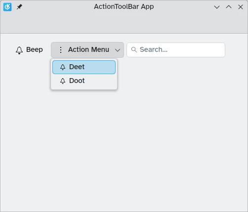
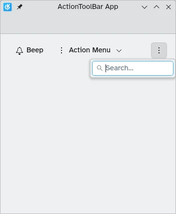
Kirigami tillhandahåller komponenten Kirigami.ActionToolBar. Den visar en lista över Kirigami.Action objekt och visar så många av dem som möjligt, och tillhandahåller en överflödesmeny för de som inte får plats. ActionToolBar är dynamisk och flyttar åtgärderna in och ut från överflödesmenyn beroende på tillgänglig storlek.
Anmärkning
Sidan antar att du är bekant med objekten i Kirigami.Action. Om det inte är fallet, kan du lära dig allt om dem i vår nybörjarhandledning eller på dokumentationssidan tillägnad till dem.Skapa vår första ActionToolBar
Layout och plats för din Kirigami.ActionToolBar är helt upp till dig, även om för att vara användarvänlig är det oftast en bra idé att hålla sig till konventioner för användargränssnittet och placera verktygsraden nära toppen och längst ner på sidan och låta den sprida sig på bredden.
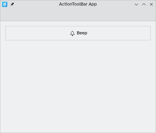
Like most other action-holding components, Kirigami.ActionToolBar has an actions property. We can assign an array of Kirigami.Action components to this property.
import QtQuick
import QtQuick.Layouts
import QtQuick.Controls as Controls
import org.kde.kirigami as Kirigami

Kirigami.ApplicationWindow {
    id: root

    title: "ActionToolBar App"
    width: 600
    height: 400

    pageStack.initialPage: Kirigami.Page {
        Kirigami.ActionToolBar {
            anchors.left: parent.left
            anchors.right: parent.right

            actions: [
                Kirigami.Action {
                    text: "Beep"
                    icon.name: "notifications"
                    onTriggered: showPassiveNotification("BEEP!")
                },
                Kirigami.Action {
                    text: "Action Menu"
                    icon.name: "overflow-menu"

                    Kirigami.Action {
                        text: "Deet";
                        icon.name: "notifications"
                        onTriggered: showPassiveNotification("DEET!")
                    }
                    Kirigami.Action {
                        text: "Doot";
                        icon.name: "notifications"
                        onTriggered: showPassiveNotification("DOOT!")
                    }
                },
                Kirigami.Action {
                    icon.name: "search"
                    displayComponent: Kirigami.SearchField { }
                }
            ]
        }
    }
}
ActionToolBar med tillräckligt utrymme för alla underliggande objekt
ActionToolBar med överflödesmeny som innehåller underliggande objekt
Justering
By default, actions in the Kirigami.ActionToolBar will be left aligned. This might not be desirable in all situations. Thankfully we can change this with the alignment property. We can set this property to a range of values, but the three most relevant ones are Qt.AlignLeft, Qt.AlignCenter, and Qt.AlignRight (which deal with horizontal alignment).
import QtQuick
import QtQuick.Layouts
import QtQuick.Controls as Controls
import org.kde.kirigami as Kirigami

Kirigami.ApplicationWindow {
    id: root

    title: "ActionToolBar App"
    width: 600
    height: 400

    pageStack.initialPage: Kirigami.Page {
        Controls.GroupBox {
            anchors.left: parent.left
            anchors.right: parent.right

            Kirigami.ActionToolBar {
                anchors.fill: parent

                alignment: Qt.AlignCenter

                actions: [
                    Kirigami.Action {
                        text: "Beep"
                        icon.name: "notifications"
                        onTriggered: showPassiveNotification("BEEP!")
                    }
                ]
            }
        }
    }
}