Åtgärdsbaserade komponenter
Åtgärder
En Kirigami.Action består av en klickbar åtgärd vars utseende beror på var den läggs till. Typiskt är det en knapp med en ikon och text.
Vi kan använda dem för att tillhandahålla åtgärder i våra program som är enkla att nå och är grundläggande för deras funktion.
Anmärkning
Åtgärder i Kirigami ärver från QtQuick Controls Action och kan tilldelas genvägar.Liksom QtQuick Controls Actions, kan de tilldelas till menyalternativet och knappar i verktygsrader, men också till flera andra komponenter i Kirigami.
import org.kde.kirigami as Kirigami

Kirigami.Action {
    id: copyAction
    text: i18n("Copy")
    icon.name: "edit-copy"
    shortcut: StandardKey.Copy
    onTriggered: {
        // ...
    }
}
Anmärkning
Egenskapen icon.name accepterar namn för systemomfattande ikoner enligt FreeDesktop-specifikationen. Ikonerna och ikonnamnen kan visas med KDE:s program CuttleFish, som levereras med plasma-sdk, eller genom att besöka FreeDesktop's icon naming specification.En funktion som åtgärder i Kirigami erbjuder över QtQuick Actions är möjligheten att nästla åtgärder.
import org.kde.kirigami as Kirigami

Kirigami.Action {
    text: "View"
    icon.name: "view-list-icons"
    Kirigami.Action {
        text: "action 1"
    }
    Kirigami.Action {
        text: "action 2"
    }
    Kirigami.Action {
        text: "action 3"
    }
}
Another feature of Kirigami Actions is to provide various hints to items using actions about how they should display the action. These are primarily handled by the displayHint and displayComponent properties.
Egenskaperna respekteras av objektet om möjligt. Exempelvis visas följande åtgärd som ett textfält och objektet gör sitt bästa för att hålla objektet synligt så länge som möjligt.
import org.kde.kirigami as Kirigami

Kirigami.Action {
    text: "Search"
    icon.name: "search"

    displayComponent: TextField { }

    displayHint: Kirigami.DisplayHints.KeepVisible
}
Använda åtgärder i andra komponenter
Som nämnts i introduktionshandledningen om åtgärder, är Kirigami Actions kontextuella, vilket innebär att de dyker upp på olika ställen beroende på var du placerar dem. Utöver det har de också olika representationer för skrivbord och mobil.
Sida
En Kirigami.Page visar åtgärder till höger om det övre sidhuvudet i skrivbordsläge och på en sidfot i mobilläge.
| |
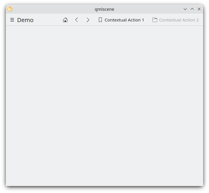
Sidoåtgärder på skrivbordet
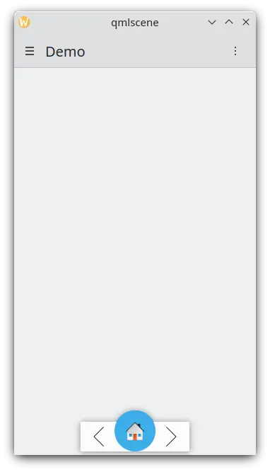
Sidoåtgärder på en mobil
Global låda
Den globala lådan Kirigami.GlobalDrawer är en menylikande sidorad som tillhandahåller en åtgärdsbaserad navigering i programmet. Det är där nästlade åtgärder är användbara eftersom det är möjligt att skapa nästlad navigering:
import org.kde.kirigami as Kirigami

Kirigami.ApplicationWindow {
    title: "Actions Demo"
    globalDrawer: Kirigami.GlobalDrawer {
        title: "Demo"
        titleIcon: "applications-graphics"
        actions: [
            Kirigami.Action {
                text: "View"
                icon.name: "view-list-icons"
                Kirigami.Action {
                    text: "View Action 1"
                    onTriggered: showPassiveNotification("View Action 1 clicked")
                }
                Kirigami.Action {
                    text: "View Action 2"
                    onTriggered: showPassiveNotification("View Action 2 clicked")
                }
            },
            Kirigami.Action {
                text: "Action 1"
                onTriggered: showPassiveNotification("Action 1 clicked")
            },
            Kirigami.Action {
                text: "Action 2"
                onTriggered: showPassiveNotification("Action 2 clicked")
            }
        ]
    }
    //...
}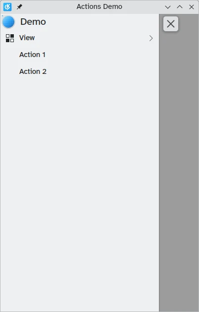
Åtgärder i global låda på skrivbordet
Du kan läsa mer om globala lådor på dokumentationssidan för lådor.
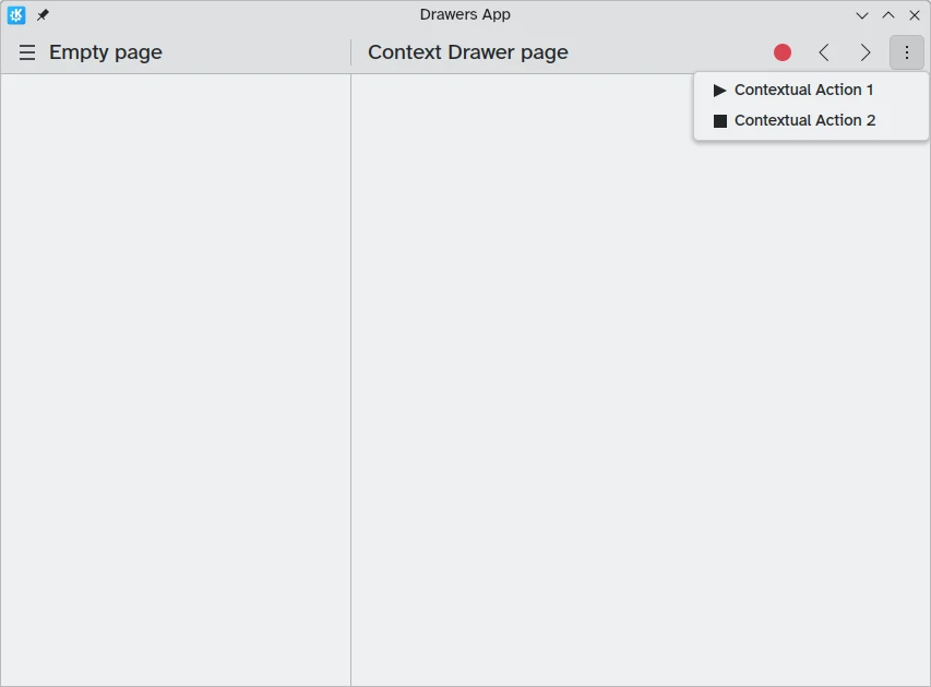
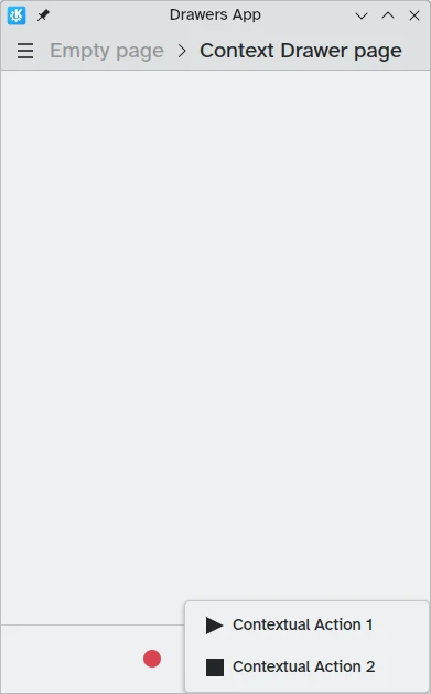
Sammanhangslåda
En Kirigami.ContextDrawer består av ytterligare en uppsättning åtgärder som är gömda bakom en meny med tre punkter uppe till höger i skrivbordsläge eller nere till höger i mobilläge om det inte finns något utrymme. Den används för att visa åtgärder som endast är relevanta för en specifik sida. Du kan läsa mer om dem i vår handledning om Kirigami-lådor.
ActionTextFields
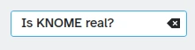
Ett Kirigami.ActionTextField används för att lägga till några sammanhangsberoende åtgärder i ett textfält, exempelvis för att rensa texten eller söka efter texten.
Kirigami.ActionTextField {
    id: searchField
    rightActions: [
        Kirigami.Action {
            icon.name: "edit-clear"
            visible: searchField.text !== ""
            onTriggered: {
                searchField.text = ""
                searchField.accepted()
            }
        }
    ]
}
I det här exemplet skapar vi en "rensningsknapp" för ett sökfält som bara är synligt när text matas in.
Anmärkning
You should rarely use an ActionTextField directly. SearchField and PasswordField both inherit from ActionTextField and are likely to cover your desired use-case.SwipeListItem
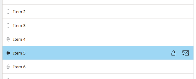
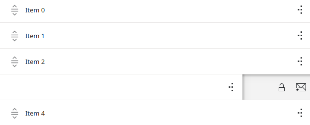
En Kirigami.SwipeListItem är en delegat avsedd att stödja extra åtgärder. När en mus används, visas dess åtgärder alltid. På en pekskärm kan de visas genom att dra objektet med greppet. På följande bilder är det ikonerna till höger.
ListView {
    model: myModel
    delegate: SwipeListItem {
        Controls.Label {
            text: model.text
        }
        actions: [
             Action {
                 icon.name: "document-decrypt"
                 onTriggered: print("Action 1 clicked")
             },
             Action {
                 icon.name: model.action2Icon
                 onTriggered: //gör någonting
             }
        ]
    }
}
SwipeListItem på en dator
SwipeListItem på en mobil
ActionToolBar
En Kirigami.ActionToolBar är en verktygsrad byggd av en lista över åtgärder. Normalt representeras varje åtgärd som får plats på verktygsraden med en verktygsknapp, medan de som inte får plats flyttas till en meny i slutat på verktygsraden.
Liksom ActionTextField, behöver du nog inte använda ActionToolBar direkt, eftersom den används av sidhuvuden och kort för att tillhandahålla deras egen åtgärdsvisning.
import org.kde.kirigami as Kirigami

Kirigami.ApplicationWindow {
    title: "Actions Demo"
    width: 350
    height: 350
    header: Kirigami.ActionToolBar {
        actions: [
            Kirigami.Action {
                text: i18n("View Action 1")
                onTriggered: showPassiveNotification(i18n("View Action 1 clicked"))
            },
            Kirigami.Action {
                text: i18n("View Action 2")
                onTriggered: showPassiveNotification(i18n("View Action 2 clicked"))
            },
            Kirigami.Action {
                text: i18n("Action 1")
                onTriggered: showPassiveNotification(i18n("Action 1 clicked"))
            },
            Kirigami.Action {
                text: i18n("Action 2")
                onTriggered: showPassiveNotification(i18n("Action 2 clicked"))
            }
        ]
    }
}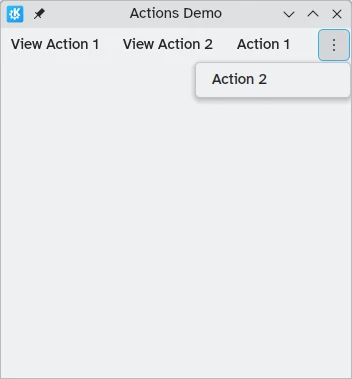
En horisontell verktygsrad visas överst i programmet
Du kan läsa mer om komponenter i ActionToolBar på deras dedicerade dokumentationssida.
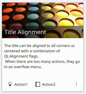
Kort
A Kirigami.Card is used to display a collection of information or actions together. These actions can be added to the actions group, similarly to previous components.
Kirigami.Card {
    actions: [
        Kirigami.Action {
            text: qsTr("Action1")
            icon.name: "add-placemark"
        },
        Kirigami.Action {
            text: qsTr("Action2")
            icon.name: "address-book-new-symbolic"
        },
        // ...
    ]
    banner {
        source: "../banner.jpg"
        title: "Title Alignment"
        titleAlignment: Qt.AlignLeft | Qt.AlignBottom
    }
    contentItem: Controls.Label {
        wrapMode: Text.WordWrap
        text: "My Text"
    }
}
För mer information se komponentsidan för Cards.