Formulärdelegater på inställningssidorna
Kirigami Addons är en ytterligare uppsättning visuella komponenter som fungerar bra på mobiler och skrivbordsdatorer och är garanterade att fungera på flera plattformar. De använder Kirigami i bakgrunden för att skapa sina komponenter.
You have learned how to add About and AboutKDE pages to your application. Now you will be able to use their same inner components to create your settings pages.
Projektstrukturen ska se ut så här:
addonsexample
├── CMakeLists.txt
├── main.cpp
├── Main.qml
├── MyAboutPage.qml
└── SettingsPage.qml
Nödvändiga ändringar
Ändra Main.qml för att inkludera vår nya inställningssida:
import QtQuick
import QtQuick.Layouts

import org.kde.kirigami as Kirigami
import org.kde.kirigamiaddons.formcard as FormCard

import org.kde.about 1.0

Kirigami.ApplicationWindow {
    id: root
    width: 600
    height: 700

    Component {
        id: aboutkde
        FormCard.AboutKDE {}
    }

    Component {
        id: aboutpage
        MyAboutPage {}
    }

    Component {
        id: settingspage
        SettingsPage {}
    }

    pageStack.initialPage: Kirigami.ScrollablePage {
        ColumnLayout {
            FormCard.FormCard {
                FormCard.FormButtonDelegate {
                    id: aboutKDEButton
                    icon.name: "kde"
                    text: i18n("About KDE Page")
                    onClicked: root.pageStack.layers.push(aboutkde)
                }

                FormCard.FormButtonDelegate {
                    id: aboutPageButton
                    icon.name: "applications-utilities"
                    text: i18n("About Addons Example")
                    onClicked: root.pageStack.layers.push(aboutpage)
                }

                FormCard.FormButtonDelegate {
                    id: settingsButton
                    icon.name: "settings-configure"
                    text: i18n("Single Settings Page")
                    onClicked: root.pageStack.layers.push(settingspage)
                }
            }
        }
    }
}
Vi kan nu börja titta på komponenterna som används för att skapa vår inställningssida: formulärkortet och dess delegater.
Formulärdelegater
FormCard och FormCardPage
FormCard.FormCard is the main component we will be using to group all its child components, the Delegates.
We used a form card in the Kirigami Addons introduction before. Its main purpose is to serve as a container for other components while following a color different from the background, in a similar manner to a Kirigami.Card.
Skapa en ny fil, SettingsPage.qml:
import QtQuick
import org.kde.kirigamiaddons.formcard as FormCard

FormCard.FormCardPage {
    FormCard.FormCard {
        // Det är här alla våra delegater ska finnas.
    }

    FormCard.FormCard {
        // Det är här alla våra delegater ska finnas.
    }
}
Since we are making a separate QML file for our Settings page, and since we need to prepare for potential scrolling in our page, we use a FormCard.FormCardPage, which inherits Kirigami.ScrollablePage.
Det fina med formulärkortsidan är att en intern layout ingår, så ingen ytterligare ColumnLayout behövs och våra delegater kan läggas till direkt.
Note
Det är möjligt att använda FormCard delegater direkt med en Kirigami.ScrollablePage, men i detta fall måste en egen layout läggas till.FormHeader
For every FormCard you want to create, you can create a FormHeader just before it. The header uses bold text and shows up right above the form card.
import org.kde.kirigamiaddons.formcard as FormCard
FormCard.FormCardPage {
FormCard.FormHeader {
title: i18n("General")
}
FormCard.FormCard {
// Våra delegater ska finnas här...
}
FormCard.FormHeader {
title: i18n("Accounts")
}
FormCard.FormCard {
// Våra delegater ska finnas här...
}
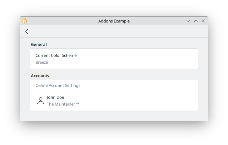
}FormTextDelegate och FormSectionText
Låt oss börja enkelt, med vanlig text.
FormSectionText lägger helt enkelt till en tunn delegat som innehåller en beteckning. FormTextDelegate har text och en inaktiv beskrivning.
import QtQuick
import org.kde.kirigami as Kirigami
import org.kde.kirigamiaddons.formcard as FormCard

FormCard.FormCardPage {
    FormCard.FormHeader {
        title: i18n("General")
    }

    FormCard.FormCard {
        FormCard.FormTextDelegate {
            text: i18n("Current Color Scheme")
            description: "Breeze"
        }
    }

    FormCard.FormHeader {
        title: i18n("Accounts")
    }

    FormCard.FormCard {
        FormCard.FormSectionText {
            text: i18n("Online Account Settings")
        }
        FormCard.FormTextDelegate {
            leading: Kirigami.Icon {source: "user"}
            text: "John Doe"
            description: i18n("The Maintainer ™️")
        }
    }
}
We add some dummy text for the hypothetical theme detection. If we wanted to have actual color scheme detection, in the future it could be done similarly to Neochat (code here), making use of a C++ model with KColorSchemeManager.
In the Online Accounts section, we see an additional property, leading. We can add an Item to it so that it appears before the text. Its opposite property, trailing, would be able to show an Item after the text, but we won't use it in our program.
We use a Kirigami.Icon here for simplicity, but this could also be implemented using a Kirigami Addons Avatar that grabs the information from a model, as is done in Neochat.
Slutligen ska det se ut så här:
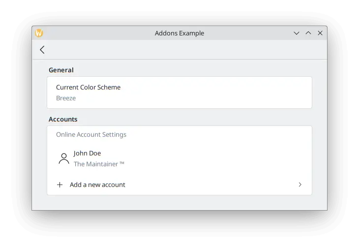
FormButtonDelegate
The FormButtonDelegate is visually similar to a FormTextDelegate, but it is clickable and shows an arrow pointing to the right. We used it in the Kirigami Addons introduction before.
While the FormTextDelegate had the leading and trailing properties to show an item before and after the main content, the FormButtonDelegate only has the leading property, because the right side is occupied by the arrow.
import QtQuick
import org.kde.kirigami as Kirigami
import org.kde.kirigamiaddons.formcard as FormCard

FormCard.FormCardPage {
    FormCard.FormHeader {
        title: i18n("General")
    }

    FormCard.FormCard {
        FormCard.FormTextDelegate {
            text: i18n("Current Color Scheme")
            description: "Breeze"
        }
    }

    FormCard.FormHeader {
        title: i18n("Accounts")
    }

    FormCard.FormCard {
        FormCard.FormSectionText {
            text: i18n("Online Account Settings")
        }
        FormCard.FormTextDelegate {
            leading: Kirigami.Icon {source: "user"}
            text: "John Doe"
            description: i18n("The Maintainer ™️")
        }
        FormCard.FormButtonDelegate {
            icon.name: "list-add"
            text: i18n("Add a new account")
            onClicked: console.info("Clicked!")
        }
    }
}
We use its icon.name property to set a plus (+) icon to appear after the space where the leading would appear, and before the main content. This is a common pattern to indicate your button will add something to a list.
Eftersom exemplet är för enkla illustrativa syften, går vi inte djupt in på vad som skulle göras när man väl klickar på knappen: den skriver bara ut "Clicked!" på terminalen. Vi kan göra en ny sida för att skapa ett konto som lägger till en annan användare till en modell, och sedan visar sidan, på samma sätt som vi gjorde i Main.qml.
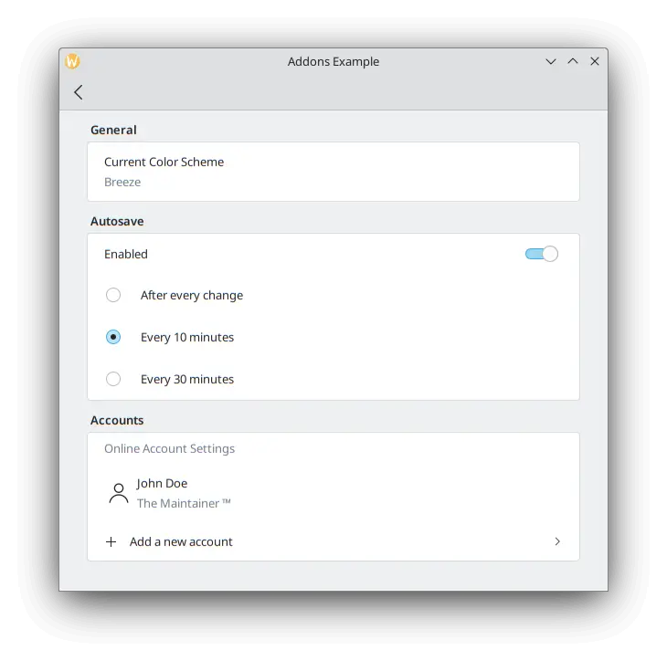
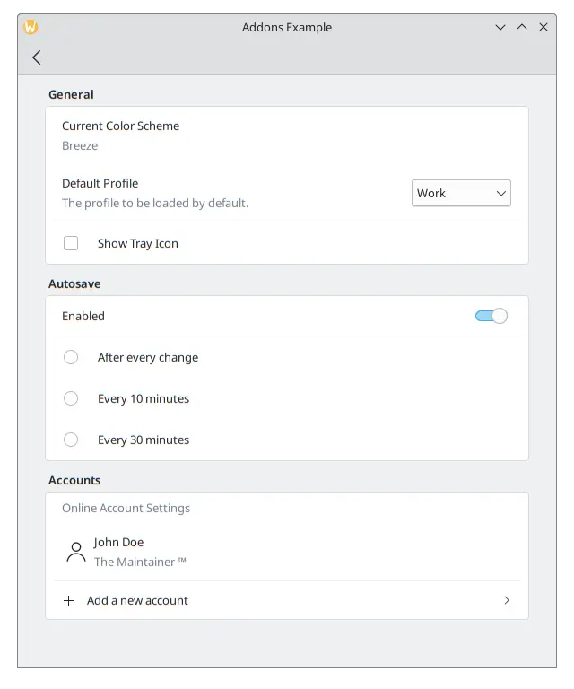
FormRadioDelegate, FormCheckDelegate och FormSwitchDelegate
The RadioButton, CheckBox and Switch are very commonly used components in any user interface. Kirigami Addons provides them as FormRadioDelegate, FormCheckDelegate and FormSwitchDelegate.
Deras enda huvudegenskaper är text och description. De är olika vid användning eftersom de alla ärver AbstractButton, och därför förväntas man använda dess signaler och hanterare: checked och onChecked, toggled och onToggled, clicked och onClicked.
We want to create some autosave functionality in our application, and we want to only show its settings if the user has enabled this functionality. Create a new section using a FormCard and a FormHeader, then add a FormSwitchDelegate and a FormRadioDelegate.
FormCard.FormHeader {
    title: i18n("Autosave")
}

FormCard.FormCard {
    FormCard.FormSwitchDelegate {
        id: autosave
        text: i18n("Enabled")
    }
    FormCard.FormRadioDelegate {
        text: i18n("After every change")
        visible: autosave.checked
    }
    FormCard.FormRadioDelegate {
        text: i18n("Every 10 minutes")
        visible: autosave.checked
    }
    FormCard.FormRadioDelegate {
        text: i18n("Every 30 minutes")
        visible: autosave.checked
    }
}
Vi kopplar synligheten för varje alternativknapp till en omkopplare, så de bara visas när omkopplaren är aktiverad.
Bästa metoder
Klicka här för att läsa mer
If you have some programming background in imperative languages such as C++, you might be tempted to set the checked property of the switch to turn the visibility of the radio buttons to true with a JavaScript assignment such as:
checked: {
    radio1.visible = true;
    radio2.visible = true;
    radio3.visible = true;
}
Det är inte särskilt effektivt med QML:s deklarativa språk och dess signaler och slots. Försök att använda QML-bindningar som i fallet med visible: autosave.checked så mycket som möjligt istället för uttryck i JavaScript.
Se den här sidan för detaljinformation.
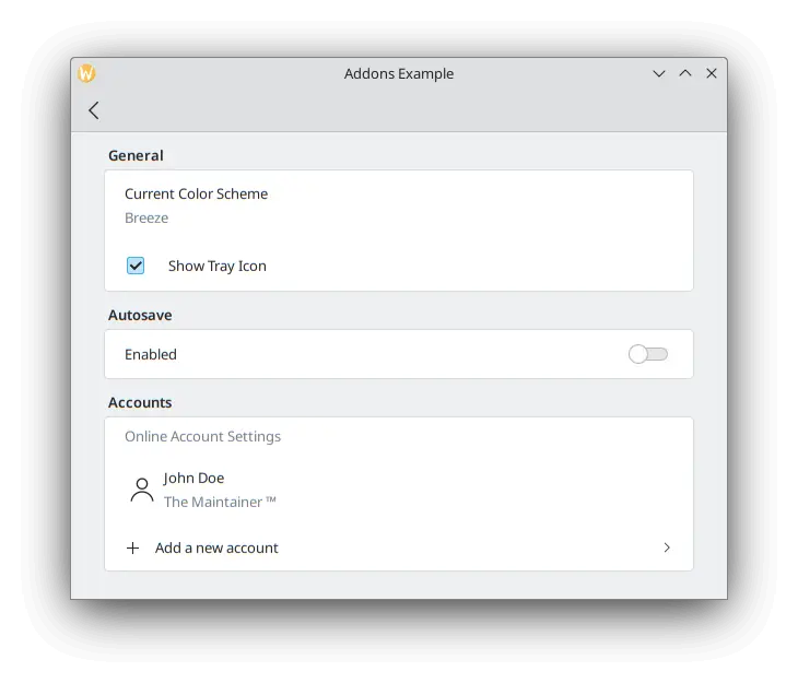
To test our checkbox, we can add a new FormCheckDelegate to our General section.
FormCard.FormHeader {
    title: i18n("General")
}

FormCard.FormCard {
    FormCard.FormTextDelegate {
        text: i18n("Current Color Scheme")
        description: "Breeze"
    }
    FormCard.FormCheckDelegate {
        text: i18n("Show Tray Icon")
        onToggled: {
            if (checkState) {
                console.info("A tray icon appears on your system!")
            } else {
                console.info("The tray icon disappears!")
            }
        }
    }
}
Here we use the signal handler called onToggled to show some dummy text to simulate a tray icon appearing in the system. If you really wanted to, you could easily implement a tray icon using KDE's KStatusNotifierItem or Qt's SystemTrayIcon.
Hittills ska programmet se ut så här:
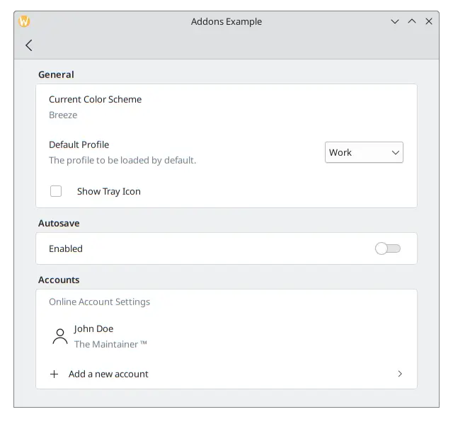
FormComboBoxDelegate
The common ComboBox component can be created using a FormComboBoxDelegate.
Kombinationsrutan har flera användbara egenskaper som vi kan använda: editable, displayText och displayMode.
Att ställa in editable: true låter användaren redigera text i kombinationsrutan, vilket är användbart om tillägg av nya alternativ i kombinationsrutan behövs:
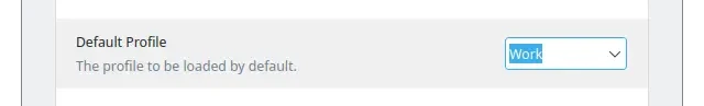
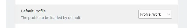
När du behöver visa ytterligare text före varje alternativ kan du använda något som liknar displayText: "Profile: " + currentText:
And the most interesting one, which we will be using in our example, is displayMode. It can have three options:
- FormComboBoxDelegate.ComboBox: Den lilla standardrutan som visar en lista med alternativ.
- FormComboBoxDelegate.Dialog: a dialog showing a list of options in the middle of the window, like a Kirigami.OverlaySheet.
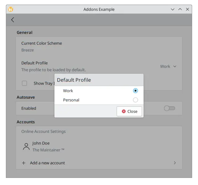
- FormComboBoxDelegate.Page: En ny sida som innehåller en lista med alternativ som visas i ett separat fönster.
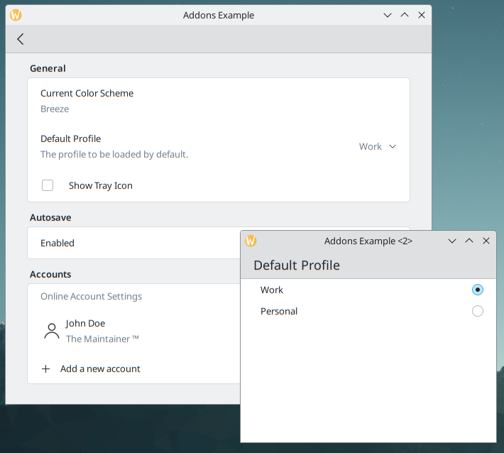
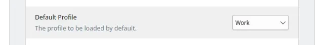
Lägg till följande mellan delegaterna "Current Color Scheme" och "Show Tray Icon" på formulärkortet "General".
FormCard.FormComboBoxDelegate {
    text: i18n("Default Profile")
    description: i18n("The profile to be loaded by default.")
    displayMode: FormCard.FormComboBoxDelegate.ComboBox
    currentIndex: 0
    editable: false
    model: ["Work", "Personal"]
}
Med kryssrutan ska inställningssidan se ut så här:
FormDelegateSeparator
Our Settings page is taking shape, but each section is starting to get long. We can add a few FormDelegateSeparator instances to make our page tidier:
import QtQuick
import org.kde.kirigami as Kirigami
import org.kde.kirigamiaddons.formcard as FormCard

FormCard.FormCardPage {
    id: root

    title: i18nc("@title", "Settings")

    FormCard.FormHeader {
        title: i18nc("@title:group", "General")
    }

    FormCard.FormCard {
        FormCard.FormTextDelegate {
            text: i18nc("@info", "Current Color Scheme")
            description: "Breeze"
        }

        FormCard.FormComboBoxDelegate {
            id: combobox
            text: i18nc("@label:listbox", "Default Profile")
            description: i18nc("@info:whatsthis", "The profile to be loaded by default.")
            displayMode: FormCard.FormComboBoxDelegate.ComboBox
            currentIndex: 0
            editable: false
            model: ["Work", "Personal"]
        }

        FormCard.FormDelegateSeparator {
            above: combobox
            below: checkbox
        }

        FormCard.FormCheckDelegate {
            id: checkbox
            text: i18nc("@option:check", "Show Tray Icon")
            onToggled: {
                if (checkState) {
                    console.info("A tray icon appears on your system!")
                } else {
                    console.info("The tray icon disappears!")
                }
            }
        }
    }

    FormCard.FormHeader {
        title: i18nc("@title:group", "Autosave")
    }

    FormCard.FormCard {
        FormCard.FormSwitchDelegate {
            id: autosave
            text: i18nc("@option:check", "Enabled")
        }
        FormCard.FormDelegateSeparator {
            above: autosave
            below: firstradio
            visible: autosave.checked
        }
        FormCard.FormRadioDelegate {
            id: firstradio
            text: i18nc("@option:radio", "After every change")
            visible: autosave.checked
        }
        FormCard.FormRadioDelegate {
            text: i18nc("@option:radio", "Every 10 minutes")
            visible: autosave.checked
        }
        FormCard.FormRadioDelegate {
            text: i18nc("@option:radio", "Every 30 minutes")
            visible: autosave.checked
        }
    }

    FormCard.FormHeader {
        title: i18nc("@title:group", "Accounts")
    }

    FormCard.FormCard {
        FormCard.FormSectionText {
            text: i18nc("@info:whatsthis", "Online Account Settings")
        }
        FormCard.FormTextDelegate {
            id: lastaccount
            leading: Kirigami.Icon {source: "user"}
            text: "John Doe"
            description: i18nc("@info:credit", "The Maintainer ™️")
        }
        FormCard.FormDelegateSeparator {
            above: lastaccount
            below: addaccount
        }
        FormCard.FormButtonDelegate {
            id: addaccount
            icon.name: "list-add"
            text: i18nc("@action:button", "Add a new account")
            onClicked: console.info("Clicked!")
        }
    }
}
I allmänhet kan avskiljare användas när det finns stora skillnader mellan komponenter, även om valet av var du ska placera dem i slutändan är fritt. Till exempel, i sektionen General, skiljer sig kryssrutan från de tidigare komponenterna eftersom den inte börjar med text, i sektionen Autosave grupperar avskiljaren alternativknapparna, och i sektionen Accounts, ger tillägg av en avskiljare mellan det sista kontot och knappen lite extra fokus på knappen.
The above and below properties are rather self-explanatory when it comes to their use: you pass the id of the components above and below the separator. When they are set, the separator will swiftly disappear whenever the above or below item is highlighted/hovered. They are most useful, for instance, when you need to generate components dynamically and you can't automatically assume which item will come immediately before or after the separator. That would be the case in the Accounts section of our application once the logic to add new accounts were actually implemented, in which case we could always grab the last item in the model to do so.
Lägg märke till hur avskiljaren ovanför brickikonens inställning inte visas när musen hålls över den.