Barve in teme v Kirigamiju
Kirigami ima barvno paleto, ki sledi sistemskim barvam, za boljšo integracijo na platformi, kjer se izvaja (npr. Plasma Desktop, Plasma Mobile, GNOME, Android itd.).
Vse QML komponente Kirigamija in vse Qt Quick Controls bodo že privzeto sledile tej paleti, tako da običajno ni treba barvanja po meri za vse kontrolnike.
Primitivne komponente, kot je Rectangle, morajo biti vedno obarvane z barvno paleto, ki jo Kirigami zagotavlja prek priložene lastnosti Kirigami.Theme.
Trdo kodiranih barv v QML, kot sta #32b2fa ali red, se je običajno treba izogibati; če je resnično potrebno imeti elemente z barvami po meri, naj bo to območje, kjer se uporabljajo samo barve po meri (običajno v območju vsebine aplikacije in nikoli v območjih Chrome, kot so orodne vrstice ali pogovorna okna). Na primer, trdo kodiranega črnega ospredja ni mogoče uporabiti čez ozadje Kirigami.Theme.backgroundColor, ker če platforma uporablja temno barvno shemo, bo rezultat imel slab kontrast s črno čez skoraj črno. To je težava z dostopnostjo in se ji je treba izogibati.
Opomba
Če že res morate uporabljati barve po meri, si oglejte Kontrast, da zagotovite, da izbrane barve ustrezajo priporočilom WCAG.Tema
Kirigami.Theme je priložena lastnost, zato jo je mogoče uporabiti za kateri koli element QML. Njene lastnosti vključujejo vse barve, ki so na voljo v paleti, in katero paleto uporabiti, kot je na primer lastnost colorSet.
import QtQuick
import org.kde.kirigami as Kirigami

Kirigami.ApplicationWindow {
    height: 300
    width: 400

    pageStack.initialPage: Kirigami.Page {
        Rectangle {
            anchors.centerIn: parent
            implicitHeight: 100
            implicitWidth: 200
            color: Kirigami.Theme.highlightColor
        }
    }
}
Galerija Kirigami ponuja primer kode, ki prikazuje vse barve, ki so na voljo za Kirigami prek Kirigami.Theme. To vključuje vsa njihova stanja: če kliknete zunaj okna, se barve spremenijo v neaktivno stanje, in če sistem preklopite na temno temo, se temne različice barv prikažejo sproti.
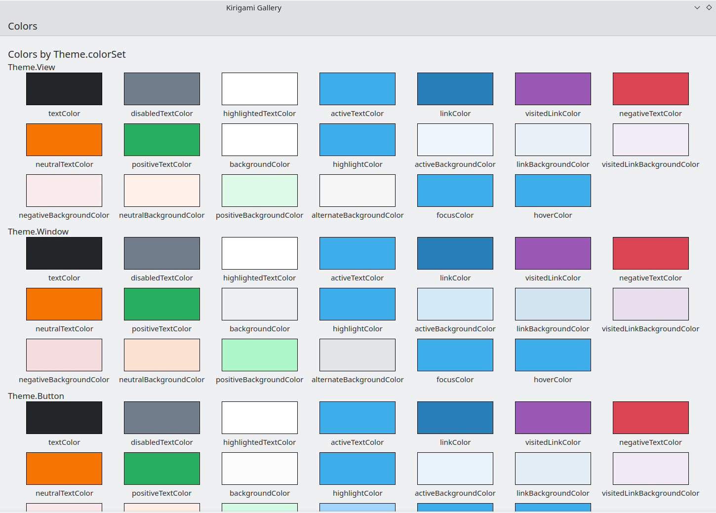
Komponenta barv v Galeriji Kirigami
Barvni nabor
Glede na to, kje se nahaja kontrolnik, bi moral uporabiti drugačen nabor barv. Primer (s temo svetlih barv Breeze/Sapica): v pogledih Views je navadno ozadje skoraj belo, medtem ko je v drugih območjih kot so orodne vrstice ali pogovorna okna, navadno barva ozadja siva.
Če za element definirate nabor barv, ga bodo vsi njegovi podrejeni elementi rekurzivno samodejno podedovali (razen če je lastnost inherit izrecno nastavljena na false, kar je treba vedno storiti, ko želi razvijalec vsiliti določen nabor barv), tako da je enostavno spremeniti barve za celotno hierarhijo elementov, ne da bi se dotaknili katerega koli od njih samih.
Kirigami.Theme podpira 5 različnih barvnih naborov:
- Pogled (View): barvni nabor za poglede elementov, običajno najsvetlejši od vseh (v svetlih barvnih temah)
- Okno (Window): Nabor barv za območja oken in krome (to je tudi privzeti nabor barv)
- Gumb (Button): nabor barv, ki ga uporabljajo gumbi
- Izbira (Selection): nabor barv, ki ga uporabljajo izbrana območja
- Namig (Tooltip): nabor barv, ki ga uporabljajo namigi orodij
- Komplementarni (Complementary): nabor barv, ki naj bi bil komplementaren z oknom: ponavadi temno tudi v svetlobnih temah. Se lahko uporablja za poudarek na majhnih območjih aplikacije
Tu je primer, ki prikazuje, kako se podedujejo nabori barv in jih je mogoče uporabiti za razlikovanje različnih komponent. Dodana je velika obroba za kontrast barvam.
| |
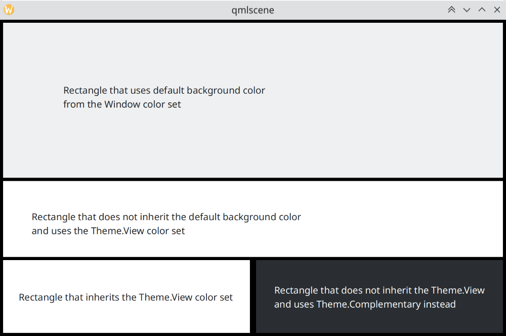
Kako se nabori barv razlikujejo v Sapici/Breeze
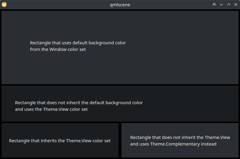
Kako se nabori barv razlikujejo v Temni sapici/Breeze Dark
Uporaba barv po meri
Čeprav odsvetujemo uporabo trdo določenih barv, ponuja Kirigami način za lažje vzdrževanje za dodeljevanje v kodi določene palete po meri elementu in vsem njegovim podrejenim, kar omogoča, da opredelite takšne barve po meri na enem samem mestu:
import QtQuick
import org.kde.kirigami as Kirigami

Kirigami.ApplicationWindow {
    title: "Custom colors"
    height: 300
    width: 300

    Rectangle {
        anchors.fill: parent
        Kirigami.Theme.inherit: false
        // OPOMBA: ne glede na uporabljeni barvni nabor je priporočljivo zamenjati vse razpoložljive
        // barve v temi, da se izognete slabo kontrastnim barvam

        Kirigami.Theme.colorSet: Kirigami.Theme.Window
        Kirigami.Theme.backgroundColor: "#b9d795"
        Kirigami.Theme.textColor: "#465c2b"
        Kirigami.Theme.highlightColor: "#89e51c"
        // Ponovno določite vse druge barve, ki jih želite

        // To bo "#b9d795"
        color: Kirigami.Theme.backgroundColor

        Rectangle {
            // To bo "#465c2b"
            anchors.centerIn: parent
            height: Math.round(parent.height / 2)
            width: Math.round(parent.width / 2)
            color: Kirigami.Theme.textColor
        }
    }
}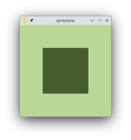
Primer z barvami po meri