Postavitve obrazcev
Komponente Kirigami.FormLayout vam olajšajo ustvarjanje obrazcev, ki so skladni s smernicami uporabniškega vmesnika KDE KDE Human Interface Guidelines. Optimalne so za pogovorna okna nastavitev in za velike skupine kontrolnikov in vnosnih polj, ki so povezana med seboj.
Če je na voljo dovolj prostora, bodo postavitve obrazcev privzele dva stolpca. Stolpec na levi bo zaseden z oznakami, ki so predvidene za sestavne dele obrazca za odvisne komponente, desnega pa bodo prevzeli sami odvisni deli. V oknih z več prostorske omejitve (ali na mobilnih napravah) bodo obrazci sestavljeni iz enega navpičnega stolpca z oznakami za odvisne komponente, ki so nameščene nad njihovo ustrezno komponento.
Enostavna oblika
Komponente Kirigami.FormLayout so v uporabi podobne komponentam QtQuick Layout, kot so ColumnLayout](https://doc.qt.io/qt-6/qml-qtquick-layouts-columnlayout.html) ali RowLayout. Odvisne komponente bodo samodejno razporejene glede na velikost, ki je na voljo za postavitev obrazca.
Podrejeni elementi Kirigami.FormLayout imajo lastnost z imenom Kirigami.FormData.label. Ta lastnost vam omogoča, da nastavite oznako, ki bo zagotovljena za zadevni podrejeni element.
import QtQuick
import QtQuick.Layouts
import QtQuick.Controls as Controls
import org.kde.kirigami as Kirigami

Kirigami.ApplicationWindow {
    pageStack.initialPage: Kirigami.Page {

        Kirigami.FormLayout {
            anchors.fill: parent

            Controls.TextField {
                Kirigami.FormData.label: "TextField 1:"
            }
            Controls.TextField {
                Kirigami.FormData.label: "TextField 2:"
            }
            Controls.TextField {
                Kirigami.FormData.label: "TextField 3:"
            }
        }
    }
}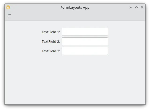
Enostaven obrazec postavljen v načinu namizja
Odseki in ločila
Postavitve obrazcev (FormLayouts) je mogoče razdeliti tudi na odseke. Nastavitev začetka odseka je tako preprosta kot nastavitev Kirigami.FormData.isSection podrejene komponente na true. To bo komponenti zagotovilo nekaj dodatnega roba na vrhu, da se razmejitev začne z novim odsekom.
Komponente Kirigami.Separator so najbolj primerne za začetek novih razdelkov. Ločila se uporabljajo za risanje tanke vodoravne črte, ki označuje konec razdelka. Če ne želite, da bi bila črta narisana med razdelki, lahko uporabite standardno lastnost QML Item. Lahko pa uporabite lastnost Kirigami.FormData.isSection na kateri koli drugi komponenti.
Vendar to ni priporočljivo. Pri komponentah, kjer je Kirigami.FormData.isSection nastavljeno na true, bo besedilo oznake, podano za lastnost Kirigami.FormData.label te komponente, prikazano kot besedilo glave razdelka.
Opozorilo
To ne velja za vsako komponento, zato priporočilo, da uporabljate komponenti Kirigami.Separator ali Item na mestih, kjer bi želeli uporabiti glavo kot besedilo.To besedilo glave je večje od običajnega besedila oznak in uporabnikom omogoča lepo vizualno iztočnico o razdelku in postavitvi obrazca.
Kirigami.FormLayout {
    anchors.fill: parent

    Controls.TextField {
        Kirigami.FormData.label: "TextField 1:"
    }
    Controls.TextField {
        Kirigami.FormData.label: "TextField 2:"
    }
    Controls.TextField {
        Kirigami.FormData.label: "TextField 3:"
    }
    Kirigami.Separator {
        Kirigami.FormData.isSection: true
        Kirigami.FormData.label: "New Section!"
    }
    ColumnLayout {
        Kirigami.FormData.label: "Radio buttons"
        Controls.RadioButton {
            text: "Radio 1"
            checked: true
        }
        Controls.RadioButton {
            text: "Radio 2"
        }
        Controls.RadioButton {
            text: "Radio 3"
        }
    }
    Item {
        Kirigami.FormData.isSection: true
        Kirigami.FormData.label: "Another Section! (lineless though)"
    }
    Controls.TextField {
        Kirigami.FormData.label: "TextField 4:"
    }
    Controls.TextField {
        Kirigami.FormData.label: "TextField 5:"
    }
    Controls.TextField {
        Kirigami.FormData.label: "TextField 5:"
    }
}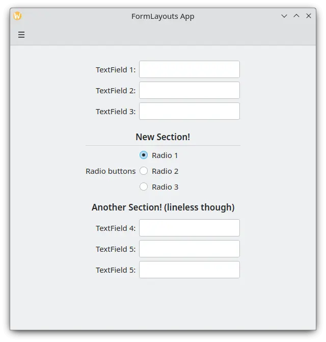
Postavitev obrazca s sekcijami
Vsiljena namizna ali mobilna postavitev
Če želite, da postavitev obrazca ostane dosledna ne glede na okolje vaše aplikacije, lahko uporabite lastnost wideMode komponente Kirigami.FormLayout:
- Ko je nastavljena na 'true', bo postavitev obrazca strukturirana v postavitvi širokega zaslona (dvojnega stolpca) z optimizacijo namizja
- Ko je nastavljena na 'false', bo postavitev obrazca strukturirana v mobilni postavitvi (en stolpec)
Kirigami.FormLayout {
    anchors.fill: parent
    wideMode: false

    Controls.TextField {
        Kirigami.FormData.label: "TextField 1:"
    }
    Controls.TextField {
        Kirigami.FormData.label: "TextField 2:"
    }
    Controls.TextField {
        Kirigami.FormData.label: "TextField 3:"
    }
}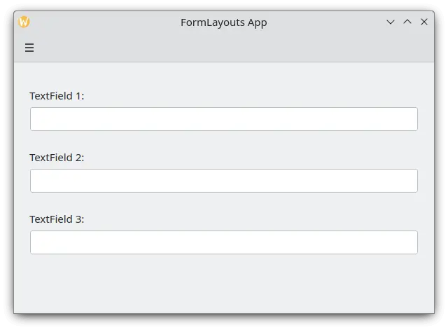
Postavitev obrazca z vsiljeno mobilno postavitvijo
Poravnava oznak
Včasih želite, da se oznaka dodeli komponentam, ki imajo več kot eno vrstico, ali seznamu komponent. To lahko dosežete tako, da v ColumnLayout vstavite Kirigami.FormData.label, kot ste morda opazili v Sections and Separators. Privzeto je oznaka postavljena navpično na sredino postavitve, kar ni vedno zaželeno. To lahko spremenimo s pomočjo Kirigami.FormData.labelAlignment.
Kirigami.FormLayout {
    anchors.fill: parent

    ColumnLayout {
        Kirigami.FormData.label: "This is a label:"
        Kirigami.FormData.labelAlignment: Qt.AlignTop

        Controls.Label {
            text: "This is some rather long text \nthat should elide to multiple lines \nto show how the label gets aligned."
            elide: Text.elideLeft
        }
    }
}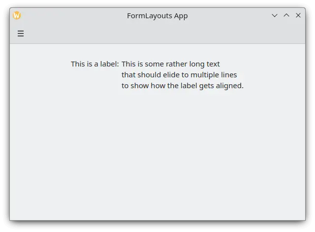
Postavitev obrazca z zgoraj poravnano oznako
Nastavitev poravnave nalepke je še posebej priročna za upravljanje komponent ali seznamov komponent, katerih velikost vnaprej ne poznate. Elisa je zelo dober primer tega:
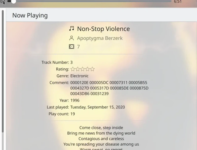
Oznaka komentarja je zgoraj poravnana le, če ima ustrezna komponenta več kot eno vrstico
Lahko naredimo nekaj podobnega s ternarnim operatorjem v JavaScriptu:
Kirigami.FormLayout {
    anchors.fill: parent

    ColumnLayout {
        Kirigami.FormData.label: "This is a label:"
        Kirigami.FormData.labelAlignment: labelText.text.lineCount > 1 ? Qt.AlignTop : Qt.AlignVCenter

        Controls.Label {
            id: labelText
            text: "This is some rather long text \nthat should elide to a new line \nso it appears below the Form Label."
            elide: Text.elideLeft
        }
    }
}