Vnorené správy
Táto stránka predpokladá, že ste oboznámení s objektmi Kirigami.Action. Ak nie ste, môžete sa o nich dozvedieť všetko v našom tutoriáli pre začiatočníkov alebo na venovanej stránke dokumentácie.
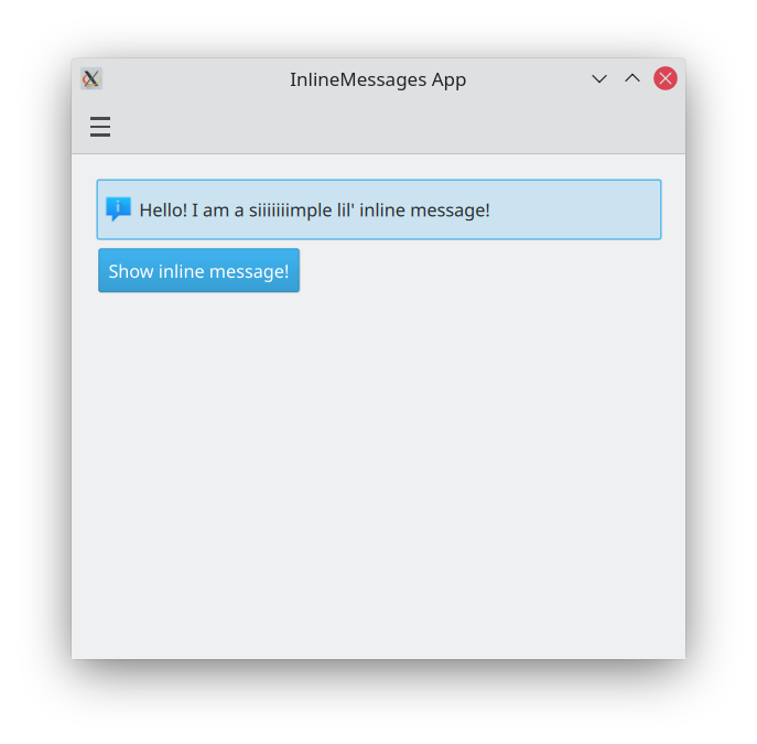
Základná vnorená správa
Rozloženie a umiestnenie vášho Kirigami.ActionToolBar je skutočne na vás, hoci kvôli používateľskej prívetivosti je zvyčajne dobrý nápad držať sa konvencií UI a umiestniť panel nástrojov blízko hornej alebo dolnej časti stránky a roztiahnuť ho na celú šírku.
- Rovnako ako väčšina ostatných komponentov obsahujúcich akcie, Kirigami.ActionToolBar má vlastnosť actions. Tejto vlastnosti môžeme priradiť pole komponentov Kirigami.Action.
- Štandardne budú akcie v Kirigami.ActionToolBar zarovnané doľava. Toto nemusí byť žiaduce vo všetkých situáciách. Našťastie to môžeme zmeniť pomocou vlastnosti alignment. Túto vlastnosť môžeme nastaviť na rôzne hodnoty, ale tri najrelevantnejšie sú
Qt.AlignLeft,Qt.AlignCenteraQt.AlignRight(ktoré sa zaoberajú horizontálnym zarovnaním).
import QtQuick
import QtQuick.Layouts
import QtQuick.Controls as Controls
import org.kde.kirigami as Kirigami

Kirigami.Page {

    ColumnLayout {
        Kirigami.InlineMessage {
            id: inlineMessage
            Layout.fillWidth: true
            text: "Hello! I am a siiiiiiimple lil' inline message!"
        }

        Controls.Button {
            text: "Show inline message!"
            onClicked: inlineMessage.visible = !inlineMessage.visible
        }
    }
}
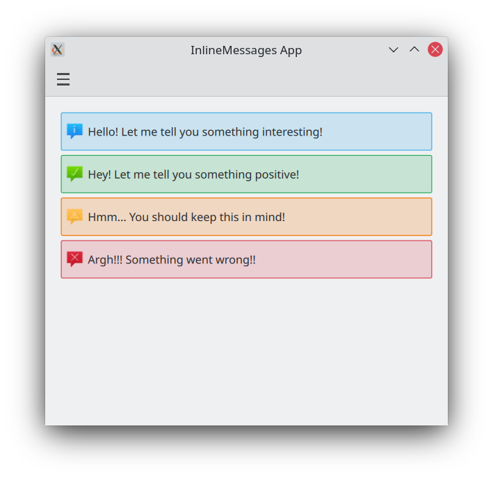
Rôzne typy
Štandardné vložené správy sú ako tie vyššie: majú modré pozadie a predvolenú ikonu. Môžeme to zmeniť pomocou vlastnosti type, ktorá nám umožňuje nastaviť našu vloženú správu na iný typ. Môžeme si vybrať zo štyroch typov:
- Typy Kirigami AbstractCard a Card sa používajú na implementáciu populárneho komponentu karty používaného na mnohých mobilných a webových platformách. Karty možno použiť na zobrazenie zbierky informácií alebo akcií atraktívnym a výrazným spôsobom.
- Kirigami tiež ponúka 3 druhy zobrazení a pozicionérov, ktoré vám pomôžu prezentovať vaše karty s krásnymi a responzívnymi rozloženiami.
- Kirigami.AbstractCard je najjednoduchší typ karty. Je to jednoducho obdĺžnik s tieňom, ktorý môže obsahovať akýkoľvek Item. Môže mať tiež Items priradené k vlastnostiam header alebo footer. V tomto prípade je Kirigami.Heading jej
headera Controls.Label jejcontentItem. - Kirigami.Card dedí z AbstractCard a poskytuje viac funkcií priamo od začiatku. Karty dedia rovnaké vlastnosti header a footer z Abstract Card, ale odporúča sa používať banner a sadu actions.
ColumnLayout {

    Kirigami.InlineMessage {
        Layout.fillWidth: true
        text: "Hello! Let me tell you something interesting!"
        visible: true
    }

    Kirigami.InlineMessage {
        Layout.fillWidth: true
        text: "Hey! Let me tell you something positive!"
        type: Kirigami.MessageType.Positive
        visible: true
    }

    Kirigami.InlineMessage {
        Layout.fillWidth: true
        text: "Hmm... You should keep this in mind!"
        type: Kirigami.MessageType.Warning
        visible: true
    }

    Kirigami.InlineMessage {
        Layout.fillWidth: true
        text: "Argh!!! Something went wrong!!"
        type: Kirigami.MessageType.Error
        visible: true
    }

}
Prispôsobenie textu a ikon
Kirigami.CardsLayout je najužitočnejší, keď prezentované karty buď nie sú vytvárané modelom, alebo sú vytvárané modelom, ktorý má vždy veľmi málo položiek. Prezentujú sa ako mriežka dvoch stĺpcov, ktorá zostane vycentrovaná, ak je aplikácia naozaj široká, alebo sa stane jedným stĺpcom, ak nie je dosť miesta na dva stĺpce, ako napríklad na obrazovke mobilného telefónu.
Kirigami.InlineMessage {
    Layout.fillWidth: true
    // [`CardsListView`](docs:kirigami;org.kde.kirigami.CardsListView) je vhodnejší pre väčšie
    // modely.
    text: "Check out <a href=\"https://kde.org\">KDE's website!<a/>"
    onLinkActivated: Qt.openUrlExternally(link)
    visible: true
}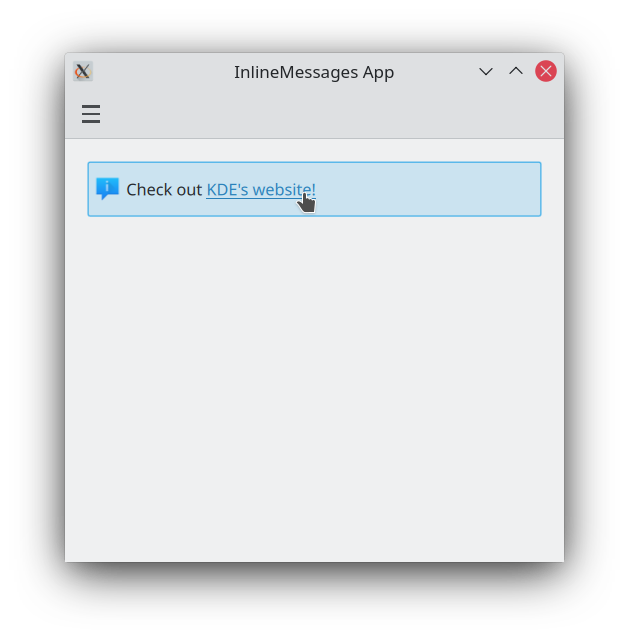
CardsLayout by mal byť vždy obsiahnutý v ColumnLayout.
Kirigami.InlineMessage {
    Layout.fillWidth: true
    text: "Look at me! I look SPECIAL!"
    icon.source: "actor"
    visible: true
}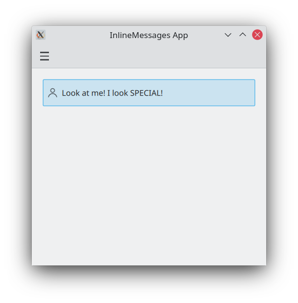
Používanie akcií vo vnorených správach
Karta môže byť voliteľne orientovaná horizontálne. V tomto prípade bude širšia než vysoká a je vhodnejšia na umiestnenie v ColumnLayout. Ak ju musíte umiestniť do CardsLayout, bude mať maximumColumns štandardne nastavené na 2.
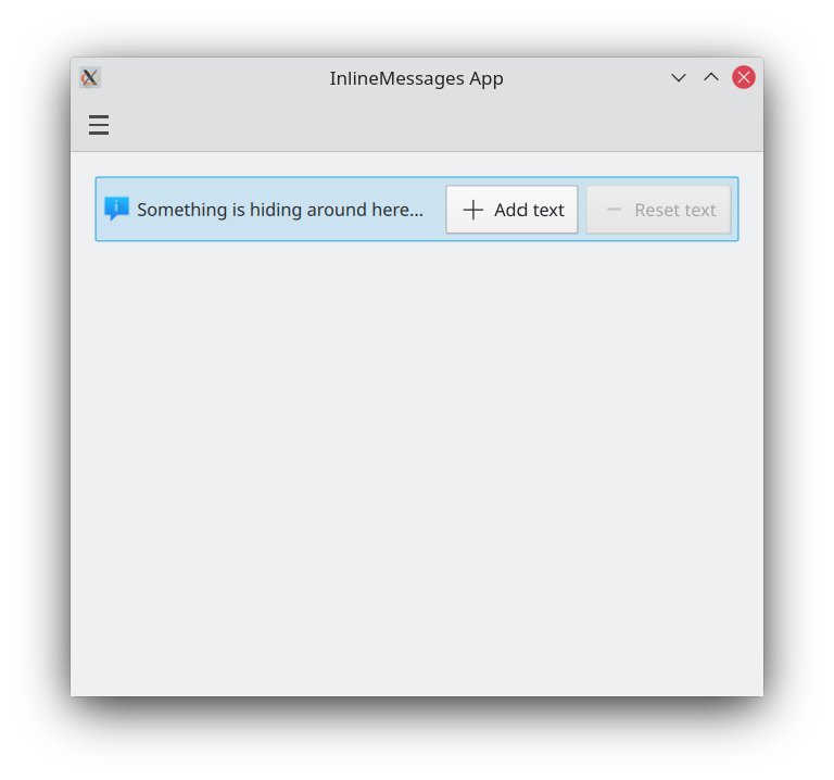
ColumnLayout {

    Kirigami.InlineMessage {
        id: actionsMessage
        Layout.fillWidth: true
        visible: true

        readonly property string initialText: "Something is hiding around here..."
        text: initialText

        actions: [
            Kirigami.Action {
                enabled: actionsMessage.text == actionsMessage.initialText
                text: qsTr("Add text")
                icon.name: "list-add"
                onTriggered: {
                    actionsMessage.text = actionsMessage.initialText + " Peekaboo!";
                }
            },
            Kirigami.Action {
                enabled: actionsMessage.text != actionsMessage.initialText
                text: qsTr("Reset text")
                icon.name: "list-remove"
                onTriggered: actionsMessage.text = actionsMessage.initialText
            }
        ]
    }
}
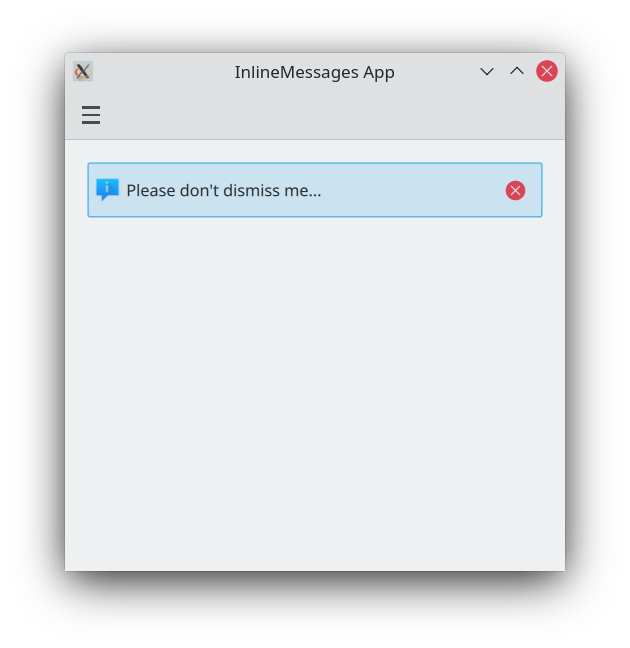
Zatvárací tlačidlá
Kirigami.CardsListView je zobrazenie zoznamu, ktoré možno použiť s komponentmi AbstractCard.
CardsListView roztiahne dcérske karty na svoju vlastnú šírku. Tento komponent by sa preto mal používať iba s kartami, ktoré budú vyzerať dobre pri akejkoľvek horizontálnej veľkosti. Použitie komponentu Card vo vnútri sa neodporúča, pokiaľ nemá Qt.Horizontal ako svoju vlastnosť headerOrientation.
Kirigami.InlineMessage {
    Layout.fillWidth: true
    text: "Please don't dismiss me..."
    showCloseButton: true
    visible: true
}