Colors and themes in Kirigami
O Kirigami tem uma paleta de cores que segue as cores do sistema, para se integrar melhor com a plataforma na qual se está a executar (i.e., Plasma no computador, Plasma Mobile, GNOME, Android, etc.).
Todos os componentes QML do Kirigami e todos os componentes QML do QtQuick Controls 2 seguem esta paleta por omissão, pelo que normalmente não será necessária mais nenhuma coloração personalizada para todos estes controlos.
Primitive components such as Rectangle should always be colored with the color palette provided by Kirigami via the Kirigami.Theme attached property.
Hardcoded colors in QML, such as #32b2fa or red, should usually be avoided; if it is really necessary to have elements with custom colors, it should be an area where only custom colors are used (usually in the content area of the app, and never in chrome areas such as toolbars or dialogs). For instance, a hardcoded black foreground cannot be used over a Kirigami.Theme.backgroundColor background, because if the platform uses a dark color scheme the result will have poor contrast with black over almost black. This is an accessibility issue and should be avoided.
Nota
Se precisar realmente de usar cores personalizadas, consulte o Kontrast para garantir que as cores que escolher têm bom contraste e são compatíveis com a WCAG.Tema
Kirigami.Theme is an attached property, and therefore it is available to use for any QML item. Its properties include all the colors available in the palette, and what palette to use, such as the colorSet property.
import QtQuick
import org.kde.kirigami as Kirigami

Kirigami.ApplicationWindow {
    height: 300
    width: 400

    pageStack.initialPage: Kirigami.Page {
        Rectangle {
            anchors.centerIn: parent
            implicitHeight: 100
            implicitWidth: 200
            color: Kirigami.Theme.highlightColor
        }
    }
}
Kirigami Gallery provides a code example showcasing all colors available for Kirigami through Kirigami.Theme. This includes all their states: if you click outside the window, the colors change to their inactive state, and if you switch your system to a dark theme, the dark variants of the colors should show up in real time.
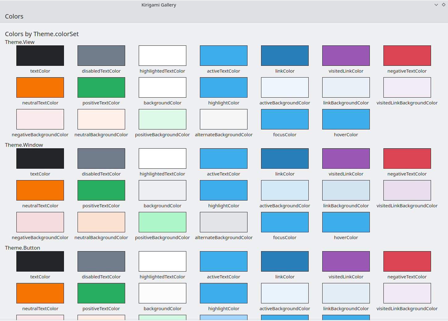
O componente Colors na Galeria do Kirigami
Conjunto de Cores
Dependendo de onde se localiza um dado controlo, deverá usar um conjunto de cores diferente: por exemplo, (com o tema de cores Brisa Claro) nas Views, o fundo normal é quase branco, enquanto noutras regiões, como as barras de ferramentas ou nas janelas, a cor de fundo normal é o cinzento.
If you define a color set for an item, all of its child items will recursively inherit it automatically (unless the property inherit has explicitly been set to false, which should always be done when the developer wants to force a specific color set) so it is easy to change colors for an entire hierarchy of items without touching any of the items themselves.
Kirigami.Theme supports 5 different color sets:
- View: Conjunto de cores das janelas de itens; normalmente é o mais claro de todos (em temas de cores claras)
- Window: Conjunto de cores para as janelas e áreas de desenho (este também é o conjunto de cores predefinido)
- Button: Conjunto de cores usado pelos botões
- Selection: Conjunto de cores usado pelas áreas seleccionadas
- Tooltip: Conjunto de cores usadas pelas dicas
- Complementary: Conjunto de cores complementar ao Window: normalmente é escuro, mesmo em temas claros. Poderá ser usado para enfatizar pequenas áreas da aplicação
Aqui está um exemplo que demonstra como são herdados os conjuntos de cores e como podem ser usados para distinguir entre os diferentes componentes. Foi adicionado um contorno grande às cores em contraste.
| |
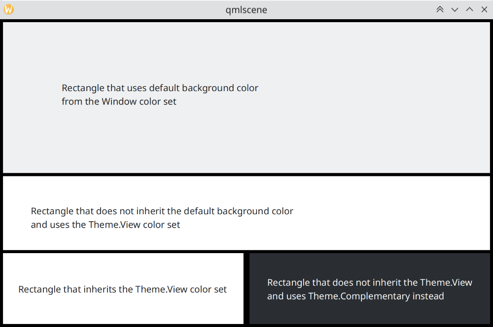
Como diferem os conjuntos de cores no Brisa
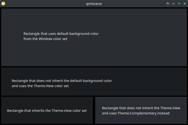
Como diferem os conjuntos de cores no Brisa Escuro
Usar Cores Personalizadas
Ainda que seja desencorajado o uso de cores fixas, o Kirigami oferece uma forma mais fácil de manter uma paleta de cores personalizadas fixas para um item e todos os seus filhos, a qual permitirá definir essas cores personalizadas em apenas um sítio:
import QtQuick
import org.kde.kirigami as Kirigami

Kirigami.ApplicationWindow {
    title: "Custom colors"
    height: 300
    width: 300

    Rectangle {
        anchors.fill: parent
        Kirigami.Theme.inherit: false
        // NOTE: regardless of the color set used, it is recommended to replace all available colors
        // in Theme, to avoid badly contrasting colors

        Kirigami.Theme.colorSet: Kirigami.Theme.Window
        Kirigami.Theme.backgroundColor: "#b9d795"
        Kirigami.Theme.textColor: "#465c2b"
        Kirigami.Theme.highlightColor: "#89e51c"
        // Redefine all the other colors you want

        // This will be "#b9d795"
        color: Kirigami.Theme.backgroundColor

        Rectangle {
            // This will be "#465c2b"
            anchors.centerIn: parent
            height: Math.round(parent.height / 2)
            width: Math.round(parent.width / 2)
            color: Kirigami.Theme.textColor
        }
    }
}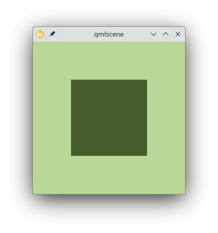
Exemplo com cores personalizadas