Layouts, ListViews e Cards
Dispor o seu conteúdo
Now that we understand how pages work, it is time to add stuff to them. We will be going through a number of important layout components and elements that will be useful when designing our app.
By the end of this section you'll have a neat-looking app.
ListViews
Se já tiver usado o Discover, o NeoChat ou a Configuração do Sistema do Plasma, já terá passado por uma ListView. De uma forma muito simples, as ListViews permitem-lhe mostrar os dados numa lista.
pageStack.initialPage: Kirigami.ScrollablePage {
    // ...
    Kirigami.CardsListView {
       id: cardsView
        model: kountdownModel
        delegate: kountdownDelegate
    }
}
Isto parece complicado, mas não se preocupe. Vamos começar pelo topo.
We add this component inside our Kirigami.ScrollablePage from the last tutorial.
We're using Kirigami.CardsListView, which is a ListView that allows us to easily display cards in a list. However, ListViews are made to show data taken from a model - to automatically populate itself from a set of data that we point it to. That's where the model property comes in: in this example, it's pointing to kountdownModel.
Modelo
Kirigami.ApplicationWindow {
    // ...
    ListModel {
        id: kountdownModel
        // Cada ListElement é um elemento na lista, contendo informações
        ListElement {
            name: "Dog birthday!!"
            description: "Big doggo birthday blowout."
            date: 100
        }
    }
    // ...
}
We add our kountdownModel inside the Kirigami.ApplicationWindow from the last tutorial.
Um modelo define a forma como se estrutura um elemento de dados. O nosso kountdownModel irá consistir apenas num elemento para já. Ao olhar para o nosso ListElement acima, podemos ver como são estruturados os elementos do 'kountdownModel': contêm um nome, uma descrição e uma data. Isto não está 'escrito na pedra', e poderá ter vários tipos de dados no seu modelo. Os dois primeiros são textos simples, enquanto o terceiro é um número que será usado como substituição.
Nota
Dado que o QML é desenvolvido sobre o JavaScript, muitas das funcionalidades desta linguagem estão disponíveis para usar nos ficheiros QML. Contudo, as variáveis em QML têm de ser antecedidas deproperty, a menos que esteja dentro de um bloco de código em JS. Poderá ler mais sobre isso nesta página.Os modelos são também úteis na forma como poderão ser modificados através do uso de vários métodos. Alguns dos importantes são:
- ListModel.append(yourobject: jsobject) adds a JavaScript object (JSObject)
yourobjectto the ListModel and places it after the last item in the model. For this to happen correctly, you must provide a JSObject with the correct properties and corresponding datatypes. - O ListModel.get(index: int) devolve o JSObject na posição 'indice' que indicar.
- O ListModel.remove(indice: int, quantidade: int) remove o JSObject na posição
indiceindicada, removendo tantos itens quantos desejar através do parâmetroquantidade(o valor 1 inclui apenas o JSObject na posição indicada) - O ListModel.set(indice: int, objecto: jsobject) altera o item na posição 'indice' indicada com os valores fornecidos em 'objecto'. Aplicam-se as mesmas regras no
append().
Delegates
While our kountdownModel contains the data that will be displayed, our kountdownDelegate will handle how the data will be displayed in the ListView. For that we use a Kirigami.CardsListView designed to display card-type delegates, and those delegates will be visually represented by means of a Kirigami.AbstractCard.
Delegates automatically receive the properties of the ListElement instances that we have specified in our model. We can therefore just refer to their name, description, and date properties as if they were conventional variables within our delegate.
Building the delegate card
The Component that will represent our delegate can be added inside our Kirigami.ApplicationWindow. We will then check what each part of our delegate component does.
Kirigami.ApplicationWindow {
    // ...
    Component {
        id: kountdownDelegate
        Kirigami.AbstractCard {
            contentItem: Item {
                // O 'implicitWidth/Height' define a largura/altura natural de um item, caso não
                // tenham sido definidas a largura ou a altura. A opção abaixo define o tamanho
                // preferido de um componente com base no seu conteúdo
                implicitWidth: delegateLayout.implicitWidth
                implicitHeight: delegateLayout.implicitHeight
                GridLayout {
                    id: delegateLayout
                    anchors {
                        left: parent.left
                        top: parent.top
                        right: parent.right
                    }
                    rowSpacing: Kirigami.Units.largeSpacing
                    columnSpacing: Kirigami.Units.largeSpacing
                    columns: root.wideScreen ? 4 : 2

                    Kirigami.Heading {
                        level: 1
                        text: date
                    }

                    ColumnLayout {
                        Kirigami.Heading {
                            Layout.fillWidth: true
                            level: 2
                            text: name
                        }
                        Kirigami.Separator {
                            Layout.fillWidth: true
                            visible: description.length > 0
                        }
                        Controls.Label {
                            Layout.fillWidth: true
                            wrapMode: Text.WordWrap
                            text: description
                            visible: description.length > 0
                        }
                    }
                    Controls.Button {
                        Layout.alignment: Qt.AlignRight
                        Layout.columnSpan: 2
                        text: i18n("Edit")
                        // onClicked: a fazer... em breve!
                    }
                }
            }
        }
    }
    // ...
}
'implicitWidth' e 'implicitHeight'
A primeira parte que iremos observar é como gerir a largura e a altura do nosso componente:
Kirigami.AbstractCard {
    contentItem: Item {
        implicitWidth: delegateLayout.implicitWidth
        implicitHeight: delegateLayout.implicitHeight
        GridLayout {
            id: delegateLayout
            // ...
        }
    }
}
Looking at our Kirigami.AbstractCard, the first properties we set are implicitWidth and implicitHeight. We have set these to the delegateLayout.implicitWidth and delegateLayout.implicitHeight, i.e. the implicitWidth and implicitHeight of the GridLayout element.
Implicit widths and heights are properties available in any Item that function as hints and are set as a default, or as a fallback, if there is no explicit width or height set for these components. These values default to 0x0, so it is very important that you define those in raw Item components as done above.
Here we have set the implicitWidth and implicitHeight of our Kirigami.AbstractCard to that of the GridLayout below to ensure it does not spill out of the card. This way, the card takes as much space is necessary for its contents.
Disposições
O GridLayout está dentro do componente Item que passámos à propriedade contentItem. Este é o Item que contém o que será apresentado no seu cartão.
Também teremos de escolher uma disposição para os nossos componentes, para que eles simplesmente não fiquem empilhados uns em cima dos outros. Existem três tipos principais que poderemos escolher:
- O ColumnLayout dispõe os seus componentes na vertical, numa única coluna
- O RowLayout dispõe os seus componentes na horizontal, numa única linha
- O GridLayout dispõe os seus componentes numa grelha com uma composição à sua escolha
Com o ColumnLayout e o RowLayout, tudo o que temos a fazer é escrever os nossos componentes dentro do componente Layout. Como poderá ver, usámos uma disposição com a GridLayout, que traz consigo um pouco mais de trabalho.
GridLayout {
    id: delegateLayout
    anchors {
        left: parent.left
        top: parent.top
        right: parent.right
    }
    rowSpacing: Kirigami.Units.largeSpacing
    columnSpacing: Kirigami.Units.largeSpacing
    columns: root.wideScreen ? 4 : 2
    // ...
}
A primeira coisa que vê é a nossa anchor. O sistema de associação de elementos do QtQuick oferece uma forma útil de garantir que os seus componentes estão posicionados em cartas partes de um dado componente-pai. Nós associámos a nossa GridLayout aos extremos esquerdo, superior e direito no cartão-pai, garantindo que o nosso conteúdo se prolonga ao longo do cartão completo.
Next we specify the spacing between the rows and columns within our grid, so that our components don't bunch up. Kirigami provides a number of handy predefined units to use for this purpose:
| Unidade do Kirigami | Pixels |
|---|---|
| smallSpacing | 4px |
| largeSpacing | 8px |
| gridUnit | 18px |
Nota
O Grupo de Desenho Visual do KDE (VDG) tem bastantes mais informações sobre as diferentes unidades definidas dentro do Plasma e do Kirigami nas Directrizes de Interfaces com Humanos.As you might remember, root is the id of our Kirigami.ApplicationWindow. It provides the wideScreen property, used to determine whether the current device screen is a widescreen (i.e. a computer monitor or a phone in landscape). We use a ternary conditional here to vary the number of columns in our grid depending on the screen we are using: if it's a widescreen, the grid will have 4 columns, else it will have 2.
Componentes interiores
We could just create three labels within our delegate component and call it a day, but that wouldn't look particularly nice. We'll make use of a few more convenient components:
GridLayout {
    // ...
    Kirigami.Heading {
        Layout.fillHeight: true
        level: 1
        text: date
    }

    ColumnLayout {
        Kirigami.Heading {
            Layout.fillWidth: true
            level: 2
            text: name
        }

        Kirigami.Separator {
            Layout.fillWidth: true
            visible: description.length > 0
        }

        Controls.Label {
            Layout.fillWidth: true
            wrapMode: Text.WordWrap
            text: description
            visible: description.length > 0
        }
    }

    Controls.Button {
        Layout.alignment: Qt.AlignRight
        Layout.columnSpan: 2
        text: i18n("Edit")
    }
}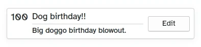
How the custom Card looks like
- Left, Kirigami.Heading: uses the
ListElement'sdateas a level 1 heading. - Middle, ColumnLayout: has a Kirigami.Heading that displays the task name; a Kirigami.Separator, which provides the horizontal line; and a Controls.Label, that displays a task's optional description. The latter two components have a visible property, which checks if the description is empty or not and displays the components depending on the result of
description.length > 0. - À direita, Controls.Button: um botão que irá fazer algo... em breve!
A nossa aplicação até agora
Main.qml:
| |
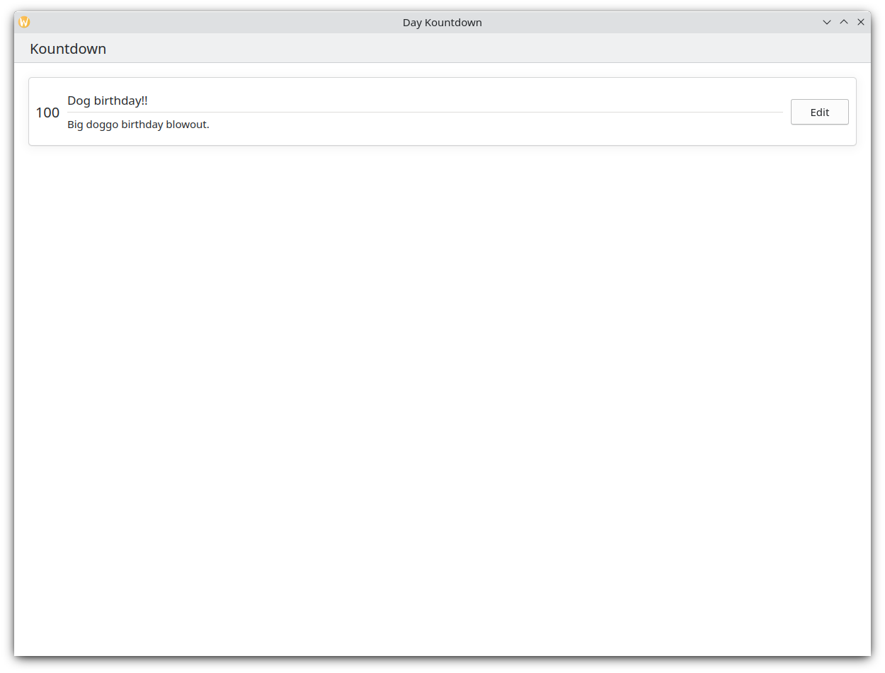
Aqui temos então o nosso cartão básico!
Com estes passos, já dispomos o trabalho de base para adicionar todas as funcionalidades à nossa aplicação.