Adicionar acções
Recapitulação
So far, we built a simple app that can display cards. However, there is currently no way for the user to add new cards to the card view.
Neste tutorial, iremos ver as acções do Kirigami. Estas ajudá-lo-ão a adicionar interactividade à nossa aplicação de uma forma consistente, rápida e acessível.
Acções
A Kirigami.Action encapsulates a user interface action. We can use these to provide our applications with easy-to-reach actions that are essential to their functionality.
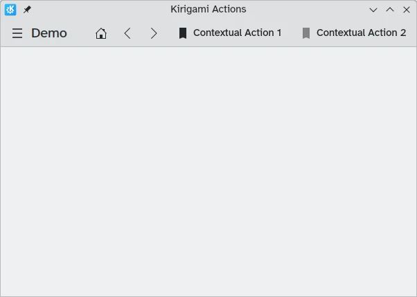
If you have used Kirigami apps before, you have certainly interacted with Kirigami actions. In this image, we can see actions to the right of the page title with various icons. Kirigami actions can be displayed in several ways and can do a wide variety of things.
Adicionar contagens decrescentes
Uma aplicação de contagens decrescentes sem a capacidade de adicionar contagens é bastante inútil. Iremos criar uma acção que nos permite fazer isso.
pageStack.initialPage: Kirigami.ScrollablePage {
// Other page properties...
actions: [
Kirigami.Action {
id: addAction
icon.name: "list-add-symbolic"
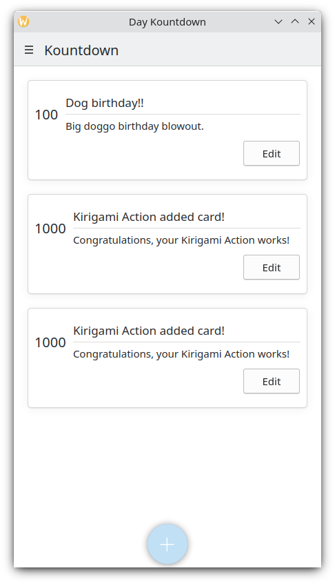
text: i18nc("@action:button", "Add kountdown")
onTriggered: kountdownModel.append({
name: "Kirigami Action added card!",
description: "Congratulations, your Kirigami Action works!",
date: 1000
})
}
]
// ...
}We are placing our Kirigami.Action within our main page from the previous tutorials. If we wanted to, we could add more actions to our page (and even nest actions within actions!).
The brackets [] used above are similar to JavaScript arrays, which means you can pass one or more things to them, separated by comma:
// General JavaScript array of components:
variable: [ component1, component2 ]
// Passing an array of Kirigami actions to QML:
actions: [ Kirigami.Action {}, Kirigami.Action {} ]
The id and text properties should be familiar from previous tutorials. However, the inherited Action.icon property should be interesting: it is an object with several properties letting you display certain icons for your actions. Fortunately, to use KDE icons all we need to do is provide the name property for the icon property, icon.name.
Viewing the available icons
Click here to see how to check the available icons on your system
Icon Explorer is a KDE application that lets you view all the icons that you can use for your application. It offers a number of useful features such as previews of their appearance across different installed themes, previews at different sizes, and more. You might find it a useful tool when deciding on which icons to use in your application.
Many of KDE's icons follow the FreeDesktop Icon Naming specification. Therefore, you might also find it useful to consult The FreeDesktop project's website, which lists all cross-desktop compatible icon names.
A propriedade onTriggered é a mais importante. É o que a nossa acção irá fazer quando for usada. Irá reparar que, no nosso exemplo, estamos a usar o método kountdownModel.append que criámos no nosso tutorial anterior. Este método permite-nos adicionar um novo elemento ao nosso modelo de lista. Estamos a passar-lhe um objecto que tem as propriedades relevantes para as nossas contagens decrescentes (nome, descrição e uma data substituta).
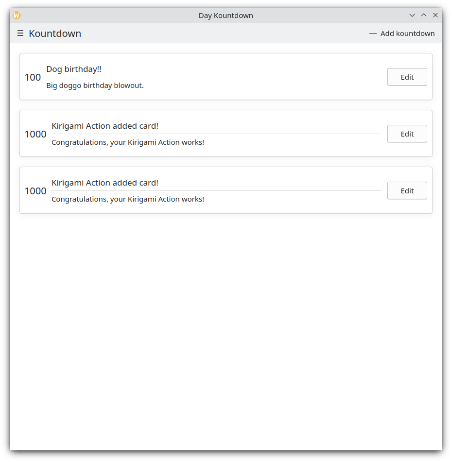
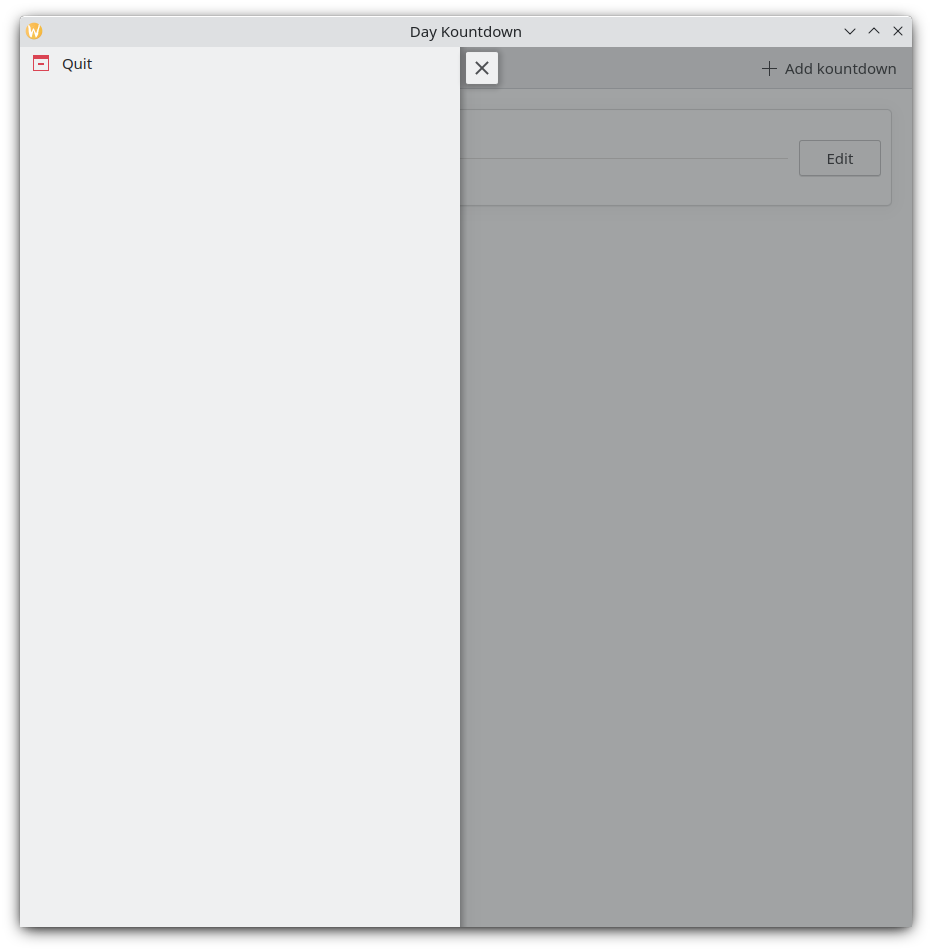
De cada vez que carregamos no nosso botão "Adicionar uma contagem" em cima e à direita, é adicionada a nossa contagem decrescente personalizada.
Versão para dispositivos móveis
Área global
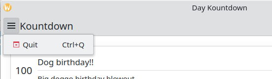
The next component is a Kirigami.GlobalDrawer. It shows up as a hamburger menu. By default it opens a sidebar, which is especially useful on mobile, as the user can just swipe in a side of the screen to open it. Global drawers are useful for global navigation and actions. We are going to create a simple global drawer that includes a "quit" button.
Kirigami.ApplicationWindow {
    id: root
    // Other window properties...
    globalDrawer: Kirigami.GlobalDrawer {
        isMenu: true
        actions: [
            Kirigami.Action {
                text: i18n("Quit")
                icon.name: "application-exit-symbolic"
                shortcut: StandardKey.Quit
                onTriggered: Qt.quit()
            }
        ]
    }
    // ...
}
Here, we put our global drawer inside our application window. The main property we need to pay attention to is GlobalDrawer.actions, which takes the form of an array of Kirigami.Action components. This action has an appropriate icon and executes the Qt.quit() function when triggered, closing the application.
Since we are keeping our global drawer simple for now, we are setting the GlobalDrawer.isMenu property to true. This displays our global drawer as a normal application menu, taking up less space than the default global drawer pane.
Área global
Área global como um menu
Sugestão
A página de componentes baseados em Action's da secção de 'Componentes' desta documentação oferece mais detalhes sobre as acções do Kirigami e como podem ser usadas.Actions are contextual
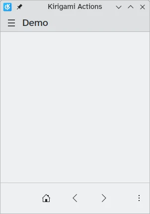
Kirigami components are designed in such a way that the place where you put Kirigami Actions is relevant. As seen above, if you add actions to a Kirigami.Page, Kirigami.ScrollablePage or any other derivative Page component, they will show up on the right side of the header in desktop mode, and on the bottom in mobile mode.
Similarly, if Kirigami Actions are added to a Kirigami.GlobalDrawer, they will show up in the resulting drawer or menu.
Other examples of Kirigami Actions showing up differently depending on their parent component are:
- Kirigami.ContextDrawer - ContextDrawer tutorial here
- Kirigami.AbstractCard and derivatives - Card tutorial here
- Kirigami.Dialog and derivatives - Dialog tutorial here
- Kirigami.ActionToolBar - ActionToolBar tutorial here
Among other Kirigami components.
A nossa aplicação até agora
Main.qml:
| |