Form layouts
Kirigami.FormLayout components make it easy for you to create forms that conform to the KDE Human Interface Guidelines. They are optimal for settings dialogs and for large groups of controls and input fields that are related to each other.
Quando tiverem espaço suficiente, as disposições dos formulários irão ocupar duas colunas. A coluna da esquerda será ocupada pelos textos fornecidos pelos componentes-filhos do formulário, enquanto o lado direito será ocupado pelos filhos propriamente ditos. Em janelas com mais restrições de espaço (ou em dispositivos móveis), os formulários irão consistir numa única coluna vertical com os textos dos componentes-filhos colocados logo acima do seu componente respectivo.
Formulário simples
Kirigami.FormLayout components are similar in use to QtQuick Layout components such as ColumnLayout or RowLayout. The child components will be automatically arranged according to the size available to the form layout.
Children of a Kirigami.FormLayout have a property named Kirigami.FormData.label. This property lets you set the label that will be provided for the child component in question.
import QtQuick
import QtQuick.Layouts
import QtQuick.Controls as Controls
import org.kde.kirigami as Kirigami

Kirigami.ApplicationWindow {
    pageStack.initialPage: Kirigami.Page {

        Kirigami.FormLayout {
            anchors.fill: parent

            Controls.TextField {
                Kirigami.FormData.label: "TextField 1:"
            }
            Controls.TextField {
                Kirigami.FormData.label: "TextField 2:"
            }
            Controls.TextField {
                Kirigami.FormData.label: "TextField 3:"
            }
        }
    }
}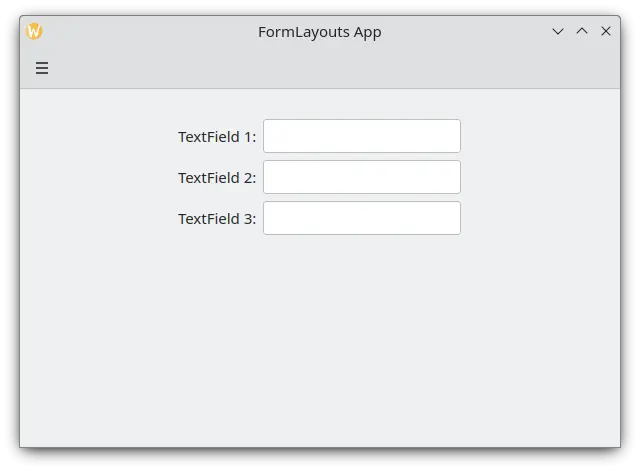
Um formulário disposto de forma simples no modo para o computador
Secções e separadores
FormLayouts can also be divided into sections. Setting where a section starts is as easy as setting a child component's Kirigami.FormData.isSection to true. This will provide the component with some extra margin at the top to demarcate the start of the new section.
Kirigami.Separator components are best suited for starting new sections. Separators are used to draw a thin horizontal line, demarcating the end of a section. If you would rather not have a line drawn between sections, you can use a standard QML Item property. Alternatively you could use the Kirigami.FormData.isSection property on any other component.
However, this is not recommended. On components where Kirigami.FormData.isSection is set to true, the label text provided for this component's Kirigami.FormData.label property will be displayed as the section's header text.
Aviso
This does not apply to every component, hence the recommendation that you use Kirigami.Separator or Item components in places where you would like to use a header text.Este texto de cabeçalho é maior que o texto das legendas normais, dando aos utilizadores uma dica visual interessante sobre o que diz respeito o formulário.
Kirigami.FormLayout {
    anchors.fill: parent

    Controls.TextField {
        Kirigami.FormData.label: "TextField 1:"
    }
    Controls.TextField {
        Kirigami.FormData.label: "TextField 2:"
    }
    Controls.TextField {
        Kirigami.FormData.label: "TextField 3:"
    }
    Kirigami.Separator {
        Kirigami.FormData.isSection: true
        Kirigami.FormData.label: "New Section!"
    }
    ColumnLayout {
        Kirigami.FormData.label: "Radio buttons"
        Controls.RadioButton {
            text: "Radio 1"
            checked: true
        }
        Controls.RadioButton {
            text: "Radio 2"
        }
        Controls.RadioButton {
            text: "Radio 3"
        }
    }
    Item {
        Kirigami.FormData.isSection: true
        Kirigami.FormData.label: "Another Section! (lineless though)"
    }
    Controls.TextField {
        Kirigami.FormData.label: "TextField 4:"
    }
    Controls.TextField {
        Kirigami.FormData.label: "TextField 5:"
    }
    Controls.TextField {
        Kirigami.FormData.label: "TextField 5:"
    }
}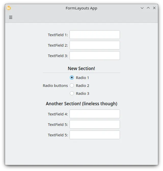
Uma disposição em formulário com secções
Forçar um formato para computador ou dispositivo móvel
If you would rather have your form layout stay consistent regardless of your application's environment, you can use the wideMode property of the Kirigami.FormLayout component:
- Quando for configurada como verdadeira, a disposição do formulário ficará estruturada como se estivesse num formato amplo e optimização para computadores (em duas colunas)
- Se for falso, a disposição do formulário ficará estruturada num formato para dispositivos móveis (única coluna)
Kirigami.FormLayout {
    anchors.fill: parent
    wideMode: false

    Controls.TextField {
        Kirigami.FormData.label: "TextField 1:"
    }
    Controls.TextField {
        Kirigami.FormData.label: "TextField 2:"
    }
    Controls.TextField {
        Kirigami.FormData.label: "TextField 3:"
    }
}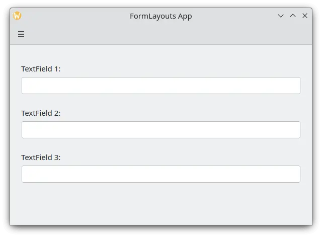
Forçar um formato para computador ou dispositivo móvel
Alinhar as suas legendas
There are instances when you want a label to be assigned to components that have more than one line or to a list of components. This can be achieved by putting the Kirigami.FormData.label in the ColumnLayout, as you might have noticed in Sections and Separators. By default the label is positioned in the vertical center of the layout, which is not always desirable. We can change this with help of Kirigami.FormData.labelAlignment.
Kirigami.FormLayout {
    anchors.fill: parent

    ColumnLayout {
        Kirigami.FormData.label: "This is a label:"
        Kirigami.FormData.labelAlignment: Qt.AlignTop

        Controls.Label {
            text: "This is some rather long text \nthat should elide to multiple lines \nto show how the label gets aligned."
            elide: Text.elideLeft
        }
    }
}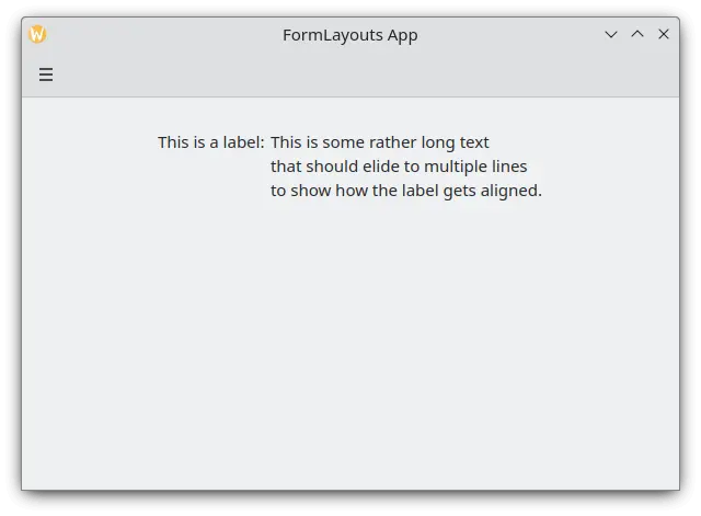
Uma disposição em formulário com a legenda alinhada ao topo
A definição do alinhamento das legendas é particularmente conveniente para gerir os componentes ou listas de componentes cujo tamanho não conhece de antemão. O Elisa é um óptimo exemplo disto:
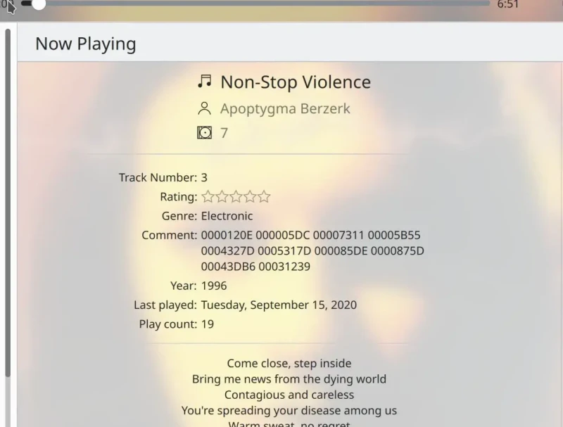
A legenda Comentário só está alinhada ao topo quando o seu componente correspondente tem mais que uma linha
Podemos fazer algo semelhante a isto com um operador ternário em JavaScript:
Kirigami.FormLayout {
    anchors.fill: parent

    ColumnLayout {
        Kirigami.FormData.label: "This is a label:"
        Kirigami.FormData.labelAlignment: labelText.text.lineCount > 1 ? Qt.AlignTop : Qt.AlignVCenter

        Controls.Label {
            id: labelText
            text: "This is some rather long text \nthat should elide to a new line \nso it appears below the Form Label."
            elide: Text.elideLeft
        }
    }
}