Áreas
As áreas são painéis que deslizam dos lados da janela da aplicação. Os mesmos poderão ser preenchidos com elementos interactivos como acções, botões, texto, entre outras coisas do Kirigami.
As áreas existem sob diferentes tipos, formas e formatos. Nesta página iremos passar por cada tipo e dar uma visão geral das suas características.
Área global
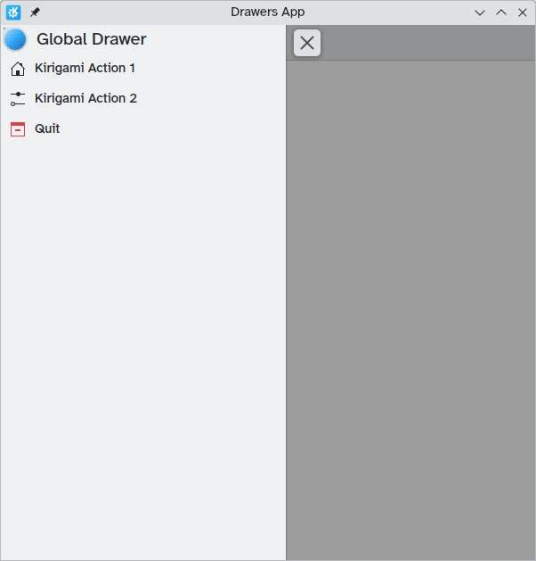
A área global é uma característica-padrão das aplicações móveis e que poderá ser encontrada alguma vezes nas suas versões futuras. Contém um menu principal da aplicação: neste existem as funções que não sejam específicas da página actual, mas que sejam à mesma relevantes para a navegação geral ou para alguma interacção dentro da aplicação.
Poderá ser activado se tocar no menu do hambúrguer ou deslizando do extremo esquerdo para o meio do ecrã, no modo da Esquerda para a Direita, ou do extremo direito para o centro no modo da Direita para a Esquerda.
Kirigami.GlobalDrawer components are what we use to create such drawers. These are set to the globalDrawer property of the Kirigami.ApplicationWindow that forms the basis of our Kirigami application.
import QtQuick
import org.kde.kirigami as Kirigami

Kirigami.ApplicationWindow {
    title: "Drawers App"
    width: 600
    height: 600
    pageStack.initialPage: Kirigami.Page { /* Page code here... */ }

    globalDrawer: Kirigami.GlobalDrawer {
        title: "Global Drawer"
        titleIcon: "applications-graphics"
        actions: [
            Kirigami.Action {
                text: "Kirigami Action 1"
                icon.name: "user-home-symbolic"
                onTriggered: showPassiveNotification("Action 1 clicked")
            },
            Kirigami.Action {
                text: "Kirigami Action 2"
                icon.name: "settings-configure-symbolic"
                onTriggered: showPassiveNotification("Action 2 clicked")
            },
            Kirigami.Action {
                text: i18n("Quit")
                icon.name: "application-exit-symbolic"
                shortcut: StandardKey.Quit
                onTriggered: Qt.quit()
            }
        ]
    }
}
Nota
The titleIcon property takes names for system-wide icons according to the FreeDesktop specification. These icons and icon names can be viewed with KDE's CuttleFish application which comes with plasma-sdk, or by visiting FreeDesktop's icon naming specification.Cabeçalho
Os cabeçalhos poderão ser usados para colocar componentes fixos no topo da sua área global. Os componentes de cabeçalho irão permanecer no lugar, mesmo que a sua área global tenha acções encadeadas do Kirigami que substituam a camada actual na área global.
Your chosen header component can be set with the global drawer's header property, and it will replace the global drawer's title. This is useful to add a Kirigami.SearchField, for example:
import QtQuick
import org.kde.kirigami as Kirigami

Kirigami.ApplicationWindow {
    title: "Drawers App"
    width: 600
    height: 600
    pageStack.initialPage: Kirigami.Page { /* Page code here... */ }

    globalDrawer: Kirigami.GlobalDrawer {
        title: "Global Drawer with searchfield (not visible)"

        header: Kirigami.SearchField {
                id: searchField
        }

        actions: [
            Kirigami.Action {
                text: "Kirigami Action 1"
                icon.name: "user-home-symbolic"
                onTriggered: showPassiveNotification("Action 1 clicked")
            },
            Kirigami.Action {
                text: "Kirigami Action 2"
                icon.name: "settings-configure-symbolic"
                onTriggered: showPassiveNotification("Action 2 clicked")
            },
            Kirigami.Action {
                text: i18n("Quit")
                icon.name: "application-exit-symbolic"
                shortcut: StandardKey.Quit
                onTriggered: Qt.quit()
            }
        ]
    }
}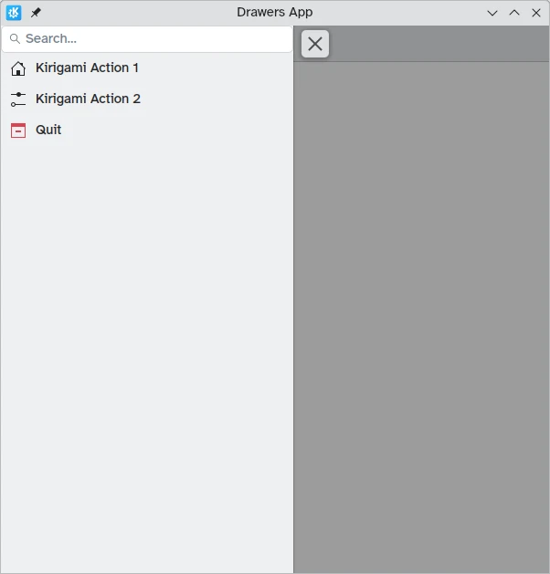
A nossa área global agora mostra o componente da barra de pesquisa que definimos como cabeçalho
Adaptar-se ao computador
While panel-style global drawers can be useful in mobile environments, they might be too large on the desktop, especially when the application has few actions.
Thankfully, Kirigami global drawers provide an isMenu property. When set to true, they turn into more traditional menus only on the desktop.
Nota
Neste modo de menu, os cabeçalhos e rodapés não ficam visíveis.globalDrawer: Kirigami.GlobalDrawer {
isMenu: true
actions: [
// Kirigami Actions here...
]
}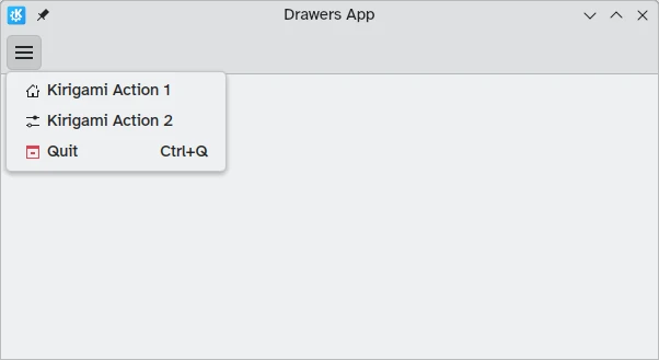
Área global no modo de menu, sem um cabeçalho ou separador
Áreas de Contexto
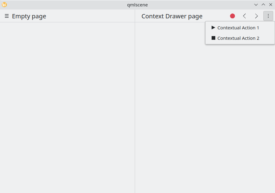
While a Kirigami.GlobalDrawer displays global actions available throughout your application, a Kirigami.ContextDrawer should be used to display actions that are only relevant in certain contexts. This is usually used in separate pages.
A context drawer will behave differently depending on whether it is being used on a mobile platform or on a desktop.
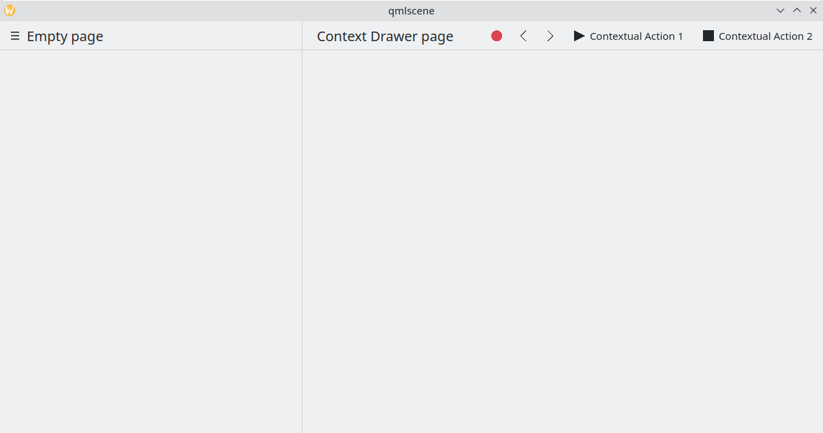
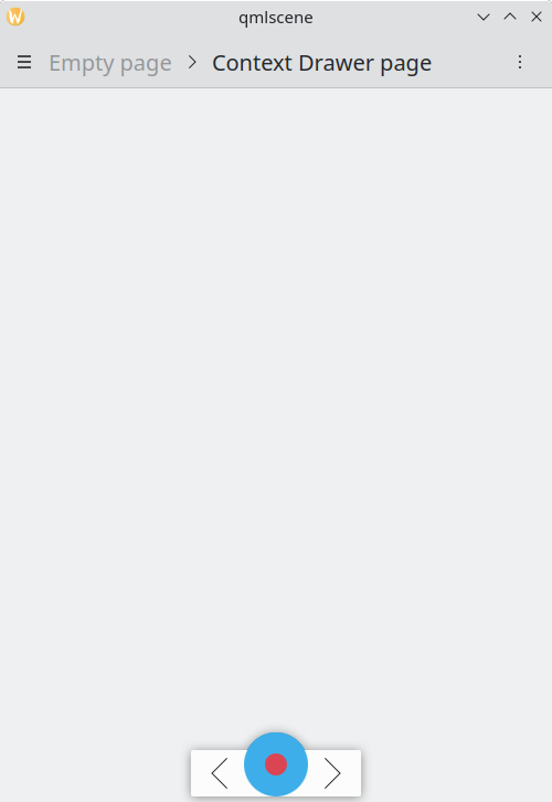
On a desktop, when a window has enough space, contextual actions show up as part of the actions group in the top toolbar. When space is limited, such as on a mobile device or in a narrow window, contextual actions are hidden behind a hamburger menu on the right side. This is different from other actions in the actions group, namely actions.main, actions.left and actions.right; these do not get hidden in space-constrained windows, and are instead collapsed into their respective icons.
| |
Área de contexto com as acções de contexto escondidas
Área de contexto a mostrar todas as acções de contexto
On mobile, the drawer always consists of actions hidden behind a hamburger menu. It can be activated by tapping the hamburger menu or by swiping from the right edge to the middle of the screen in Left to Right mode or from the left edge in Right to Left mode.
O mesmo exemplo acima, a correr num dispositivo móvel
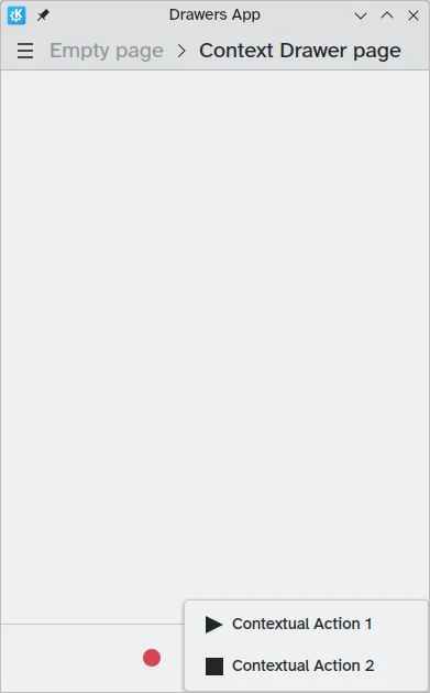
Área de contexto aberta no modo para dispositivos móveis
Áreas Modais e Incorporadas
O Kirigami oferece dois tipos adicionais de áreas, as áreas modais e as incorporadas. Estas são muito parecidas entre si: ambas ocupam por inteiro a largura ou altura da aplicação e poderão ser colocadas nos extremos da janela da aplicação . Contudo, reagem de forma diferente à interacção com o utilizador.
- Modal drawers are hidden by default and darken the rest of the application, being dismissed when clicking on a darkened area.
- Inline drawers are shown by default and allow the user to still interact with the rest of the application without being dismissed, and do not darken other areas.
This kind of drawer is open ended and flexible, but generally, you may want to use this kind of drawer when you want a small list of options to appear on a long press or right click.
These two drawers are so similar because they can, in fact, be implemented using the same Kirigami component: Kirigami.OverlayDrawer. Here are a few important inherited properties of this component to keep in mind:
- Popup.modal controls whether the drawer will be modal or inline depending on a boolean value.
- Drawer.edge controls which edge of the application window the drawer will appear on; options for this property are part of the Edge enum, namely
Qt.TopEdge,Qt.RightEdge,Qt.BottomEdge, andQt.LeftEdge. - Popup.contentItem contains the component that will form the content of your drawer.
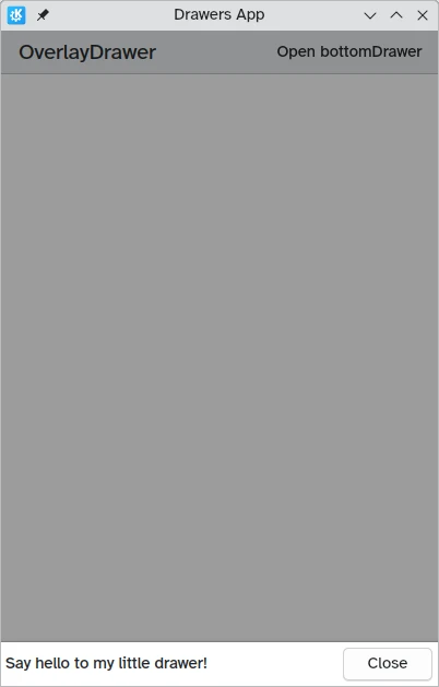
import QtQuick
import QtQuick.Layouts
import QtQuick.Controls as Controls
import org.kde.kirigami as Kirigami

Kirigami.ApplicationWindow {
    title: "Drawers App"
    width: 400
    height: 600
    pageStack.initialPage: Kirigami.Page {
        title: "OverlayDrawer at the bottom"
        actions: [
            Kirigami.Action {
                text: "Open bottomDrawer"
                onTriggered: bottomDrawer.open()
            }
        ]
        Kirigami.OverlayDrawer {
            id: bottomDrawer
            edge: Qt.BottomEdge
            // Configure o `modal` como falso para tornar esta área incorporada!
            modal: true

            contentItem: RowLayout {
                Controls.Label {
                    Layout.fillWidth: true
                    text: "Say hello to my little drawer!"
                }
                Controls.Button {
                    text: "Close"
                    onClicked: bottomDrawer.close()
                }
            }
        }
    }
}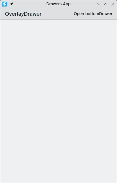
Modal drawer not visible
Modal drawer at the bottom edge of the screen