Controlos e elementos interactivos
Kirigami makes use of a wide selection of different interactive elements from Qt that you can use in your applications. Each different type has slightly different interaction styles, visual styles, and functionality. Using the right type of control in your application can help make your user interface more responsive and intuitive.
Botões
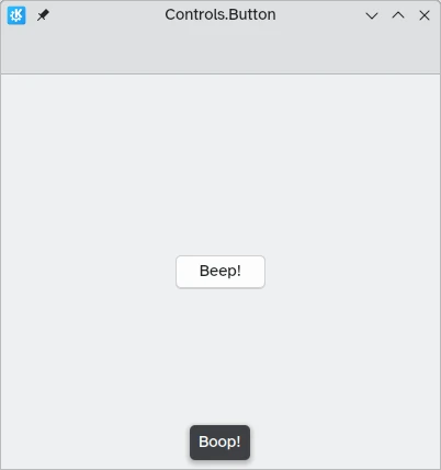
In Kirigami apps, we use the QtQuick Controls Button. Using them is pretty straightforward: we set the text property and any action we want it to perform is set to the onClicked property.
import QtQuick
import QtQuick.Layouts
import QtQuick.Controls as Controls
import org.kde.kirigami as Kirigami

Kirigami.ApplicationWindow {
    title: "Controls.Button"
    width: 400
    height: 400
    pageStack.initialPage: Kirigami.Page {
        ColumnLayout {
            anchors.fill: parent
            Controls.Button {
                Layout.alignment: Qt.AlignCenter
                text: "Beep!"
                onClicked: showPassiveNotification("Boop!")
            }
        }
    }
}
Botões comutáveis
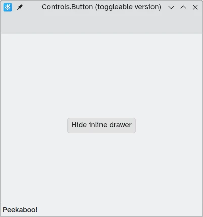
The behavior of buttons can be changed to make them toggleable: in this mode, they will stay pressed until clicked on once more. This mode can be activated by setting their checkable property to true; we can also set buttons to be toggled on by default by setting checked to true.
We can get the most out of toggleable buttons by using the onCheckedChanged signal handler which is automatically generated from the checked signal. It works similarly to onClicked, except here the assigned action will be executed when the button's state changes. It is a boolean property, which can come in handy for specific use cases.
Neste exemplo, definimos a visibilidade de uma área incorporada com base no estado de um botão comutável:
import QtQuick
import QtQuick.Layouts
import QtQuick.Controls as Controls
import org.kde.kirigami as Kirigami

Kirigami.ApplicationWindow {
    title: "Controls.Button (toggleable version)"
    width: 400
    height: 400
    pageStack.initialPage: Kirigami.Page {
        ColumnLayout {
            anchors.fill: parent
            Controls.Button {
                Layout.alignment: Qt.AlignCenter
                text: "Hide inline drawer"
                checkable: true
                checked: true
                onCheckedChanged: myDrawer.visible = checked
            }

            Kirigami.OverlayDrawer {
                id: myDrawer
                edge: Qt.BottomEdge
                modal: false

                contentItem: Controls.Label {
                    text: "Peekaboo!"
                }
            }
        }
    }
}
Nota
Com o tema predefinido Brisa no Plasma do KDE, poderá ser difícil de perceber se um botão está carregado, dado que os botões ficam com uma cor azul quando estão carregados. Certifique-se de que tem isto em conta ao criar a sua aplicação: um controlo diferente poderá ser mais amigável.Botões da barra de ferramentas
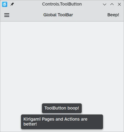
Existe um tipo de botão específico para usar nas barras de ferramentas, o Controls.ToolButton. A diferença mais óbvia entre este e um Button convencional é o estilo, onde os botões de ferramentas ficam planos (ainda que isto possa ser alterado com a propriedade booleana flat).
import QtQuick
import QtQuick.Layouts
import QtQuick.Controls as Controls
import org.kde.kirigami as Kirigami

Kirigami.ApplicationWindow {
    title: "Controls.ToolButton"
    width: 600
    height: 600

    header: Controls.ToolBar {
        RowLayout {
            anchors.fill: parent
            Controls.ToolButton {
                icon.name: "application-menu-symbolic"
                onClicked: showPassiveNotification("Kirigami Pages and Actions are better!")
            }
            Controls.Label {
                text: "Global ToolBar"
                horizontalAlignment: Qt.AlignHCenter
                verticalAlignment: Qt.AlignVCenter
                Layout.fillWidth: true
            }
            Controls.ToolButton {
                text: "Beep!"
                onClicked: showPassiveNotification("ToolButton boop!")
            }
        }
    }
}
Controlos de selecção
Os controlos de selecção permitem aos utilizadores fazerem uma escolha ou seleccionar uma opção. Existem diferentes tipos que são mais adequados, dependendo das diferente situações.
Opções de Marcação
Uma Controls.CheckBox serve para opções em que as alternativas não são exclusivas e onde cada opção tem uma alternativa bem definida.
import QtQuick
import QtQuick.Layouts
import QtQuick.Controls as Controls
import org.kde.kirigami as Kirigami

Kirigami.ApplicationWindow {
    title: "Controls.CheckBox"
    width: 400
    height: 400
    pageStack.initialPage: Kirigami.Page {
        ColumnLayout {
            anchors.left: parent.left
            anchors.right: parent.right
            Controls.CheckBox {
                Layout.alignment: Qt.AlignHCenter
                text: "This checkbox is checked!"
                checked: true
            }
            Controls.CheckBox {
                Layout.alignment: Qt.AlignHCenter
                text: "This checkbox is not checked!"
                checked: false
            }
        }
    }
}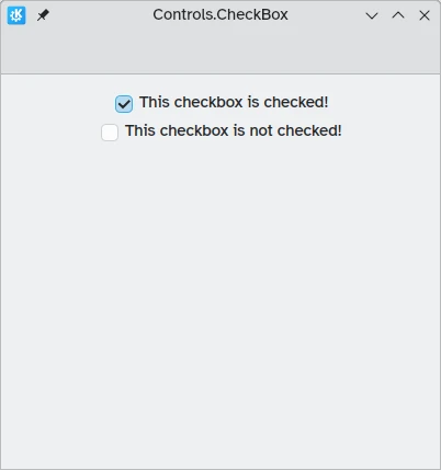
Como poderá ver, são simples de usar. A propriedade checked guarda um valor booleano que determina se estavam ou não assinaladas.
Opções exclusivas
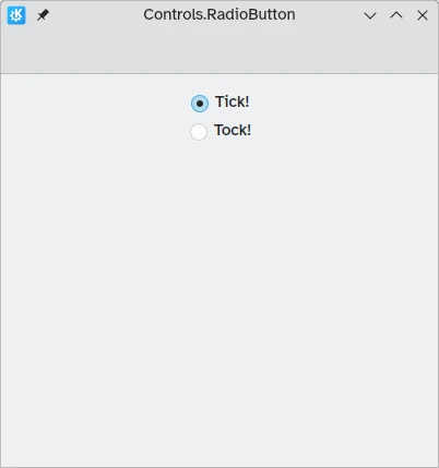
Um Controls.RadioButton é desenhado para situações em que o utilizador deverá escolher uma única opção a partir de um conjunto de várias opções.
Estes botões são exclusivos por omissão: só um deles poderá estar assinalado no mesmo item-pai.
Como as opções de marcação, poderão estar assinalados ou não por omissão com a propriedade checked.
import QtQuick
import QtQuick.Layouts
import QtQuick.Controls as Controls
import org.kde.kirigami as Kirigami

Kirigami.ApplicationWindow {
    title: "Controls.RadioButton"
    width: 400
    height: 400
    pageStack.initialPage: Kirigami.Page {

        ColumnLayout {
            anchors.left: parent.left
            anchors.right: parent.right
            Controls.RadioButton {
                Layout.alignment: Qt.AlignCenter
                text: "Tick!"
                checked: true
            }
            Controls.RadioButton {
                Layout.alignment: Qt.AlignCenter
                text: "Tock!"
                checked: false
            }
        }
    }
}
Comutadores
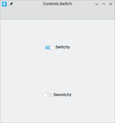
No computador, a alteração da configuração normalmente envolve a alteração de uma opção e depois aplicar essa alteração com um botão "Aplicar" ou "OK". Em dispositivos móveis, podemos usar os objectos Controls.Switch para esse fim.
Os comutadores poderão alternar entre um estado ligado e desligado. Poderá carregar ou tocar nos mesmos para os comutar, e os mesmos poderão ser arrastados para a posição 'ligado' ou 'desligado'. Mais uma vez, os comutadores poderão ser configurados para estar ligados ou desligados por omissão com a propriedade checked.
import QtQuick
import QtQuick.Layouts
import QtQuick.Controls as Controls
import org.kde.kirigami as Kirigami

Kirigami.ApplicationWindow {
    title: "Controls.Switch"
    width: 400
    height: 400
    pageStack.initialPage: Kirigami.Page {
        ColumnLayout {
            anchors.fill: parent
            Controls.Switch {
                Layout.alignment: Qt.AlignCenter
                text: "Switchy"
                checked: true
            }
            Controls.Switch {
                Layout.alignment: Qt.AlignCenter
                text: "Swootchy"
                checked: false
            }
        }
    }
}
Barras
As barras deslizantes permitem aos utilizadores seleccionarem determinados valores se deslizar uma pega ao longo de um risco. Graças aos QtQuick Controls, existem vários tipos que poderá escolher, dependendo dos valores que gostaria que os seus utilizadores escolhessem na sua aplicação.
Barras normais e com marcações
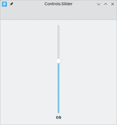
Um Controls.Slider normal fornece ao utilizador algum controlo fino na selecção que pretendem fazer.
No modo da Esquerda para a Direita, as barras aumentam o seu valor quando as desloca da esquerda para a direita, enquanto que no modo da Direita para a Esquerda, as mesmas funcionam na direcção inversa. Em ambos os modos, as barras com orientação vertical são incrementadas de baixo para cima.
A coloração dá uma reacção visual de quão grande é o valor que está a escolher.
As barras deslizantes têm algumas propriedades interessantes às quais devemos prestar atenção:
- value: contém o valor onde se encontra a pega, podendo ser definido manualmente para oferecer um valor predefinido válido
- to: defines the range of the slider by specifying the maximum value it can go to
- orientation: allows the slider to be set to a vertical orientation with Qt.Vertical
import QtQuick
import QtQuick.Layouts
import QtQuick.Controls as Controls
import org.kde.kirigami as Kirigami

Kirigami.ApplicationWindow {
    title: "Controls.Slider"
    width: 400
    height: 400
    pageStack.initialPage: Kirigami.Page {
        ColumnLayout {
            anchors.fill: parent
            Controls.Slider {
                id: normalSlider
                Layout.alignment: Qt.AlignHCenter
                Layout.fillHeight: true
                orientation: Qt.Vertical
                value: 60
                to: 100
            }
            Controls.Label {
                Layout.alignment: Qt.AlignHCenter
                text: Math.round(normalSlider.value)
            }
        }
    }
}
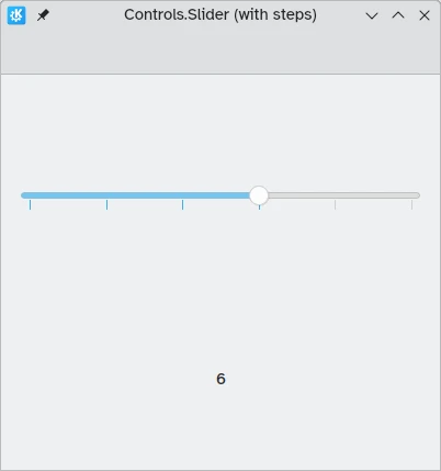
Outra propriedade útil que podemos usar é o stepSize. Se configurarmos esta com um valor numérico, permite-nos criar uma barra deslizante que se ajusta aos valors que sejam múltiplos do stepSize indicado, sendo estes múltiplos indicados através de traços. Por isso, se configurarmos esta propriedade como 2.0, quando o utilizador arrastar a pega da barra, só poderá seleccionar os valores 0.0, 2.0, 4.0, etc., até ao valor indicado na propriedade to.
import QtQuick
import QtQuick.Layouts
import QtQuick.Controls as Controls
import org.kde.kirigami as Kirigami

Kirigami.ApplicationWindow {
    title: "Controls.Slider (with steps)"
    width: 400
    height: 400
    pageStack.initialPage: Kirigami.Page {
        ColumnLayout {
            anchors.fill: parent
            Controls.Slider {
                id: tickmarkedSlider
                Layout.alignment: Qt.AlignHCenter
                Layout.fillWidth: true
                orientation: Qt.Horizontal
                snapMode: Controls.Slider.SnapAlways
                value: 6.0
                to: 10.0
                stepSize: 2.0
            }
            Controls.Label {
                Layout.alignment: Qt.AlignHCenter
                text: tickmarkedSlider.value
            }
        }
    }
}
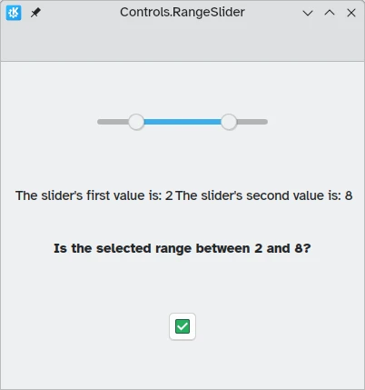
Barras deslizantes de intervalos
O QtQuick Controls também fornece Controls.RangeSliders. Estas têm duas pegas, permitindo-lhe definir uma gama de valores entre as duas pegas.
Two new properties are important to keep in mind: first.value and second.value, which hold the values of the two handles. Like the value property of the standard sliders, these can be pre-set.
import QtQuick
import QtQuick.Layouts
import QtQuick.Controls as Controls
import org.kde.kirigami as Kirigami

Kirigami.ApplicationWindow {
    title: "Controls.RangeSlider"
    width: 400
    height: 400
    pageStack.initialPage: Kirigami.Page {
        ColumnLayout {
            anchors.fill: parent
            Controls.RangeSlider {
                id: rangeSlider
                Layout.alignment: Qt.AlignHCenter
                to: 10.0
                first.value: 2.0
                second.value: 8.0
                stepSize: 1.0
                snapMode: Controls.Slider.SnapAlways
            }
            RowLayout {
                Layout.alignment: Qt.AlignHCenter
                Layout.fillWidth: true
                Controls.Label {
                    Layout.fillWidth: true
                    text: "The slider's first value is: " + Math.round(rangeSlider.first.value)
                }
                Controls.Label {
                    Layout.fillWidth: true
                    text: "The slider's second value is: " + Math.round(rangeSlider.second.value)
                }
            }
            Controls.Label {
                Layout.alignment: Qt.AlignHCenter
                font.bold: true
                text: "Is the selected range between 2 and 8?"
            }
            Controls.Button {
                Layout.alignment: Qt.AlignHCenter
                icon.name: {
                    if (rangeSlider.first.value >= 2 && rangeSlider.second.value <= 8)
                        return "emblem-checked"
                    else
                        return "emblem-error"
                }
            }
        }
    }
}