Componentes baseados em acções
Acções
A Kirigami.Action consists of a clickable action whose appearance depends on where it is added. Typically it is a button with an icon and text.
We can use these to provide our applications with easy-to-reach actions that are essential to their functionality.
Nota
Kirigami Actions inherit from QtQuick.Controls.Action and can be assigned shortcuts.Como as Action's do QtQuick Controls, as mesmas poderão ser associadas não só aos itens do menu e aos botões das barras de ferramentas, mas também a vários outros componentes do Kirigami.
import org.kde.kirigami as Kirigami

Kirigami.Action {
    id: copyAction
    text: i18n("Copy")
    icon.name: "edit-copy"
    shortcut: StandardKey.Copy
    onTriggered: {
        // ...
    }
}
Nota
The icon.name property takes names for system-wide icons following the FreeDesktop specification. These icons and icon names can be viewed with KDE's CuttleFish application which comes with plasma-sdk, or by visiting FreeDesktop's icon naming specification.One feature offered by Kirigami Actions on top of QtQuick Actions is the possibility to nest actions.
import org.kde.kirigami as Kirigami

Kirigami.Action {
    text: "View"
    icon.name: "view-list-icons"
    Kirigami.Action {
        text: "action 1"
    }
    Kirigami.Action {
        text: "action 2"
    }
    Kirigami.Action {
        text: "action 3"
    }
}
Another feature of Kirigami Actions is to provide various hints to items using actions about how they should display the action. These are primarily handled by the displayHint and displayComponent properties.
Estas propriedades serão respeitadas pelo item, se possível. Por exemplo, as seguintes acções serão apresentadas como um TextField com o item a tentar o seu melhor em manter o item visível o máximo de tempo possível.
import org.kde.kirigami as Kirigami

Kirigami.Action {
    text: "Search"
    icon.name: "search"

    displayComponent: TextField { }

    displayHint: Kirigami.DisplayHints.KeepVisible
}
Usar as acções noutros componentes
As mentioned in the introduction tutorial for actions, Kirigami Actions are contextual, which means they show up in different places depending on where you put them. In addition to that, they also have different representations for desktop and mobile.
Página
A Kirigami.Page shows Actions on the right of the top header in desktop mode, and on a footer in mobile mode.
| |
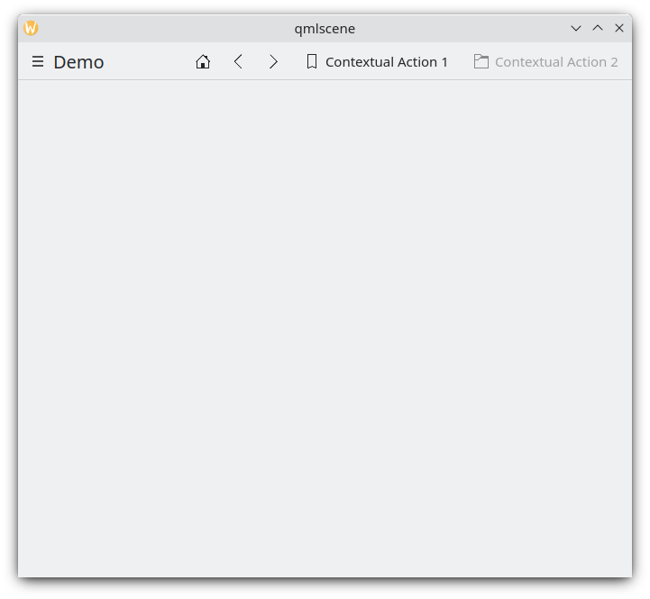
Acções da página no computador
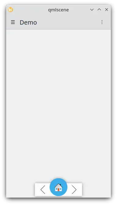
Acções da página num dispositivo móvel
Área global
The Kirigami.GlobalDrawer is a menu-like sidebar that provides an action based navigation to your application. This is where nested actions are useful because it is possible to create nested navigation:
import org.kde.kirigami as Kirigami

Kirigami.ApplicationWindow {
    title: "Actions Demo"
    globalDrawer: Kirigami.GlobalDrawer {
        title: "Demo"
        titleIcon: "applications-graphics"
        actions: [
            Kirigami.Action {
                text: "View"
                icon.name: "view-list-icons"
                Kirigami.Action {
                    text: "View Action 1"
                    onTriggered: showPassiveNotification("View Action 1 clicked")
                }
                Kirigami.Action {
                    text: "View Action 2"
                    onTriggered: showPassiveNotification("View Action 2 clicked")
                }
            },
            Kirigami.Action {
                text: "Action 1"
                onTriggered: showPassiveNotification("Action 1 clicked")
            },
            Kirigami.Action {
                text: "Action 2"
                onTriggered: showPassiveNotification("Action 2 clicked")
            }
        ]
    }
    //...
}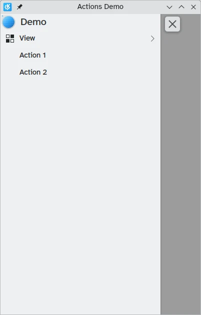
Acções das Áreas Globais no computador
Poderá ler mais sobre as Áreas Globais na página de documentação das mesmas.
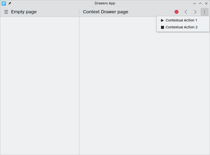
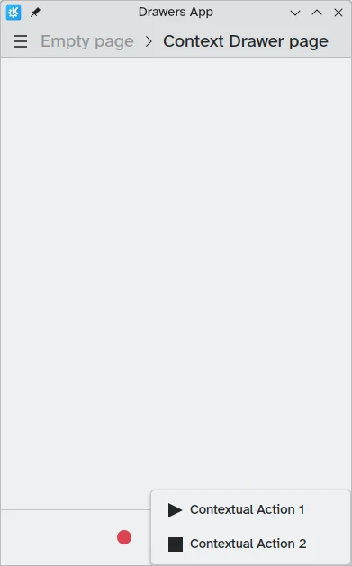
Context drawer
A Kirigami.ContextDrawer consists of an additional set of actions that are hidden behind a three-dots menu on the top right in desktop mode or on the bottom right in mobile mode if there is no space. It is used to display actions that are only relevant to a specific page. You can read more about them in our Kirigami Drawers tutorial.
ActionTextFields
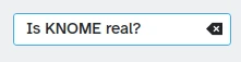
A Kirigami.ActionTextField is used to add some contextual actions to a text field, for example to clear the text, or to search for the text.
Kirigami.ActionTextField {
    id: searchField
    rightActions: [
        Kirigami.Action {
            icon.name: "edit-clear"
            visible: searchField.text !== ""
            onTriggered: {
                searchField.text = ""
                searchField.accepted()
            }
        }
    ]
}
Neste exemplo, estamos a criar um botão "limpar" para um campo de pesquisa que só aparece quando tiver introduzido algum texto.
Nota
You should rarely use an ActionTextField directly. SearchField and PasswordField both inherit from ActionTextField and are likely to cover your desired use-case.SwipeListItem
A Kirigami.SwipeListItem is a delegate intended to support extra actions. When using a mouse, its actions will always be shown. On a touch device, they can be shown by dragging the item with the handle. In the following pictures, these are the icons to the right.
ListView {
    model: myModel
    delegate: SwipeListItem {
        Controls.Label {
            text: model.text
        }
        actions: [
             Action {
                 icon.name: "document-decrypt"
                 onTriggered: print("Action 1 clicked")
             },
             Action {
                 icon.name: model.action2Icon
                 onTriggered: //fazer algo
             }
        ]
    }
}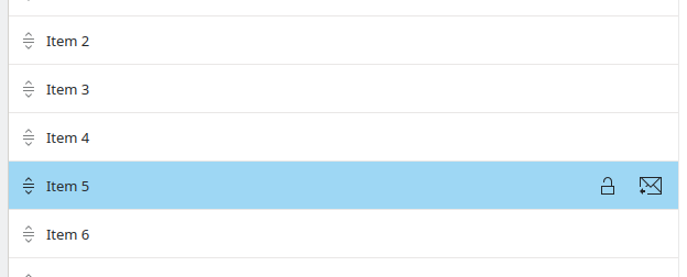
O SwipeListItem num computador
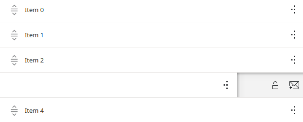
O SwipeListItem num dispositivo móvel
ActionToolBar
A Kirigami.ActionToolBar is a toolbar built out of a list of actions. By default, each action that will fit in the toolbar will be represented by a ToolButton, with those that do not fit being moved into a menu at the end of the toolbar.
Like ActionTextField, you may not need to use ActionToolBar directly as it is used by page headers and cards to provide their action display.
import org.kde.kirigami as Kirigami

Kirigami.ApplicationWindow {
    title: "Actions Demo"
    width: 350
    height: 350
    header: Kirigami.ActionToolBar {
        actions: [
            Kirigami.Action {
                text: i18n("View Action 1")
                onTriggered: showPassiveNotification(i18n("View Action 1 clicked"))
            },
            Kirigami.Action {
                text: i18n("View Action 2")
                onTriggered: showPassiveNotification(i18n("View Action 2 clicked"))
            },
            Kirigami.Action {
                text: i18n("Action 1")
                onTriggered: showPassiveNotification(i18n("Action 1 clicked"))
            },
            Kirigami.Action {
                text: i18n("Action 2")
                onTriggered: showPassiveNotification(i18n("Action 2 clicked"))
            }
        ]
    }
}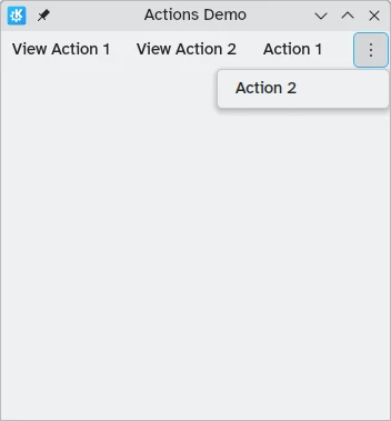
Uma barra de ferramentas horizontal a ser apresentada no topo da aplicação
You can read more about ActionToolBar components in their dedicated documentation page.
Cartões
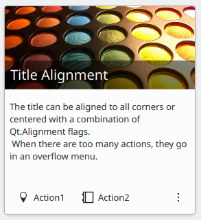
A Kirigami.Card is used to display a collection of information or actions together. These actions can be added to the actions group, similarly to previous components.
Kirigami.Card {
    actions: [
        Kirigami.Action {
            text: qsTr("Action1")
            icon.name: "add-placemark"
        },
        Kirigami.Action {
            text: qsTr("Action2")
            icon.name: "address-book-new-symbolic"
        },
        // ...
    ]
    banner {
        source: "../banner.jpg"
        title: "Title Alignment"
        titleAlignment: Qt.AlignLeft | Qt.AlignBottom
    }
    contentItem: Controls.Label {
        wrapMode: Text.WordWrap
        text: "My Text"
    }
}
Para mais informações, consulte a página dos componentes Card.