Cores e temas no Kirigami
O Kirigami possui uma paleta de cores que segue as cores do sistema para melhor integração com a plataforma em que está sendo executado (por exemplo, Plasma Desktop, Plasma Mobile, GNOME, Android, etc.).
Todos os componentes QML do Kirigami e do QtQuick Controls já devem seguir esta paleta por padrão, portanto, normalmente, nenhuma coloração personalizada é necessária para esses controles.
Componentes primitivos como Rectangle devem sempre ser coloridos com a paleta de cores fornecida pelo Kirigami por meio da propriedade anexada Kirigami.Theme.
Cores codificadas em QML, como #32b2fa ou vermelho, geralmente devem ser evitadas; se for realmente necessário ter elementos com cores personalizadas, deve ser uma área onde apenas cores personalizadas sejam usadas (geralmente na área de conteúdo do aplicativo e nunca em áreas comuns, como barras de ferramentas ou caixas de diálogo). Por exemplo, um primeiro plano preto codificado não pode ser usado sobre um fundo Kirigami.Theme.backgroundColor, porque se a plataforma usar um esquema de cores escuras, o resultado terá um contraste ruim com preto sobre quase preto. Isso é um problema de acessibilidade e deve ser evitado.
Nota
Se você realmente precisa usar cores personalizadas, confira o Kontrast para garantir que as cores escolhidas tenham bom contraste e sejam compatíveis com WCAG.Tema
Kirigami.Theme é uma propriedade anexada e, portanto, está disponível para uso em qualquer item QML. Suas propriedades incluem todas as cores disponíveis na paleta e qual paleta usar, como a propriedade colorSet.
import QtQuick
import org.kde.kirigami as Kirigami

Kirigami.ApplicationWindow {
    height: 300
    width: 400

    pageStack.initialPage: Kirigami.Page {
        Rectangle {
            anchors.centerIn: parent
            implicitHeight: 100
            implicitWidth: 200
            color: Kirigami.Theme.highlightColor
        }
    }
}
A Galeria Kirigami fornece um exemplo de código mostrando todas as cores disponíveis para Kirigami por meio do Kirigami.Theme. Isso inclui todos os seus estados: se você clicar fora da janela, as cores mudam para o estado inativo, e se você alternar seu sistema para um tema escuro, as variantes escuras das cores devem aparecer em tempo real.
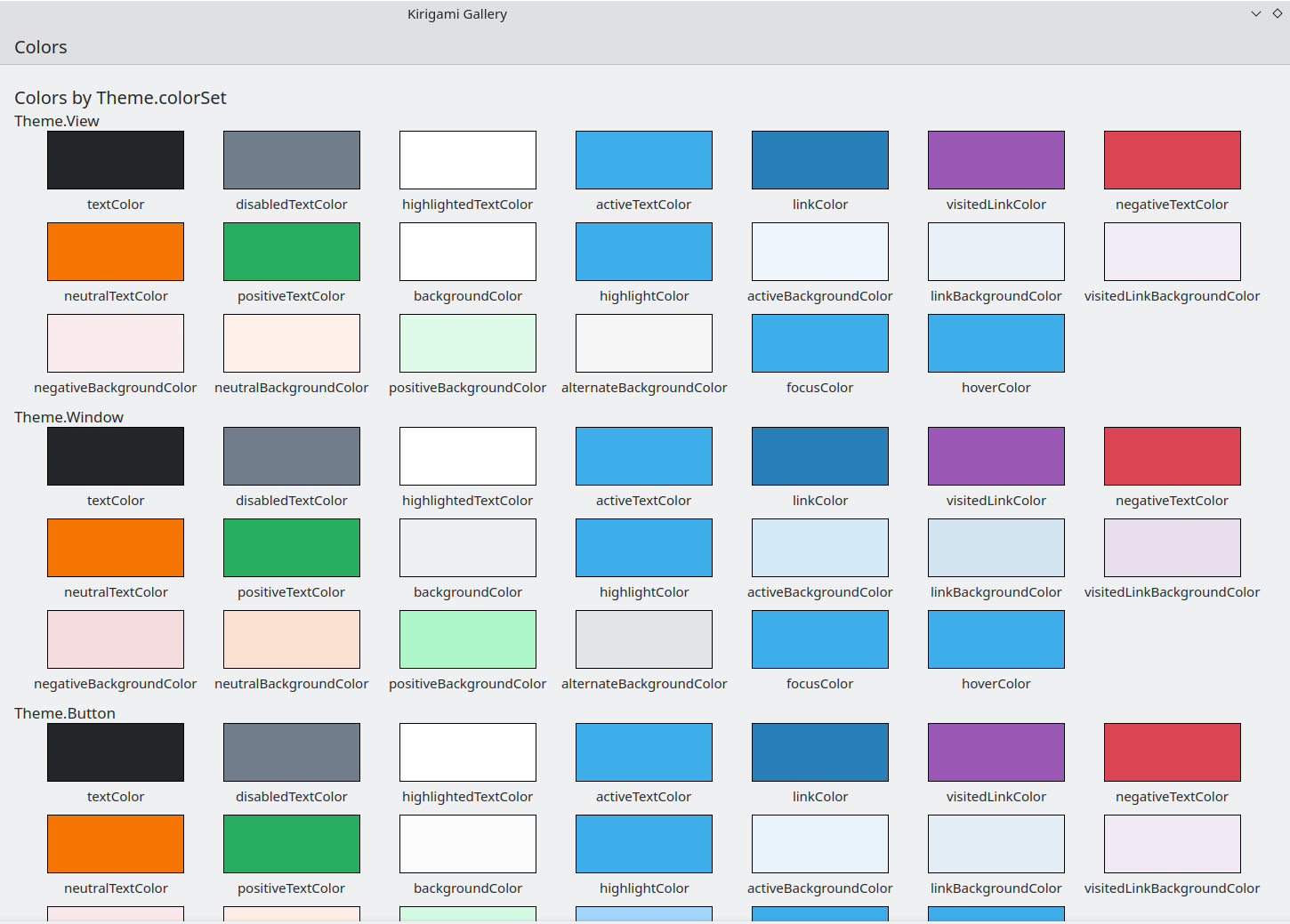
O componente Cores na Galeria Kirigami
Conjunto de cor
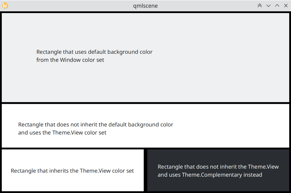
Dependendo de onde um controle estiver localizado, ele deverá usar um conjunto de cor diferente: por exemplo, quando o esquema de cor Breeze Light é usado em Visualizações, o fundo normal é quase branco, enquanto em outras regiões, como barras de ferramentas ou caixas de diálogo, a cor de fundo normal é cinza.
Se você definir um conjunto de cor para um item, todos os seus itens filhos o herdarão recursivamente de forma automática (a menos que a propriedade inherit tenha sido explicitamente definida como false, o que sempre deve ser feito quando o desenvolvedor deseja forçar um conjunto de cor específico), de modo que é fácil alterar as cores de uma hierarquia inteira de itens sem tocar em nenhum dos itens em si.
Kirigami.Theme suporta 5 conjuntos de cores diferentes:
- Visualização: Conjunto de cor para visualização de itens, geralmente o mais claro de todos (em temas de cores claras)
- Janela: Conjunto de cor para janelas e áreas cromadas (este também é o conjunto de cor padrão)
- Botão: Conjunto de cor usado pelos botões
- Seleção: Conjunto de cor usado pelas áreas selecionadas
- Dica: Conjunto de cor usado pelas dicas
- Complementar: Conjunto de cor que visa complementar a Janela: geralmente escuro, mesmo em temas claros. Pode ser usado para dar ênfase em pequenas áreas do aplicativo
Aqui está um exemplo que mostra como os conjuntos de cor são herdados e podem ser usados para distinguir diferentes componentes. Uma borda grande foi adicionada para contrastar as cores.
| |
Como os conjuntos de cor diferem no Breeze
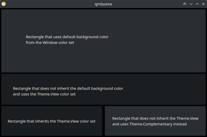
Como os conjuntos de cor diferem no Breeze Dark
Usando cores personalizadas
Embora seja desencorajado o uso de cores codificadas, o Kirigami oferece uma maneira mais sustentável de atribuir uma paleta personalizada codificada a um item e a todos os seus filhos, o que permite definir essas cores personalizadas em um único, e apenas um, lugar:
import QtQuick
import org.kde.kirigami as Kirigami

Kirigami.ApplicationWindow {
    title: "Custom colors"
    height: 300
    width: 300

    Rectangle {
        anchors.fill: parent
        Kirigami.Theme.inherit: false
        // NOTA: independentemente do conjunto de cor utilizado, é recomendável substituir todas as
        // cores disponíveis no Tema, para evitar cores com muito contraste

        Kirigami.Theme.colorSet: Kirigami.Theme.Window
        Kirigami.Theme.backgroundColor: "#b9d795"
        Kirigami.Theme.textColor: "#465c2b"
        Kirigami.Theme.highlightColor: "#89e51c"
        // Redefina todas as outras cores que você desejar

        // Isto será "#b9d795"
        color: Kirigami.Theme.backgroundColor

        Rectangle {
            // Isto será "#465c2b"
            anchors.centerIn: parent
            height: Math.round(parent.height / 2)
            width: Math.round(parent.width / 2)
            color: Kirigami.Theme.textColor
        }
    }
}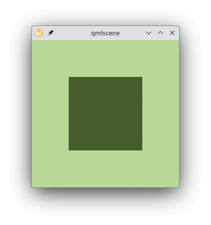
Exemplo com cores personalizadas