Scrollable pages and list views
Kirigami.ScrollablePage
A Kirigami.ScrollablePage is a page that holds scrollable content, such as a ListView. Scrolling, as well as scrolling indicators, are automatically managed.
Kirigami.ScrollablePage {
    id: root
    //Prostokąt sam umożliwi swoje przewijanie
    Rectangle {
        width: root.width
        height: 99999
    }
}
Pod prawie każdym względem, przewijalna strona jest taka sama jak zwykła.
Ostrzeżenie
Do not put a ScrollView inside of a Kirigami.ScrollablePage; children of aKirigami.ScrollablePage are already inside a ScrollView.ListView w ScrollablePage
When the direct children of a Kirigami.ScrollablePage extend vertically beyond the size of the page itself, a scrollbar appears at the right edge of the page and the page will be scrollable.
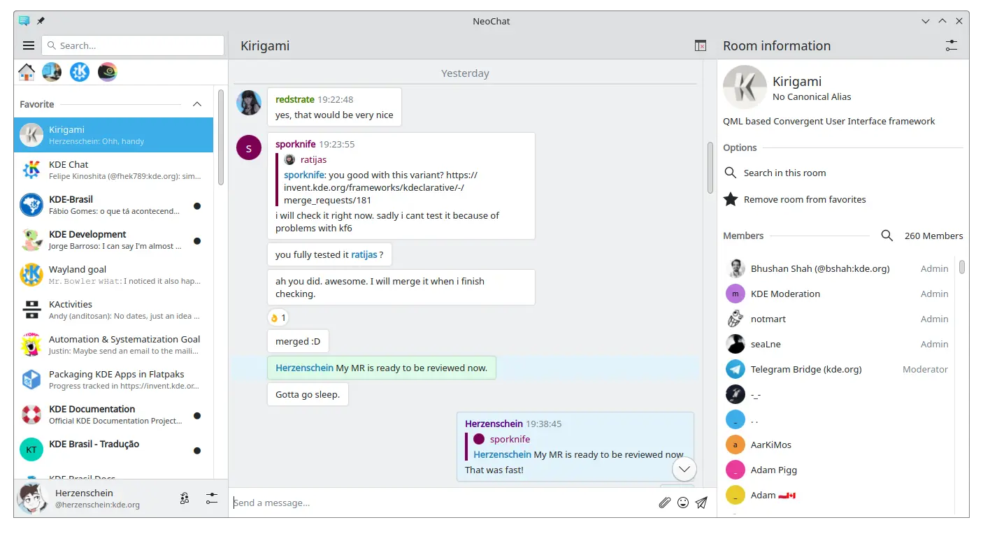
Two scrollable pages, both containing a ListView with custom contents (screenshot of NeoChat)
Often you have more than one child in your Kirigami.ScrollablePage, and positioning items can be tricky—especially in combination with a ListView.
- For non-visual components, having them inside the ListView component won't change the visuals of the page, so we can move them inside the scope of the list view. Same for elements anchored to the center of the page, such as placeholder messages for empty list views.
- For other items, it might make sense to move them to the header or footer of the Kirigami.ScrollablePage. This is often the case for search bars.
Wiadomość zastępcza
It is possible to add a Kirigami.PlaceholderMessage with some instructions in case the list view is empty.
Kirigami.ScrollablePage {
    ListView {
        id: listView
        Kirigami.PlaceholderMessage {
            anchors.centerIn: parent
            width: parent.width - (Kirigami.Units.largeSpacing * 4)
            visible: listView.count === 0
            text: i18n("No data found")
            helpfulAction: Kirigami.Action {
            text: i18n("Load data")
                // More code...
            }
        }
        model: // Model code...
    }
}
Szukanie w widoku listy
A search field is often added to a Kirigami.ScrollablePage to filter the ListView. This can be done by changing the default titleDelegate to use a Kirigami.SearchField instead.
Kirigami.ScrollablePage {
    titleDelegate: Kirigami.SearchField {
        Layout.topMargin: Kirigami.Units.smallSpacing
        Layout.bottomMargin: Kirigami.Units.smallSpacing
        Layout.fillHeight: true
        Layout.fillWidth: true
        onTextChanged: mySortFilterModel.filterText = text
        KeyNavigation.tab: listView
    }

    ListView {
        id: listView
        // Rest of listview code...
    }
}
Podpowiedź
You can use KSortFilterProxyModel from KItemModel to easily add filtering capability directly in QML without any need for C++ code.Pociągnij, aby odświeżyć
Another function provided by this component is a "pull-to-refresh" action. To use this, activate it as follows:
Kirigami.ScrollablePage {
    id: view
    supportsRefreshing: true
    onRefreshingChanged: {
        if (refreshing) {
            myModel.refresh();
        }
    }
    ListView {
        // NOTE: MyModel doesn't come from the components, it's purely an example on how it can be
        // used together with some application logic that can update the list model and signals when
        // it's done.
        model: MyModel {
            onRefreshDone: view.refreshing = false;
        }
        delegate: BasicListItem {}
    }
}
Pociągając w dół, możesz także włączyć wyjątkowy tryb z większym marginesem górnym, który czyni obsługę aplikacji jedną ręką łatwiejszą.