Arkusze nakładkowe
A Kirigami.OverlaySheet is a simple component that you can use to supplement the content being displayed on an application's page. They are designed to display long, vertical content and can accommodate content longer than the application window itself.
Można je odwołać naciskając lub stukając poza ich obszarem lub naciskając na ikonę 'x' na nagłówkach stron.
Nauka arkuszy
Aby użyć arkusza nakładkowego, powinniśmy stworzyć go wewnątrz strony Kirigami, na której chcemy, aby się pojawił.
import QtQuick 2.15
import QtQuick.Controls 2.15 as Controls
import QtQuick.Layouts 1.15
import org.kde.kirigami 2.20 as Kirigami

Kirigami.Page {
    id: page
    Layout.fillWidth: true

    Kirigami.OverlaySheet {
        id: mySheet
        Controls.Label {
            Layout.fillWidth: true
            wrapMode: Text.WordWrap
            text: "Weeeeee, overlay sheet!"
        }
    }
}
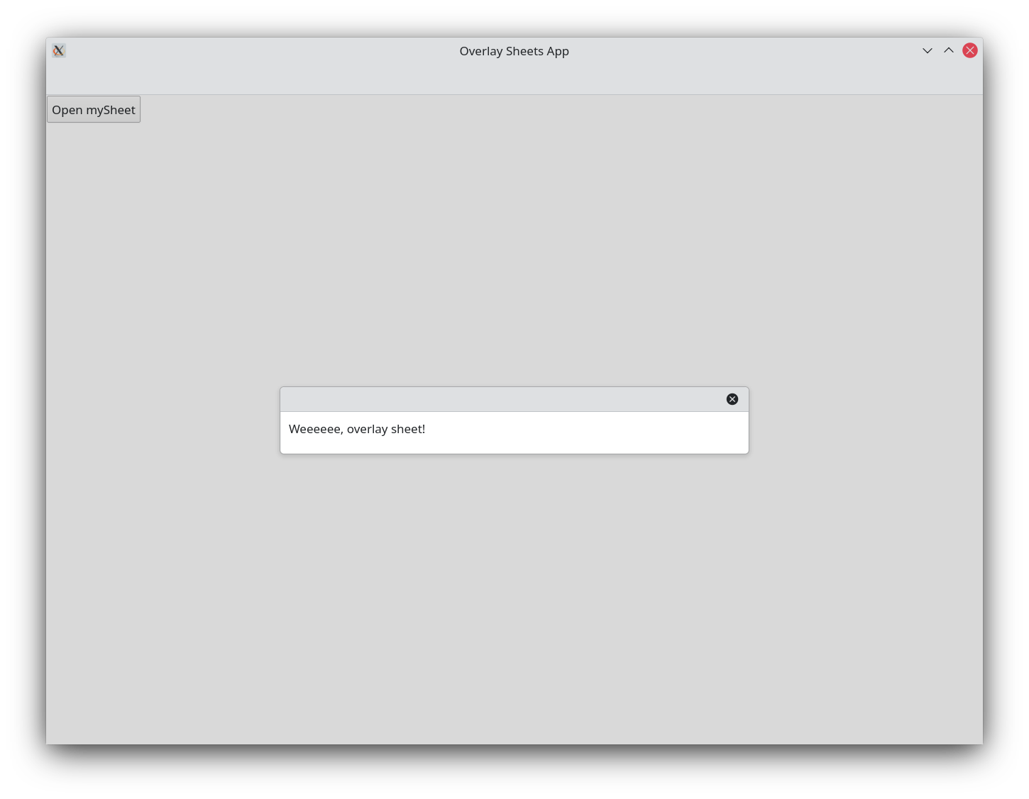
Overlay sheets come with methods we can use to
open()
or
close()
them as we see fit. By default overlay sheets are hidden, so at the very least we will need to use the open() method.
Controls.Button {
    text: "Open mySheet"
    onClicked: mySheet.open()
}
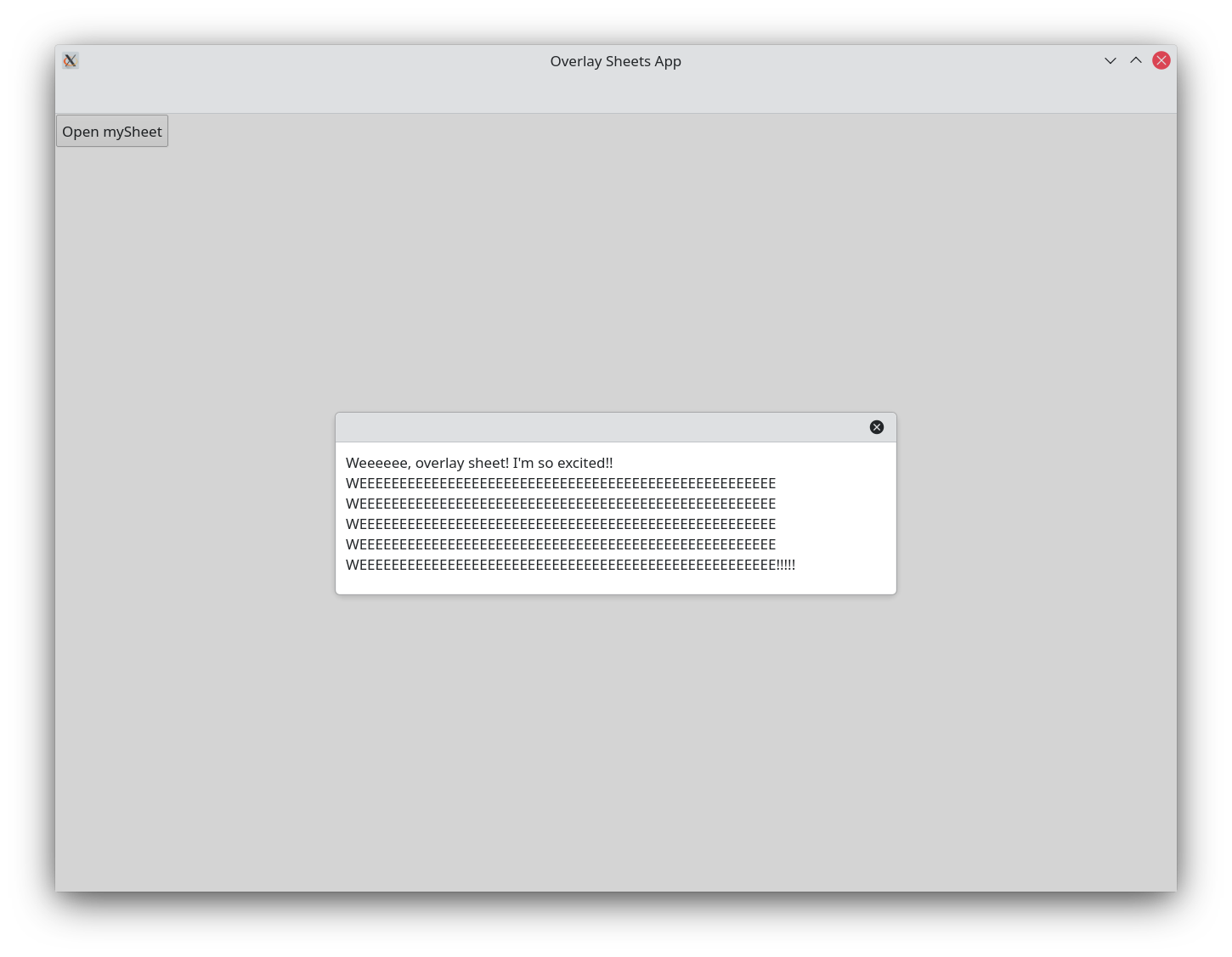
When opened, this overlay sheet will appear centered vertically and horizontally within its parent page. Horizontally it will be bounded by its parent even if the width of its contents exceeds its parent's. If the sheet's vertical length exceeds its parent's, then the sheet will be displayed starting from its top position, and will be scrollable.
Arkusz globalny
If you want to display the sheet as a global sheet—one that spans across the entire width of the application, regardless of the page it is a child to—we have to reparent our overlay sheet to our application window's overlay property. We can do this with the parent property.
Kirigami.OverlaySheet {
    id: mySheet

    parent: applicationWindow().overlay

    Controls.Label {
        Layout.fillWidth: true
        wrapMode: Text.WordWrap
        text: "Weeeeee, overlay sheet!"
    }
}
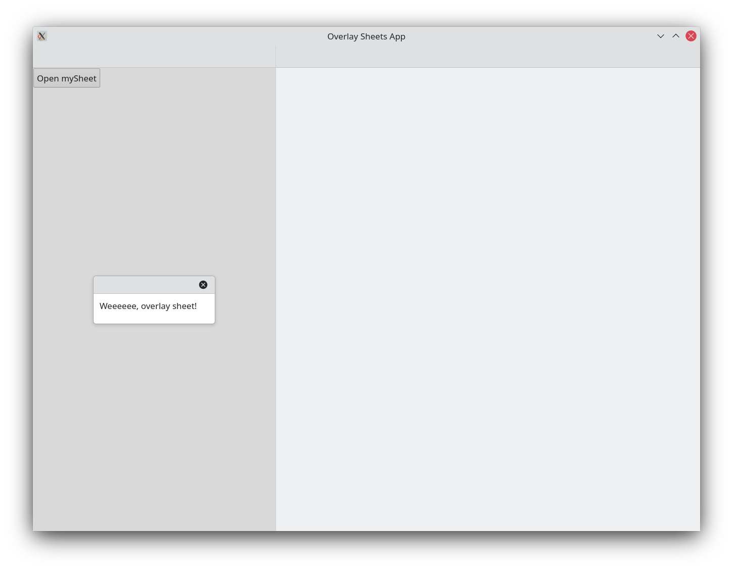
Nieglobalny arkusz nakładkowy
Globalny arkusz nakładkowy
Stały rozmiar
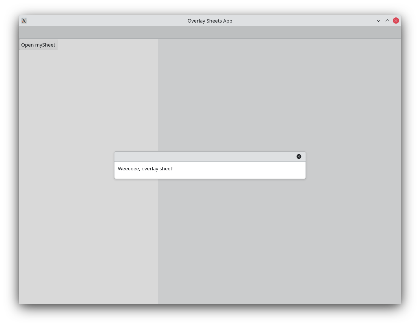
A sheet is greedy and will take the maximum amount of available width in a page if needed. We can avoid this by specifying an implicitWidth or a Layout.preferredWidth for its child elements, which will limit how much the sheet will grow width wise.
Kirigami.OverlaySheet {
    id: mySheet
    Controls.Label {
        Layout.preferredWidth: Kirigami.Units.gridUnit * 25
        wrapMode: Text.WordWrap
        text: "Weeeeee, overlay sheet! I'm so excited!! WEEEEEEEEEEEEEEEEEEEEEEEEEEEEEEEEEEEEEEEEEEEEEEEEEEEE WEEEEEEEEEEEEEEEEEEEEEEEEEEEEEEEEEEEEEEEEEEEEEEEEEEEE WEEEEEEEEEEEEEEEEEEEEEEEEEEEEEEEEEEEEEEEEEEEEEEEEEEEE WEEEEEEEEEEEEEEEEEEEEEEEEEEEEEEEEEEEEEEEEEEEEEEEEEEEE WEEEEEEEEEEEEEEEEEEEEEEEEEEEEEEEEEEEEEEEEEEEEEEEEEEEE!!!!!"
    }
}
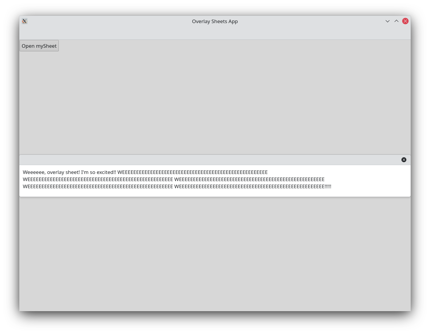
Arkusz nakładkowy z nieustaloną szerokością
Arkusz nakładkowy z ustaloną szerokością
Nagłówki i stopki
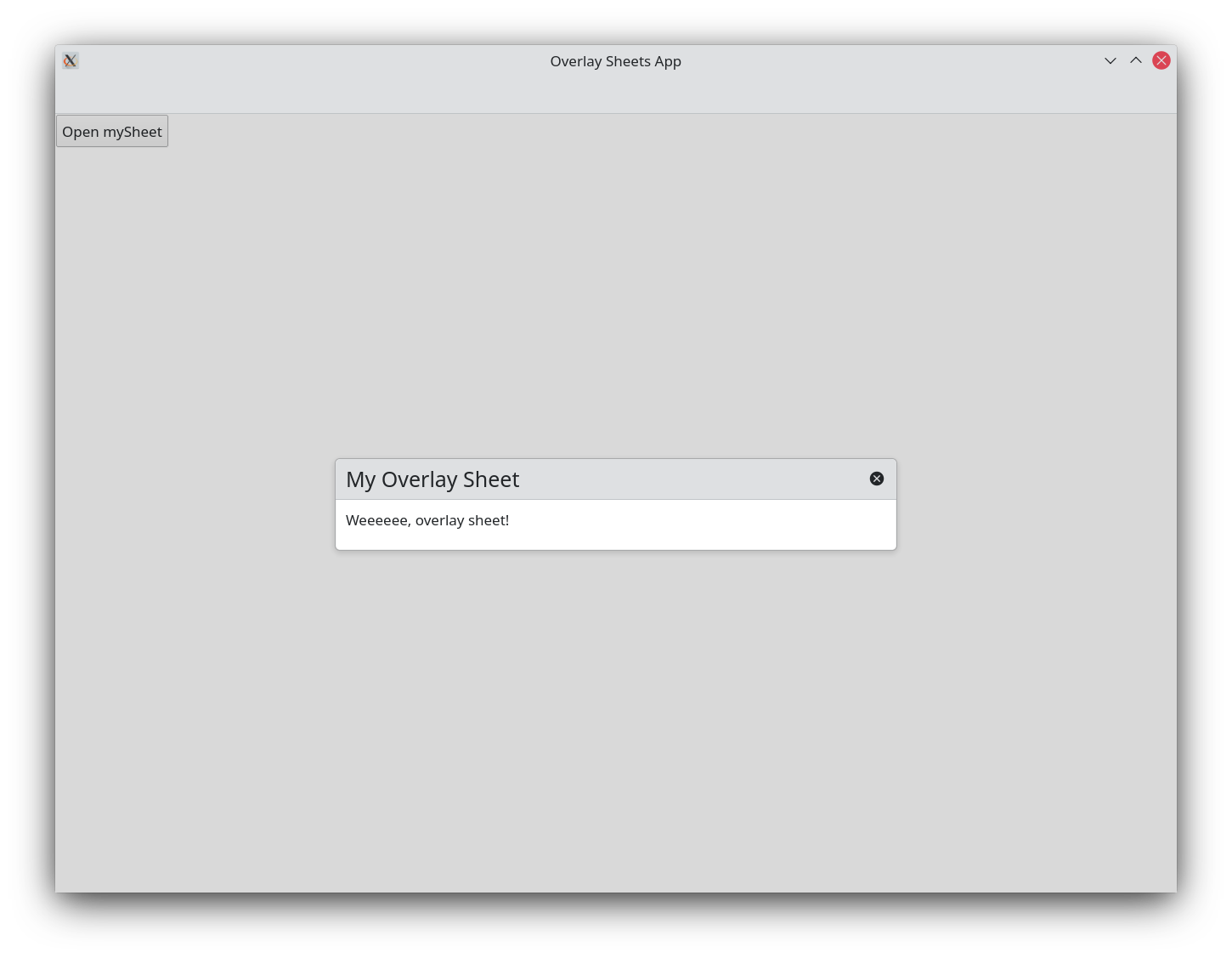
Overlay sheets come by default with a
header
that only contains a button for closing our overlay sheet. We can add a
Kirigami.Heading
as a title in our
header
to make it easy for users to understand what the sheet is for. This is done by setting header to contain our heading component.
Kirigami.OverlaySheet {
    id: mySheet

    header: Kirigami.Heading {
        text: "My Overlay Sheet"
    }

    Controls.Label {
        Layout.fillWidth: true
        wrapMode: Text.WordWrap
        text: "Weeeeee, overlay sheet!"
    }
}
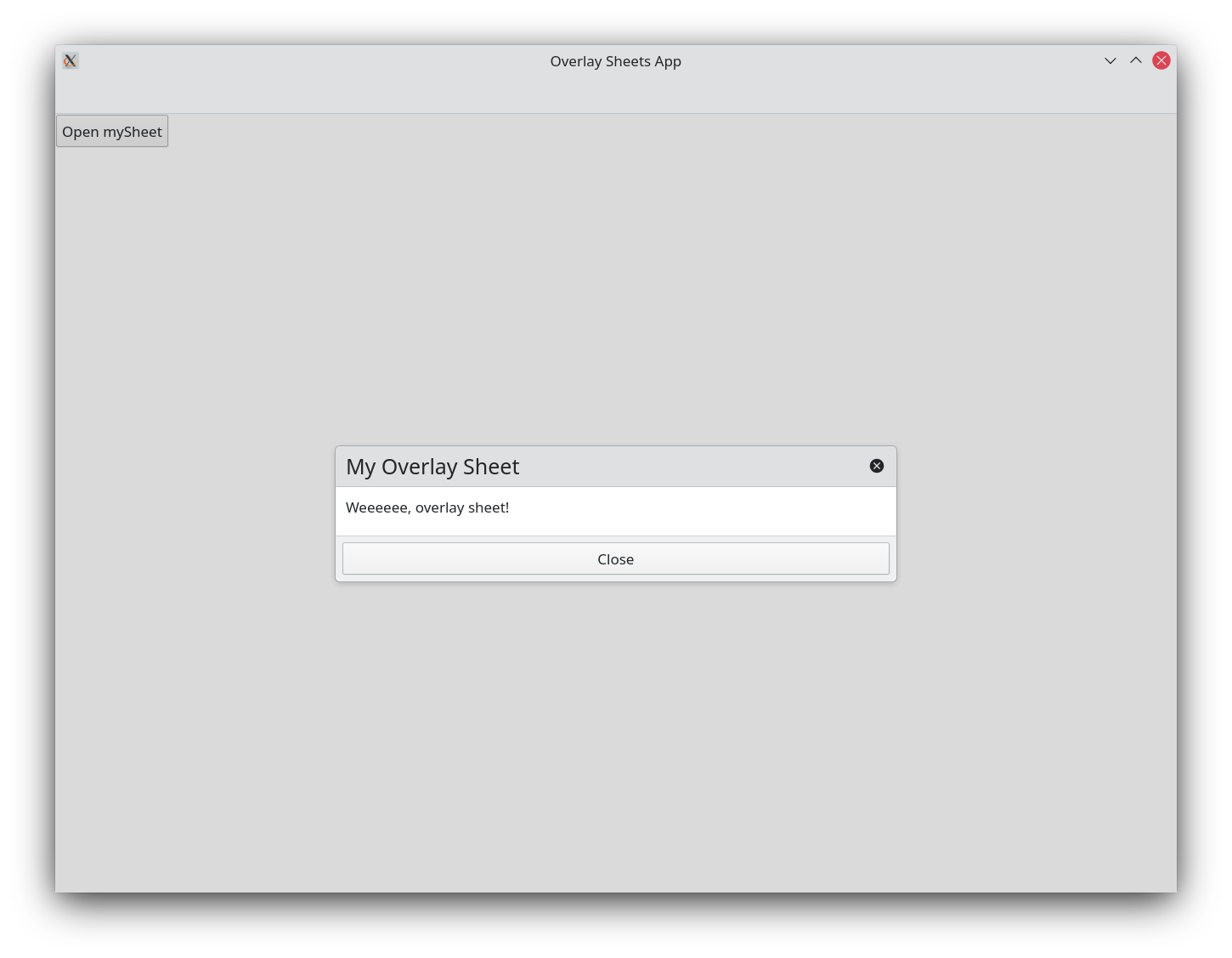
We can also provide our overlay sheet with a footer . Footers in overlay sheets are quite flexible, but most often they are used to provide overlay sheets with some sort of quick interactive input similar to that provided by modal dialogs (e.g. buttons for "Apply", "Ok", "Cancel", "Close", etc.)
Stopki są ustawiane w ten sam sposób co nagłówki:
Kirigami.OverlaySheet {
    id: mySheet

    header: Kirigami.Heading {
        text: "My Overlay Sheet"
    }

    footer: Controls.DialogButtonBox {
        standardButtons: DialogButtonBox.Close
        onRejected: mySheet.close()
    }

    Controls.Label {
        Layout.fillWidth: true
        wrapMode: Text.WordWrap
        text: "Weeeeee, overlay sheet!"
    }
}
Używanie widoków delegatów / modeli
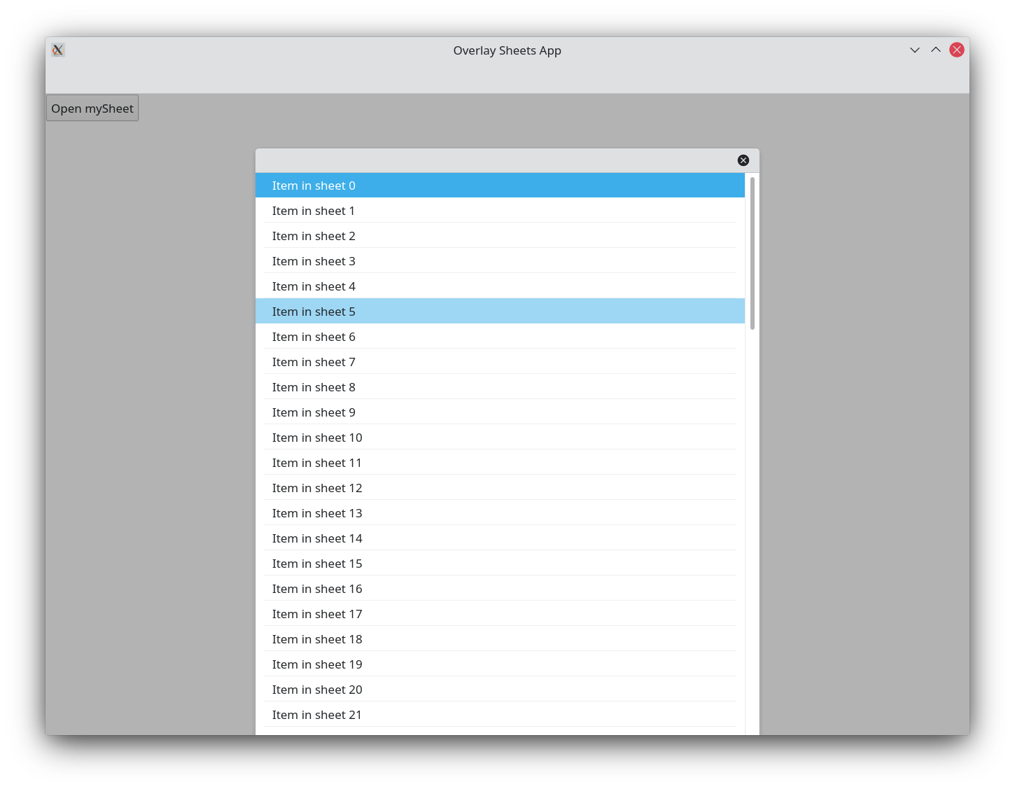
Since overlay sheets are designed to display vertical content, they can be especially useful when used in conjunction with components such as ListViews . When displaying content longer than the application window itself, the overlay sheet becomes scrollable:
Kirigami.OverlaySheet {
    id: mySheet

    ListView {
        model: 100
        implicitWidth: Kirigami.Units.gridUnit * 30
        delegate: Kirigami.BasicListItem {
            label: "Item in sheet " + modelData
        }
    }
}