Panele
Półki to panele, które wysuwają się z boków okna aplikacji. Można je wypełnić rzeczami interaktywnymi takimi jak Działania Kirigami, przyciskami, tekstem i wieloma innymi.
Półki występują w różnych rodzajach, kształtach i postaciach. Na tej stronie przerobimy każdy rodzaj i przedstawimy ich cechy szczególne.
Globalna półka
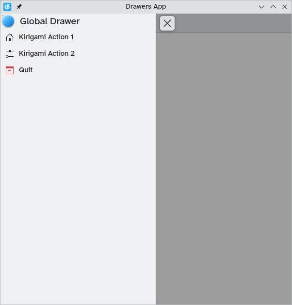
Globalna półka jest standardową cechą w aplikacjach przenośnych KDE, a czasami można ją znaleźć także na aplikacjach biurkowych. Zawiera główne menu aplikacji: znajdują się tutaj wpisy, które nie są szczególne dla danej strony lecz znaczące do ogólnego poruszania i oddziaływania na aplikację.
It can be activated by tapping the hamburger menu or by swiping from the left edge to the middle of the screen in Left to Right mode or from the right edge in Right to Left mode.
Kirigami.GlobalDrawer components are what we use to create such drawers. These are set to the globalDrawer property of the Kirigami.ApplicationWindow that forms the basis of our Kirigami application.
import QtQuick
import org.kde.kirigami as Kirigami

Kirigami.ApplicationWindow {
    title: "Drawers App"
    width: 600
    height: 600
    pageStack.initialPage: Kirigami.Page { /* Page code here... */ }

    globalDrawer: Kirigami.GlobalDrawer {
        title: "Global Drawer"
        titleIcon: "applications-graphics"
        actions: [
            Kirigami.Action {
                text: "Kirigami Action 1"
                icon.name: "user-home-symbolic"
                onTriggered: showPassiveNotification("Action 1 clicked")
            },
            Kirigami.Action {
                text: "Kirigami Action 2"
                icon.name: "settings-configure-symbolic"
                onTriggered: showPassiveNotification("Action 2 clicked")
            },
            Kirigami.Action {
                text: i18n("Quit")
                icon.name: "application-exit-symbolic"
                shortcut: StandardKey.Quit
                onTriggered: Qt.quit()
            }
        ]
    }
}
Uwaga
The titleIcon property takes names for system-wide icons according to the FreeDesktop specification. These icons and icon names can be viewed with KDE's CuttleFish application which comes with plasma-sdk, or by visiting FreeDesktop's icon naming specification.Nagłówek
Nagłówków można używać do umieszczania lepkich składników na górze naszej globalnej półki. Składki nagłówków pozostaną na swoim miejscu nawet gdy globalna półka będzie zawierać zagnieżdżone działania, które będą zastępować bieżącą warstwę w globalnej półce.
Your chosen header component can be set with the global drawer's header property, and it will replace the global drawer's title. This is useful to add a Kirigami.SearchField, for example:
import QtQuick
import org.kde.kirigami as Kirigami

Kirigami.ApplicationWindow {
    title: "Drawers App"
    width: 600
    height: 600
    pageStack.initialPage: Kirigami.Page { /* Page code here... */ }

    globalDrawer: Kirigami.GlobalDrawer {
        title: "Global Drawer with searchfield (not visible)"

        header: Kirigami.SearchField {
                id: searchField
        }

        actions: [
            Kirigami.Action {
                text: "Kirigami Action 1"
                icon.name: "user-home-symbolic"
                onTriggered: showPassiveNotification("Action 1 clicked")
            },
            Kirigami.Action {
                text: "Kirigami Action 2"
                icon.name: "settings-configure-symbolic"
                onTriggered: showPassiveNotification("Action 2 clicked")
            },
            Kirigami.Action {
                text: i18n("Quit")
                icon.name: "application-exit-symbolic"
                shortcut: StandardKey.Quit
                onTriggered: Qt.quit()
            }
        ]
    }
}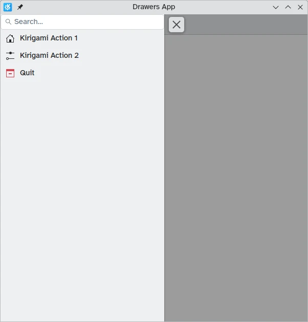
Our global drawer now shows the search bar component we set as the header
Dostosowywanie na urządzenia biurkowe
While panel-style global drawers can be useful in mobile environments, they might be too large on the desktop, especially when the application has few actions.
Thankfully, Kirigami global drawers provide an isMenu property. When set to true, they turn into more traditional menus only on the desktop.
Uwaga
W tym trybie menu, nagłówki i banery nie są widoczne.globalDrawer: Kirigami.GlobalDrawer {
isMenu: true
actions: [
// Kirigami Actions here...
]
}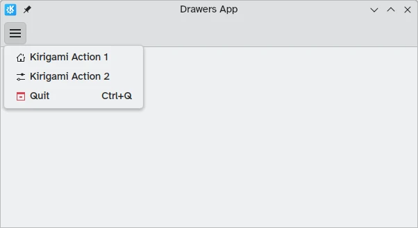
Global drawer in menu mode, without a header or banner
Context Drawers
While a Kirigami.GlobalDrawer displays global actions available throughout your application, a Kirigami.ContextDrawer should be used to display actions that are only relevant in certain contexts. This is usually used in separate pages.
A context drawer will behave differently depending on whether it is being used on a mobile platform or on a desktop.
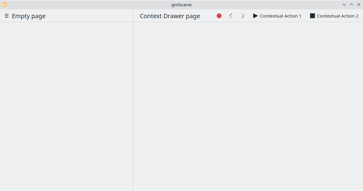
On a desktop, when a window has enough space, contextual actions show up as part of the actions group in the top toolbar. When space is limited, such as on a mobile device or in a narrow window, contextual actions are hidden behind a hamburger menu on the right side. This is different from other actions in the actions group, namely actions.main, actions.left and actions.right; these do not get hidden in space-constrained windows, and are instead collapsed into their respective icons.
| |
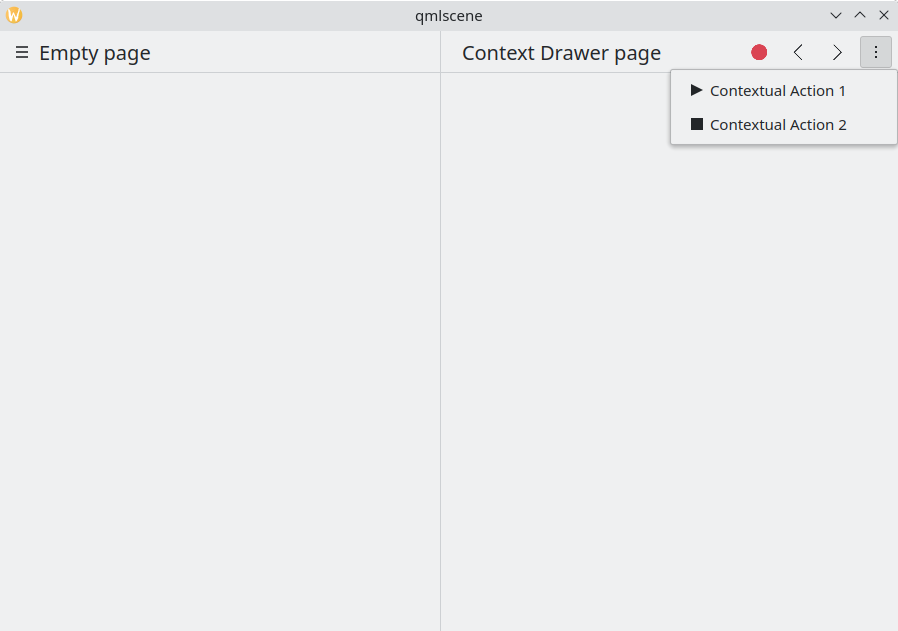
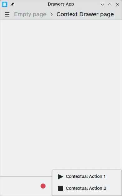
Context drawer with contextual actions hidden
Context drawer showing all contextual actions
On mobile, the drawer always consists of actions hidden behind a hamburger menu. It can be activated by tapping the hamburger menu or by swiping from the right edge to the middle of the screen in Left to Right mode or from the left edge in Right to Left mode.
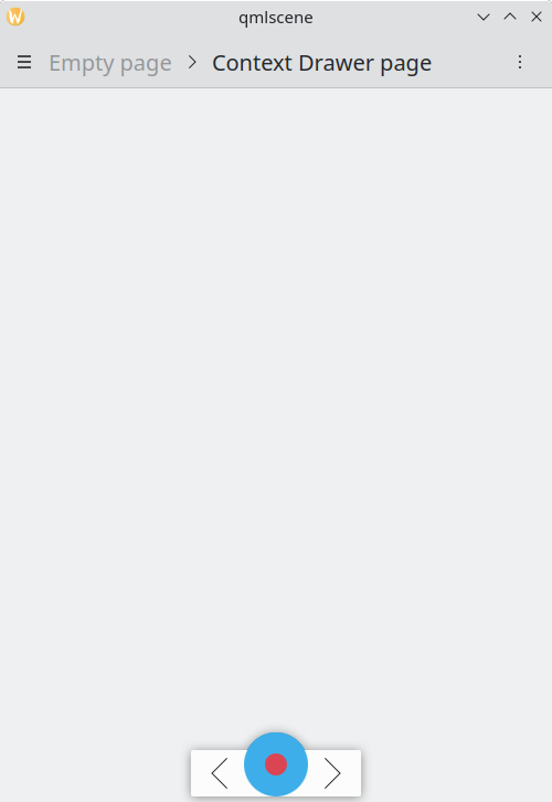
Same example above, running in mobile mode
Context drawer open in mobile mode
Półki modalne i w wierszu
Kirigami daje dwa dodatkowe rodzaje półek, półki modalne oraz w wierszu. Są do siebie całkiem podobne: oba mogą rozciągnąć się całkowicie na szerokość lub wysokość aplikacji oraz można je umieszczać na krawędziach okna aplikacji. Jednakże, odpowiadają inaczej na działania użytkownika.
- Modal drawers are hidden by default and darken the rest of the application, being dismissed when clicking on a darkened area.
- Inline drawers are shown by default and allow the user to still interact with the rest of the application without being dismissed, and do not darken other areas.
This kind of drawer is open ended and flexible, but generally, you may want to use this kind of drawer when you want a small list of options to appear on a long press or right click.
These two drawers are so similar because they can, in fact, be implemented using the same Kirigami component: Kirigami.OverlayDrawer. Here are a few important inherited properties of this component to keep in mind:
- Popup.modal controls whether the drawer will be modal or inline depending on a boolean value.
- Drawer.edge controls which edge of the application window the drawer will appear on; options for this property are part of the Edge enum, namely
Qt.TopEdge,Qt.RightEdge,Qt.BottomEdge, andQt.LeftEdge. - Popup.contentItem contains the component that will form the content of your drawer.
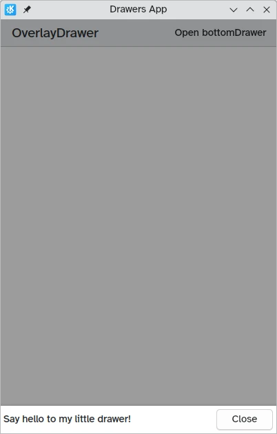
import QtQuick
import QtQuick.Layouts
import QtQuick.Controls as Controls
import org.kde.kirigami as Kirigami

Kirigami.ApplicationWindow {
    title: "Drawers App"
    width: 400
    height: 600
    pageStack.initialPage: Kirigami.Page {
        title: "OverlayDrawer at the bottom"
        actions: [
            Kirigami.Action {
                text: "Open bottomDrawer"
                onTriggered: bottomDrawer.open()
            }
        ]
        Kirigami.OverlayDrawer {
            id: bottomDrawer
            edge: Qt.BottomEdge
            // Ustaw modal na false, aby umieścić tę półkę w wierszu!
            modal: true

            contentItem: RowLayout {
                Controls.Label {
                    Layout.fillWidth: true
                    text: "Say hello to my little drawer!"
                }
                Controls.Button {
                    text: "Close"
                    onClicked: bottomDrawer.close()
                }
            }
        }
    }
}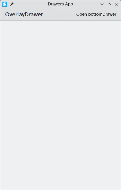
Modal drawer not visible
Modal drawer at the bottom edge of the screen