Rzeczy sterujące i z którym można oddziaływać
Kirigami makes use of a wide selection of different interactive elements from Qt that you can use in your applications. Each different type has slightly different interaction styles, visual styles, and functionality. Using the right type of control in your application can help make your user interface more responsive and intuitive.
Przyciski
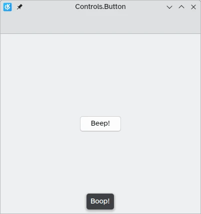
In Kirigami apps, we use the QtQuick Controls Button. Using them is pretty straightforward: we set the text property and any action we want it to perform is set to the onClicked property.
import QtQuick
import QtQuick.Layouts
import QtQuick.Controls as Controls
import org.kde.kirigami as Kirigami

Kirigami.ApplicationWindow {
    title: "Controls.Button"
    width: 400
    height: 400
    pageStack.initialPage: Kirigami.Page {
        ColumnLayout {
            anchors.fill: parent
            Controls.Button {
                Layout.alignment: Qt.AlignCenter
                text: "Beep!"
                onClicked: showPassiveNotification("Boop!")
            }
        }
    }
}
Przestawialne przyciski
The behavior of buttons can be changed to make them toggleable: in this mode, they will stay pressed until clicked on once more. This mode can be activated by setting their checkable property to true; we can also set buttons to be toggled on by default by setting checked to true.
We can get the most out of toggleable buttons by using the onCheckedChanged signal handler which is automatically generated from the checked signal. It works similarly to onClicked, except here the assigned action will be executed when the button's state changes. It is a boolean property, which can come in handy for specific use cases.
In this example, we set the visibility of an inline drawer according to the status of a toggleable button:
import QtQuick
import QtQuick.Layouts
import QtQuick.Controls as Controls
import org.kde.kirigami as Kirigami

Kirigami.ApplicationWindow {
    title: "Controls.Button (toggleable version)"
    width: 400
    height: 400
    pageStack.initialPage: Kirigami.Page {
        ColumnLayout {
            anchors.fill: parent
            Controls.Button {
                Layout.alignment: Qt.AlignCenter
                text: "Hide inline drawer"
                checkable: true
                checked: true
                onCheckedChanged: myDrawer.visible = checked
            }

            Kirigami.OverlayDrawer {
                id: myDrawer
                edge: Qt.BottomEdge
                modal: false

                contentItem: Controls.Label {
                    text: "Peekaboo!"
                }
            }
        }
    }
}
Uwaga
With the default Breeze theme in KDE Plasma it can be hard to tell whether a button is toggled, since buttons are coloured blue when they are clicked on. Make sure you take this into account when creating your application: a different control might be more user friendly.Przyciski paska narzędzi:
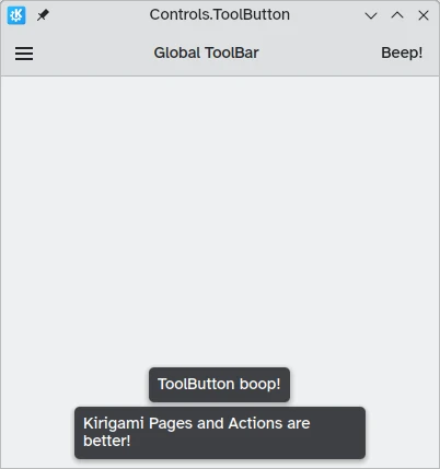
There is a specific button type meant for use in toolbars, Controls.ToolButton. The most obvious difference between this and a conventional Button is the styling, with toolbuttons being flat (though this is alterable with the boolean property flat).
import QtQuick
import QtQuick.Layouts
import QtQuick.Controls as Controls
import org.kde.kirigami as Kirigami

Kirigami.ApplicationWindow {
    title: "Controls.ToolButton"
    width: 600
    height: 600

    header: Controls.ToolBar {
        RowLayout {
            anchors.fill: parent
            Controls.ToolButton {
                icon.name: "application-menu-symbolic"
                onClicked: showPassiveNotification("Kirigami Pages and Actions are better!")
            }
            Controls.Label {
                text: "Global ToolBar"
                horizontalAlignment: Qt.AlignHCenter
                verticalAlignment: Qt.AlignVCenter
                Layout.fillWidth: true
            }
            Controls.ToolButton {
                text: "Beep!"
                onClicked: showPassiveNotification("ToolButton boop!")
            }
        }
    }
}
Pola zaznaczane
Rzeczy sterujące zaznaczeniem umożliwiają użytkownikowi wybór lub wybranie ustawienia. Istnieją różne rodzaje, które najlepiej opowiadają danemu przypadkowi.
Pola zaznaczania
A Controls.CheckBox is meant for options where the choices are non-exclusive and where each option has a clear alternative.
import QtQuick
import QtQuick.Layouts
import QtQuick.Controls as Controls
import org.kde.kirigami as Kirigami

Kirigami.ApplicationWindow {
    title: "Controls.CheckBox"
    width: 400
    height: 400
    pageStack.initialPage: Kirigami.Page {
        ColumnLayout {
            anchors.left: parent.left
            anchors.right: parent.right
            Controls.CheckBox {
                Layout.alignment: Qt.AlignHCenter
                text: "This checkbox is checked!"
                checked: true
            }
            Controls.CheckBox {
                Layout.alignment: Qt.AlignHCenter
                text: "This checkbox is not checked!"
                checked: false
            }
        }
    }
}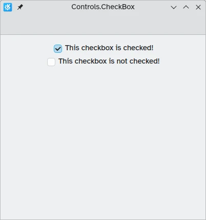
As you can see, they are simple to use. The checked property holds a boolean value determining whether or not they have been checked.
Przyciski radio
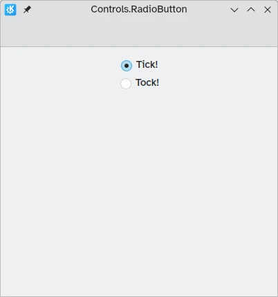
A Controls.RadioButton is designed for situations where the user must choose one option from a set of several options.
Przyciski radio są domyślnie wykluczające: można zaznaczyć tylko jeden przycisk, z przycisków należących do tej samej rzeczy nadrzędnej.
Like checkboxes, they can be set to be checked or unchecked by default with the checked property.
import QtQuick
import QtQuick.Layouts
import QtQuick.Controls as Controls
import org.kde.kirigami as Kirigami

Kirigami.ApplicationWindow {
    title: "Controls.RadioButton"
    width: 400
    height: 400
    pageStack.initialPage: Kirigami.Page {

        ColumnLayout {
            anchors.left: parent.left
            anchors.right: parent.right
            Controls.RadioButton {
                Layout.alignment: Qt.AlignCenter
                text: "Tick!"
                checked: true
            }
            Controls.RadioButton {
                Layout.alignment: Qt.AlignCenter
                text: "Tock!"
                checked: false
            }
        }
    }
}
Przełączniki
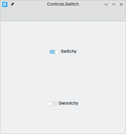
On the desktop, changing settings usually involves changing the setting and then applying it by clicking on an "Apply" or "OK" button. On mobile, we can use a Controls.Switch instead.
Switches can be toggled between an on and off state. They can be toggled by clicking or tapping on them, or they can be dragged towards the on or off position. Once again, switches can be set to be on or off by default with the checked property.
import QtQuick
import QtQuick.Layouts
import QtQuick.Controls as Controls
import org.kde.kirigami as Kirigami

Kirigami.ApplicationWindow {
    title: "Controls.Switch"
    width: 400
    height: 400
    pageStack.initialPage: Kirigami.Page {
        ColumnLayout {
            anchors.fill: parent
            Controls.Switch {
                Layout.alignment: Qt.AlignCenter
                text: "Switchy"
                checked: true
            }
            Controls.Switch {
                Layout.alignment: Qt.AlignCenter
                text: "Swootchy"
                checked: false
            }
        }
    }
}
Suwaki
Sliders allow users to select certain values by sliding a handle along a track. There are several types that you can choose from depending on the values you'd like your users to choose in your application.
Suwaki zwyczajne i z naniesionymi kresami
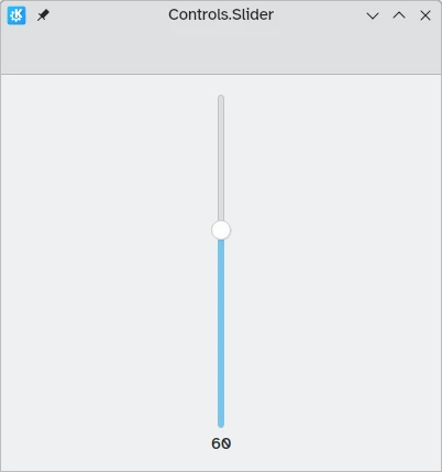
A standard Controls.Slider provides the user with very fine control over the selection they wish to make.
In Left to Right mode, sliders go left to right to increase when in horizontal orientation, while in Right to Left mode they go in the reverse direction. In both modes, sliders in vertical orientation go from the bottom up.
The coloration provides a visual indicator of how large the value you are selecting is.
Suwaki mają kilka istotnych właściwości, na które musimy zwrócić uwagę:
- value: contains the value at which the handle is placed, and can also be set manually to provide a default starting value
- to: defines the range of the slider by specifying the maximum value it can go to
- orientation: allows the slider to be set to a vertical orientation with Qt.Vertical
import QtQuick
import QtQuick.Layouts
import QtQuick.Controls as Controls
import org.kde.kirigami as Kirigami

Kirigami.ApplicationWindow {
    title: "Controls.Slider"
    width: 400
    height: 400
    pageStack.initialPage: Kirigami.Page {
        ColumnLayout {
            anchors.fill: parent
            Controls.Slider {
                id: normalSlider
                Layout.alignment: Qt.AlignHCenter
                Layout.fillHeight: true
                orientation: Qt.Vertical
                value: 60
                to: 100
            }
            Controls.Label {
                Layout.alignment: Qt.AlignHCenter
                text: Math.round(normalSlider.value)
            }
        }
    }
}
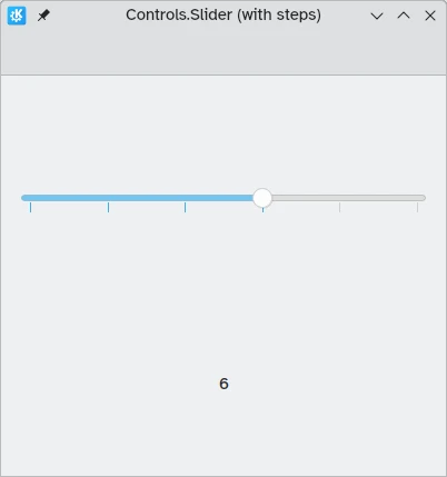
Another useful property we can use is stepSize. Setting this to a numerical value allows us to create a slider that snaps onto values that are multiples of the specified stepSize, with these multiples being indicated by tickmarks. Therefore if we set this property to 2.0, when the user drags the slider handle, they will only be able to select 0.0, 2.0, 4.0, etc. up to the value specified in the to property.
import QtQuick
import QtQuick.Layouts
import QtQuick.Controls as Controls
import org.kde.kirigami as Kirigami

Kirigami.ApplicationWindow {
    title: "Controls.Slider (with steps)"
    width: 400
    height: 400
    pageStack.initialPage: Kirigami.Page {
        ColumnLayout {
            anchors.fill: parent
            Controls.Slider {
                id: tickmarkedSlider
                Layout.alignment: Qt.AlignHCenter
                Layout.fillWidth: true
                orientation: Qt.Horizontal
                snapMode: Controls.Slider.SnapAlways
                value: 6.0
                to: 10.0
                stepSize: 2.0
            }
            Controls.Label {
                Layout.alignment: Qt.AlignHCenter
                text: tickmarkedSlider.value
            }
        }
    }
}
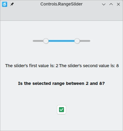
Range sliders
QtQuick Controls also provides Controls.RangeSliders. These have two handles, hence allowing you to define a range of numbers between the two handles.
Two new properties are important to keep in mind: first.value and second.value, which hold the values of the two handles. Like the value property of the standard sliders, these can be pre-set.
import QtQuick
import QtQuick.Layouts
import QtQuick.Controls as Controls
import org.kde.kirigami as Kirigami

Kirigami.ApplicationWindow {
    title: "Controls.RangeSlider"
    width: 400
    height: 400
    pageStack.initialPage: Kirigami.Page {
        ColumnLayout {
            anchors.fill: parent
            Controls.RangeSlider {
                id: rangeSlider
                Layout.alignment: Qt.AlignHCenter
                to: 10.0
                first.value: 2.0
                second.value: 8.0
                stepSize: 1.0
                snapMode: Controls.Slider.SnapAlways
            }
            RowLayout {
                Layout.alignment: Qt.AlignHCenter
                Layout.fillWidth: true
                Controls.Label {
                    Layout.fillWidth: true
                    text: "The slider's first value is: " + Math.round(rangeSlider.first.value)
                }
                Controls.Label {
                    Layout.fillWidth: true
                    text: "The slider's second value is: " + Math.round(rangeSlider.second.value)
                }
            }
            Controls.Label {
                Layout.alignment: Qt.AlignHCenter
                font.bold: true
                text: "Is the selected range between 2 and 8?"
            }
            Controls.Button {
                Layout.alignment: Qt.AlignHCenter
                icon.name: {
                    if (rangeSlider.first.value >= 2 && rangeSlider.second.value <= 8)
                        return "emblem-checked"
                    else
                        return "emblem-error"
                }
            }
        }
    }
}