Typografie
Uw inhoud indelen
Als demonstratie, gebruiken we in deze instructie een AbstractCard om de tekst duidelijker te maken. Een betere manier om hetzelfde resultaat te krijgen is om een Kirigami Addons FormCard te gebruiken.
Hoofdstuktitels
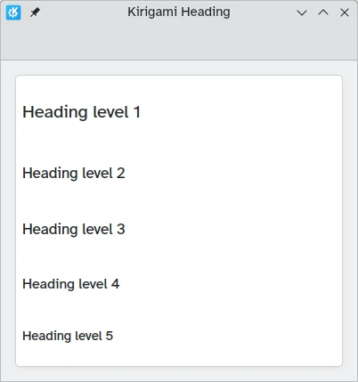
Kirigami biedt een Heading dat gebruikt kan worden voor pagina- of sectietitels.
import QtQuick
import QtQuick.Layouts
import org.kde.kirigami as Kirigami

Kirigami.ApplicationWindow {
    title: "Kirigami Heading"
    height: 400
    width: 400

    pageStack.initialPage: Kirigami.Page {
        Kirigami.AbstractCard {
            anchors.fill: parent
            contentItem: ColumnLayout {
                anchors.fill: parent
                Kirigami.Heading {
                    text: "Heading level 1"
                    level: 1
                }
                Kirigami.Heading {
                    text: "Heading level 2"
                    level: 2
                }
                Kirigami.Heading {
                    text: "Heading level 3"
                    level: 3
                }
                Kirigami.Heading {
                    text: "Heading level 4"
                    level: 4
                }
                Kirigami.Heading {
                    text: "Heading level 5"
                    level: 5
                }
            }
        }
    }
}
Labels
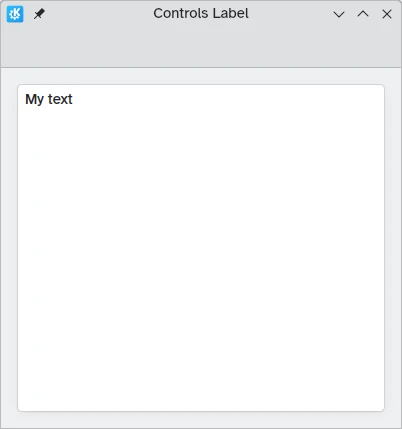
Tekstelementen zouden de component Label uit QtQuick Controls 2 moeten gebruiken.
import QtQuick
import QtQuick.Controls as Controls
import org.kde.kirigami as Kirigami

Kirigami.ApplicationWindow {
    title: "Controls Label"
    height: 400
    width: 400

    pageStack.initialPage: Kirigami.Page {
        Kirigami.AbstractCard {
            anchors.fill: parent
            contentItem: Controls.Label {
                    text: "My text"
            }
        }
    }
}
Uitlijning tekst
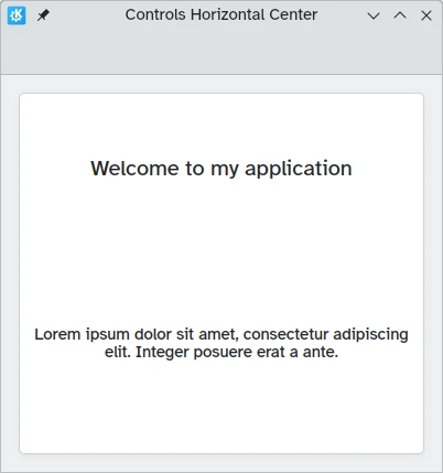
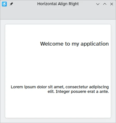
U kunt uw tekstelementen uitlijnen met de eigenschappen horizontalAlignment en verticalAlignment.
import QtQuick
import QtQuick.Layouts
import QtQuick.Controls as Controls
import org.kde.kirigami as Kirigami

Kirigami.ApplicationWindow {
    title: "Controls Horizontal Center"
    height: 400
    width: 400

    pageStack.initialPage: Kirigami.Page {
        Kirigami.AbstractCard {
            anchors.fill: parent
            contentItem: ColumnLayout {
                Kirigami.Heading {
                    Layout.fillWidth: true
                    horizontalAlignment: Text.AlignHCenter
                    text: "Welcome to my application"
                    wrapMode: Text.Wrap
                }
                Controls.Label {
                    Layout.fillWidth: true
                    horizontalAlignment: Text.AlignHCenter
                    text: "Lorem ipsum dolor sit amet, consectetur adipiscing elit. Integer posuere erat a ante."
                    wrapMode: Text.Wrap
                }
            }
        }
    }
}
import QtQuick
import QtQuick.Layouts
import QtQuick.Controls as Controls
import org.kde.kirigami as Kirigami

Kirigami.ApplicationWindow {
    title: "Horizontal Align Right"
    height: 400
    width: 400

    pageStack.initialPage: Kirigami.Page {
        Kirigami.AbstractCard {
            anchors.fill: parent
            contentItem: ColumnLayout {
                Kirigami.Heading {
                    Layout.fillWidth: true
                    horizontalAlignment: Text.AlignRight
                    text: "Welcome to my application"
                    wrapMode: Text.Wrap
                }
                Controls.Label {
                    Layout.fillWidth: true
                    horizontalAlignment: Text.AlignRight
                    text: "Lorem ipsum dolor sit amet, consectetur adipiscing elit. Integer posuere erat a ante."
                    wrapMode: Text.Wrap
                }
            }
        }
    }
}
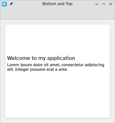
import QtQuick
import QtQuick.Layouts
import QtQuick.Controls as Controls
import org.kde.kirigami as Kirigami

Kirigami.ApplicationWindow {
    title: "Bottom and Top"
    height: 400
    width: 400

    pageStack.initialPage: Kirigami.Page {
        Kirigami.AbstractCard {
            anchors.fill: parent
            contentItem: ColumnLayout {
                Kirigami.Heading {
                    Layout.fillWidth: true
                    Layout.fillHeight: true
                    verticalAlignment: Text.AlignBottom
                    text: "Welcome to my application"
                    wrapMode: Text.WordWrap
                }
                Controls.Label {
                    Layout.fillWidth: true
                    Layout.fillHeight: true
                    verticalAlignment: Text.AlignTop
                    text: "Lorem ipsum dolor sit amet, consectetur adipiscing elit. Integer posuere erat a ante."
                    wrapMode: Text.WordWrap
                }
            }
        }
    }
}
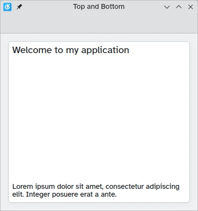
import QtQuick
import QtQuick.Layouts
import QtQuick.Controls as Controls
import org.kde.kirigami as Kirigami

Kirigami.ApplicationWindow {
    title: "Top and Bottom"
    height: 400
    width: 400

    pageStack.initialPage: Kirigami.Page {
        Kirigami.AbstractCard {
            anchors.fill: parent
            contentItem: ColumnLayout {
                Kirigami.Heading {
                    Layout.fillWidth: true
                    Layout.fillHeight: true
                    verticalAlignment: Text.AlignTop
                    text: "Welcome to my application"
                    wrapMode: Text.WordWrap
                }
                Controls.Label {
                    Layout.fillWidth: true
                    Layout.fillHeight: true
                    verticalAlignment: Text.AlignBottom
                    text: "Lorem ipsum dolor sit amet, consectetur adipiscing elit. Integer posuere erat a ante."
                    wrapMode: Text.WordWrap
                }
            }
        }
    }
}
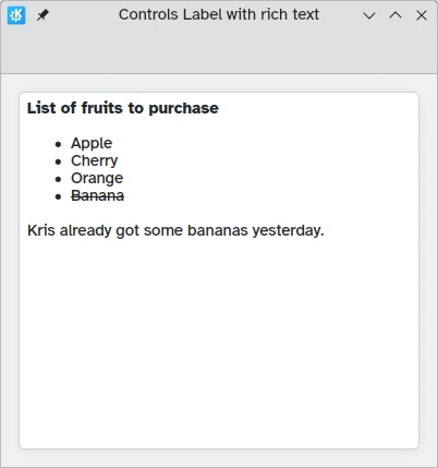
Opgemaakte tekst
QML biedt u het tonen (en bewerken) van opgemaakte tekst. Het gedrag kan bestuurd worden via de eigenschap textFormat.
import QtQuick
import QtQuick.Layouts
import QtQuick.Controls as Controls
import org.kde.kirigami as Kirigami

Kirigami.ApplicationWindow {
    title: "Controls Label with rich text"
    height: 400
    width: 400

    pageStack.initialPage: Kirigami.Page {
        Kirigami.AbstractCard {
            anchors.fill: parent
            contentItem: Controls.Label {
                text: "<p><strong>List of fruits to purchase</strong></p>
                <ul>
                <li>Apple</li>
                <li>Cherry</li>
                <li>Orange</li>
                <li><del>Banana</del></li>
                </ul>
                <p>Kris already got some bananas yesterday.</p>"
            }
        }
    }
}
Thema
De tekengrootte van het Kirigami.Theme is beschikbaar als Kirigami.Theme.defaultFont.pointSize in uw toepassing.