Kleuren en thema's in Kirigami
Kirigami heeft een kleurenpalet dat de systeemkleuren volgt, om beter te integreren op het platform waarop het actief is (d.w.z. Plasma bureaublad, Plasma mobiel, GNOME, Android, etc.).
Alle QML componenten van Kirigami en alle Qt Quick Controls zouden het pallet al standaard moeten volgen, dus zal gewoonlijk helemaal geen aangepaste kleuring nodig zijn voor deze besturingen.
Primitieve componenten zoals Rectangle zouden altijd gekleurd moeten zijn met het kleurpalet geleverd door Kirigami via de aangehangen eigenschap Kirigami.Thema.
Hard gecodeerde kleuren in QML, zoals #32b2fa of red zouden gewoonlijk vermeden moeten worden; als het echt noodzakelijk is om elementen met aangepaste kleuren te hebben, zou het in een gebied moeten zijn waar alleen aangepaste kleuren zijn gebruikt (gewoonlijk in het inhoudsgebied van de toepassing en nooit in het chroomgebieden zoals werkbalken of dialogen). Bijvoorbeeld, een hard gecodeerd black als voorgrond kan niet gebruikt worden over een Kirigami.Theme.backgroundColor achtergrond, omdat als het platform een donker kleurenschema gebruikt het resultaat er slecht uitziet met contrast tussen zwart en bijna zwart.
Notitie
Als u echt aangepaste kleuren nodig hebt, kijk dan op Kontrast om er zeker van te zijn dat de kleuren die u kiest een goed contrast hebben en WCAG compliant zijn.Thema
Kirigami.Theme is een aangehangen eigenschap en is daarom beschikbaar voor gebruik in elk QML item. Het bevat als eigenschap alle kleuren beschikbaar in het palet, zoals eigenschap colorSet.
import QtQuick
import org.kde.kirigami as Kirigami

Kirigami.ApplicationWindow {
    height: 300
    width: 400

    pageStack.initialPage: Kirigami.Page {
        Rectangle {
            anchors.centerIn: parent
            implicitHeight: 100
            implicitWidth: 200
            color: Kirigami.Theme.highlightColor
        }
    }
}
Kirigami Gallery levert een codevoorbeeld die alle beschikbare kleuren voor Kirigami presenteert via Kirigami.Theme. Dit omvat alle hun statussen: als u buiten het venster klikt, wijzigen de kleuren naar hun inactieve status en als u uw systeem omschakelt naar een donker thema, zouden de donkere varianten van de kleuren direct moeten verschijnen.
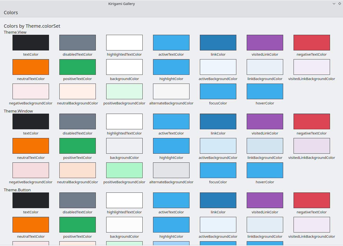
De kleurencomponent in Kirigami galerij
Kleurenset
Afhankelijk van waar een besturing is gelokaliseerd, zou het een andere kleurset moeten gebruiken: bijvoorbeeld, (met het kleurenthema Breeze light) in Views, is de normale achtergrond bijna wit, terwijl in andere gebieden, zoals werkbalken of dialogen, de normale achtergrondkleur grijs is.
Als u een kleurenset voor een item definieert, zullen alle kind-items recursief het automatisch erven (tenzij de eigenschap inherit expliciet is ingesteld op false, wat altijd gedaan zou moeten worden wanneer de ontwikkelaars een specifieke kleurenset wil afdwingen) het is dus gemakkelijk kleuren te wijzigen voor een gehele hiërarchie van items zonder de items zelf aan te raken.
Kirigami.Theme ondersteunt 5 verschillende kleurensets:
- Beeld: kleurenset voor item weergaven, gewoonlijk de lichtste van allen (in lichte kleurenthema's)
- Venster: kleurenset voor vensters en chroom-gebieden (dit is ook de standaard kleurenset)
- Knop: kleurenset gebruikt door knoppen
- Selectie: kleurenset gebruikt door geselecteerde gebieden
- Tekstballon: kleurenset gebruikt door tekstballonnen
- Complementair: kleurenset bedoeld om complementair te zijn aan venster: gewoonlijk is donker de tegenhanger van lichte thema's. Kan gebruikt worden voor emphasis in kleine gebieden van de toepassing
Hier is een voorbeeld dat presenteert hoe kleurensets geërfd worden en gebruikt kunnen worden om verschillende componenten te onderscheiden. Een grote rand is toegevoegd om kleuren te laten contrasteren.
| |
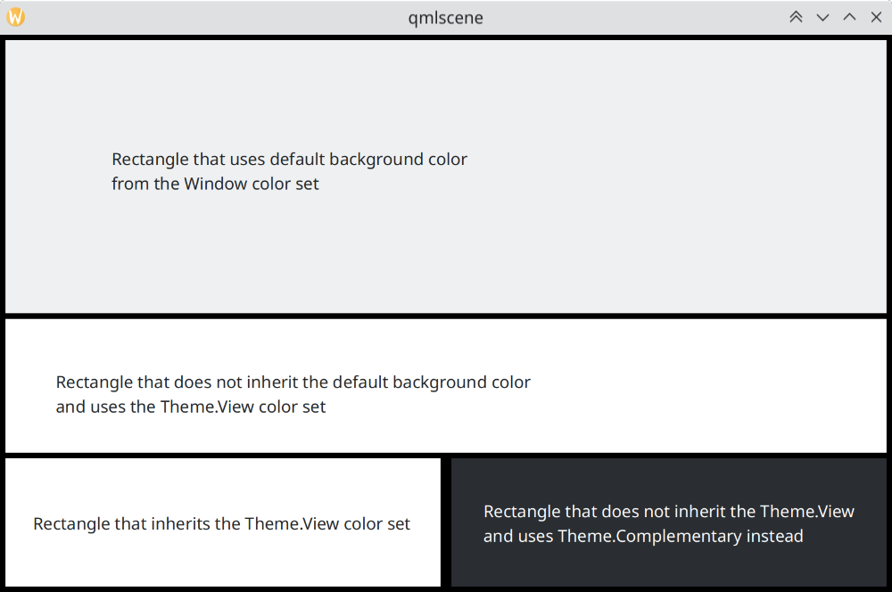
Hoe kleurensets in Breeze verschillen
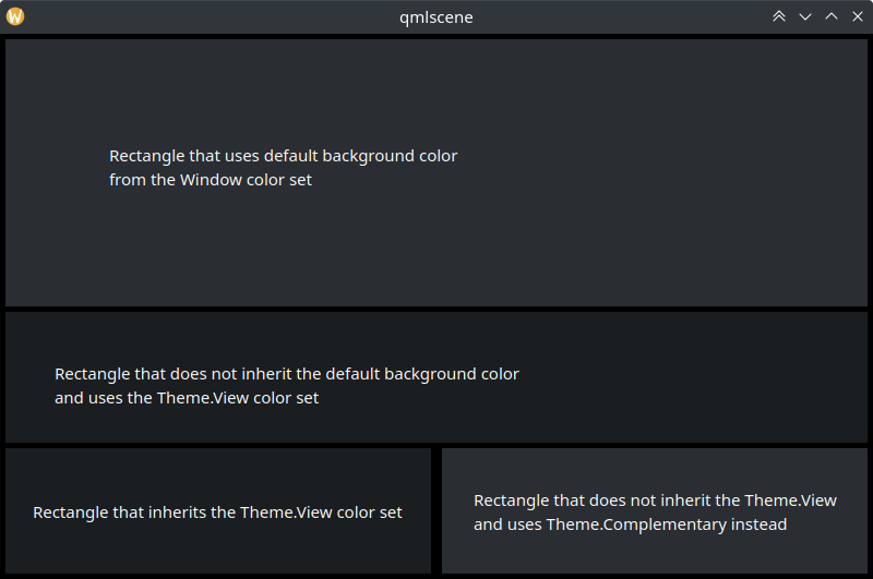
Hoe kleurensets in Breeze Dark verschillen
Aangepaste kleuren gebruiken
Hoewel het ontmoedigd wordt om hard gecodeerde kleuren te gebruiken, biedt Kirigami een meer te onderhouden manier om een aangepaste hard gecodeerd palet aan een item en al zijn kinderen toe te kennen, dat biedt het definiëren van zulke aangepaste kleuren op alleen één plaats:
import QtQuick
import org.kde.kirigami as Kirigami

Kirigami.ApplicationWindow {
    title: "Custom colors"
    height: 300
    width: 300

    Rectangle {
        anchors.fill: parent
        Kirigami.Theme.inherit: false
        // Opmerking: onafhankelijk van welke kleurenset wordt gebruikt, wordt aanbevolen om alle
        // beschikbare kleuren van het thema te vervangen, om slechte combinaties van kleuren te
        // vermijden

        Kirigami.Theme.colorSet: Kirigami.Theme.Window
        Kirigami.Theme.backgroundColor: "#b9d795"
        Kirigami.Theme.textColor: "#465c2b"
        Kirigami.Theme.highlightColor: "#89e51c"
        // Definieer alle andere door u gewenste kleuren

        // Dits zal "#b9d795" zijn
        color: Kirigami.Theme.backgroundColor

        Rectangle {
            // Dit zal "#465c2b" zijn
            anchors.centerIn: parent
            height: Math.round(parent.height / 2)
            width: Math.round(parent.width / 2)
            color: Kirigami.Theme.textColor
        }
    }
}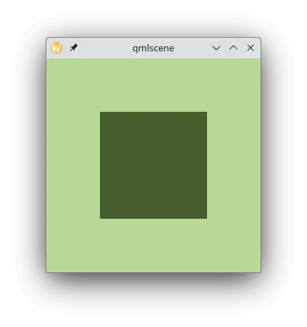
Voorbeeld met eigen/aangepaste kleuren