Indelingen, Lijstweergaven en Kaarten
Uw inhoud indelen
Nu we begrijpen hoe pagina's werken, is het tijd om zaken eraan toe te voegen. We zullen door een aantal belangrijke indelingscomponenten en elementen lopen die nuttig zullen zijn bij het ontwerpen van onze toepassing.
Aan het eind van deze sectie zal u een goed uitziend programma hebben.
Lijstweergaven
Als u ooit Discover, NeoChat of Systeeminstellingen van Plasma hebt gebruikt, bent u langs een ListView gekomen. Heel eenvoudig, het laat u gegevens in een lijst tonen.
pageStack.initialPage: Kirigami.ScrollablePage {
    // ...
    Kirigami.CardsListView {
       id: cardsView
        model: kountdownModel
        delegate: kountdownDelegate
    }
}
Dat lijkt cryptisch, maar geen getob. Laten we vanaf het begin beginnen.
We voegen deze component toe in onze Kirigami.ScrollablePage uit de laatste handleiding.
We gaan Kirigami.CardsListView gebruiken, die een ListView is en ons gemakkelijk kaarten biedt om in een lijst te tonen. Lijstweergaven zijn echter gemaakt om gegevens genomen uit een model te tonen - om automatisch zichzelf te bevolken uit een set gegevens waar we naar wijzen. Dat is waar de eigenschap model in beeld komt: in dit voorbeeld wijst het naar kountdownModel.
Model
Kirigami.ApplicationWindow {
    // ...
    ListModel {
        id: kountdownModel
        // Elk ListElement is een element in de lijst, die informatie bevat
        ListElement {
            name: "Dog birthday!!"
            description: "Big doggo birthday blowout."
            date: 100
        }
    }
    // ...
}
We voegen ons kountdownModel toe in de Kirigami.ApplicationWindow uit de laatste handleiding.
Een model definieert de manier waarop invoer van gegevens zijn gestructureerd. Ons kountdownModel zal, voor nu, bestaan uit slechts één element. Door naar ons bovenstaande ListElement te kijken kunnen we zien hoe gegevens van het kountdownModel zijn gestructureerd: ze bevatten een naam, een beschrijving en een datum. Dit is niet in beton gegoten en u kunt verschillende soorten gegevens in uw model hebben. De eerste twee zijn gewoon tekenreeksen en de derde is een getal dat we als plaatshouder gebruiken.
Notitie
Omdat QML is bovenop JavaScript is gebouwd, zijn vele van deze taalfuncties beschikbaar voor gebruik in QML-bestanden. QML-variabelen moeten echter een prefix metproperty hebben, tenzij het binnen een JS codeblok is. U kunt hier meer over lezen op deze pagina.Modellen zijn ook nuttig in hoe ze gewijzigd kunnen worden met gebruik van verschillende methoden. Enige belangrijken zijn:
- ListModel.append(yourobject: jsobject) voegt een JavaScript-object toe (JSObject)
yourobjectaan het ListModel en plaatst het na het laatste item in het model. Om dit juist te laten gebeuren moet u een JSObject leveren met de juiste eigenschappen en overeenkomstige gegevenstypen. - ListModel.get(index: int)](https://doc.qt.io/qt-6/qml-qtqml-models-listmodel.html#get-method) geeft het JSObject terug op de indexlocatie die u levert.
- ListModel.remove(index: int, count: int) verwijdert het JSObject op de geleverde locatie van
indexen zoveel na die indexlocatie als u stopt incount(1 stopt alleen het JSObject in de geleverde index) - ListModel.set(index: int, yourobject: jsobject) wijzigt het item op de geleverde locatie
indexmet de waarden geleverd inyourobject. Zelfde regels als metappend().
Gedelegeerden
Terwijl ons kountdownModel de gegevens bevat die getoond zullen worden, zal onze kountdownDelegate behandelen hoe de gegevens getoond zullen worden in de ListView. Daarvoor gebruiken we een Kirigami.CardsListView ontworpen om card-type gedelegeerden te tonen en die gedelegeerden zullen zichtbaar gerepresenteerd worden door middel van een Kirigami.AbstractCard.
Gedelegeerden ontvangen automatisch de eigenschappen van het ListElement-exemplaren die we gespecificeerd hebben in ons model. We kunnen daarom gewoon refereren naar de eigenschappen name, description en date alsof ze conventionele variabelen zijn binnen onze gedelegeerde.
De delegatiekaart bouwen
De Component die onze gedelegeerde representeert kan toegevoegd worden in ons Kirigami.ApplicationWindow. We zullen daarna controleren wat elk deel van onze gedelegeerde component doet.
Kirigami.ApplicationWindow {
    // ...
    Component {
        id: kountdownDelegate
        Kirigami.AbstractCard {
            contentItem: Item {
                // implicitWidth/Height definiëren de natuurlijke breedte/hoogte van een item als er
                // geen breedte of hoogte is gespecificeerd. De onderstaande instelling definieert
                // een grootte met voorkeur gebaseerd op zijn inhoud
                implicitWidth: delegateLayout.implicitWidth
                implicitHeight: delegateLayout.implicitHeight
                GridLayout {
                    id: delegateLayout
                    anchors {
                        left: parent.left
                        top: parent.top
                        right: parent.right
                    }
                    rowSpacing: Kirigami.Units.largeSpacing
                    columnSpacing: Kirigami.Units.largeSpacing
                    columns: root.wideScreen ? 4 : 2

                    Kirigami.Heading {
                        level: 1
                        text: date
                    }

                    ColumnLayout {
                        Kirigami.Heading {
                            Layout.fillWidth: true
                            level: 2
                            text: name
                        }
                        Kirigami.Separator {
                            Layout.fillWidth: true
                            visible: description.length > 0
                        }
                        Controls.Label {
                            Layout.fillWidth: true
                            wrapMode: Text.WordWrap
                            text: description
                            visible: description.length > 0
                        }
                    }
                    Controls.Button {
                        Layout.alignment: Qt.AlignRight
                        Layout.columnSpan: 2
                        text: i18n("Edit")
                        // onClicked: nog te doen... spoedig!
                    }
                }
            }
        }
    }
    // ...
}
implicitWidth en implicitHeight
Het eerste deel waar we naar zullen kijken is hoe de breedte en hoogte van onze component te beheren:
Kirigami.AbstractCard {
    contentItem: Item {
        implicitWidth: delegateLayout.implicitWidth
        implicitHeight: delegateLayout.implicitHeight
        GridLayout {
            id: delegateLayout
            // ...
        }
    }
}
Kijkend naar onze Kirigami.AbstractCard, zijn de eerste eigenschappen die we instellen implicitWidth en implicitHeight. We hebben deze ingesteld op de delegateLayout.implicitWidth en delegateLayout.implicitHeight, d.w.z. de implicitWidth en implicitHeight van het element GridLayout.
Impliciete breedtes en hoogtes zijn eigenschappen die beschikbaar zijn bij elkItem die functioneren als hints en ingesteld als een set standaarden of als terugvalwaarden, als er geen expliciete breedte of hoogte in ingesteld voor deze waarden. Deze waarden zijn standaard 0x0, dus is het belangrijk dat u ze definieert in ruwe Item-componenten zoals bovenstaand.
Hier hebben we de implicitWidth en implicitHeight van ons Kirigami.AbstractCard hetzelfde ingesteld als dat van de GridLayout eronder zodat het niet uit de kaart loopt. Op deze manier neemt de kaart zoveel ruimte als nodig is voor zijn inhoud.
Indelingen
De GridLayout is binnen de Item-component die we hebben geleverd voor de eigenschap contentItem. Dit is het Item dat bevat wat getoond zal worden in uw kaart.
We moeten ook een layout voor onze componenten kiezen zodat ze niet op elkaar gestapeld worden. Er zijn drie hoofdtypen waaruit we kunnen kiezen:
- ColumnLayout zet uw componenten verticaal neer, in een enkele kolom
- RowLayout zet uw componenten horizontaal neer, in een enkele rij
- GridLayout zet uw componenten neer in een raster met een compositie naar keuze
Met ColumnLayout en RowLayout, is alles wat we hoeven te doen is onze componenten binnen de component Layout schrijven. Zoals u kunt zien, we gingen voor een GridLayout, die wat meer handwerk vraagt.
GridLayout {
    id: delegateLayout
    anchors {
        left: parent.left
        top: parent.top
        right: parent.right
    }
    rowSpacing: Kirigami.Units.largeSpacing
    columnSpacing: Kirigami.Units.largeSpacing
    columns: root.wideScreen ? 4 : 2
    // ...
}
Het eerste wat u ziet is ons anchors. Het verankeringssysteem van QtQuick biedt een bruikbare manier om te verzekeren dat uw componenten gepositioneerd worden in bepaalde delen van een oudercomponent. We hebben onze GridLayout linksboven verankerd en rechts van de ouderkaart, om te verzekeren dat onze inhoud zich uitstrekt over de gehele kaart.
Vervolgens specificeren we de ruimte tussen de rijen en kolommen in ons raster, zodat onze componenten niet opeenstapelen. Kirigami biedt een aantal handige voorgedefinieerde eenheden om voor dit doel te gebruiken:
| Kirigami-eenheid | Pixels |
|---|---|
| smallSpacing | 4px |
| largeSpacing | 8px |
| gridUnit | 18px |
Notitie
De Visuele ontwerpgroep (VDG) van KDE heeft heel wat meer informatie over de verschillende eenheden gedefinieerd in Plasma en Kirigami op het Human Interface Guidelines.Zoals u zich misschien herinnert, root is de id van onze KirigamipplicationWindow. Het levert de eigenschap wideScreen, gebruikt om te bepalen of het huidige apparaatscherm een breed scherm is (d.w.z. een computermonitor of een telefoon in landschap). We gebruiken hier een drievoudige voorwaarde om het aantal kolommen in ons raster te variëren afhankelijk van het scherm dat we gebruiken: als het een breed scherm is, zal het raster 4 kolommen hebben, anders zal het er 2 hebben.
Interne componenten
We konden net drie labels in onze gedelegeerde component aanmaken en dan gereed zijn, maar dat zou er niet erg mooi uit zien. We zullen gebruik maken van een paar handigere componenten:
GridLayout {
    // ...
    Kirigami.Heading {
        Layout.fillHeight: true
        level: 1
        text: date
    }

    ColumnLayout {
        Kirigami.Heading {
            Layout.fillWidth: true
            level: 2
            text: name
        }

        Kirigami.Separator {
            Layout.fillWidth: true
            visible: description.length > 0
        }

        Controls.Label {
            Layout.fillWidth: true
            wrapMode: Text.WordWrap
            text: description
            visible: description.length > 0
        }
    }

    Controls.Button {
        Layout.alignment: Qt.AlignRight
        Layout.columnSpan: 2
        text: i18n("Edit")
    }
}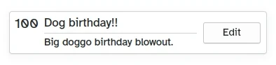
Hoe de aangepaste kaart er uitziet
- Links, Kirigami.Heading: gebruikt de
datevanListElementals een niveau 1 kop. - Midden, ColumnLayout: heeft een Kirigami.Heading die de taaknaam toont; een Kirigami.Separator, die de horizontale lijn levert; en een Controls.Label, die een optionele beschrijving van de taak toont. De laatste twee componenten hebben een eigenschap visible, die controleert of de beschrijving leeg is of niet en de componenten toont afhankelijk van het resultaat van
description.length > 0. - Rechts, Controls.Button: een knop die iets zal doen... spoedig!
Onze toepassing (app) tot zover
Main.qml:
| |
Dus hier is onze basis kaart!
Met deze stappen hebben we de basis gelegd voor het toevoegen van alle functionaliteit aan uw toepassing.