Toevoegen van acties
Samenvattend
Tot nu toe hebben we een eenvoudige toepassing gemaakt die kaarten kan tonen. We hebben echter nog geen manier om door de gebruiker nieuwe kaarten aan de kaartweergave toe te voegen.
In deze handleiding zullen we kijken naar acties van Kirigami. Deze zullen ons helpen interactiviteit toe te voegen aan onze toepassing op een consistente, snelle en toegankelijke manier.
Acties
Een Kirigami.Action omvat geheel een actie in de gebruikersinterface. We kunnen deze gebruiken om onze toepassingen te voorzien van gemakkelijk te bereiken acties die essentieel zijn voor hun functionaliteit.
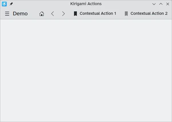
Als u Kirigami toepassingen eerder hebt gebruikt, hebt u zeker samengewerkt met acties van Kirigami. In deze afbeelding kunnen we acties rechts van de paginatitel zien met verschillende pictogrammen. Acties van Kirigami kunnen op verschillende manieren getoond worden en kunnen een brede variëteit van dingen doen.
Aftellingen toevoegen
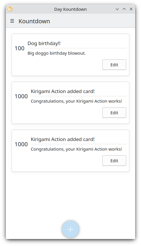
Een aftel toepassing is tamelijk nutteloos zonder de mogelijkheid om aftellingen toe te voegen. Laten we een actie aanmaken die ons dat laat doen.
pageStack.initialPage: Kirigami.ScrollablePage {
    // Andere paginaeigenschappen...
    actions: [
        Kirigami.Action {
            id: addAction
            icon.name: "list-add-symbolic"
            text: i18nc("@action:button", "Add kountdown")
            onTriggered: kountdownModel.append({
                name: "Kirigami Action added card!",
                description: "Congratulations, your Kirigami Action works!",
                date: 1000
            })
        }
    ]
    // ...
}
We plaatsen onze Kirigami.Action op onze hoofdpagina uit de eerdere instructie. Als we het willen, dan kunnen we meer acties aan onze pagina (en zelfs geneste acties in acties!) toevoegen.
De haakjes [] hierboven gebruikt zijn vergelijkbaar met JavaScript arrays, wat inhoud dat u een of meer argumenten aan ze kan doorgeven, gescheiden door komma's:
// Algemeen JavaScript array met componenten:
variable: [ component1, component2 ]
// Het doorgeven van een array met Kirigami acties naar QML:
actions: [ Kirigami.Action {}, Kirigami.Action {} ]
De eigenschappen id en text zouden bekend moeten zijn uit eerdere instructies. De geërfde eigenschap Action.icon zou interessant moeten zijn: het is een object met verschillende eigenschappen die u bepaalde pictogrammen voor uw acties laat tonen. Gelukkig alles wat we nodig hebben, bij gebruik van KDE pictogrammen, het leveren van de naameigenschap voor de pictogrameigenschap, icon.name.
De beschikbare pictogrammen weergeven
Click here to see how to check the available icons on your system
Icon Explorer is een KDE toepassing die u alle pictogrammen laat zien die u voor uw toepassing kunt gebruiken. Het biedt een aantal nuttige functies zoals voorbeelden van hun uiterlijk over verschillende geïnstalleerde thema's, voorbeelden bij verschillende groottes en meer. U zou het een nuttig hulpmiddel kunnen vinden bij beslissen over welke pictogrammen in uw toepassing te gebruiken.
Veel van de pictogrammen van KDE volgen de specificatie FreeDesktop Icon Naming. U zou het daarom ook nuttig kunnen vinden om de website van The FreeDesktop project te consulteren, die lijsten heeft van cross-desktop compatibele pictogramnamen.
De eigenschap onTriggered is de belangrijkste. Dit is wat onze actie zal doen wanneer het wordt gebruikt. U zult opmerken dat in ons voorbeeld we de methode kountdownModel.append van het kountdownModel gebruiken dat we in onze vorige handleiding hebben aangemaakt. Deze methode laten ons een nieuw element toevoegen aan ons lijstmodel. We leveren het met een object (aangegeven door accolades {}) dat de relevante eigenschappen heeft voor ons aftellen (naam, beschrijving en een plaatshouder datum).
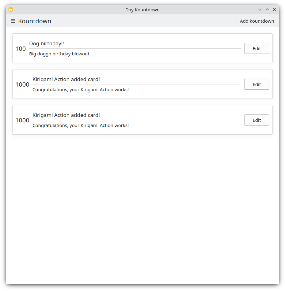
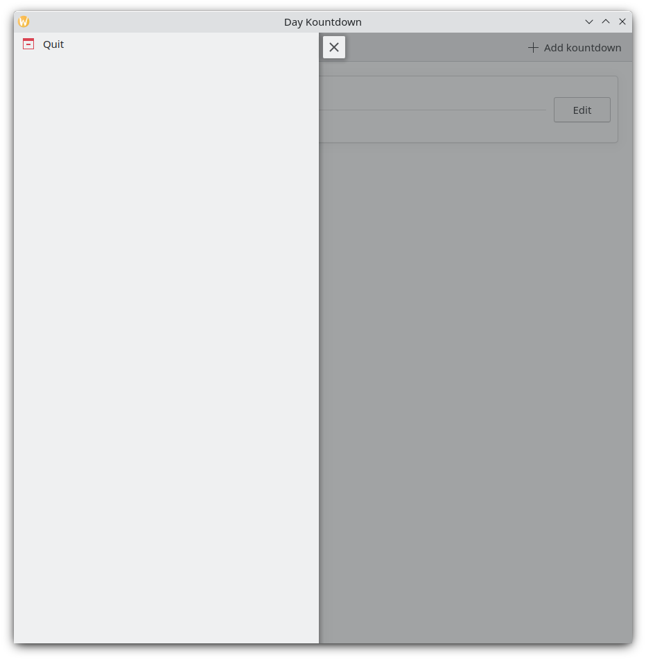
Elke keer dat we op onze knop "Aftellen toevoegen" rechtsboven klikken, wordt onze aangepaste aftelling toegevoegd
Mobiele versie
Globale schuiflade
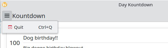
Het volgende component is een Kirigami.GlobalDrawer. Het verschijnt als een hamburger menu. Standaard opent het een zijbalk, wat met name zinvol is bij een mobieltje, omdat de gebruiker gewoon langs de zijkant van het scherm een veegbeweging kan maken om het te openen. Globale schuiflades zijn erg handig voor de algemene navigatie en de bijbehorende acties. We gaan een eenvoudige schuiflade creëren met daarop een knop "afsluiten".
Kirigami.ApplicationWindow {
    id: root
    // Andere venstereigenschappen...
    globalDrawer: Kirigami.GlobalDrawer {
        isMenu: true
        actions: [
            Kirigami.Action {
                text: i18n("Quit")
                icon.name: "application-exit-symbolic"
                shortcut: StandardKey.Quit
                onTriggered: Qt.quit()
            }
        ]
    }
    // ...
}
Hier stoppen we onze globale schuiflade in ons toepassingsvenster. De hoofdeigenschap die we nodig hebben om aandacht aan te geven is GlobalDrawer.actions, die de vorm van een array met Kirigami.Action componenten aanneemt. Deze actie heeft een toepasselijk pictogram en start de functie Qt.quit(), om de toepassing af te sluiten.
Omdat we onze globale schuiflade voor nu eenvoudig houden, stellen we de eigenschap GlobalDrawer.isMenu in op true. Dit toont onze globale schuiflade als een normaal toepassingsmenu, die minder ruimte inneemt dan het standaard globale schuifladepaneel.
Globale schuiflade
Globale schuiflade als menu
Tip
De pagina op acties gebaseerde componenten van deze documenten levert verdere details over acties van Kirigami en hoe ze gebruikt kunnen worden.De context van acties
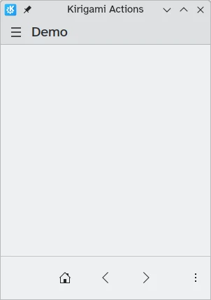
Kirigami componenten zijn zodanig ontworpen dat de plaats waar de Kirigami acties geplaatst worden relevant is. Zoals hierboven te zien is, dat als acties aan een Kirigami.Page, Kirigami.ScrollablePage of elke andere afgeleide pagina-component wordt toegevoegd, dan verschijnen ze aan de rechterzijde van de titel in de desktop mode, en aan de onderkant in de mobile modus.
Daarentegen als if Kirigami acties worden toegevoegd aan een Kirigami.GlobalDrawer, dan verschijnen ze in de resulterende lade of menu.
Andere voorbeelden van Kirigami acties die op andere plekken verschijnen afhankelijk van hun oudercomponent zijn:
- Kirigami.ContextDrawer - ContextDrawer tutorial here
- Kirigami.AbstractCard and derivatives - Instructie over Card hier
- Kirigami.Dialog en afgeleiden - Instructie over het dialoogvenster hier
- Kirigami.ActionToolBar - ActionToolBar handleiding hier
Tussen andere Kirigami-componenten
Onze toepassing (app) tot zover
Main.qml:
| |