Inline berichten
Inline berichten leveren een onmiddellijke manier voor u op om uw gebruikers te informeren over iets wat gebeurde tijdens het gebruik van de toepassing.
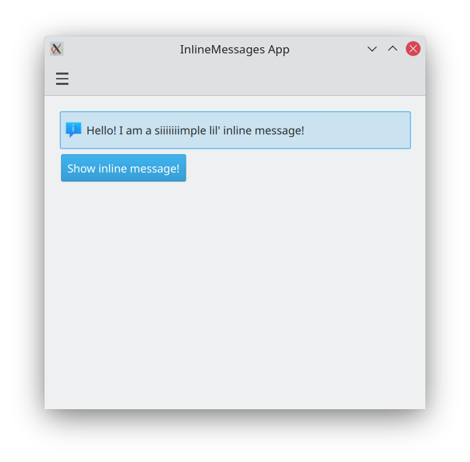
Basis inline bericht
Kirigami.InlineMessage componenten hebben twee belangrijke eigenschappen om aan te denken:
- visible: dit is standaard gezet op false, zodat het bericht alleen verschijnt wanneer u het expliciet wilt. Indien gewenst kan dit aangepast worden door het op true te zetten. Wanneer een verborgen inline bericht op zichtbaar is gezet, krijgt u een leuke animatie.
- text: hier is waar u de tekst van uw inline bericht zet.
import QtQuick
import QtQuick.Layouts
import QtQuick.Controls as Controls
import org.kde.kirigami as Kirigami

Kirigami.Page {

    ColumnLayout {
        Kirigami.InlineMessage {
            id: inlineMessage
            Layout.fillWidth: true
            text: "Hello! I am a siiiiiiimple lil' inline message!"
        }

        Controls.Button {
            text: "Show inline message!"
            onClicked: inlineMessage.visible = !inlineMessage.visible
        }
    }
}
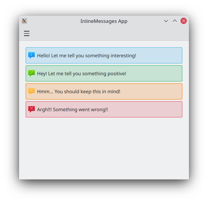
Verschillende typen
Standaard inline berichten zijn als die hierboven: ze hebben een blauwe achtergrond en een standaard pictogram. We kunnen dat wijzigen met de eigenschap type, die ons ons inline bericht op een ander type laat zetten. Er zijn vier typen waar we uit kunnen kiezen:
- Informatie (
Kirigami.MessageType.Information): de standaard. Heeft een blauwe achtergrond, een 'i' pictogram en wordt gebruikt om een resultaat te melden of aan de gebruiker iets algemeens te vertellen. Het is niet nodig om het handmatig te zetten. - Positief (
Kirigami.MessageType.Positive): heeft een groene achtergrond, pictogram met vinkje, en geeft aan dat iets goed ging. - Waarschuwing (
Kirigami.MessageType.Warning): heeft een oranje achtergrond, een pictogram met uitroepteken, en kan gebruikt worden om de gebruiker te waarschuwen voor iets waar deze aan moet denken. - Fout (
Kirigami.MessageType.Error): heeft een rode achtergrond, een pictogram met een kruis, en kan gebruikt worden om de gebruiker te vertellen dat er iets verkeerd ging.
ColumnLayout {

    Kirigami.InlineMessage {
        Layout.fillWidth: true
        text: "Hello! Let me tell you something interesting!"
        visible: true
    }

    Kirigami.InlineMessage {
        Layout.fillWidth: true
        text: "Hey! Let me tell you something positive!"
        type: Kirigami.MessageType.Positive
        visible: true
    }

    Kirigami.InlineMessage {
        Layout.fillWidth: true
        text: "Hmm... You should keep this in mind!"
        type: Kirigami.MessageType.Warning
        visible: true
    }

    Kirigami.InlineMessage {
        Layout.fillWidth: true
        text: "Argh!!! Something went wrong!!"
        type: Kirigami.MessageType.Error
        visible: true
    }

}
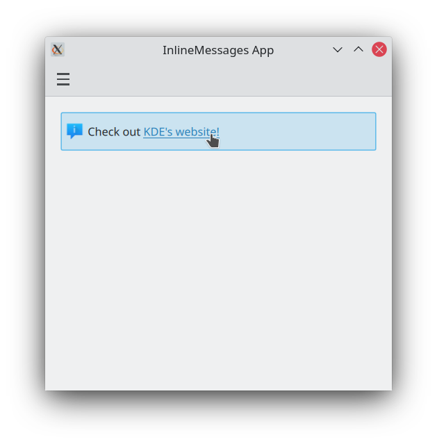
Tekst en pictogrammen aanpassen
Inline meldingen ondersteunen opgemaakte tekst, die gedefinieerd kan worden met eenvoudige HTML-regelopmaak. Dit biedt u het toevoegen van enige formattering aan uw inline berichttekst of zelfs invoegen van een externe webkoppeling als u dat wilt.
Kirigami.InlineMessage {
    Layout.fillWidth: true
    // Merk op dat wanneer u aanhalingstekens in een tekenreeks wilt gebruiken u escape moet
    // gebruiken!
    text: "Check out <a href=\"https://kde.org\">KDE's website!<a/>"
    onLinkActivated: Qt.openUrlExternally(link)
    visible: true
}
U kunt ook het pictogram dat linksboven van uw melding verschijnt aanpassen door een systeempictogram-naam te leveren voor de eigenschap icon.source. Deze pictogramnamen zouden overeen moeten komen met op uw systeem geïnstalleerde pictogrammen; u kunt een toepassing zoals Cuttlefish, geleverd door plasma-sdk, gebruiken om te bladeren en te zoeken naar de beschikbare pictogrammen op uw systeem en zien wat hun namen zijn.
Kirigami.InlineMessage {
    Layout.fillWidth: true
    text: "Look at me! I look SPECIAL!"
    icon.source: "actor"
    visible: true
}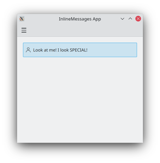
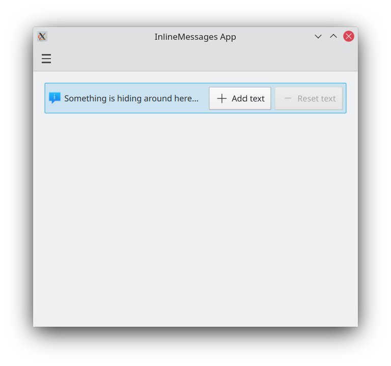
Acties in inline meldingen gebruiken
Als uw meldingen interactief moeten zijn, kunt u Kirigami acties toevoegen aan uw inline meldingen. Net als met pagina's kunt u dit doen door het zetten van de eigenschap InlineMessage.actions op ofwel een Kirigami.Action of een array dat Kirigami.Action componenten bevat.
ColumnLayout {

    Kirigami.InlineMessage {
        id: actionsMessage
        Layout.fillWidth: true
        visible: true

        readonly property string initialText: "Something is hiding around here..."
        text: initialText

        actions: [
            Kirigami.Action {
                enabled: actionsMessage.text == actionsMessage.initialText
                text: qsTr("Add text")
                icon.name: "list-add"
                onTriggered: {
                    actionsMessage.text = actionsMessage.initialText + " Peekaboo!";
                }
            },
            Kirigami.Action {
                enabled: actionsMessage.text != actionsMessage.initialText
                text: qsTr("Reset text")
                icon.name: "list-remove"
                onTriggered: actionsMessage.text = actionsMessage.initialText
            }
        ]
    }
}
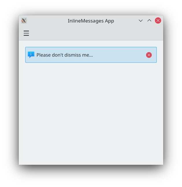
Knoppen voor afsluiten
Inline meldingen leveren een sluitknop die gebruikt kan worden om ze gemakkelijk af te wijzen.
Standaard is deze sluitknop verborgen, maar dit kan overschreven worden door de eigenschap showCloseButton op true te zetten.
Kirigami.InlineMessage {
    Layout.fillWidth: true
    text: "Please don't dismiss me..."
    showCloseButton: true
    visible: true
}