Formulierindeling
De componenten Kirigami.FormLayout maken het gemakkelijk voor u om formulieren te maken die zich conformeren aan de KDE Human Interface Guidelines. Ze zijn optimaal voor dialogen voor instellingen en voor grote groepen besturingselementen en invoervelden die bij elkaar horen.
Als er voldoende ruimte is, krijgen formulierindelingen twee kolommen. De linker kolom bevat de labels geleverd door de kindcomponenten van het formulier, terwijl het rechter de kinderen van het formulier zelf bevatten. Bij meer beperkte ruimte in het venster (of op een mobiel), zullen formulieren bestaan uit een enkele verticale kolom met de labels van kindcomponenten, die geplaatst worden boven hun respectievelijke component.
Eenvoudig formulier
Kirigami.FormLayout componenten zijn in gebruik gelijk aan de componenten QtQuick Layout zoals ColumnLayout of RowLayout. De kindcomponenten zullen automatisch gearrangeerd worden volgens de grootte beschikbaar in de formulierindeling.
Kinderen van een Kirigami.FormLayout hebben een eigenschap genaamd Kirigami.FormData.label. Deze eigenschap laat u het label instellen die geleverd zal worden voor de betreffende kindcomponent.
import QtQuick
import QtQuick.Layouts
import QtQuick.Controls as Controls
import org.kde.kirigami as Kirigami

Kirigami.ApplicationWindow {
    pageStack.initialPage: Kirigami.Page {

        Kirigami.FormLayout {
            anchors.fill: parent

            Controls.TextField {
                Kirigami.FormData.label: "TextField 1:"
            }
            Controls.TextField {
                Kirigami.FormData.label: "TextField 2:"
            }
            Controls.TextField {
                Kirigami.FormData.label: "TextField 3:"
            }
        }
    }
}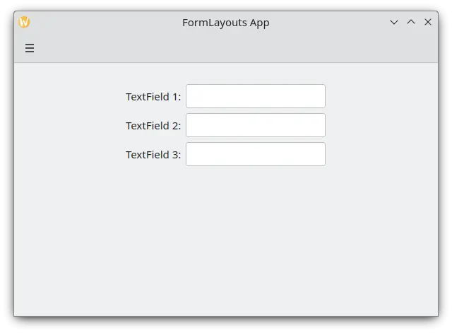
Een eenvoudige indeling van een formulier in modus bureaublad
Secties en scheidingstekens
FormLayouts kunnen ook opgedeeld worden in secties. Instellen waar een sectie begint is net zo gemakkelijk als instellen van een kindcomponent van Kirigami.FormData.isSection op true. Dit zal de component leveren met enige extra marges bovenaan om het begin van de nieuwe sectie aan te geven.
Kirigami.Separator componenten zijn het best geschikt voor het beginnen van nieuwe secties. Scheidingen worden gebruikt om een dunne horizontale lijn te tekenen, die het einde van een sectie aangeeft. Als u liever geen lijn, getekend tussen secties, wilt hebben, dan kunt u een standaard QML-eigenschap Item gebruiken. Alternatief zou u de eigenschap Kirigami.FormData.isSection kunnen gebruiken op elke andere component.
Dit is echter niet aanbevolen. Op componenten waar Kirigami.FormData.isSection is gezet op true, zal het label tekst geleverd voor deze eigenschap Kirigami.FormData.label getoond worden als de koptekst van de sectie.
Waarschuwing
Dit is niet van toepassing op elke component, dus de aanbeveling dat u componenten Kirigami.Separator of Item gebruikt op plaatsen waar u liever een koptekst zou gebruiken.Deze koptekst is groter dan de normale labeltekst en geeft aan de gebruikers een nette visuele aanwijzing waar de sectie formulierindeling over gaat.
Kirigami.FormLayout {
    anchors.fill: parent

    Controls.TextField {
        Kirigami.FormData.label: "TextField 1:"
    }
    Controls.TextField {
        Kirigami.FormData.label: "TextField 2:"
    }
    Controls.TextField {
        Kirigami.FormData.label: "TextField 3:"
    }
    Kirigami.Separator {
        Kirigami.FormData.isSection: true
        Kirigami.FormData.label: "New Section!"
    }
    ColumnLayout {
        Kirigami.FormData.label: "Radio buttons"
        Controls.RadioButton {
            text: "Radio 1"
            checked: true
        }
        Controls.RadioButton {
            text: "Radio 2"
        }
        Controls.RadioButton {
            text: "Radio 3"
        }
    }
    Item {
        Kirigami.FormData.isSection: true
        Kirigami.FormData.label: "Another Section! (lineless though)"
    }
    Controls.TextField {
        Kirigami.FormData.label: "TextField 4:"
    }
    Controls.TextField {
        Kirigami.FormData.label: "TextField 5:"
    }
    Controls.TextField {
        Kirigami.FormData.label: "TextField 5:"
    }
}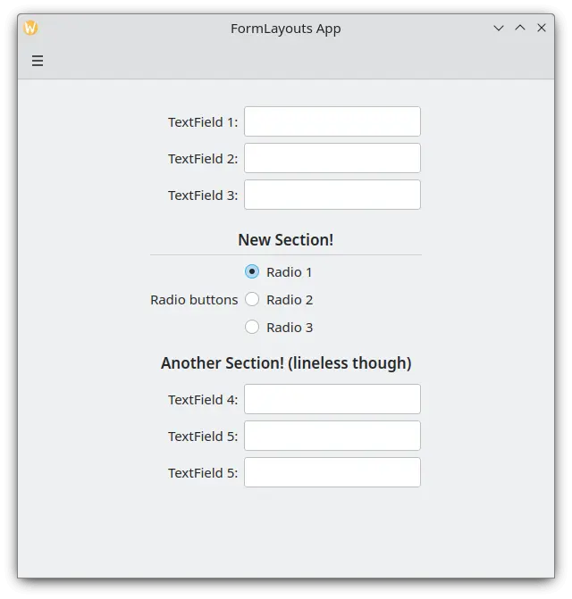
Een formulierindeling met secties
Een bureaublad- of mobielindeling afdwingen
Als u liever hebt dat uw formulierindeling consistent blijft onafhankelijk van de omgeving van uw toepassing, dan kunt u de eigenschap wideMode van de component Kirigami.FormLayout gebruiken.
- Indien gezet op
true, zal de formulierindeling gestructureerd zijn in een voor het bureaublad geoptimaliseerd indeling breed scherm (dubbele kolommen) - Indien gezet op
false, zal de formulierindeling gestructureerd zijn in een indeling voor een mobiel (enkele kolom)
Kirigami.FormLayout {
    anchors.fill: parent
    wideMode: false

    Controls.TextField {
        Kirigami.FormData.label: "TextField 1:"
    }
    Controls.TextField {
        Kirigami.FormData.label: "TextField 2:"
    }
    Controls.TextField {
        Kirigami.FormData.label: "TextField 3:"
    }
}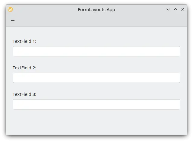
Een formulierindeling met afdwongen indeling voor mobiel
Uw labels uitlijnen
Er zijn exemplaren wanneer u een label wilt toekennen aan componenten die meer dan één regel hebben of aan een lijst componenten. Dit kan bereikt worden door de Kirigami.FormData.label te stoppen in de ColumnLayout, zoals u zou kunnen hebben opgemerkt in Secties en scheidingstekens. Standaard is de label gepositioneerd in het verticale centrum van de indeling, wat niet altijd wenselijk is. We kunnen dit met hulp van Kirigami.FormData.labelAlignment wijzigen.
Kirigami.FormLayout {
    anchors.fill: parent

    ColumnLayout {
        Kirigami.FormData.label: "This is a label:"
        Kirigami.FormData.labelAlignment: Qt.AlignTop

        Controls.Label {
            text: "This is some rather long text \nthat should elide to multiple lines \nto show how the label gets aligned."
            elide: Text.elideLeft
        }
    }
}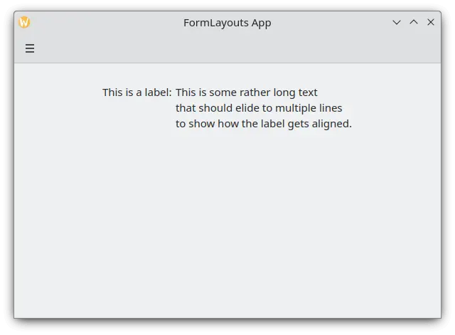
Een formulierindeling met een label bovenaan uitgelijnd
De uitlijning van het label is speciaal handig om componenten te behandelen of lijsten componenten waarvan u de grootte van tevoren niet weet. Elisa is hier een erg goed voorbeeld van:
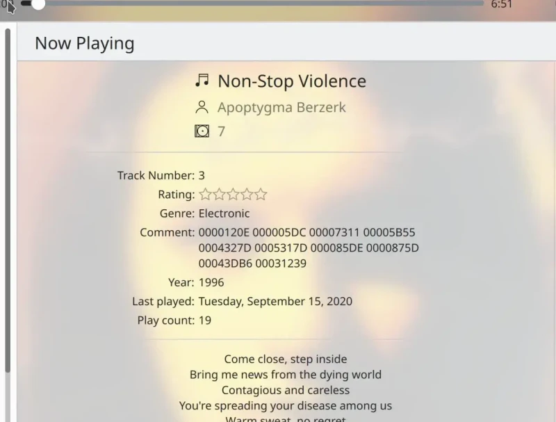
Het commentaarlabel is alleen bovenaan uitgelijnd wanneer zijn bijbehorende component meer dan één regel heeft
We kunnen hierbij iets soortgelijks doen met een JavaScript ternary-operator:
Kirigami.FormLayout {
    anchors.fill: parent

    ColumnLayout {
        Kirigami.FormData.label: "This is a label:"
        Kirigami.FormData.labelAlignment: labelText.text.lineCount > 1 ? Qt.AlignTop : Qt.AlignVCenter

        Controls.Label {
            id: labelText
            text: "This is some rather long text \nthat should elide to a new line \nso it appears below the Form Label."
            elide: Text.elideLeft
        }
    }
}