Aggiungere azioni
Ricapitoliamo
Finora abbiamo creato una semplice applicazione in grado di visualizzare le schede. Tuttavia, al momento non è possibile per l'utente aggiungere nuove schede alla visualizzazione schede.
In questa esercitazione guarderemo le azioni di Kirigami: ci aiuteranno ad aggiungere l'interattività al nostro programma, in modo coerente, veloce e accessibile.
Azioni
Un Kirigami.Action incapsula un'azione dell'interfaccia utente. Possiamo usarli per fornire alle nostre applicazioni azioni facili da raggiungere che sono essenziali per la loro funzionalità.
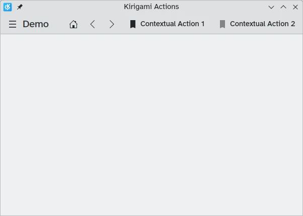
Se hai già usato delle applicazioni in Kirigami avrai certamente interagito con le azioni di Kirigami. In quest'immagine, alla destra del titolo della pagina possiamo vedere delle azioni con varie icone. Le azioni di Kirigami possono essere visualizzate in molti modi e possono fare molte cose.
Aggiunta dei conti alla rovescia
Un applicazione per il conto alla rovescia è abbastanza inutile senza la possibilità di aggiungerne qualcuno. Creiamo un'azione che ci permetterà di farlo.
pageStack.initialPage: Kirigami.ScrollablePage {
    // Altre proprietà della pagina...
    actions: [
        Kirigami.Action {
            id: addAction
            icon.name: "list-add-symbolic"
            text: i18nc("@action:button", "Add kountdown")
            onTriggered: kountdownModel.append({
                name: "Kirigami Action added card!",
                description: "Congratulations, your Kirigami Action works!",
                date: 1000
            })
        }
    ]
    // ...
}
Stiamo inserendo il nostro Kirigami.Action nella nostra pagina principale dei tutorial precedenti. Se volessimo, potremmo aggiungere più azioni alla nostra pagina (e persino annidare azioni all'interno di azioni!).
Le parentesi [] utilizzate sopra sono simili agli array JavaScript, il che significa che puoi passare loro uno o più elementi, separati da virgola:
// Array generale di componenti JavaScript:
variable: [ component1, component2 ]
// Passare una serie di azioni Kirigami a QML:
actions: [ Kirigami.Action {}, Kirigami.Action {} ]
Le proprietà "id" e "text" dovrebbero essere familiari dai tutorial precedenti. Tuttavia, la proprietà ereditata Action.icon dovrebbe essere interessante: è un oggetto con diverse proprietà che ti consentono di visualizzare determinate icone per le tue azioni. Fortunatamente, per usare le icone di KDE tutto ciò che dobbiamo fare è fornire la proprietà name per la proprietà icon, icon.name.
Visualizzazione delle icone disponibili
Fai clic qui per vedere come controllare le icone disponibili nel sistema
Icon Explorer è un'applicazione KDE che ti consente di visualizzare tutte le icone che puoi utilizzare per la tua applicazione. Offre una serie di funzionalità utili come anteprime del loro aspetto su diversi temi installati, anteprime di dimensioni diverse e altro ancora. Potresti trovarlo uno strumento utile quando decidi quali icone utilizzare nella tua applicazione.
Molte delle icone di KDE seguono la specifica di denominazione delle icone di FreeDesktop. Pertanto, potresti trovare utile consultare il sito web del progetto FreeDesktop, che elenca tutti i nomi di icone compatibili con più desktop.
Il gestore del segnale onTriggered è il più importante. Questo è ciò che farà la nostra azione quando verrà utilizzata. Noterai che nel nostro esempio stiamo utilizzando il metodo kountdownModel.append del kountdownModel che abbiamo creato nel nostro tutorial precedente. Questo metodo ci consente di aggiungere un nuovo elemento al nostro modello di elenco. Gli stiamo fornendo un oggetto (indicato dalle parentesi graffe {}) che ha le proprietà rilevanti per i nostri conti alla rovescia (nome, descrizione e un segnaposto data).
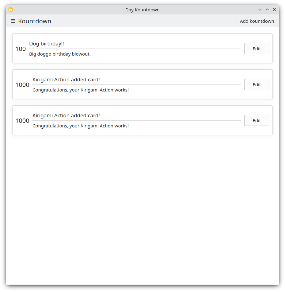
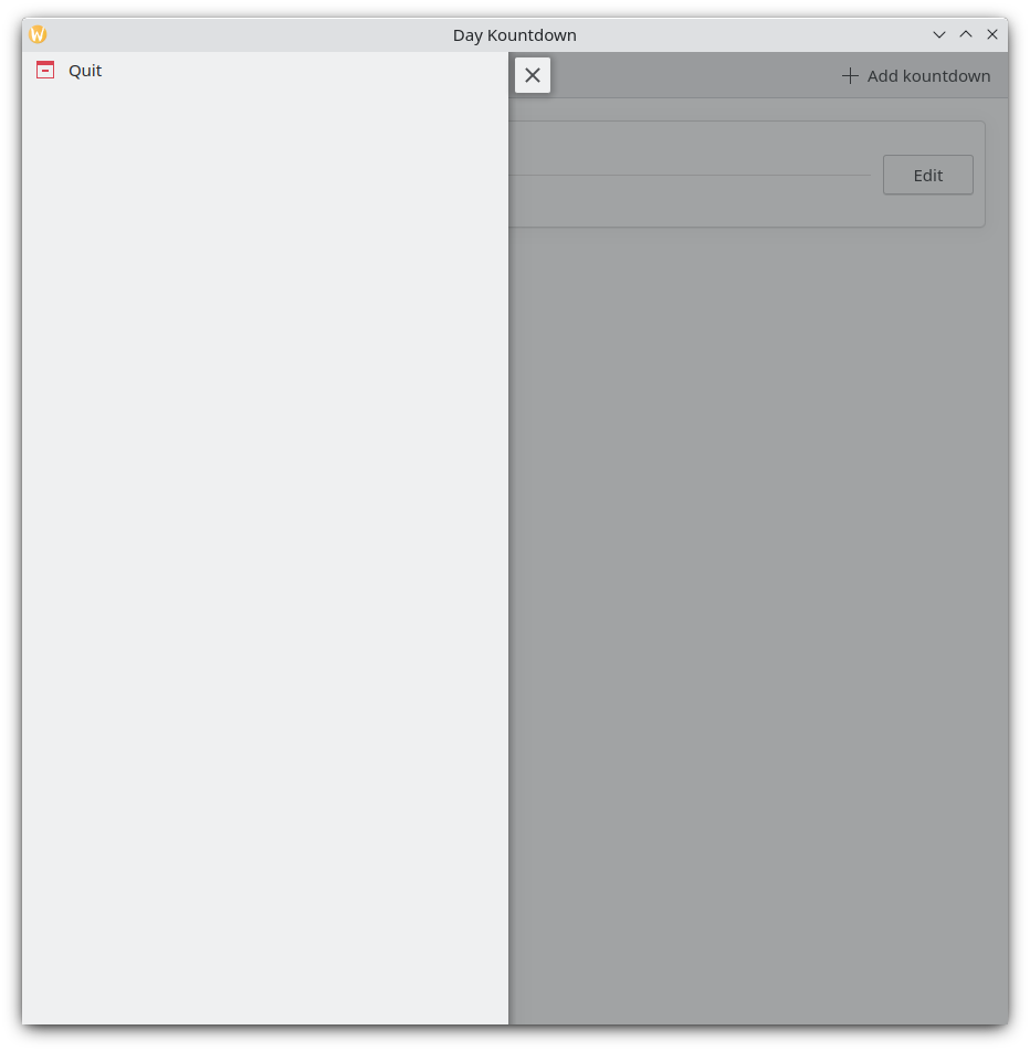
Ogni volta che facciamo clic sul pulsante "Aggiungi conto alla rovescia" in alto a destra, viene aggiunto il nostro conto alla rovescia personalizzato
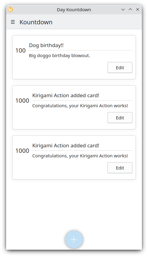
Versione mobile
Cassetto globale
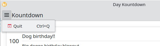
Il componente successivo è un Kirigami.GlobalDrawer. Si presenta come un menu di hamburger. Per impostazione predefinita si apre una barra laterale, che è particolarmente utile sui dispositivi mobili, poiché l'utente può semplicemente scorrere un lato dello schermo per aprirla. I cassetti globali sono utili per la navigazione e le azioni globali. Creeremo un semplice cassetto globale che include un pulsante «esci».
Kirigami.ApplicationWindow {
    id: root
    // Altre proprietà della finestra...
    globalDrawer: Kirigami.GlobalDrawer {
        isMenu: true
        actions: [
            Kirigami.Action {
                text: i18n("Quit")
                icon.name: "application-exit-symbolic"
                shortcut: StandardKey.Quit
                onTriggered: Qt.quit()
            }
        ]
    }
    // ...
}
Qui inseriamo il nostro cassetto globale nella finestra dell'applicazione. La proprietà principale a cui dobbiamo prestare attenzione è GlobalDrawer.actions, che assume la forma di un array di componenti Kirigami.Action. Questa azione ha un'icona appropriata ed esegue la funzione Qt.quit() quando attivata, chiudendo l'applicazione.
Dato che per ora manteniamo semplice il nostro cassetto globale, stiamo impostando la proprietà GlobalDrawer.isMenu su "true". Questo visualizza il nostro cassetto globale come un normale menu dell'applicazione, occupando meno spazio rispetto al riquadro del cassetto globale predefinito.
Cassetto globale
Cassetto globale come menu
Suggerimento
La pagina Componenti basati su azioni di questi documenti fornisce ulteriori dettagli sulle azioni Kirigami e su come possono essere utilizzate.Le azioni sono contestuali
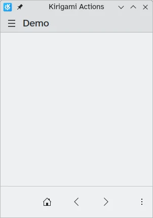
I componenti di Kirigami sono progettati in modo tale che il luogo in cui inserisci le azioni di Kirigami sia rilevante. Come visto sopra, se aggiungi azioni a Kirigami.Page, Kirigami.ScrollablePage o qualsiasi altro componente derivato della pagina, verranno visualizzate sul lato destro dell'intestazione in modalità desktop e in basso in modalità mobile.
Allo stesso modo, se le azioni Kirigami vengono aggiunte a un Kirigami.GlobalDrawer, saranno visualizzate nel cassetto o nel menu risultante.
Altri esempi di azioni Kirigami visualizzate in modo diverso a seconda del componente principale sono:
- Kirigami.ContextDrawer - Tutorial su ContextDrawer qui
- Kirigami.AbstractCard e derivati - Tutorial sulle schede qui
- Kirigami.Dialog e derivati - Tutorial sulla finestra di dialogo qui
- Kirigami.ActionToolBar - Tutorial su ActionToolBar qui
Tra gli altri componenti Kirigami.
Il nostro programma finora
Main.qml:
| |