Pagine scorrevoli e viste a elenco
Kirigami.ScrollablePage
Una Kirigami.ScrollablePage è una pagina che contiene contenuto scorrevole, come un ListView. Lo scorrimento, così come gli indicatori di scorrimento, vengono gestiti automaticamente.
Kirigami.ScrollablePage {
    id: root
    //Il rettangolo sarà automaticamente scorrevole
    Rectangle {
        width: root.width
        height: 99999
    }
}
In quasi ogni altra modalità, una pagina scorrevole è uguale a una pagina normale.
Attenzione
Non inserire un ScrollView all'interno di un Kirigami.ScrollablePage; i figli di unKirigami.ScrollablePage sono già all'interno di un ScrollView.ListView in ScrollablePage
Quando i figli diretti di una Kirigami.ScrollablePage si estendono verticalmente oltre la dimensione della pagina stessa, appare una barra di scorrimento sul bordo destro della pagina e la pagina sarà scorrevole.
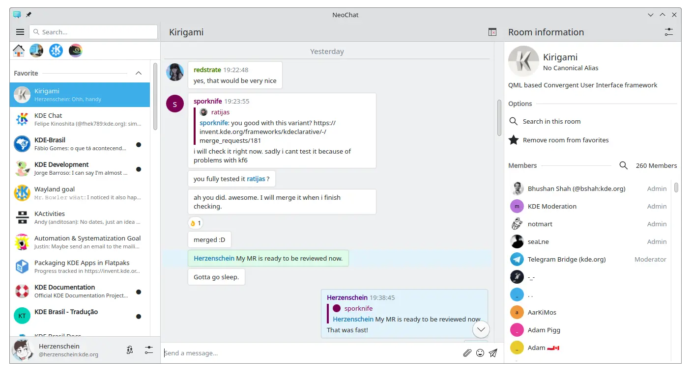
Due pagine scorrevoli, entrambe contenenti un ListView con contenuti personalizzati (schermata di NeoChat)
Spesso hai più di un figlio nella tua Kirigami.ScrollablePage e posizionare gli elementi può essere complicato, specialmente in combinazione con una ListView.
- Per i componenti non visivi, averli all'interno del componente ListView non modificherà la grafica della pagina, quindi possiamo spostarli all'interno dell'ambito della visualizzazione elenco. Lo stesso vale per gli elementi ancorati al centro della pagina, come i messaggi segnaposto per le visualizzazioni elenco vuote.
- Per altri elementi, potrebbe avere senso spostarli nell'intestazione o nel piè di pagina della Kirigami.ScrollablePage. Questo è spesso il caso delle barre di ricerca.
PlaceholderMessage
È possibile aggiungere un Kirigami.PlaceholderMessage con alcune istruzioni nel caso in cui la vista elenco sia vuota.
Kirigami.ScrollablePage {
    ListView {
        id: listView
        Kirigami.PlaceholderMessage {
            anchors.centerIn: parent
            width: parent.width - (Kirigami.Units.largeSpacing * 4)
            visible: listView.count === 0
            text: i18n("No data found")
            helpfulAction: Kirigami.Action {
            text: i18n("Load data")
                // Altro codice...
            }
        }
        model: // Codice modello...
    }
}
Cercare nella ListView
Un campo di ricerca viene spesso aggiunto a una Kirigami.ScrollablePage per filtrare ListView. Questo può essere fatto modificando il titleDelegate predefinito per utilizzare invece un Kirigami.SearchField.
Kirigami.ScrollablePage {
    titleDelegate: Kirigami.SearchField {
        Layout.topMargin: Kirigami.Units.smallSpacing
        Layout.bottomMargin: Kirigami.Units.smallSpacing
        Layout.fillHeight: true
        Layout.fillWidth: true
        onTextChanged: mySortFilterModel.filterText = text
        KeyNavigation.tab: listView
    }

    ListView {
        id: listView
        // Resto del codice listview...
    }
}
Suggerimento
Puoi utilizzare KSortFilterProxyModel da KItemModel per aggiungere facilmente funzionalità di filtro direttamente in QML senza bisogno di codice C++.Tira per ricaricare
Un'altra funzione fornita da questo componete è l'azione Tira per ricaricare. Per usarla, attivala come segue:
Kirigami.ScrollablePage {
    id: view
    supportsRefreshing: true
    onRefreshingChanged: {
        if (refreshing) {
            myModel.refresh();
        }
    }
    ListView {
        // NOTA: MyModel non proviene dai componenti, è puramente un esempio di come può essere
        // utilizzato insieme ad una logica applicativa in grado di aggiornare il modello di elenco
        // e segnalarne il completamento.
        model: MyModel {
            onRefreshDone: view.refreshing = false;
        }
        delegate: BasicListItem {}
    }
}
Tirando verso il basso è inoltre possibile attivare una modalità speciale con un margine superiore più ampio che semplifica l'utilizzo dell'applicazione con una sola mano.