Barre di avanzamento e indicatori
Se la tua applicazione fa qualcosa che impiega una notevole quantità di tempo, vorrai utilizzare un elemento visivo che dice all'utente che sta succedendo qualcosa dietro le quinte.
I controlli di QtQuick forniscono due utili componenti che puoi usare a questo scopo.
Barra di avanzamento
Controls.ProgressBar è un componente che ti consente di includere facilmente barre di avanzamento nella tua applicazione. Ci sono quattro proprietà principali che dovrai utilizzare:
- from: il valore minimo rappresentato dall'inizio della barra di avanzamento
- to: il valore massimo rappresentato dalla fine della barra di avanzamento
- valore: il valore corrente dell'azione in corso (ad esempio caricato al 50%)
- indeterminato: se l'azione in corso attualmente non ha un valore di avanzamento chiaro, puoi impostare questa proprietà su "true" per mostrare all'utente che sta accadendo qualcosa ma il suo progresso non è ancora chiaro (ma lo sarà presto).
import QtQuick
import QtQuick.Layouts
import QtQuick.Controls as Controls
import org.kde.kirigami as Kirigami

Kirigami.ApplicationWindow {
    title: "Progressbar App"
    width: 400
    height: 400
    pageStack.initialPage: Kirigami.Page {
        ColumnLayout {
            anchors.left: parent.left
            anchors.right: parent.right
            Controls.ProgressBar {
                Layout.fillWidth: true
                from: 0
                to: 100
                value: 50
                indeterminate: false
            }
            Controls.ProgressBar {
                Layout.fillWidth: true
                from: 0
                to: 100
                // valore: 50
                indeterminate: true
            }
        }
    }
}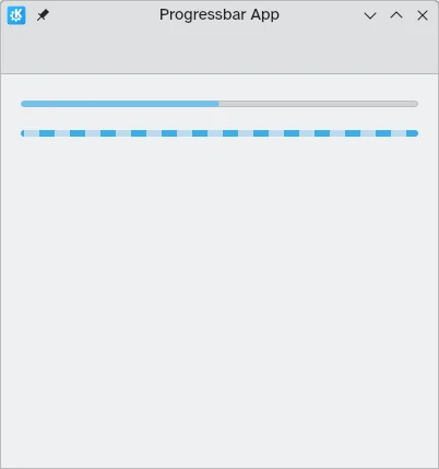
Sopra: la barra di avanzamento e al 50%; sotto: barra di avanzamento indeterminata
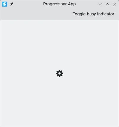
Indicatore di occupato
Nei casi in cui i tempi di caricamento sono più brevi o la misurazione dei progressi non è fattibile, puoi invece utilizzare Controls.BusyIndicator. Questo componente fornisce una semplice ruota che gira che mostra agli utenti che sta succedendo qualcosa.
Se desideri che l'indicatore interrompa l'esecuzione, puoi farlo impostando la proprietà running su false, nel qual caso il file .
import QtQuick
import QtQuick.Controls as Controls
import org.kde.kirigami as Kirigami

Kirigami.ApplicationWindow {
    title: "Progressbar App"
    width: 400
    height: 400
    pageStack.initialPage: Kirigami.Page {
        actions: [
            Kirigami.Action {
                text: "Toggle busy indicator"
                onTriggered: indicator.running ? indicator.running = false : indicator.running = true
            }
        ]
        Controls.BusyIndicator {
            id: indicator
            anchors.centerIn: parent
        }
    }
}