Cassetti
I cassetti sono dei pannelli che scivolano fuori dai lati della finestra dell'applicazione. Possono essere popolati con degli elementi interattivi quali azioni di Kirigami, pulsanti, testo e altro.
I cassetti arrivano in diversi tipi, forme e moduli. In questa pagina esamineremo tutti i tipi, e forniremo una panoramica sulle loro caratteristiche.
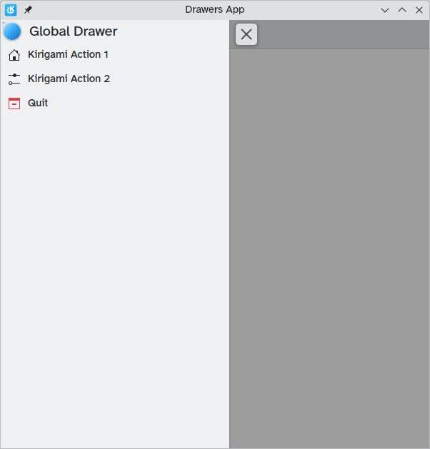
Cassetto globale
Il cassetto globale è una funzionalità standard delle applicazioni di KDE per dispositivi mobili, ma può essere trovata anche nella loro incarnazione per desktop. Contiene un menu principale dell'applicazione: vengono incluse qui molte funzioni che non sono specifiche per la pagina corrente ma che sono sempre significative per la navigazione generale o con l'interazione dell'applicazione.
Può essere attivato toccando il menu dell'hamburger o scorrendo dal bordo sinistro al centro dello schermo in modalità Da sinistra a destra o dal bordo destro in modalità Da destra a sinistra.
I componenti Kirigami.GlobalDrawer sono ciò che usiamo per creare tali cassetti. Questi sono impostati sulla proprietà globalDrawer della proprietà Kirigami.ApplicationWindow che costituisce la base della nostra applicazione Kirigami.
import QtQuick
import org.kde.kirigami as Kirigami

Kirigami.ApplicationWindow {
    title: "Drawers App"
    width: 600
    height: 600
    pageStack.initialPage: Kirigami.Page { /* Page code here... */ }

    globalDrawer: Kirigami.GlobalDrawer {
        title: "Global Drawer"
        titleIcon: "applications-graphics"
        actions: [
            Kirigami.Action {
                text: "Kirigami Action 1"
                icon.name: "user-home-symbolic"
                onTriggered: showPassiveNotification("Action 1 clicked")
            },
            Kirigami.Action {
                text: "Kirigami Action 2"
                icon.name: "settings-configure-symbolic"
                onTriggered: showPassiveNotification("Action 2 clicked")
            },
            Kirigami.Action {
                text: i18n("Quit")
                icon.name: "application-exit-symbolic"
                shortcut: StandardKey.Quit
                onTriggered: Qt.quit()
            }
        ]
    }
}
Nota
La proprietà titleIcon prende i nomi per le icone a livello di sistema in base alle specifiche di FreeDesktop. Queste icone e i nomi delle icone possono essere visualizzati con l'applicazione CuttleFish di KDE fornita con plasma-sdk o visitando Specifiche di denominazione delle icone di FreeDesktop.Intestazione
Le intestazioni possono essere utilizzate per posizionare componenti adesivi nella parte superiore del tuo cassetto globale. I componenti dell'intestazione rimarranno al loro posto anche se il tuo cassetto globale contiene azioni Kirigami nidificate che sostituiscono il livello corrente nel cassetto globale.
Il componente di intestazione scelto può essere impostato con la proprietà header del cassetto globale e sostituirà il titolo del cassetto globale. Questo è utile per aggiungere un Kirigami.SearchField, ad esempio:
import QtQuick
import org.kde.kirigami as Kirigami

Kirigami.ApplicationWindow {
    title: "Drawers App"
    width: 600
    height: 600
    pageStack.initialPage: Kirigami.Page { /* Page code here... */ }

    globalDrawer: Kirigami.GlobalDrawer {
        title: "Global Drawer with searchfield (not visible)"

        header: Kirigami.SearchField {
                id: searchField
        }

        actions: [
            Kirigami.Action {
                text: "Kirigami Action 1"
                icon.name: "user-home-symbolic"
                onTriggered: showPassiveNotification("Action 1 clicked")
            },
            Kirigami.Action {
                text: "Kirigami Action 2"
                icon.name: "settings-configure-symbolic"
                onTriggered: showPassiveNotification("Action 2 clicked")
            },
            Kirigami.Action {
                text: i18n("Quit")
                icon.name: "application-exit-symbolic"
                shortcut: StandardKey.Quit
                onTriggered: Qt.quit()
            }
        ]
    }
}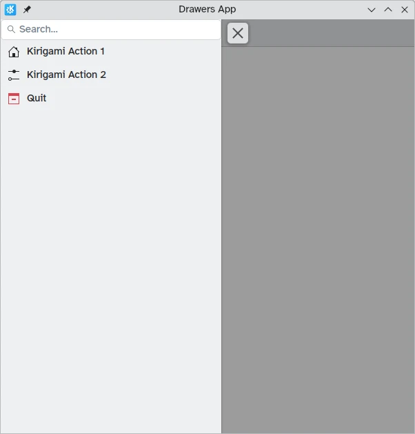
Il nostro cassetto globale ora mostra il componente barra di ricerca che abbiamo impostato come intestazione.
Adattamento al tuo desktop
Sebbene i cassetti globali in stile pannello possano essere utili negli ambienti mobili, potrebbero essere troppo grandi sul desktop, soprattutto quando l'applicazione ha poche azioni.
Per fortuna, i cassetti globali di Kirigami forniscono una proprietà isMenu. Se impostati su "true", si trasformano in menu più tradizionali solo sul desktop.
Nota
In questa modalità menu le intestazioni e gli striscioni non sono visibili.globalDrawer: Kirigami.GlobalDrawer {
isMenu: true
actions: [
// Azioni Kirigami qui...
]
}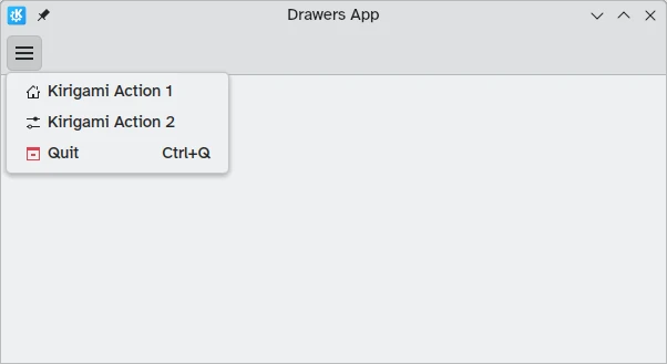
Cassetto globale in modalità menu, senza intestazione o banner
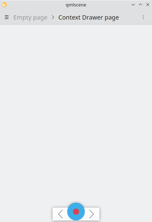
Cassetti di contesto
Mentre un Kirigami.GlobalDrawer mostra le azioni globali disponibili in tutta l'applicazione, un Kirigami.ContextDrawer dovrebbe essere usato per visualizzare azioni che sono rilevanti solo in determinati contesti. Di solito viene utilizzato in pagine separate.
Un cassetto contestuale si comporterà in modo diverso a seconda che venga utilizzato su una piattaforma mobile o su un desktop.
Su un desktop, quando una finestra ha spazio sufficiente, le azioni contestuali vengono visualizzate come parte del gruppo azioni nella barra degli strumenti in alto. Quando lo spazio è limitato, come su un dispositivo mobile o in una finestra stretta, le azioni contestuali sono nascoste dietro un menu ad hamburger sul lato destro. Questo è diverso dalle altre azioni del gruppo "actions", vale a dire "actions.main", "actions.left" e "actions.right"; questi non vengono nascosti nelle finestre con vincoli di spazio e vengono invece compressi nelle rispettive icone.
| |
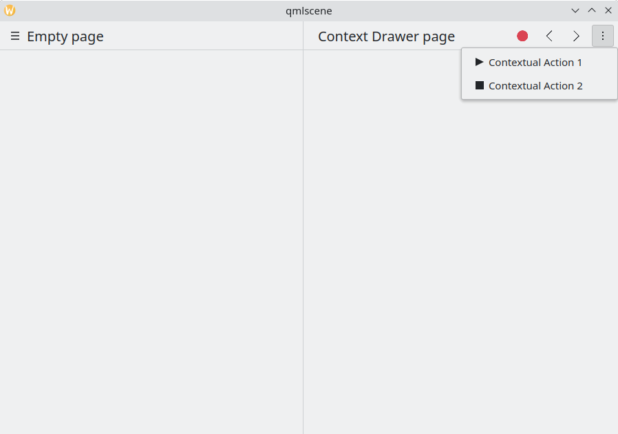
Cassetto contestuale con azioni contestuali nascoste
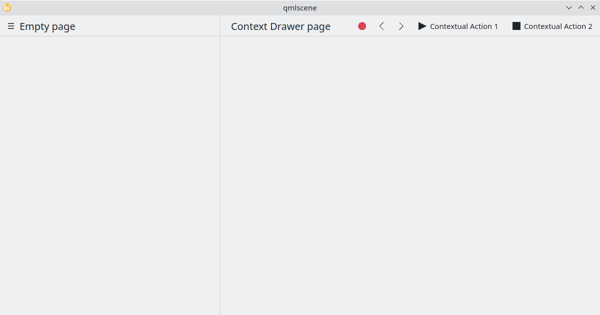
Cassetto contestuale che mostra tutte le azioni contestuali
Sui dispositivi mobili, il cassetto è sempre composto da azioni nascoste dietro un menu hamburger. Può essere attivato toccando il menu hamburger o scorrendo dal bordo destro al centro dello schermo in modalità Da sinistra a destra o dal bordo sinistro in modalità Da destra a sinistra.
Stesso esempio sopra, in esecuzione in modalità mobile
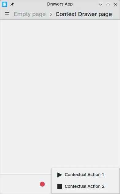
Cassetto contestuale aperto in modalità mobile
Cassetti modali e in linea
Kirigami offre due ulteriori tipi di cassetti, cassetti modali e cassetti in linea. Sono abbastanza simili tra loro: entrambi coprono l'intera larghezza o altezza dell'applicazione e possono essere posizionati sui bordi della finestra dell'applicazione. Tuttavia, reagiscono in modo diverso all'interazione dell'utente.
- I cassetti modali sono nascosti per impostazione predefinita e oscurano il resto dell'applicazione, venendo chiusi quando si fa clic su un'area oscurata.
- I cassetti in linea vengono visualizzati per impostazione predefinita e consentono all'utente di interagire comunque con il resto dell'applicazione senza essere chiuso e non oscurano le altre aree.
Questo tipo di cassetto è aperto e flessibile, ma in generale potresti voler utilizzare questo tipo di cassetto quando desideri che un piccolo elenco di opzioni appaia premendo a lungo o facendo clic con il pulsante destro del mouse.
Questi due cassetti sono così simili perché possono, in effetti, essere implementati utilizzando lo stesso componente Kirigami: Kirigami.OverlayDrawer. Ecco alcune importanti proprietà ereditate di questo componente da tenere a mente:
- Popup.modal controlla se il cassetto sarà modale o inline a seconda di un valore booleano.
- Drawer.edge controlla su quale bordo della finestra dell'applicazione apparirà il cassetto; le opzioni per questa proprietà fanno parte di Edge enum, ovvero
Qt.TopEdge,Qt.RightEdge,Qt.BottomEdgeeQt.LeftEdge. - Popup.contentItem contiene il componente che formerà il contenuto del tuo cassetto.
import QtQuick
import QtQuick.Layouts
import QtQuick.Controls as Controls
import org.kde.kirigami as Kirigami

Kirigami.ApplicationWindow {
    title: "Drawers App"
    width: 400
    height: 600
    pageStack.initialPage: Kirigami.Page {
        title: "OverlayDrawer at the bottom"
        actions: [
            Kirigami.Action {
                text: "Open bottomDrawer"
                onTriggered: bottomDrawer.open()
            }
        ]
        Kirigami.OverlayDrawer {
            id: bottomDrawer
            edge: Qt.BottomEdge
            // Imposta modale a falso per rendere questo cassetto in linea!
            modal: true

            contentItem: RowLayout {
                Controls.Label {
                    Layout.fillWidth: true
                    text: "Say hello to my little drawer!"
                }
                Controls.Button {
                    text: "Close"
                    onClicked: bottomDrawer.close()
                }
            }
        }
    }
}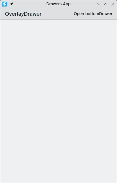
Cassetto modale non visibile
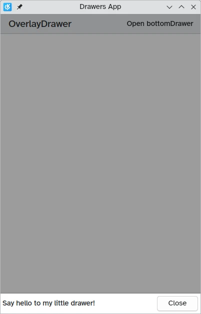
Cassetto modale sul bordo inferiore dello schermo