Controlli ed elementi interattivi
Kirigami fa uso di un'ampia selezione di diversi elementi interattivi di Qt che puoi utilizzare nelle tue applicazioni. Ogni tipo diverso ha stili di interazione, stili visivi e funzionalità leggermente diversi. L'utilizzo del giusto tipo di controllo nella tua applicazione può contribuire a rendere l'interfaccia utente più reattiva e intuitiva.
Pulsanti
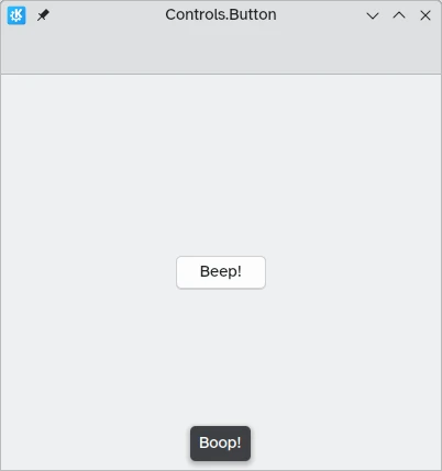
Nelle app Kirigami utilizziamo il [pulsante] QtQuick Controls (https://doc.qt.io/qt-6/qml-qtquick-controls-button.html). Usarli è piuttosto semplice: impostiamo la proprietà text e qualsiasi azione che vogliamo che esegua è impostata sulla proprietà onClicked.
import QtQuick
import QtQuick.Layouts
import QtQuick.Controls as Controls
import org.kde.kirigami as Kirigami

Kirigami.ApplicationWindow {
    title: "Controls.Button"
    width: 400
    height: 400
    pageStack.initialPage: Kirigami.Page {
        ColumnLayout {
            anchors.fill: parent
            Controls.Button {
                Layout.alignment: Qt.AlignCenter
                text: "Beep!"
                onClicked: showPassiveNotification("Boop!")
            }
        }
    }
}
Pulsanti attivabili
Il comportamento dei pulsanti può essere modificato per renderli commutabili: in questa modalità rimarranno premuti finché non verranno cliccati nuovamente. Questa modalità può essere attivata impostando la proprietà checkable su "true"; possiamo anche impostare i pulsanti in modo che siano attivati per impostazione predefinita impostando checked su "true".
Possiamo ottenere il massimo dai pulsanti attivabili utilizzando il gestore del segnale "onCheckedChanged" che è generato automaticamente dal Segnale selezionato. Funziona in modo simile a "onClicked", tranne che qui l'azione assegnata verrà eseguita quando cambia lo stato del pulsante. È una proprietà booleana, che può tornare utile per casi d'uso specifici.
In questo esempio, impostiamo la visibilità di un cassetto in linea in base allo stato di un pulsante commutabile:
import QtQuick
import QtQuick.Layouts
import QtQuick.Controls as Controls
import org.kde.kirigami as Kirigami

Kirigami.ApplicationWindow {
    title: "Controls.Button (toggleable version)"
    width: 400
    height: 400
    pageStack.initialPage: Kirigami.Page {
        ColumnLayout {
            anchors.fill: parent
            Controls.Button {
                Layout.alignment: Qt.AlignCenter
                text: "Hide inline drawer"
                checkable: true
                checked: true
                onCheckedChanged: myDrawer.visible = checked
            }

            Kirigami.OverlayDrawer {
                id: myDrawer
                edge: Qt.BottomEdge
                modal: false

                contentItem: Controls.Label {
                    text: "Peekaboo!"
                }
            }
        }
    }
}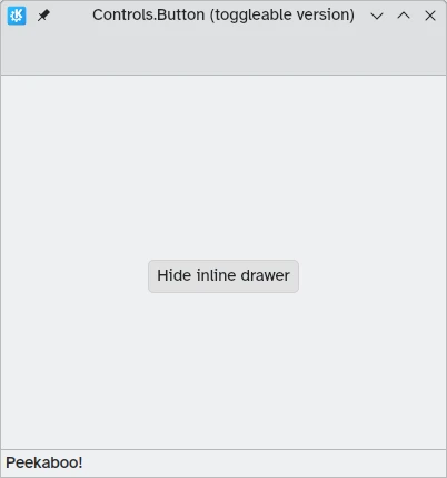
Nota
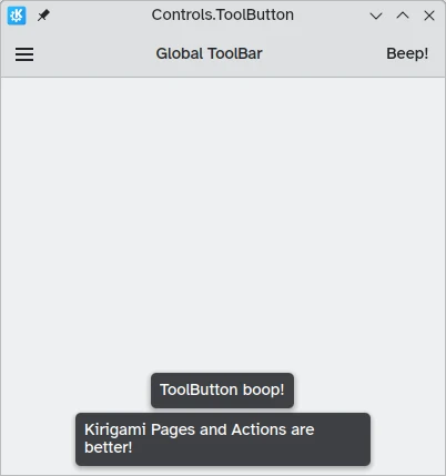
Con lo stile predefinito di KDE Plasma, Brezza, può essere difficile capire se un pulsante è attivato o meno: i pulsanti su cui si è fatto clic vengono infatti colorati di blu. Assicurati di tener conto di questo fatto mentre progetti la tua applicazione: un controllo diverso potrebbe risultare più amichevole.Pulsanti della barra degli strumenti
Esiste un tipo di pulsante specifico pensato per l'uso nelle barre degli strumenti, Controls.ToolButton. La differenza più evidente tra questo e un Button convenzionale è lo stile, con i pulsanti degli strumenti piatti (anche se questo è modificabile con la proprietà booleana flat).
import QtQuick
import QtQuick.Layouts
import QtQuick.Controls as Controls
import org.kde.kirigami as Kirigami

Kirigami.ApplicationWindow {
    title: "Controls.ToolButton"
    width: 600
    height: 600

    header: Controls.ToolBar {
        RowLayout {
            anchors.fill: parent
            Controls.ToolButton {
                icon.name: "application-menu-symbolic"
                onClicked: showPassiveNotification("Kirigami Pages and Actions are better!")
            }
            Controls.Label {
                text: "Global ToolBar"
                horizontalAlignment: Qt.AlignHCenter
                verticalAlignment: Qt.AlignVCenter
                Layout.fillWidth: true
            }
            Controls.ToolButton {
                text: "Beep!"
                onClicked: showPassiveNotification("ToolButton boop!")
            }
        }
    }
}
Controlli di selezione
I controlli di selezione permetto all'utente di fare una scelta o di scegliere un'opzione. Ne esistono di vari tipi, che meglio si adattano alle varie situazioni.
Caselle
Un Controls.CheckBox è pensato per le opzioni in cui le scelte non sono esclusive e in cui ciascuna opzione ha un'alternativa chiara.
import QtQuick
import QtQuick.Layouts
import QtQuick.Controls as Controls
import org.kde.kirigami as Kirigami

Kirigami.ApplicationWindow {
    title: "Controls.CheckBox"
    width: 400
    height: 400
    pageStack.initialPage: Kirigami.Page {
        ColumnLayout {
            anchors.left: parent.left
            anchors.right: parent.right
            Controls.CheckBox {
                Layout.alignment: Qt.AlignHCenter
                text: "This checkbox is checked!"
                checked: true
            }
            Controls.CheckBox {
                Layout.alignment: Qt.AlignHCenter
                text: "This checkbox is not checked!"
                checked: false
            }
        }
    }
}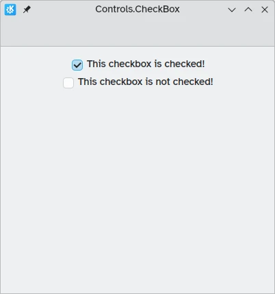
Come puoi vedere, sono semplici da usare. La proprietà checked contiene un valore booleano che determina se sono stati controllati o meno.
Pulsanti a scelta singola
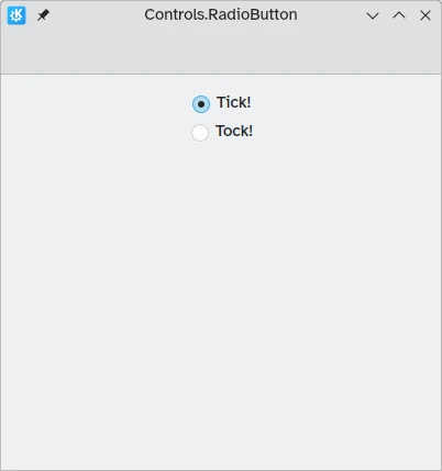
Un Controls.RadioButton è progettato per situazioni in cui l'utente deve scegliere un'opzione da un insieme di diverse opzioni.
I pulsanti a scelta singola sono esclusivi per impostazione predefinita: può essere selezionato solo un pulsante nello stesso elemento genitore.
Come per le caselle, essi possono essere selezionato o no per impostazione predefinita grazie alla proprietà checked.
import QtQuick
import QtQuick.Layouts
import QtQuick.Controls as Controls
import org.kde.kirigami as Kirigami

Kirigami.ApplicationWindow {
    title: "Controls.RadioButton"
    width: 400
    height: 400
    pageStack.initialPage: Kirigami.Page {

        ColumnLayout {
            anchors.left: parent.left
            anchors.right: parent.right
            Controls.RadioButton {
                Layout.alignment: Qt.AlignCenter
                text: "Tick!"
                checked: true
            }
            Controls.RadioButton {
                Layout.alignment: Qt.AlignCenter
                text: "Tock!"
                checked: false
            }
        }
    }
}
Interruttori
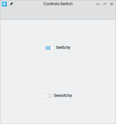
Sul desktop, la modifica delle impostazioni comporta solitamente la modifica dell'impostazione e quindi l'applicazione facendo clic sul pulsante "Applica" o "OK". Sui dispositivi mobili, possiamo invece utilizzare un Controls.Switch.
Gli interruttori possono essere commutati tra lo stato acceso e quello spento. Possono essere attivati facendo clic o toccandoli oppure possono essere trascinati verso la posizione di attivazione o disattivazione. Ancora una volta, gli interruttori possono essere impostati per essere attivati o disattivati per impostazione predefinita con la proprietà checked.
import QtQuick
import QtQuick.Layouts
import QtQuick.Controls as Controls
import org.kde.kirigami as Kirigami

Kirigami.ApplicationWindow {
    title: "Controls.Switch"
    width: 400
    height: 400
    pageStack.initialPage: Kirigami.Page {
        ColumnLayout {
            anchors.fill: parent
            Controls.Switch {
                Layout.alignment: Qt.AlignCenter
                text: "Switchy"
                checked: true
            }
            Controls.Switch {
                Layout.alignment: Qt.AlignCenter
                text: "Swootchy"
                checked: false
            }
        }
    }
}
Cursori
I dispositivi di scorrimento consentono agli utenti di selezionare determinati valori facendo scorrere una maniglia lungo una traccia. È possibile scegliere tra diversi tipi a seconda dei valori che desideri che gli utenti scelgano nella tua applicazione.
Cursori standard e graduati
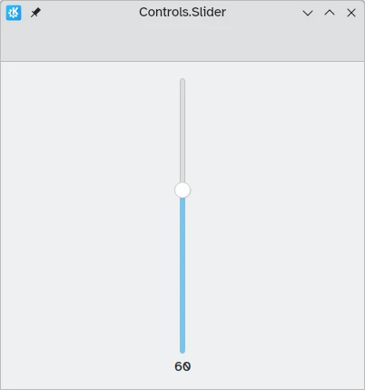
Un Controls.Slider fornisce all'utente un controllo molto preciso sulla selezione che desidera effettuare.
Nella modalità Da sinistra a destra, i cursori vanno da sinistra a destra per aumentare quando si è in orientamento orizzontale, mentre nella modalità Da destra a sinistra vanno nella direzione opposta. In entrambe le modalità, i cursori con orientamento verticale vanno dal basso verso l'alto.
La colorazione fornisce un indicatore visivo dell'entità del valore selezionato.
I cursori hanno poche proprietà importanti alle quali devi prestare attenzione:
- valore: contiene il valore su cui è posizionato l'handle e può anche essere impostato manualmente per fornire un valore iniziale predefinito
- to: definisce l'intervallo dello slider specificando il valore massimo a cui può arrivare
- orientamento: consente di impostare lo slider su un orientamento verticale con Qt.Vertical
import QtQuick
import QtQuick.Layouts
import QtQuick.Controls as Controls
import org.kde.kirigami as Kirigami

Kirigami.ApplicationWindow {
    title: "Controls.Slider"
    width: 400
    height: 400
    pageStack.initialPage: Kirigami.Page {
        ColumnLayout {
            anchors.fill: parent
            Controls.Slider {
                id: normalSlider
                Layout.alignment: Qt.AlignHCenter
                Layout.fillHeight: true
                orientation: Qt.Vertical
                value: 60
                to: 100
            }
            Controls.Label {
                Layout.alignment: Qt.AlignHCenter
                text: Math.round(normalSlider.value)
            }
        }
    }
}
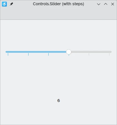
Un'altra proprietà utile che possiamo usare è stepSize. Impostandolo su un valore numerico ci consente di creare uno slider che si aggancia ai valori che sono multipli dello stepSize specificato, con questi multipli indicati da segni di graduazione. Pertanto, se impostiamo questa proprietà su "2.0", quando l'utente trascina la maniglia del dispositivo di scorrimento, potrà selezionare solo "0.0", "2.0", "4.0" e così via fino al valore specificato nella proprietà "to".
import QtQuick
import QtQuick.Layouts
import QtQuick.Controls as Controls
import org.kde.kirigami as Kirigami

Kirigami.ApplicationWindow {
    title: "Controls.Slider (with steps)"
    width: 400
    height: 400
    pageStack.initialPage: Kirigami.Page {
        ColumnLayout {
            anchors.fill: parent
            Controls.Slider {
                id: tickmarkedSlider
                Layout.alignment: Qt.AlignHCenter
                Layout.fillWidth: true
                orientation: Qt.Horizontal
                snapMode: Controls.Slider.SnapAlways
                value: 6.0
                to: 10.0
                stepSize: 2.0
            }
            Controls.Label {
                Layout.alignment: Qt.AlignHCenter
                text: tickmarkedSlider.value
            }
        }
    }
}
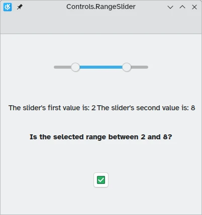
Cursori di intervallo
QtQuick Controls fornisce anche Controls.RangeSliders. Questi hanno due maniglie, quindi consentono di definire un intervallo di numeri tra le due maniglie.
Due nuove proprietà sono importanti da tenere a mente: first.value e second.value, che contengono i valori delle due maniglie. Come la proprietà value degli slider standard, questi possono essere preimpostati.
import QtQuick
import QtQuick.Layouts
import QtQuick.Controls as Controls
import org.kde.kirigami as Kirigami

Kirigami.ApplicationWindow {
    title: "Controls.RangeSlider"
    width: 400
    height: 400
    pageStack.initialPage: Kirigami.Page {
        ColumnLayout {
            anchors.fill: parent
            Controls.RangeSlider {
                id: rangeSlider
                Layout.alignment: Qt.AlignHCenter
                to: 10.0
                first.value: 2.0
                second.value: 8.0
                stepSize: 1.0
                snapMode: Controls.Slider.SnapAlways
            }
            RowLayout {
                Layout.alignment: Qt.AlignHCenter
                Layout.fillWidth: true
                Controls.Label {
                    Layout.fillWidth: true
                    text: "The slider's first value is: " + Math.round(rangeSlider.first.value)
                }
                Controls.Label {
                    Layout.fillWidth: true
                    text: "The slider's second value is: " + Math.round(rangeSlider.second.value)
                }
            }
            Controls.Label {
                Layout.alignment: Qt.AlignHCenter
                font.bold: true
                text: "Is the selected range between 2 and 8?"
            }
            Controls.Button {
                Layout.alignment: Qt.AlignHCenter
                icon.name: {
                    if (rangeSlider.first.value >= 2 && rangeSlider.second.value <= 8)
                        return "emblem-checked"
                    else
                        return "emblem-error"
                }
            }
        }
    }
}