Barre degli strumenti delle azioni
Sebbene le pagine di Kirigami ti permettono di disporre con semplicità un insieme di azioni nell'intestazione di una pagina, altre volte potresti volere qualcosa di più flessibile.
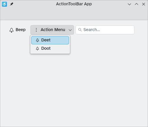
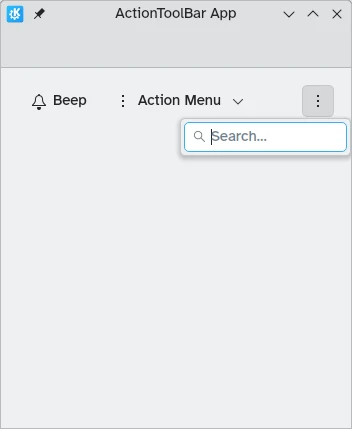
Kirigami fornisce il componente Kirigami.ActionToolBar. Visualizza un elenco di oggetti Kirigami.Action e ne mostrerà il maggior numero possibile, fornendo un menu di overflow per quelli che non si adattano. La ActionToolBar è dinamica e sposterà le azioni dentro e fuori il menu extra a seconda delle dimensioni disponibili.
Nota
Questa pagina presuppone che tu abbia familiarità con gli oggetti Kirigami.Action. Se non lo sei, puoi imparare tutto su di essi nel nostro tutorial per principianti o nella pagina della documentazione dedicata.Creazione della prima ActionToolBar
Il layout e la posizione del tuo Kirigami.ActionToolBar dipendono davvero da te, anche se per motivi di facilità d'uso di solito è una buona idea attenersi alle convenzioni dell'interfaccia utente e posizionare la barra degli strumenti vicino alla parte superiore o inferiore della pagina e diffonderla in larghezza.
Come la maggior parte degli altri componenti che contengono azioni, Kirigami.ActionToolBar ha una proprietà actions. Possiamo assegnare un array di componenti Kirigami.Action a questa proprietà.
import QtQuick
import QtQuick.Layouts
import QtQuick.Controls as Controls
import org.kde.kirigami as Kirigami

Kirigami.ApplicationWindow {
    id: root

    title: "ActionToolBar App"
    width: 600
    height: 400

    pageStack.initialPage: Kirigami.Page {
        Kirigami.ActionToolBar {
            anchors.left: parent.left
            anchors.right: parent.right

            actions: [
                Kirigami.Action {
                    text: "Beep"
                    icon.name: "notifications"
                    onTriggered: showPassiveNotification("BEEP!")
                },
                Kirigami.Action {
                    text: "Action Menu"
                    icon.name: "overflow-menu"

                    Kirigami.Action {
                        text: "Deet";
                        icon.name: "notifications"
                        onTriggered: showPassiveNotification("DEET!")
                    }
                    Kirigami.Action {
                        text: "Doot";
                        icon.name: "notifications"
                        onTriggered: showPassiveNotification("DOOT!")
                    }
                },
                Kirigami.Action {
                    icon.name: "search"
                    displayComponent: Kirigami.SearchField { }
                }
            ]
        }
    }
}
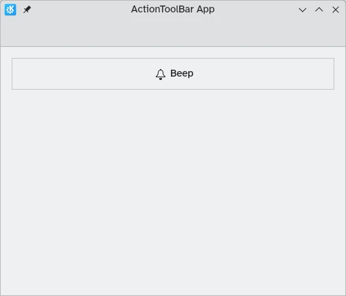
Una ActionToolBar con abbastanza spazio per tutti i figli
Una ActionToolBar con il menu a espansione contenente i figli
Allineamento
Per impostazione predefinita, le azioni nella Kirigami.ActionToolBar saranno allineate a sinistra. Ciò potrebbe non essere desiderabile in tutte le situazioni. Per fortuna possiamo cambiarlo con la proprietà alignment. Possiamo impostare questa proprietà su un intervallo di valori, ma i tre più rilevanti sono Qt.AlignLeft, Qt.AlignCenter e Qt.AlignRight (che si occupano dell'allineamento orizzontale).
import QtQuick
import QtQuick.Layouts
import QtQuick.Controls as Controls
import org.kde.kirigami as Kirigami

Kirigami.ApplicationWindow {
    id: root

    title: "ActionToolBar App"
    width: 600
    height: 400

    pageStack.initialPage: Kirigami.Page {
        Controls.GroupBox {
            anchors.left: parent.left
            anchors.right: parent.right

            Kirigami.ActionToolBar {
                anchors.fill: parent

                alignment: Qt.AlignCenter

                actions: [
                    Kirigami.Action {
                        text: "Beep"
                        icon.name: "notifications"
                        onTriggered: showPassiveNotification("BEEP!")
                    }
                ]
            }
        }
    }
}