Componenti basati sulle azioni
Azioni
Una Kirigami.Action consiste in un'azione cliccabile il cui aspetto dipende da dove viene aggiunta. In genere è un pulsante con un'icona e un testo.
Possiamo usarle per fornire le nostre applicazioni di azioni facili da raggiungere, che sono essenzialmente le loro funzionalità.
Nota
Le azioni Kirigami ereditano da QtQuick.Controls.Action e possono essere assegnate scorciatoie.Come le azioni dei controlli QtQuick possono essere assegnate alle voci di menu e ai pulsanti della barra degli strumenti, ma anche ad altri componenti Kirigami.
import org.kde.kirigami as Kirigami

Kirigami.Action {
    id: copyAction
    text: i18n("Copy")
    icon.name: "edit-copy"
    shortcut: StandardKey.Copy
    onTriggered: {
        // ...
    }
}
Nota
La proprietà icon.name prende i nomi per le icone a livello di sistema seguendo la specifica FreeDesktop. Queste icone e i nomi delle icone possono essere visualizzati con l'applicazione CuttleFish di KDE fornita con plasma-sdk o visitando Specifiche di denominazione delle icone di FreeDesktop.Una funzionalità offerta della azioni di Kirigami sulle azioni di QtQuick è la possibilità di nidificare le azioni.
import org.kde.kirigami as Kirigami

Kirigami.Action {
    text: "View"
    icon.name: "view-list-icons"
    Kirigami.Action {
        text: "action 1"
    }
    Kirigami.Action {
        text: "action 2"
    }
    Kirigami.Action {
        text: "action 3"
    }
}
Un'altra caratteristica di Kirigami Actions è quella di fornire vari suggerimenti agli oggetti utilizzando le azioni su come dovrebbero visualizzare l'azione. Questi sono gestiti principalmente dalle proprietà displayHint e displayComponent.
Se possibile, queste proprietà saranno rispettate dall'articolo. Ad esempio, la seguente azione verrà visualizzata come TextField con l'elemento che farà del suo meglio per mantenersi visibile il più a lungo possibile.
import org.kde.kirigami as Kirigami

Kirigami.Action {
    text: "Search"
    icon.name: "search"

    displayComponent: TextField { }

    displayHint: Kirigami.DisplayHints.KeepVisible
}
Usare le azioni in altri componenti
Come menzionato nel tutorial introduttivo alle azioni, le azioni Kirigami sono contestuali, il che significa che vengono visualizzate in luoghi diversi a seconda di dove le inserisci. Oltre a ciò, hanno anche rappresentazioni diverse per desktop e dispositivi mobili.
Pagina
Una Kirigami.Page mostra Azioni a destra dell'intestazione superiore in modalità desktop e su un piè di pagina in modalità mobile.
| |
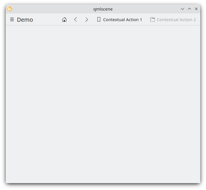
Azioni delle pagine in un desktop
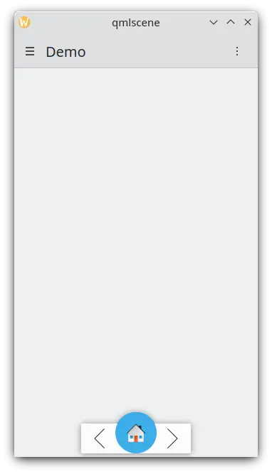
Azioni della pagina su un dispositivo mobile
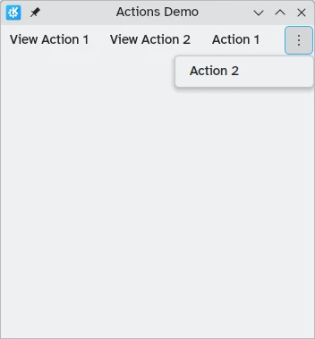
Cassetto globale
Il Kirigami.GlobalDrawer è una barra laterale simile a un menu che fornisce una navigazione basata sulle azioni nella tua applicazione. È qui che le azioni nidificate sono utili perché è possibile creare una navigazione nidificata:
import org.kde.kirigami as Kirigami

Kirigami.ApplicationWindow {
    title: "Actions Demo"
    globalDrawer: Kirigami.GlobalDrawer {
        title: "Demo"
        titleIcon: "applications-graphics"
        actions: [
            Kirigami.Action {
                text: "View"
                icon.name: "view-list-icons"
                Kirigami.Action {
                    text: "View Action 1"
                    onTriggered: showPassiveNotification("View Action 1 clicked")
                }
                Kirigami.Action {
                    text: "View Action 2"
                    onTriggered: showPassiveNotification("View Action 2 clicked")
                }
            },
            Kirigami.Action {
                text: "Action 1"
                onTriggered: showPassiveNotification("Action 1 clicked")
            },
            Kirigami.Action {
                text: "Action 2"
                onTriggered: showPassiveNotification("Action 2 clicked")
            }
        ]
    }
    //...
}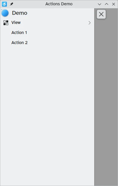
Azioni globali del cassetto sul desktop
Puoi saperne di più sui cassetti globali nella pagina della documentazione dei cassetti.
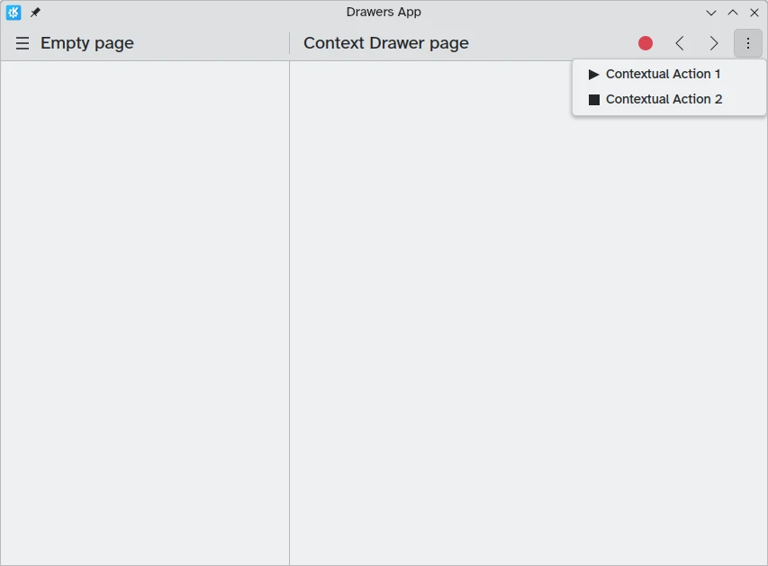
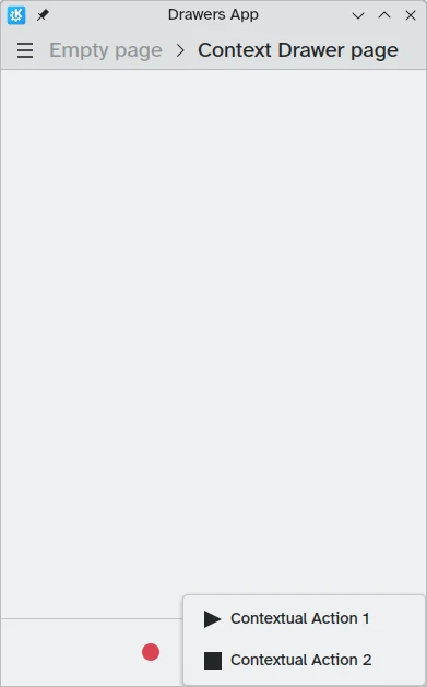
Cassetto a contesto
Un Kirigami.ContextDrawer consiste in un insieme aggiuntivo di azioni nascoste dietro un menu a tre punti in alto a destra in modalità desktop o in basso a destra in modalità mobile se non c'è spazio. Viene utilizzato per visualizzare azioni rilevanti solo per una pagina specifica. Puoi leggere ulteriori informazioni al riguardo nel nostro tutorial sui Cassetti Kirigami.
ActionTextFields
Un Kirigami.ActionTextField viene utilizzato per aggiungere alcune azioni contestuali a un campo di testo, ad esempio per cancellare il testo o per cercare il testo.
Kirigami.ActionTextField {
    id: searchField
    rightActions: [
        Kirigami.Action {
            icon.name: "edit-clear"
            visible: searchField.text !== ""
            onTriggered: {
                searchField.text = ""
                searchField.accepted()
            }
        }
    ]
}
In questo esempio, stiamo creando un pulsante "Cancella" per un campo di ricerca che è visibile solo quando viene inserito del testo.

Nota
Raramente dovresti usare direttamente un ActionTextField. SearchField e PasswordField ereditano entrambi da ActionTextField e probabilmente soddisfano i requisiti desiderati caso d'uso.SwipeListItem
Un Kirigami.SwipeListItem è un delegato destinato a supportare azioni extra. Quando si utilizza un mouse, le sue azioni verranno sempre mostrate. Su un dispositivo touch possono essere visualizzati trascinando l'elemento con la maniglia. Nelle immagini seguenti, queste sono le icone a destra.
ListView {
    model: myModel
    delegate: SwipeListItem {
        Controls.Label {
            text: model.text
        }
        actions: [
             Action {
                 icon.name: "document-decrypt"
                 onTriggered: print("Action 1 clicked")
             },
             Action {
                 icon.name: model.action2Icon
                 onTriggered: //fai qualcosa
             }
        ]
    }
}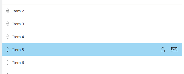
SwipeListItem su un computer
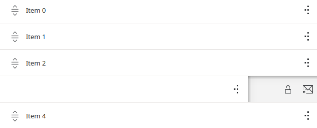
SwipeListItem su un dispositivo mobile
ActionToolBar
Una Kirigami.ActionToolBar è una barra degli strumenti composta da un elenco di azioni. Per impostazione predefinita, ogni azione che si adatta alla barra degli strumenti sarà rappresentata da un ToolButton, mentre quelle che non si adattano verranno spostate in un menu alla fine della barra degli strumenti.
Come ActionTextField, potrebbe non essere necessario utilizzare direttamente ActionToolBar poiché viene utilizzato dalle intestazioni di pagina e dalle schede per fornire la visualizzazione delle azioni.
import org.kde.kirigami as Kirigami

Kirigami.ApplicationWindow {
    title: "Actions Demo"
    width: 350
    height: 350
    header: Kirigami.ActionToolBar {
        actions: [
            Kirigami.Action {
                text: i18n("View Action 1")
                onTriggered: showPassiveNotification(i18n("View Action 1 clicked"))
            },
            Kirigami.Action {
                text: i18n("View Action 2")
                onTriggered: showPassiveNotification(i18n("View Action 2 clicked"))
            },
            Kirigami.Action {
                text: i18n("Action 1")
                onTriggered: showPassiveNotification(i18n("Action 1 clicked"))
            },
            Kirigami.Action {
                text: i18n("Action 2")
                onTriggered: showPassiveNotification(i18n("Action 2 clicked"))
            }
        ]
    }
}
Una barra degli strumenti orizzontale visualizzata nella parte superiore dell'applicazione
Puoi leggere ulteriori informazioni sui componenti ActionToolBar nella loro pagina di documentazione dedicata.
Schede
Una Kirigami.Card viene utilizzata per visualizzare insieme una raccolta di informazioni o azioni. Queste azioni possono essere aggiunte al gruppo azioni, in modo simile ai componenti precedenti.
Kirigami.Card {
    actions: [
        Kirigami.Action {
            text: qsTr("Action1")
            icon.name: "add-placemark"
        },
        Kirigami.Action {
            text: qsTr("Action2")
            icon.name: "address-book-new-symbolic"
        },
        // ...
    ]
    banner {
        source: "../banner.jpg"
        title: "Title Alignment"
        titleAlignment: Qt.AlignLeft | Qt.AlignBottom
    }
    contentItem: Controls.Label {
        wrapMode: Text.WordWrap
        text: "My Text"
    }
}
Per maggiori informazioni consultare la pagina dei componenti per le Schede.