Text and labels
Whenever writing text, start by following these guidelines:
- Make it as short as possible without losing meaning or precision.
- Keep it actionable.
- Front-load the most important information in longer text.
- Use plain language and minimize technical jargon. For example, prefer “folder” over “directory.”
- Adhere to common wording conventions.
- Use a neutral, informative tone: not informal, boring, exciting, or harsh.
- Use the word “Delete” for actions that remove files on disk.
- Don’t overuse bold text and pull the user’s attention in multiple directions at once.
And then keep in mind these implementation details:
- Use QtQuick.Controls.Label for normal-sized text, and Kirigami.Heading (with a
levelsuitable for the context) for larger header text. See more information here. - Don’t use QtQuick.Text directly, as it doesn’t respect the system’s font settings.
- Manually assign accelerator keys only for text in buttons, radio buttons, checkboxes, and switches (in other places, they are auto-generated).
- Assign text for icons-only buttons anyway, so it can be read by screen readers. Hide the text by setting the AbstractButton.display property to
IconOnlyand then manually add a Tooltip for the benefit of mouse and touch users. - For standard actions, use KStandardActions so that it gets standard text automatically.
Capitalization and punctuation
All user interface text is written in either sentence case or title case. Use sentence case when:
- The text ends with a period or colon.
- The text is clearly a sentence.
- The text is a subtitle, tooltip, transient status message, or placeholder label.
- The text is used as a label for a radio button, checkbox, combobox item, or placed in front of a control — for example using Kirigami.FormData.label.
Otherwise, use title case.
Also use title case for specialized proper nouns such as “the Internet” or “Plasma Widgets”.
Use a serial comma (also known as an “Oxford comma”) when mentioning three or more list items in a sentence.
Put spaces around em-dashes.
Mood and tone
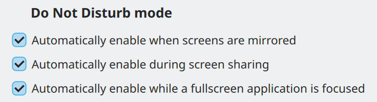
Use the imperative mood when providing instructions or suggestions to the user — especially in the labels for buttons, menu items, checkboxes, and switches.
This means beginning the label with an action verb, and phrasing it as a command:
Bad: Yes
Good: Apply
Bad: Info
Good: Show Info
Bad: Maximum Volume Raising
Good: Raise Maximum Volume
Use positive phrasing; describe what controls will do when enabled, not what they won’t do when disabled:
Bad: When disabled, prevent the system from going to sleep.
Good: Allow the system to go to sleep.
Phrase longer text impersonally. Avoid the word “you” in sentences that instruct the user to do something, as it sounds accusatory in English — particularly at the beginning of a sentence. This is less important for questions and descriptions, but try to minimize it anyway.
Bad: You are not authorized to access the file.
Good: Missing authorization to access the file.
Bad: Are you sure you want to permanently delete all items from the Trash?
Good: Permanently delete all items from the Trash?
Word ordering and length
Front-load the most important words and minimize total length. Anything longer than “Configure Keyboard Shortcuts” in an interactive control is too long.
For multi-sentence text, try to limit line length to 85 characters or less, which improves readability. This generally works out to about 450px. However if this would cause excessive whitespace in wide windows, consider changing the layout to move elements to the right of the text area, or even move the long text into a Kirigami.ContextualHelpButton or KWidgetsAddons::KContextualHelpButton, which enforces this length internally.
A strategy for minimizing length is to omit the subject when the context makes it clear:
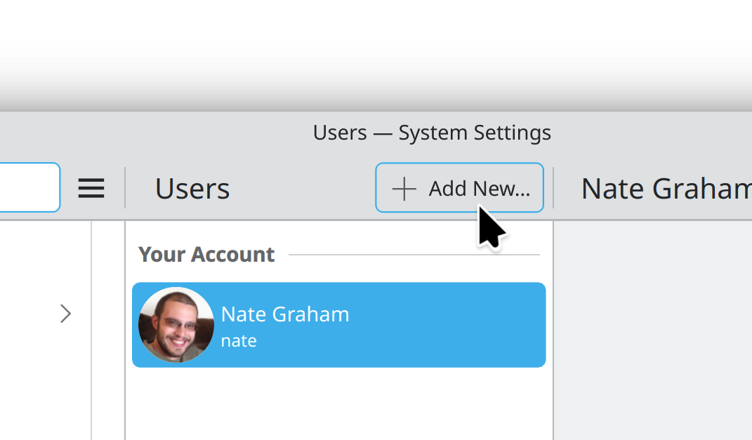
Nearby “Users” title provides context and makes it obvious what new thing will be added.
Bad: Re-Assign Key Binding to this Action
Good: Re-Assign Shortcut
Another strategy is to relocate the verb to the beginning of a shared intoductory label if if would lead to shorter labels, less repetition, or a more natural formulation:
When shortening an interactive control’s label like this, always set Accessible.name to the full text including the verb and subject, since screen reader users won’t be able to see the context. Don’t do this for a static label.
Acronyms
Avoid the use of acronyms, as many users will not know what they mean. Only use an acronym when you have to display the same term multiple times and can explain the acronym the first time it’s seen. Strive to use human-readable words instead of acronyms — even those you might assume are commonly understood, for example:
- PC → System, computer
- OS → Operating system
- URL → Link
- RAM → Memory
This guideline does not apply to common functionality only ever referred to via its acronym (e.g. “USB”), or in highly technical software where the user is expected to be familiar with common terminology. These are exceptions, not the rule.
When you do use an acronym, capitalize all the letters.
Ellipses
End an action’s label with an ellipsis if it always requires additional user input before it completes. This is common for actions that open a dialog prompting the user to make a further choice.
Bad: Save As
Good: Save As…
Use the real “…” ellipsis character (U+2026 in Unicode), not three periods. For labeled buttons that directly open a pop-up menu, use a downward-pointing arrow to indicate this instead of an ellipsis.
Window titles
Give every window a distinctive title briefly describing its visible content. This text is shown in multiple places where space may be limited, so keep it as short as possible while retaining distinctiveness. Don’t include the app’s vendor or version number.
Bad: AppName 5.3.9 Professional Edition, by SquidSoft™
Bad: Main Window
Good: Inbox — konqi@kde.org
Good: Stairway To Heaven, by Led Zeppelin
Avoid showing file paths, which can be long and hard to parse. In a tab-based app that can have multiple files open, disambiguate identically-named files only by their parent folder names, like this:
CMakeLists.txt — library
CMakeLists.txt — app
For dialog titles, describe the action being performed starting with an imperative mood verb, just like button and menu item labels. If the dialog was opened from a button or menu item, echo its label in the dialog title.
Bad: Load… → Open File
Bad: About [app name]→ Details
Good: Save… → Save File
Good: Properties → Properties for [file name]
Placeholders
Placeholder text is used in empty text fields and empty views. Both share a common purpose: to tell users how to get content into it.
For placeholder messages in empty views, use Kirigami.PlaceholderMessage.
In empty text fields, use the following rules:
- If the text field has an explanatory label to the left of it, write the placeholder text as an example of the sort of text the user is expected to type into it. Placeholder text can be omitted if this is not relevant.
- Otherwise, write the placeholder text as a very short sentence starting with an imperative mood verb that describes what the user should do: “Search”, “Enter file name”, etc.
- Don’t end with an ellipsis character, as it would contradict the meaning of the character in the context of buttons and menu items.
For search fields, use Kirigami.SearchField which includes standard placeholder text.
Translation
Many or even most users won’t be using your software in English, so keep translatability in mind:
- Leave enough room for strings to become 50% longer or more when translated into languages with longer text than English.
- Respect system-wide locale settings for units, date and time formats, etc.
- Use the ki18n guidelines to write localization-friendly English text.
- Use the i18nc() function to provide translation context to your strings, and use semantic markup (KUIT) instead of HTML.
- Use the i18ncp() function for any text that refers to a number, as plurals are handled differently in different languages.
- Test your app in right-to-left mode by running it in Arabic with
LANGUAGE=ar_AR [app_executable]. Even if you can’t read the words, make sure everything has reversed properly and there’s enough room for the text. - Don’t use internet memes or culture-specific colloquialisms, expressions, and references.
Brand names
Each app’s name is automatically a brand name; craft it carefully!
- Choose something catchy, easy to remember, and fun-sounding. Avoid negative language.
- Use only a single word, preferably one related to the app’s purpose — even just tangentially.
- Don’t simply add a “K” onto the beginning of an existing word. It’s acceptable to choose a brand name with a K inside it, or even replace a “C” with a “K” (e.g. Falkon, DigiKam), but don’t force it. Not all KDE brand names need to include a K (e.g. Dolphin, Plasma, NeoChat).
- Don’t use common words like “Files” or “Photos.” If your brand name is too generic, its identity will be diluted and users will have a hard time finding it in web searches or describing it to others. It will also be difficult to distinguish from GNOME apps also installed on the system that have similar generic names.
Describe Plasma features with user-friendly descriptive terminology, not their internal codenames.
Bad: Powerdevil
Good: Power Management
Bad: KWin Scripts
Good: Window Management Plug-Ins
Symbols
Use appropriate Unicode symbols rather than handmade approximations. This makes the text of your app look nicer and more professional, easier to translate, and more comprehensible when read by a screen reader. For example:
…(U+2026) instead of...anywhere ellipses are used→(U+2192) instead of->÷(U+00F7),×(U+00D7), and−(U+2212) instead of/,x, and-in mathematical expressions; e.g.−1,2×,2×2,10÷5etc. (applicable for other mathematical operators as well)×(U+00D7) instead ofxfor dimensions; e.g.1920 × 1080, instead of1920x1080’(U+2019) instead of'for apostrophes‘(U+2018) and’(U+2019) instead of'for single quotation marks“(U+201C) and”(U+201D) instead of"for double quotation marks–(U+2013) instead of-for date ranges; e.g.2020–2024—(U+2014) instead of-,-, or--for interjections‒(U+2012) instead of-for separating number values like dates or telephone numbers&(U+0026) instead of the word “and” to join sets of exactly two items, e.g. “Input & Output”©(U+00A9)™(U+2122), and®(U+00AE); instead of(C),TM, and(R)
KDE’s KCharSelect app can be used to find these and other symbols. If you suspect there might be a dedicated Unicode symbol for the expression you want to include (which there probably is), please look it up first!
Units
Prefer whole words when writing out units, unless space is extremely limited (e.g. graph legends, table views). In this case, use internationally-accepted abbreviations.
Bad: 200msec
Good: 200 ms
Better: 200 milliseconds
See also the lists of accepted abbreviations for SI units and US customary units.