Application Icons
![]()
Purpose
Application icons are the expression of an application's brand. They communicate the application's identity in a clear, bold, and friendly manner. While application icons should be distinct from one another, all icons should be unified with the same design style.
Design
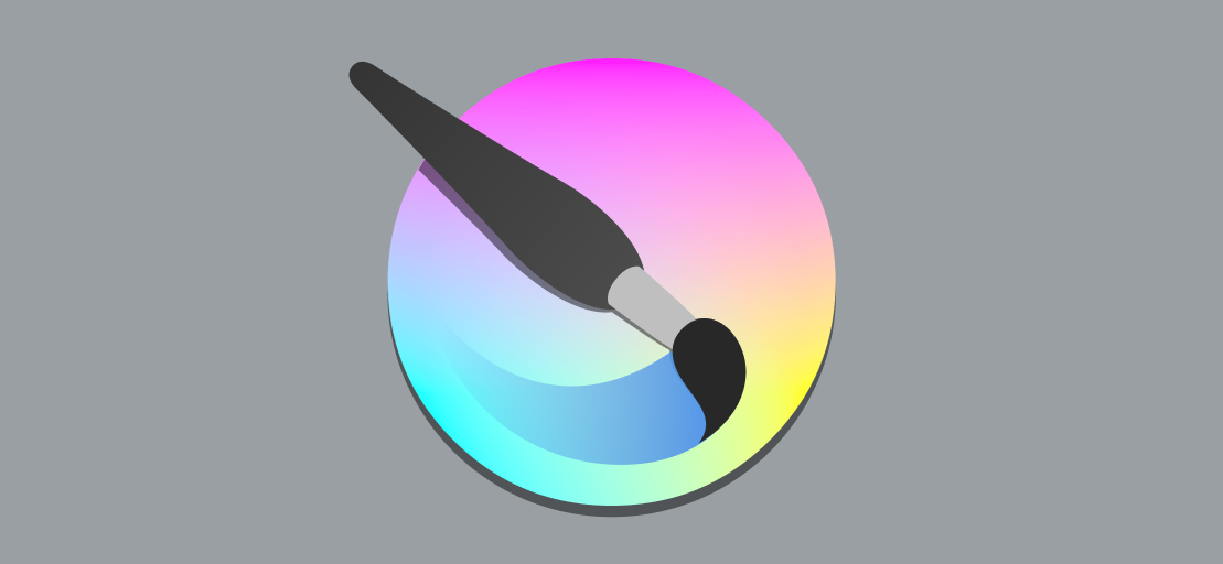
Application icons always use the colorful icon style. Their baseline size is 48 pixels.
1st-Party App Icons
When creating a Breeze icon as your application's icon, there are some things you should consider.
Recognizability
Your application's icon should be distinct and recognisable.


Metaphor
Your app's icon should use an appropriate metaphor to inform the user what your app does.

3rd-Party App Icons
When creating a Breeze theme version of an existing app's icon, it critically important that the icon's existing brand and visual style be preserved. The goal is to create a Breeze version of the icon, not something completely new and different.