Colorful Icons

Colorful icons make full use of the Breeze color palette. Colorful icons are not flat and incorporate elevation, shadows, and lighting.


There are a variety of colorful icon types:
- 32px: Category, Preferences, MIME type, and Places icons
- 48px: Application icons
- 64px: MIME type, Places, Devices, and a few Status icons
Margins
Vertical
Colorful icons have a top and bottom margin of 4 pixels. Icons should not put any details here whatsoever.

Horizontal
Colorful icons also have a left and right margin of 4 pixels. Minor details can extend here as necessary.

32px Colorful Icons
32px colorful icons have a 2px margin instead of 4px margins.


Anatomy
All colorful icons share the same basic anatomy.
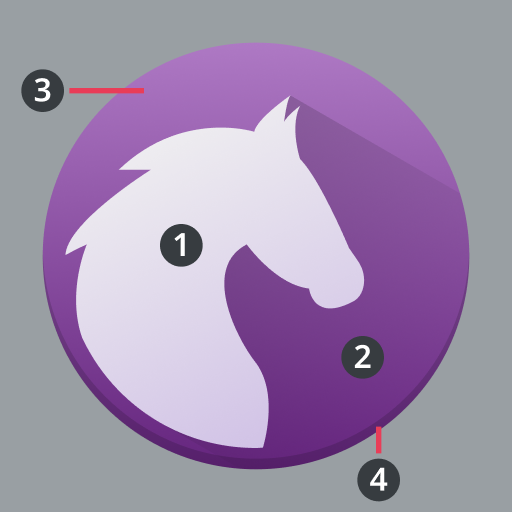
- Foreground
- Foreground Shadow
- Base
- Base Shadow

The foreground of an icon is the distinctive part that conveys the most branding.
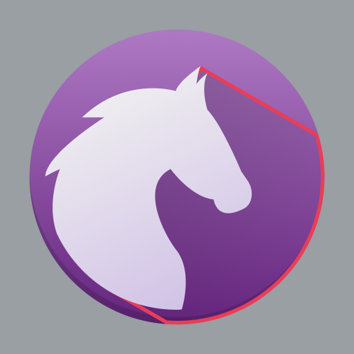
Foregrounds on a background have a 45° shadow to the bottom right that spans the entire background.

Icons can have a background to serve as a base for their foreground.

The foreground, or the background if there is one, has a 1px hard shadow on the bottom.
Elements
Color
Icons can have a variety of shapes, which when combined with color, produce numerous unique arrangements.


Layers
Icons are composed of layers that cast shadows.


Lighting and Shadows
Ambient Lighting
Icon fills should reflect ambient lighting — go from a lighter top to a darker bottom.


Hard Shadow
Every icon should have a 1px solid hard shadow. A good baseline color to overlay is black (#000000) at 10% opacity.


45° Shadows
Foregrounds should have a 45° shadow to the bottom right.

