Getting input
KDE apps mostly use standard input controls such as buttons, menus, checkboxes, text fields, and sliders. Here's how to handle various situations:
Initiating actions
The Button, ToolButton, and RoundButton controls all initiate a one-time action when pressed. This is where and how to use them:
- Use a ToolButton on a toolbar in the header or footer position or a window, page, or scrollable view.
- Use a RoundButton overlaid in a fixed “floating” position over a scrollable content view, especially an image view. This kind of button never has text, so choose an icon that conveys the button's action perfectly, with no ambiguity.
- For all other cases, use a Button.
Follow the standard labeling guidelines for buttons with visible text.
Choosing between 2 obvious states or settings
The Switch and CheckBox controls are both used for two-state settings where both states are obvious with a single label.
Don’t change the label or icon when the state changes, and follow the standard labeling guidelines.
Use a Switch for “instant apply” controls that take effect immediately; otherwise, use a CheckBox.
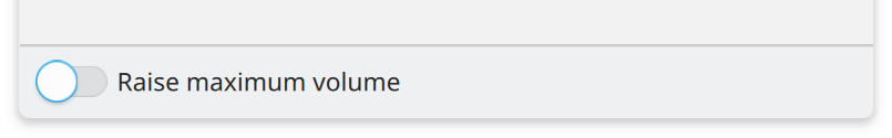
Switches take effect the moment they're clicked.
CheckBoxes only take effect when the user clicks “OK” or “Apply”.
Avoid making buttons checkable (by setting their checkable property to true), as their checkability isn’t obvious when unchecked (or even when checked, depending on the theme)
If the surrounding context nonetheless dictates that a checkable button is the right control, treat it as a checkbox that happens to look like a button, applying the above guidelines.
Alternatively, use a normal non-checkable button with text indicating what will happen when it’s pressed, and change the text and icon when the state changes. When doing so, follow the standard guidelines for labels and icons.
Choosing between non-obvious states or settings
The Radio Button and ComboBox controls are both used to present a set of labeled, mutually-exclusive options.
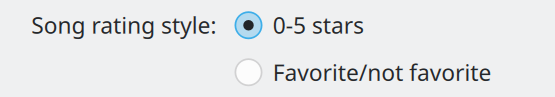
Each option's opposite state is not obvious without explanation, so Radio Buttons are used.
- For 3 or fewer options with short text where vertical space is plentiful, use RadioButtons.
- For up to 10 items, or where vertical space is limited, use a ComboBox.
- For more than 10 options, use a scrollable list view.
In all cases, arrange items in a logical order; if none exists, alphabetical is a good default.
Gross and fine input
Use a Slider for bounded input where fast interaction is more important than precision.
Use a SpinBox where precision is more important than speed of interaction.
If both factors are important at different times, then use a Slider with a SpinBox trailing it:
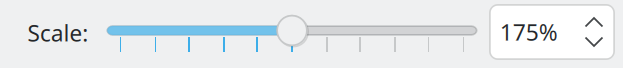
The user can drag the Slider's handle for quick changes, or enter a precise value in the SpinBox for fine adjustments.
Getting text input
Only ask for input using a text field when it's not possible to use a control that automatically validates input. For this reason, you must validate the input text yourself.
When the current text is invalid, indicate this using a Kirigami.InlineMessage and disable the ability to confirm or send the input.
If possible, implement an auto-complete feature to help the user enter valid input.
If possible, use one of the pre-made Kirigami text fields:
- Use Kirigami.ActionTextField when you need to add inline actions in the trailing position (e.g. a clear button).
- Use Kirigami.SearchField to implement a search field.
- Use Kirigami.PasswordField to display password prompts.
Interrupting the user to ask for input
Dialog windows interrupt the user to ask for input or confirmation. Minimize their use, as they can be considered annoying; many users click through them without reading anything.
Only interrupt the user with a dialog window for one of two reasons:
- When the user must make an immediate decision before the app can continue working normally.
- To display progress information about a task that must complete before the app can continue working normally.
For all other purposes, don't use a dialog; request input or display information inline in a non-modal fashion.
For opening and saving files, use QtQuick.Dialogs.FileDialog with the fileMode set appropriately. Don't implement a custom file-choosing UI.
For getting other kinds of input, use one of the Kirigami Dialog types:
- Use Kirigami.PromptDialog for a “do it/don't do it” type of choice.
- Use Kirigami.PromptDialog with a QtQuick.Controls.TextField inside it to get text input from the user.
- Use Kirigami.MenuDialog to let the user choose from among a set of actions.
Don't display more than one dialog at a time. Never use a dialog to create more dialogs.
Signaling interactivity
Standard Breeze styling for controls signals interactivity primary through hover effects—typically by changing the background or outline color. Keep these guidelines in mind:
- Use standard controls as much as possible to automatically inherit this style of visual interactivity.
- When custom controls must be used, prefer to override the
contentItemproperty of standard controls so that only the content is custom, and the interactivity and styling of the background effect are preserved. - If even that is not possible, re-implement interactivity signaling using hover effects.
- Only use the pointing finger cursor to signal interactivity for a clickable URL.
- Only use underlined web-style links for clickable URLs, never for internal navigation within your app.