Displaying content
Maximize the space available for the app's main content area; it's what users open your app to interact with! Avoid unnecessary frames, spacing, and padding around content views.
Lists and grids
When a view's content consists of multiple items that can be seen or interacted with, display them in a QtQuick.ListView or a QtQuick.GridView. Which one to choose depends on the context:
- Lists are faster to visually scan and handle long text better. They tend to be superior for mostly-textual content. Use alternating background colors with Kirigami.Theme for list items with subtitles or extra items on their right sides.
- Grids make better use of space when the view is wide, items are large, or scrolling is undesirable. They tend to be superior for mostly-visual content.
Depending on the context, it can be reasonable to let the user pick their preferred representation, or even to automatically switch from one to another based on the width of the window.
Implement list and grid items as instances or subclasses of one of the standard QtQuick.Controls Delegates, which makes them inherit the common KDE styling automatically. If the content is more complex than what the Qt Delegate items provide, use one of the pre-made Kirigami Delegates. If none of these are sufficient, override the ItemDelegate.contentItem to create your own delegates.
Implement controls used to add content to list or grid views as Kirigami.Actions on a Kirigami.InlineViewHeader.
Place controls used to remove list or grid items inline, on the items themselves. Make them visible, rather than appearing on hover.
Use bold text for the selected or actively-used list or grid item.
Page vs Dialog vs OverlaySheet
When everything doesn't fit on one page and some content is only contextually relevant, show it on demand using one of the following user interface elements:
- Push a new Page on the page stack if the content will take up all or nearly all of the window or view area.
- Use a Kirigami.OverlaySheet to display auxiliary views of read-only narrow scrollable content. Don't use it for getting input or if the content is never tall enough to be scrollable.
- For all other uses — including getting input from the user — use one of the Kirigami.Dialog classes.
Whenever overlaying a popup, box, or dialog on top of the app's main content area, add a contrasting outline around the edge of the overlaid element. Without this, visual recognizability suffers when using a dark color scheme, and the popup can appear to blend into the background.
Tabbed views
Use tabs to let the user switch between related views sharing the same level of hierarchy within a page or window.
There are 2 broad categories of tabs: mutable and immutable.
Mutable tabs allow the user to open, close, and re-arrange them. They are used for documents or editable views, and implemented with QtQuick.Controls.TabBar. Always give them the following characteristics:
- Tab bar located above the content view
- Tabs are re-orderable
- Tabs span the available width
- Tabs show visible close buttons
Immutable tabs are not modifiable by the user. They are for grouping settings or Contextual Toolview pages, and implemented with Kirigami.NavigationTabBar. This control can be located above or below its view, depending on what makes the most visual sense. Make sure every page has unique controls and content. In QtWidgets applications, set QTabBars with immutable contents to expanding, and the containing QTabWidget to documentMode.
Regardless of the type chosen, all tabbed views should hide the tab bar when there's only one tab and implement standard keyboard shortcuts for switching with KStandardShortcut.
On the desktop, tab views scale poorly beyond 4 or 5 tabs. And on mobile, they can become unworkable with more than just two. Consider a different switching control such as a sidebar if the user is expected to regularly interact with many tabs.
Tables and tree views
Use a QtQuick.TableView to display lists of items with 3 or more pieces of data per list item, where being able to quickly compare the data across list items makes sense. Put each piece of data in its own column.
If you would ever end up with a table that has only two columns, or where sorting or reversing the order of any column does not make sense, instead use a list view.
Minimize the use of tree views, as they tend to be confusing for regular users--especially if they allow more than one level of nesting. Instead, consider a list view with collapsible sections.
Only use a tree view in an app meant for technical users where the content being shown already has an inherent tree-like structure (e.g. a tree of system processes).
Inline help and tooltips
Sometimes complex features require explanation, even for experts. If the text is important for the user to understand and can be kept to the length of a brief sentence, place it inline below the control it affects.
If it requires up to two sentences and can broadly describe a whole page's worth of content, place the text inline, at the top of the page.
If there is no space in the current context (e.g. for a menu item), place the text in a tooltip.
Note
Don't put any truly important text in a tooltip that appears on hover. This component is either unusable or unintuitive for touchscreen users, and even mouse/touchpad users may not be in the habit of hovering the cursor over everything to see if there's a tooltip.If the tooltip's text is longer than a sentence, or it's important that the user reads it, use a Kirigami.ContextualHelpButton or KWidgetsAddons::KContextualHelpButton. Using this component can also be a good idea even for shorter explanations if the UI would otherwise look overrun with multiple inline descriptions.
If it might not be clear from context what the Kirigami.ContextualHelpButton refers to, or if the user might want to keep the explanation expanded for longer, put the text in a collapsed section. This should be expandable by clicking on a button labeled “Details”, “Show More”, or whatever makes the most contextual sense.
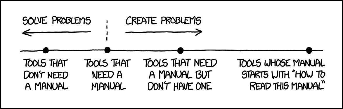
A well-designed app of low to moderate complexity does not require written documentation to use. If an app is too complex to understand even with inline help text, the user will uninstall it and find another one rather than turning to a manual. Spend your time improving the app's UI instead.
Manuals and formal documentation are acceptable for highly technical and specialized professional apps (video editing, image manipulation, CAD, etc.) that may be incomprehensible without any prior technical training. Even then, first attempt to make the app easier to use so no manual is required.
Click here to learn about relevant QtWidgets technologies
Use QWidget::setToolTip() for short explanations, and QWidget::setWhatsThis() for more detailed help. Make the whatsThis() help text discoverable for users by using the KXmlGui::KToolTipHelper class. KToolTipHelper is already used by default if the main window of your application inherits from KXmlGui::KMainWindow. KToolTipHelper also adds keyboard shortcuts of relevant actions to tooltips.