Dispositions, vues en liste et cartes
Mise en page de votre contenu
Now that we understand how pages work, it is time to add stuff to them. We will be going through a number of important layout components and elements that will be useful when designing our app.
À la fin de cette section, vous aurez une application soignée.
Vues en liste
If you've ever used Discover, NeoChat, or Plasma's System Settings, you will have come across a ListView. Quite simply, it lets you display data on a list.
pageStack.initialPage: Kirigami.ScrollablePage {
    // ...
    Kirigami.CardsListView {
       id: cardsView
        model: kountdownModel
        delegate: kountdownDelegate
    }
}
Cela semble mystérieux mais ne vous inquiétez pas. Commençons par le début.
We add this component inside our Kirigami.ScrollablePage from the last tutorial.
We're using Kirigami.CardsListView, which is a ListView that allows us to easily display cards in a list. However, ListViews are made to show data taken from a model - to automatically populate itself from a set of data that we point it to. That's where the model property comes in: in this example, it's pointing to kountdownModel.
Modèle
Kirigami.ApplicationWindow {
    // ...
    ListModel {
        id: kountdownModel
        // Chaque « ListElement » est un élément de la liste, contenant des informations.
        ListElement {
            name: "Dog birthday!!"
            description: "Big doggo birthday blowout."
            date: 100
        }
    }
    // ...
}
We add our kountdownModel inside the Kirigami.ApplicationWindow from the last tutorial.
A model defines the way that a data entry is structured. Our kountdownModel will consist of only one element for now. By looking at our ListElement above, we can see how the data of our kountdownModel are structured: it contains a name, a description, and a date. This isn't set in stone, and you may have different sorts of data in your model. The first two are just strings, and the third is a number we're using as a placeholder.
Note
Since QML is built on top of JavaScript, many of this language's features are available for use in QML files. However, QML variables have to be prefixed withproperty, unless it is inside a JS code block. You can read more about it in this page.Les modèles sont également utiles dans la mesure où ils peuvent être modifiés grâce à l'utilisation de plusieurs méthodes. En voici les plus importants :
- ListModel.append(yourobject: jsobject) adds a JavaScript object (JSObject)
yourobjectto the ListModel and places it after the last item in the model. For this to happen correctly, you must provide a JSObject with the correct properties and corresponding datatypes. - ListModel.get(index: int) returns the JSObject at the index location you provide.
- ListModel.remove(index: int, count: int) removes the JSObject at the provided
indexlocation, and as many after that index location as you put incount(1 includes only the JSObject at the provided index) - ListModel.set(index: int, yourobject: jsobject) changes the item at the provided
indexlocation with the values provided inyourobject. Same rules as withappend().
Délégués
While our kountdownModel contains the data that will be displayed, our kountdownDelegate will handle how the data will be displayed in the ListView. For that we use a Kirigami.CardsListView designed to display card-type delegates, and those delegates will be visually represented by means of a Kirigami.AbstractCard.
Delegates automatically receive the properties of the ListElement instances that we have specified in our model. We can therefore just refer to their name, description, and date properties as if they were conventional variables within our delegate.
Compilation de la carte déléguée
The Component that will represent our delegate can be added inside our Kirigami.ApplicationWindow. We will then check what each part of our delegate component does.
Kirigami.ApplicationWindow {
    // ...
    Component {
        id: kountdownDelegate
        Kirigami.AbstractCard {
            contentItem: Item {
                // ImplicitWidth / ImplicitHeight définissent la largeur / hauteur naturelle d'un
                // élément si aucune largeur ou hauteur n'est spécifiée. Le paramètre ci-dessous
                // définit la taille préférée d'un composant selon son contenu.
                implicitWidth: delegateLayout.implicitWidth
                implicitHeight: delegateLayout.implicitHeight
                GridLayout {
                    id: delegateLayout
                    anchors {
                        left: parent.left
                        top: parent.top
                        right: parent.right
                    }
                    rowSpacing: Kirigami.Units.largeSpacing
                    columnSpacing: Kirigami.Units.largeSpacing
                    columns: root.wideScreen ? 4 : 2

                    Kirigami.Heading {
                        level: 1
                        text: date
                    }

                    ColumnLayout {
                        Kirigami.Heading {
                            Layout.fillWidth: true
                            level: 2
                            text: name
                        }
                        Kirigami.Separator {
                            Layout.fillWidth: true
                            visible: description.length > 0
                        }
                        Controls.Label {
                            Layout.fillWidth: true
                            wrapMode: Text.WordWrap
                            text: description
                            visible: description.length > 0
                        }
                    }
                    Controls.Button {
                        Layout.alignment: Qt.AlignRight
                        Layout.columnSpan: 2
                        text: i18n("Edit")
                        // onClicked : à faire... bientôt !
                    }
                }
            }
        }
    }
    // ...
}
implicitWidth et implicitHeight
La première partie que nous allons examiner est de savoir comment gérer la largeur et la hauteur de notre composant :
Kirigami.AbstractCard {
    contentItem: Item {
        implicitWidth: delegateLayout.implicitWidth
        implicitHeight: delegateLayout.implicitHeight
        GridLayout {
            id: delegateLayout
            // ...
        }
    }
}
Looking at our Kirigami.AbstractCard, the first properties we set are implicitWidth and implicitHeight. We have set these to the delegateLayout.implicitWidth and delegateLayout.implicitHeight, i.e. the implicitWidth and implicitHeight of the GridLayout element.
Implicit widths and heights are properties available in any Item that function as hints and are set as a default, or as a fallback, if there is no explicit width or height set for these components. These values default to 0x0, so it is very important that you define those in raw Item components as done above.
Here we have set the implicitWidth and implicitHeight of our Kirigami.AbstractCard to that of the GridLayout below to ensure it does not spill out of the card. This way, the card takes as much space is necessary for its contents.
Dispositions
The GridLayout is inside the Item component we have provided for the property contentItem. This is the Item that contains what will be displayed in your card.
We also need to choose a layout for our components so that they don't just pile on top of each other. There are three main types that we can choose from:
- ColumnLayout lays out your components vertically, in a single column
- RowLayout lays out your components horizontally, in a single row
- GridLayout lays out your components in a grid with a composition of your choosing
With ColumnLayout and RowLayout, all we have to do is write our components inside the Layout component. As you can see, we went with a GridLayout, which entails a bit more handiwork.
GridLayout {
    id: delegateLayout
    anchors {
        left: parent.left
        top: parent.top
        right: parent.right
    }
    rowSpacing: Kirigami.Units.largeSpacing
    columnSpacing: Kirigami.Units.largeSpacing
    columns: root.wideScreen ? 4 : 2
    // ...
}
The first thing you see is our anchors. QtQuick's anchoring system provides a useful way of making sure your components are positioned in certain parts of a parent component. We have anchored our GridLayout to the left, top, and right of the parent card, ensuring our content stretches across the whole card.
Next we specify the spacing between the rows and columns within our grid, so that our components don't bunch up. Kirigami provides a number of handy predefined units to use for this purpose:
| Unité de Kirigami | Pixels |
|---|---|
| Petit espacement | 4 px |
| Espacement large | 8 px |
| Unité de grille | 18 px |
Note
KDE's Visual Design Group (VDG) has a lot more information about the different units defined within Plasma and Kirigami on the Human Interface Guidelines.As you might remember, root is the id of our Kirigami.ApplicationWindow. It provides the wideScreen property, used to determine whether the current device screen is a widescreen (i.e. a computer monitor or a phone in landscape). We use a ternary conditional here to vary the number of columns in our grid depending on the screen we are using: if it's a widescreen, the grid will have 4 columns, else it will have 2.
Composants internes
We could just create three labels within our delegate component and call it a day, but that wouldn't look particularly nice. We'll make use of a few more convenient components:
GridLayout {
    // ...
    Kirigami.Heading {
        Layout.fillHeight: true
        level: 1
        text: date
    }

    ColumnLayout {
        Kirigami.Heading {
            Layout.fillWidth: true
            level: 2
            text: name
        }

        Kirigami.Separator {
            Layout.fillWidth: true
            visible: description.length > 0
        }

        Controls.Label {
            Layout.fillWidth: true
            wrapMode: Text.WordWrap
            text: description
            visible: description.length > 0
        }
    }

    Controls.Button {
        Layout.alignment: Qt.AlignRight
        Layout.columnSpan: 2
        text: i18n("Edit")
    }
}
À quoi ressemble la carte personnalisée
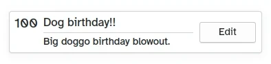
- Left, Kirigami.Heading: uses the
ListElement'sdateas a level 1 heading. - Middle, ColumnLayout: has a Kirigami.Heading that displays the task name; a Kirigami.Separator, which provides the horizontal line; and a Controls.Label, that displays a task's optional description. The latter two components have a visible property, which checks if the description is empty or not and displays the components depending on the result of
description.length > 0. - A droite, [Controls.Button](docs:qtquickcontrols ; QtQuick.Controls.Button) : un bouton qui fera quelque chose... bientôt !
Notre application jusqu'à présent
Main.qml :
| |
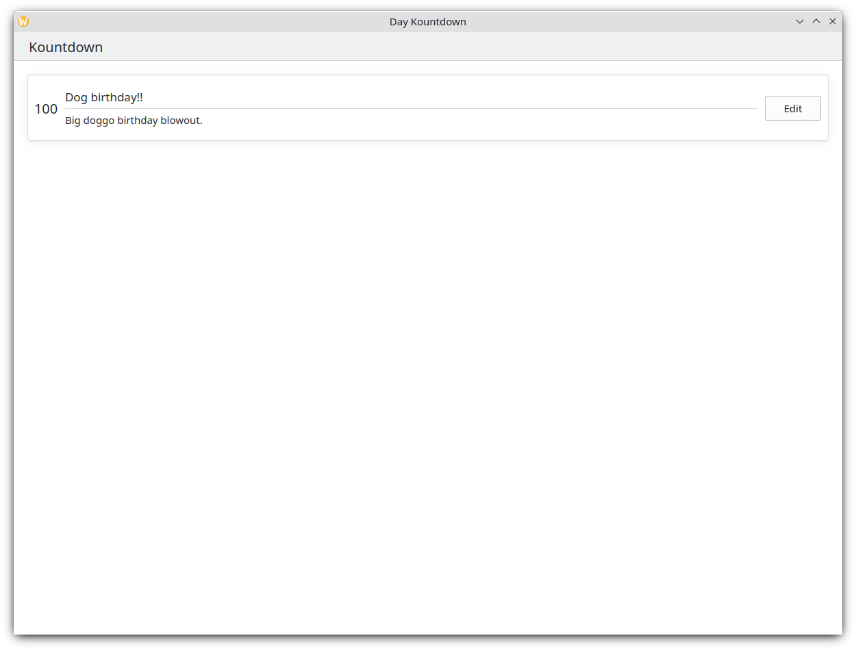
Ainsi, ceci est notre carte basique !
Avec ces étapes, nous avons maintenant posé les bases pour ajouter toutes les fonctionnalités à notre application.