Tiroirs
Les tiroirs sont des panneaux coulissant sur les côtés de la fenêtre de l'application. Ils peuvent être remplis d'éléments interactifs tels que des actions de Kirigami, des boutons, du texte, etc.
Les tiroirs sont proposés avec différents types, différentes formes et différents modèles. Dans cette page, nous allons passer en revue chaque type et donner un aperçu de leurs caractéristiques.
Tiroir global
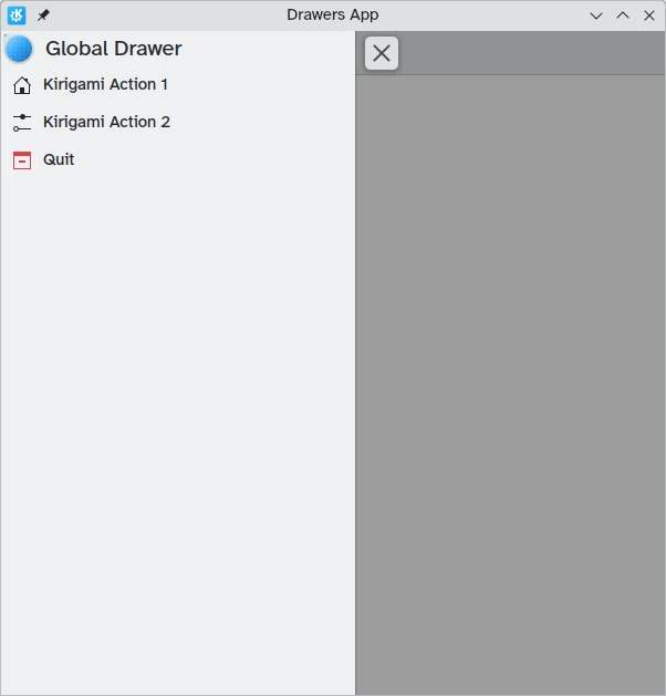
Le tiroir global est une fonctionnalité standard dans les applications mobiles de KDE et peut parfois être aussi présent dans leurs versions de bureau. Il contient un menu principal d'une application. Ce qui est inclus sont toutes les fonctions qui ne sont pas spécifiques à la page en cours, mais qui sont importantes pour la navigation ou l'interaction générale au sein de l'application.
It can be activated by tapping the hamburger menu or by swiping from the left edge to the middle of the screen in Left to Right mode or from the right edge in Right to Left mode.
Kirigami.GlobalDrawer components are what we use to create such drawers. These are set to the globalDrawer property of the Kirigami.ApplicationWindow that forms the basis of our Kirigami application.
import QtQuick
import org.kde.kirigami as Kirigami

Kirigami.ApplicationWindow {
    title: "Drawers App"
    width: 600
    height: 600
    pageStack.initialPage: Kirigami.Page { /* Page code here... */ }

    globalDrawer: Kirigami.GlobalDrawer {
        title: "Global Drawer"
        titleIcon: "applications-graphics"
        actions: [
            Kirigami.Action {
                text: "Kirigami Action 1"
                icon.name: "user-home-symbolic"
                onTriggered: showPassiveNotification("Action 1 clicked")
            },
            Kirigami.Action {
                text: "Kirigami Action 2"
                icon.name: "settings-configure-symbolic"
                onTriggered: showPassiveNotification("Action 2 clicked")
            },
            Kirigami.Action {
                text: i18n("Quit")
                icon.name: "application-exit-symbolic"
                shortcut: StandardKey.Quit
                onTriggered: Qt.quit()
            }
        ]
    }
}
Note
The titleIcon property takes names for system-wide icons according to the FreeDesktop specification. These icons and icon names can be viewed with KDE's CuttleFish application which comes with plasma-sdk, or by visiting FreeDesktop's icon naming specification.En-tête
Les en-têtes peuvent être utilisés pour placer des composants collants en haut de votre tiroir global. Les composants d'en-tête resteront en place même si votre tiroir global contient des actions de Kirigami imbriquées qui remplacent la couche actuelle du tiroir global.
Your chosen header component can be set with the global drawer's header property, and it will replace the global drawer's title. This is useful to add a Kirigami.SearchField, for example:
import QtQuick
import org.kde.kirigami as Kirigami

Kirigami.ApplicationWindow {
    title: "Drawers App"
    width: 600
    height: 600
    pageStack.initialPage: Kirigami.Page { /* Page code here... */ }

    globalDrawer: Kirigami.GlobalDrawer {
        title: "Global Drawer with searchfield (not visible)"

        header: Kirigami.SearchField {
                id: searchField
        }

        actions: [
            Kirigami.Action {
                text: "Kirigami Action 1"
                icon.name: "user-home-symbolic"
                onTriggered: showPassiveNotification("Action 1 clicked")
            },
            Kirigami.Action {
                text: "Kirigami Action 2"
                icon.name: "settings-configure-symbolic"
                onTriggered: showPassiveNotification("Action 2 clicked")
            },
            Kirigami.Action {
                text: i18n("Quit")
                icon.name: "application-exit-symbolic"
                shortcut: StandardKey.Quit
                onTriggered: Qt.quit()
            }
        ]
    }
}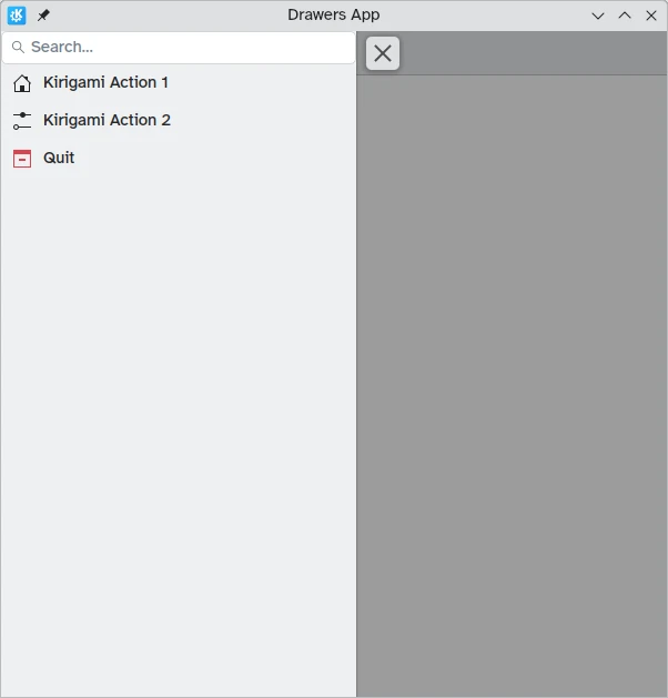
Notre tiroir global affiche maintenant le composant de la barre de recherche que nous avons défini comme en-tête.
Adaptation au bureau
While panel-style global drawers can be useful in mobile environments, they might be too large on the desktop, especially when the application has few actions.
Thankfully, Kirigami global drawers provide an isMenu property. When set to true, they turn into more traditional menus only on the desktop.
Note
Dans ce mode de menu, les en-têtes et les bannières ne sont pas visibles.globalDrawer: Kirigami.GlobalDrawer {
isMenu: true
actions: [
// Actions de Kirigami ici...
]
}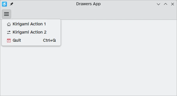
Tiroir global en mode « Menu », sans en-tête ni bannière
Tiroirs de contexte
While a Kirigami.GlobalDrawer displays global actions available throughout your application, a Kirigami.ContextDrawer should be used to display actions that are only relevant in certain contexts. This is usually used in separate pages.
A context drawer will behave differently depending on whether it is being used on a mobile platform or on a desktop.
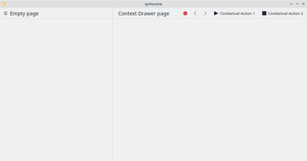
On a desktop, when a window has enough space, contextual actions show up as part of the actions group in the top toolbar. When space is limited, such as on a mobile device or in a narrow window, contextual actions are hidden behind a hamburger menu on the right side. This is different from other actions in the actions group, namely actions.main, actions.left and actions.right; these do not get hidden in space-constrained windows, and are instead collapsed into their respective icons.
| |
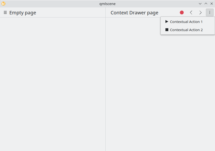
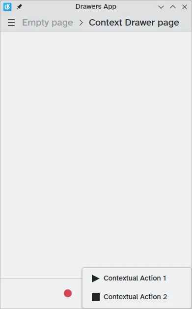
Tiroir de contexte avec des actions contextuelles masquées
Tiroir de contexte affichant toutes les actions contextuelles
On mobile, the drawer always consists of actions hidden behind a hamburger menu. It can be activated by tapping the hamburger menu or by swiping from the right edge to the middle of the screen in Left to Right mode or from the left edge in Right to Left mode.
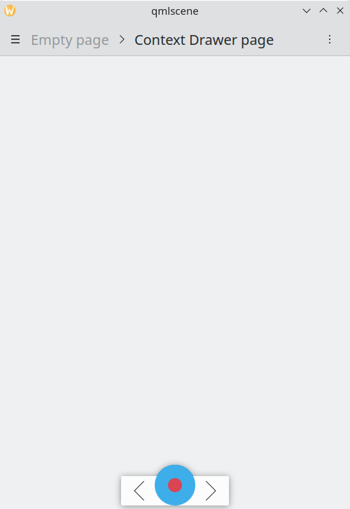
Même exemple ci-dessus, en exécution en mode mobile
Tiroir de contexte ouvert en mode pour mobile
Tiroirs modaux et intégrés
Kirigami propose deux autres types de tiroirs, les tiroirs modaux et les tiroirs intégrés. Ils sont assez semblables l'un à l'autre. Tous deux s'étendent sur toute la largeur ou la hauteur de l'application et peuvent être placés sur les bords de la fenêtre de l'application. Cependant, ils réagissent différemment lors d'une interaction avec l'utilisateur.
- Modal drawers are hidden by default and darken the rest of the application, being dismissed when clicking on a darkened area.
- Inline drawers are shown by default and allow the user to still interact with the rest of the application without being dismissed, and do not darken other areas.
This kind of drawer is open ended and flexible, but generally, you may want to use this kind of drawer when you want a small list of options to appear on a long press or right click.
These two drawers are so similar because they can, in fact, be implemented using the same Kirigami component: Kirigami.OverlayDrawer. Here are a few important inherited properties of this component to keep in mind:
- Popup.modal controls whether the drawer will be modal or inline depending on a boolean value.
- Drawer.edge controls which edge of the application window the drawer will appear on; options for this property are part of the Edge enum, namely
Qt.TopEdge,Qt.RightEdge,Qt.BottomEdge, andQt.LeftEdge. - Popup.contentItem contains the component that will form the content of your drawer.
import QtQuick
import QtQuick.Layouts
import QtQuick.Controls as Controls
import org.kde.kirigami as Kirigami

Kirigami.ApplicationWindow {
    title: "Drawers App"
    width: 400
    height: 600
    pageStack.initialPage: Kirigami.Page {
        title: "OverlayDrawer at the bottom"
        actions: [
            Kirigami.Action {
                text: "Open bottomDrawer"
                onTriggered: bottomDrawer.open()
            }
        ]
        Kirigami.OverlayDrawer {
            id: bottomDrawer
            edge: Qt.BottomEdge
            // Définissez le paramètre « modal » à « False » pour que ce tiroir soit en ligne !
            modal: true

            contentItem: RowLayout {
                Controls.Label {
                    Layout.fillWidth: true
                    text: "Say hello to my little drawer!"
                }
                Controls.Button {
                    text: "Close"
                    onClicked: bottomDrawer.close()
                }
            }
        }
    }
}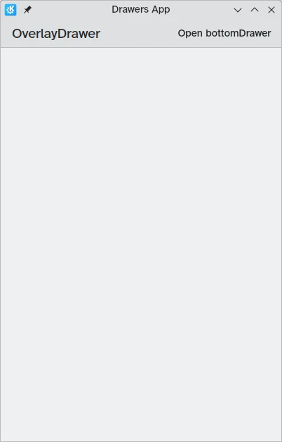
Tiroir modal non visible
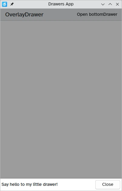
Tiroir modal sur le bord inférieur de l'écran.