Formez des délégués dans vos pages de configuration
Kirigami Addons is an additional set of visual components that work well on mobile and desktop and are guaranteed to be cross-platform. It uses Kirigami under the hood to create its components.
You have learned how to add About and AboutKDE pages to your application. Now you will be able to use their same inner components to create your settings pages.
La structure du projet devrait ressembler à ceci :
addonsexample
├── CMakeLists.txt
├── main.cpp
├── Main.qml
├── MyAboutPage.qml
└── SettingsPage.qml
Modifications nécessaires
Modifier le fichier main.qml pour inclure notre nouvelle page de configuration :
import QtQuick
import QtQuick.Layouts

import org.kde.kirigami as Kirigami
import org.kde.kirigamiaddons.formcard as FormCard

import org.kde.about 1.0

Kirigami.ApplicationWindow {
    id: root
    width: 600
    height: 700

    Component {
        id: aboutkde
        FormCard.AboutKDE {}
    }

    Component {
        id: aboutpage
        MyAboutPage {}
    }

    Component {
        id: settingspage
        SettingsPage {}
    }

    pageStack.initialPage: Kirigami.ScrollablePage {
        ColumnLayout {
            FormCard.FormCard {
                FormCard.FormButtonDelegate {
                    id: aboutKDEButton
                    icon.name: "kde"
                    text: i18n("About KDE Page")
                    onClicked: root.pageStack.layers.push(aboutkde)
                }

                FormCard.FormButtonDelegate {
                    id: aboutPageButton
                    icon.name: "applications-utilities"
                    text: i18n("About Addons Example")
                    onClicked: root.pageStack.layers.push(aboutpage)
                }

                FormCard.FormButtonDelegate {
                    id: settingsButton
                    icon.name: "settings-configure"
                    text: i18n("Single Settings Page")
                    onClicked: root.pageStack.layers.push(settingspage)
                }
            }
        }
    }
}
Nous pouvons maintenant commencer à consulter les composants utilisés pour la création de notre page « Configuration » : la carte de formulaire et ses délégués.
Délégués de formulaire
Formcard et FormCardpage
FormCard.FormCard is the main component we will be using to group all its child components, the Delegates.
We used a form card in the Kirigami Addons introduction before. Its main purpose is to serve as a container for other components while following a color different from the background, in a similar manner to a Kirigami.Card.
Crée un nouveau fichier « SettingsPage.qml » :
import QtQuick
import org.kde.kirigamiaddons.formcard as FormCard

FormCard.FormCardPage {
    FormCard.FormCard {
        // C'est là que vont tous nos délégués !
    }

    FormCard.FormCard {
        // C'est là que vont tous nos délégués !
    }
}
Since we are making a separate QML file for our Settings page, and since we need to prepare for potential scrolling in our page, we use a FormCard.FormCardPage, which inherits Kirigami.ScrollablePage.
The nice thing about the form card page is that it comes with an internal layout, so no additional ColumnLayout is needed and our delegates can be added directly to it.
Note
It is possible to use FormCard delegates directly with a Kirigami.ScrollablePage, but in that case you will need to add your own layouts.En-tête de formes
For every FormCard you want to create, you can create a FormHeader just before it. The header uses bold text and shows up right above the form card.
import org.kde.kirigamiaddons.formcard as FormCard
FormCard.FormCardPage {
FormCard.FormHeader {
title: i18n("General")
}
FormCard.FormCard {
// Nos délégués vont ici ...
}
FormCard.FormHeader {
title: i18n("Accounts")
}
FormCard.FormCard {
// Nos délégués vont ici ...
}
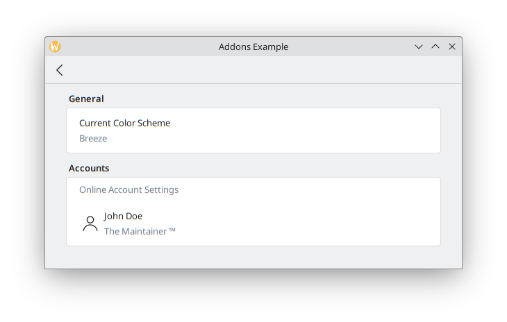
}FormTextDelegate et FormSectionText
Commençons simplement, avec du texte brut.
FormSectionText simply adds a thin delegate containing a label. FormTextDelegate has text and a grayed out description.
import QtQuick
import org.kde.kirigami as Kirigami
import org.kde.kirigamiaddons.formcard as FormCard

FormCard.FormCardPage {
    FormCard.FormHeader {
        title: i18n("General")
    }

    FormCard.FormCard {
        FormCard.FormTextDelegate {
            text: i18n("Current Color Scheme")
            description: "Breeze"
        }
    }

    FormCard.FormHeader {
        title: i18n("Accounts")
    }

    FormCard.FormCard {
        FormCard.FormSectionText {
            text: i18n("Online Account Settings")
        }
        FormCard.FormTextDelegate {
            leading: Kirigami.Icon {source: "user"}
            text: "John Doe"
            description: i18n("The Maintainer ™️")
        }
    }
}
We add some dummy text for the hypothetical theme detection. If we wanted to have actual color scheme detection, in the future it could be done similarly to Neochat (code here), making use of a C++ model with KColorSchemeManager.
In the Online Accounts section, we see an additional property, leading. We can add an Item to it so that it appears before the text. Its opposite property, trailing, would be able to show an Item after the text, but we won't use it in our program.
We use a Kirigami.Icon here for simplicity, but this could also be implemented using a Kirigami Addons Avatar that grabs the information from a model, as is done in Neochat.
Cela devrait à la fin ressembler à ceci :
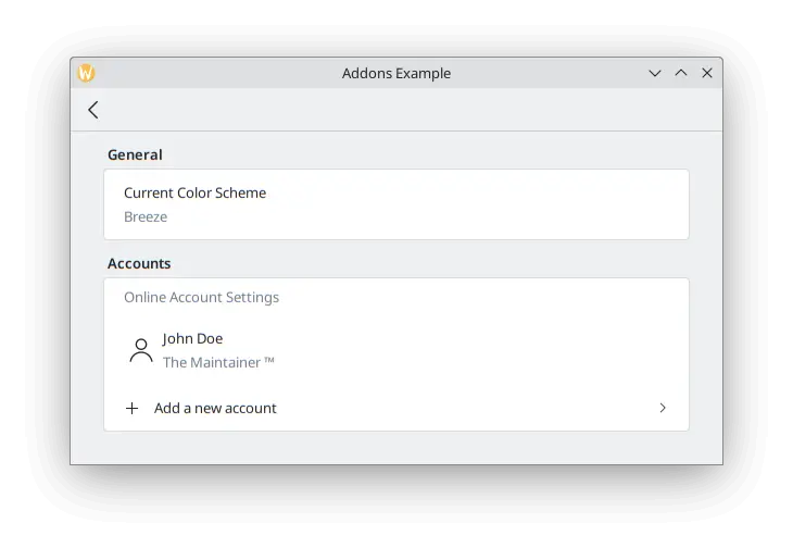
FormButtonDelegate
The FormButtonDelegate is visually similar to a FormTextDelegate, but it is clickable and shows an arrow pointing to the right. We used it in the Kirigami Addons introduction before.
While the FormTextDelegate had the leading and trailing properties to show an item before and after the main content, the FormButtonDelegate only has the leading property, because the right side is occupied by the arrow.
import QtQuick
import org.kde.kirigami as Kirigami
import org.kde.kirigamiaddons.formcard as FormCard

FormCard.FormCardPage {
    FormCard.FormHeader {
        title: i18n("General")
    }

    FormCard.FormCard {
        FormCard.FormTextDelegate {
            text: i18n("Current Color Scheme")
            description: "Breeze"
        }
    }

    FormCard.FormHeader {
        title: i18n("Accounts")
    }

    FormCard.FormCard {
        FormCard.FormSectionText {
            text: i18n("Online Account Settings")
        }
        FormCard.FormTextDelegate {
            leading: Kirigami.Icon {source: "user"}
            text: "John Doe"
            description: i18n("The Maintainer ™️")
        }
        FormCard.FormButtonDelegate {
            icon.name: "list-add"
            text: i18n("Add a new account")
            onClicked: console.info("Clicked!")
        }
    }
}
We use its icon.name property to set a plus (+) icon to appear after the space where the leading would appear, and before the main content. This is a common pattern to indicate your button will add something to a list.
Since this example is for simple illustrative purposes, we don't delve deep into what would be done once the button is clicked: it just prints "Clicked!" to the terminal. We could make a new page for account creation that adds another user to a model, then push the page into view, similarly to what we did in Main.qml.
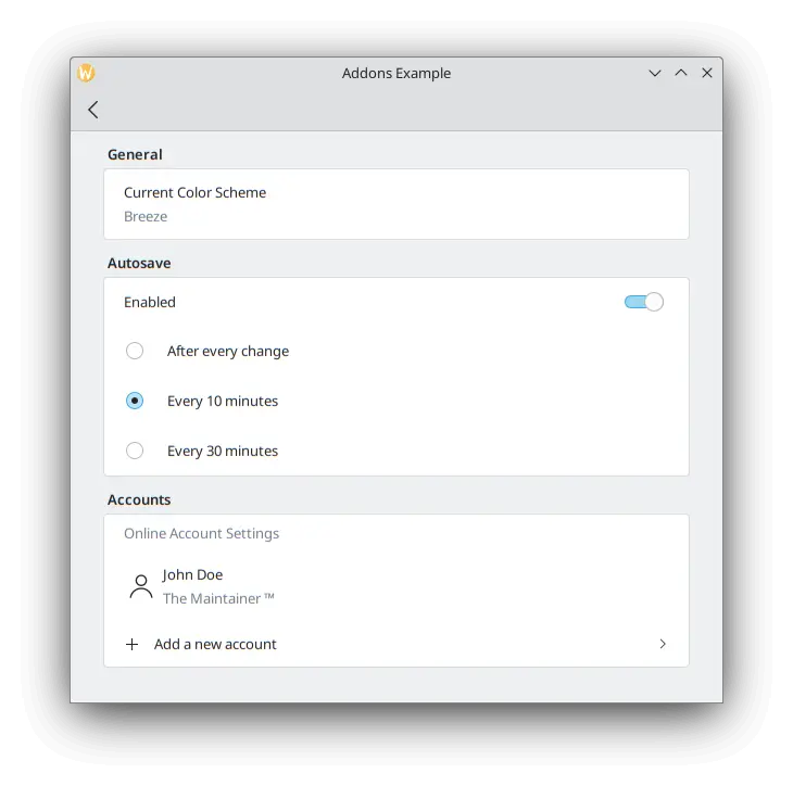
FormRadioDelegate, FormCheckDelegate et FormSwitchDelegate
The RadioButton, CheckBox and Switch are very commonly used components in any user interface. Kirigami Addons provides them as FormRadioDelegate, FormCheckDelegate and FormSwitchDelegate.
Their only main properties are text and description. They are different in usage because they all inherit AbstractButton, and so you are expected to use its signals and handlers: checked and onChecked, toggled and onToggled, clicked and onClicked.
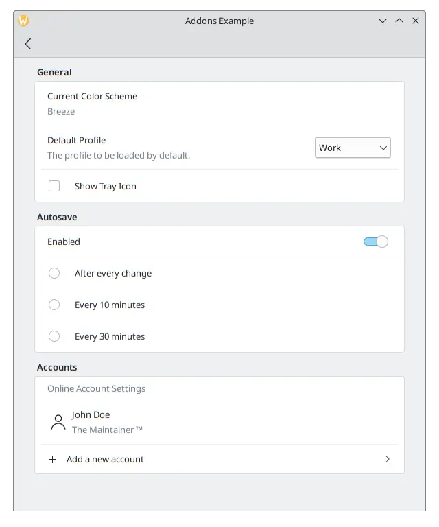
We want to create some autosave functionality in our application, and we want to only show its settings if the user has enabled this functionality. Create a new section using a FormCard and a FormHeader, then add a FormSwitchDelegate and a FormRadioDelegate.
FormCard.FormHeader {
    title: i18n("Autosave")
}

FormCard.FormCard {
    FormCard.FormSwitchDelegate {
        id: autosave
        text: i18n("Enabled")
    }
    FormCard.FormRadioDelegate {
        text: i18n("After every change")
        visible: autosave.checked
    }
    FormCard.FormRadioDelegate {
        text: i18n("Every 10 minutes")
        visible: autosave.checked
    }
    FormCard.FormRadioDelegate {
        text: i18n("Every 30 minutes")
        visible: autosave.checked
    }
}
Nous lions la visibilité de chaque bouton radio à un commutateur, de sorte qu'ils n'apparaissent que lorsque le commutateur est activé.
Les meilleures pratiques
Cliquez ici pour en savoir plus
If you have some programming background in imperative languages such as C++, you might be tempted to set the checked property of the switch to turn the visibility of the radio buttons to true with a JavaScript assignment such as:
checked: {
    radio1.visible = true;
    radio2.visible = true;
    radio3.visible = true;
}
This is not very efficient for QML's declarative language and its signals and slots. Try to use QML bindings like in the case of visible: autosave.checked as much as possible instead of JavaScript expressions.
See this page for details.
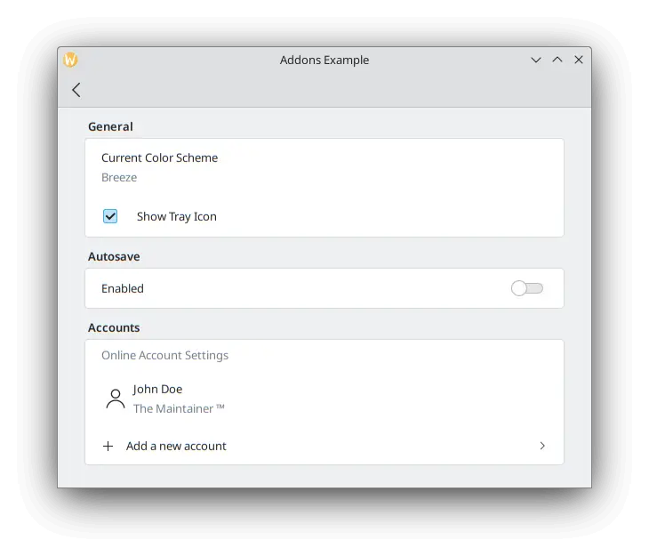
To test our checkbox, we can add a new FormCheckDelegate to our General section.
FormCard.FormHeader {
    title: i18n("General")
}

FormCard.FormCard {
    FormCard.FormTextDelegate {
        text: i18n("Current Color Scheme")
        description: "Breeze"
    }
    FormCard.FormCheckDelegate {
        text: i18n("Show Tray Icon")
        onToggled: {
            if (checkState) {
                console.info("A tray icon appears on your system!")
            } else {
                console.info("The tray icon disappears!")
            }
        }
    }
}
Here we use the signal handler called onToggled to show some dummy text to simulate a tray icon appearing in the system. If you really wanted to, you could easily implement a tray icon using KDE's KStatusNotifierItem or Qt's SystemTrayIcon.
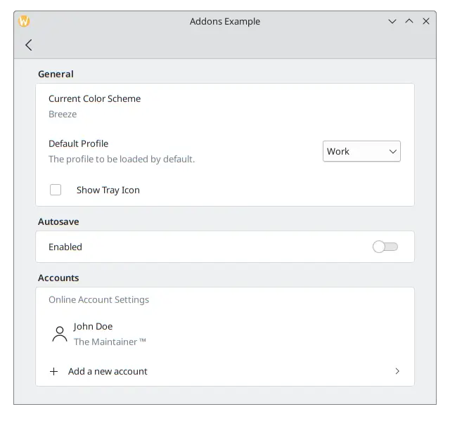
A la fin, notre application devrait ressembler à ceci :
FormComboBoxDelegate
The common ComboBox component can be created using a FormComboBoxDelegate.
This combobox has several useful properties we can make use of: editable, displayText and displayMode.
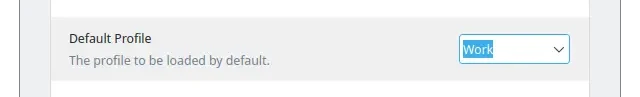
Setting editable: true allows the user to edit the text of the combobox, which is useful in case adding new combobox options is needed:
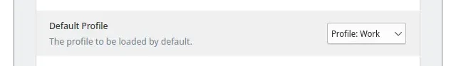
Whenever you need to show additional text before each option, you can use something like displayText: "Profile: " + currentText:
And the most interesting one, which we will be using in our example, is displayMode. It can have three options:
- FormComboBoxDelegate.ComboBox : la petite boite standard affichant une liste d'options.
- FormComboBoxDelegate.Dialog: a dialog showing a list of options in the middle of the window, like a Kirigami.OverlaySheet.
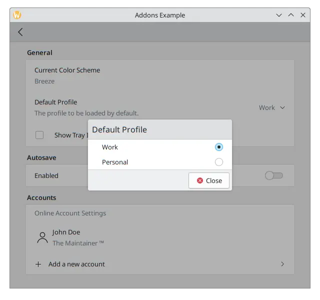
- FormComboBoxDelegate.Page : une nouvelle page contenant une liste d'options affichée dans une fenêtre séparée.
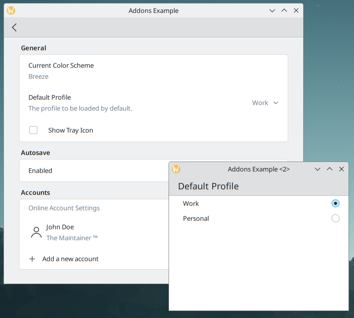
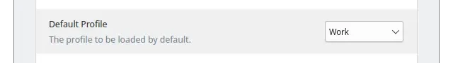
Ajoutez ce qui suit entre les délégués « Thème courant de couleurs » et « Afficher la boite à miniatures » dans votre carte de formulaire « Général ».
FormCard.FormComboBoxDelegate {
    text: i18n("Default Profile")
    description: i18n("The profile to be loaded by default.")
    displayMode: FormCard.FormComboBoxDelegate.ComboBox
    currentIndex: 0
    editable: false
    model: ["Work", "Personal"]
}
A la boite de dialogue à cocher, notre page de configuration devrait ressembler à ceci :
FormDelegateSeparator
Our Settings page is taking shape, but each section is starting to get long. We can add a few FormDelegateSeparator instances to make our page tidier:
import QtQuick
import org.kde.kirigami as Kirigami
import org.kde.kirigamiaddons.formcard as FormCard

FormCard.FormCardPage {
    id: root

    title: i18nc("@title", "Settings")

    FormCard.FormHeader {
        title: i18nc("@title:group", "General")
    }

    FormCard.FormCard {
        FormCard.FormTextDelegate {
            text: i18nc("@info", "Current Color Scheme")
            description: "Breeze"
        }

        FormCard.FormComboBoxDelegate {
            id: combobox
            text: i18nc("@label:listbox", "Default Profile")
            description: i18nc("@info:whatsthis", "The profile to be loaded by default.")
            displayMode: FormCard.FormComboBoxDelegate.ComboBox
            currentIndex: 0
            editable: false
            model: ["Work", "Personal"]
        }

        FormCard.FormDelegateSeparator {
            above: combobox
            below: checkbox
        }

        FormCard.FormCheckDelegate {
            id: checkbox
            text: i18nc("@option:check", "Show Tray Icon")
            onToggled: {
                if (checkState) {
                    console.info("A tray icon appears on your system!")
                } else {
                    console.info("The tray icon disappears!")
                }
            }
        }
    }

    FormCard.FormHeader {
        title: i18nc("@title:group", "Autosave")
    }

    FormCard.FormCard {
        FormCard.FormSwitchDelegate {
            id: autosave
            text: i18nc("@option:check", "Enabled")
        }
        FormCard.FormDelegateSeparator {
            above: autosave
            below: firstradio
            visible: autosave.checked
        }
        FormCard.FormRadioDelegate {
            id: firstradio
            text: i18nc("@option:radio", "After every change")
            visible: autosave.checked
        }
        FormCard.FormRadioDelegate {
            text: i18nc("@option:radio", "Every 10 minutes")
            visible: autosave.checked
        }
        FormCard.FormRadioDelegate {
            text: i18nc("@option:radio", "Every 30 minutes")
            visible: autosave.checked
        }
    }

    FormCard.FormHeader {
        title: i18nc("@title:group", "Accounts")
    }

    FormCard.FormCard {
        FormCard.FormSectionText {
            text: i18nc("@info:whatsthis", "Online Account Settings")
        }
        FormCard.FormTextDelegate {
            id: lastaccount
            leading: Kirigami.Icon {source: "user"}
            text: "John Doe"
            description: i18nc("@info:credit", "The Maintainer ™️")
        }
        FormCard.FormDelegateSeparator {
            above: lastaccount
            below: addaccount
        }
        FormCard.FormButtonDelegate {
            id: addaccount
            icon.name: "list-add"
            text: i18nc("@action:button", "Add a new account")
            onClicked: console.info("Clicked!")
        }
    }
}
Generally, you may use separators whenever you see major distinctions between components, although the choice of where to place them is ultimately yours. For example, in the General section, the checkbox differs from its previous components as it doesn't start with text; in the Autosave section, the separator groups the radio buttons together; and in the Accounts section, adding a separator between the last account and the button provides some additional focus to the button.
The above and below properties are rather self-explanatory when it comes to their use: you pass the id of the components above and below the separator. When they are set, the separator will swiftly disappear whenever the above or below item is highlighted/hovered. They are most useful, for instance, when you need to generate components dynamically and you can't automatically assume which item will come immediately before or after the separator. That would be the case in the Accounts section of our application once the logic to add new accounts were actually implemented, in which case we could always grab the last item in the model to do so.
Veuillez noter comment le séparateur au-dessus du paramètre de la boite à miniatures n'apparait pas lorsqu'il est survolé.