Explicación de las páginas
Nuestra aplicación
En el tutorial anterior hemos configurado, construido y compilado nuestra primera aplicación de Kirigami. Con los conceptos básicos en su lugar, podemos comenzar nuestro viaje hacia la creación de una aplicación repleta de funcionalidad.
Estos tutoriales se centrarán en la creación de una aplicación que permita ver cuántos días faltan para un determinado evento.
We also recommend you check out the Kirigami Gallery, which provides a number of useful UI examples.
En esta sección nos centraremos en las páginas, uno de los elementos estructurales clave de cualquier aplicación Kirigami.
Páginas
Kirigami apps are typically organized in pages by using Kirigami.Page. Pages are the different "screens" of an app. You will want to have a page dedicated to specific aspects of your app's interaction, and to make things easier you can create different QML files for each page.
Pages are organized in a page stack where they can be pushed and popped. On a phone only the top-most page is shown, whereas on a larger screen (desktop or tablet), if desired, multiple pages can be shown next to each other.
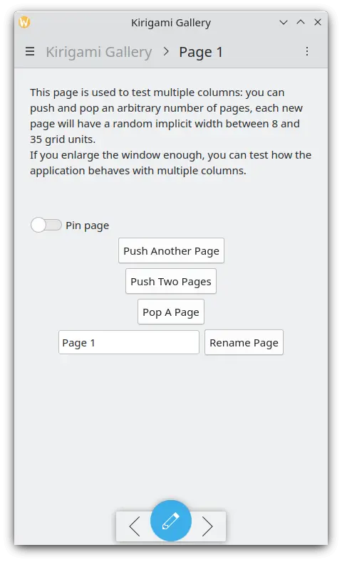
Una única página en el teléfono
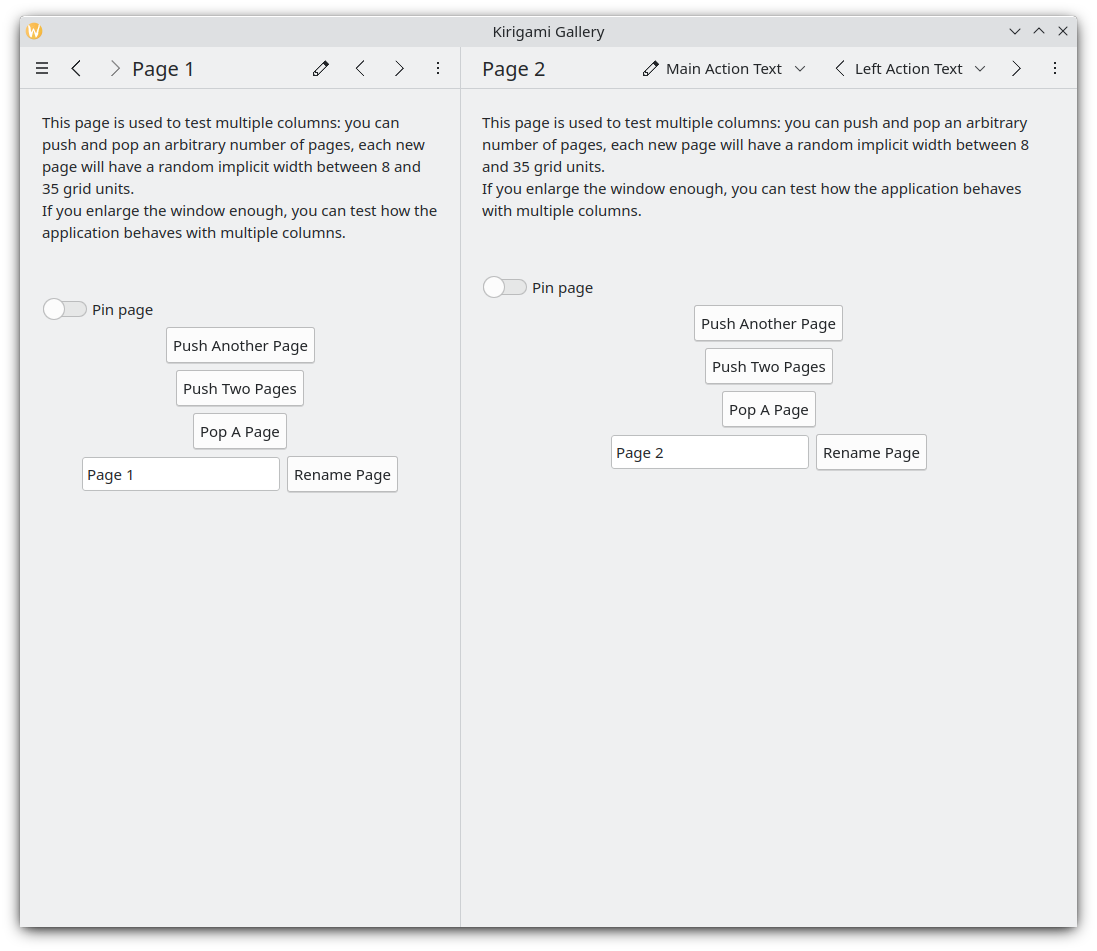
Dos páginas, una junto a la otra, en el escritorio
Nota
A Kirigami.Page inherits from a Controls.Page, and as such you can use the latter's properties as well.
When looking through QML API documentation, make sure to look into the functions and properties inherited by the API you are looking at as well.
Volvamos al archivo Main-qml que hemos creado en el anterior tutorial:
| |
We make our application start to our Kirigami.Page. All we have included in it is a label containing "Hello World", but we're going to spruce things up a little.
The idea behind our app is that we're going to be able to display a bunch of countdowns to the user. The problem with a normal Kirigami.Page is that it has a fixed vertical size, so instead we can use a Kirigami.ScrollablePage, which already comes with its own built-in scrollbar.
| |
Kirigami pages also feature neat titles placed within the toolbar, quickly indicating to the user which page they are on. All we need to do is to set a page title using the title property of Kirigami.ScrollablePage. In this case, we used one of the i18nc() functions we explored in our previous tutorial to this end.
Nota
You could also choose to define your page within its own QML document. To do so, you'd create the new QML file, for example kirigami-tutorial/src/qml/StartPage.qml, add it to your kirigami-tutorial/src/CMakeLists.txt file, and set the window's first page to load it, like so:
pageStack.initialPage: Qt.resolvedUrl("StartPage.qml")pageStack.initialPage sets the initial Page of the application's page stack, and Qt.resolvedUrl converts the relative URL of the QML file into an absolute one.
Existe más información sobre estructuras de páginas alternativas dentro de nuestra documentación de Kirigami.