Layouts, ListViews y Cards
Organización del contenido
Ahora que entendemos cómo funcionan las páginas, es hora de añadirles cosas. Revisaremos una serie de componentes y elementos de diseño importantes que serán de utilidad para diseñar nuestra aplicación.
Al final de esta sección tendremos una aplicación de aspecto atractivo.
ListViews
If you've ever used Discover, NeoChat, or Plasma's System Settings, you will have come across a ListView. Quite simply, it lets you display data on a list.
pageStack.initialPage: Kirigami.ScrollablePage {
    // …
    Kirigami.CardsListView {
       id: cardsView
        model: kountdownModel
        delegate: kountdownDelegate
    }
}
Eso parece críptico, pero no se preocupe. Empecemos por el principio.
We add this component inside our Kirigami.ScrollablePage from the last tutorial.
We're using Kirigami.CardsListView, which is a ListView that allows us to easily display cards in a list. However, ListViews are made to show data taken from a model - to automatically populate itself from a set of data that we point it to. That's where the model property comes in: in this example, it's pointing to kountdownModel.
Modelo
Kirigami.ApplicationWindow {
    // …
    ListModel {
        id: kountdownModel
        // Cada ListElement es un elemento de la lista que contiene información
        ListElement {
            name: "Dog birthday!!"
            description: "Big doggo birthday blowout."
            date: 100
        }
    }
    // …
}
We add our kountdownModel inside the Kirigami.ApplicationWindow from the last tutorial.
A model defines the way that a data entry is structured. Our kountdownModel will consist of only one element for now. By looking at our ListElement above, we can see how the data of our kountdownModel are structured: it contains a name, a description, and a date. This isn't set in stone, and you may have different sorts of data in your model. The first two are just strings, and the third is a number we're using as a placeholder.
Nota
Since QML is built on top of JavaScript, many of this language's features are available for use in QML files. However, QML variables have to be prefixed withproperty, unless it is inside a JS code block. You can read more about it in this page.Los modelos también son útiles porque se pueden modificar mediante el uso de varios métodos. Algunos importantes son:
- ListModel.append(yourobject: jsobject) adds a JavaScript object (JSObject)
yourobjectto the ListModel and places it after the last item in the model. For this to happen correctly, you must provide a JSObject with the correct properties and corresponding datatypes. - ListModel.get(index: int) devuelve el JSObject que hay en la posición del índice indicado.
- ListModel.remove(index: int, count: int) removes the JSObject at the provided
indexlocation, and as many after that index location as you put incount(1 includes only the JSObject at the provided index) - ListModel.set(index: int, yourobject: jsobject) changes the item at the provided
indexlocation with the values provided inyourobject. Same rules as withappend().
Delegados
While our kountdownModel contains the data that will be displayed, our kountdownDelegate will handle how the data will be displayed in the ListView. For that we use a Kirigami.CardsListView designed to display card-type delegates, and those delegates will be visually represented by means of a Kirigami.AbstractCard.
Delegates automatically receive the properties of the ListElement instances that we have specified in our model. We can therefore just refer to their name, description, and date properties as if they were conventional variables within our delegate.
Construyendo la tarjeta de delegado
The Component that will represent our delegate can be added inside our Kirigami.ApplicationWindow. We will then check what each part of our delegate component does.
Kirigami.ApplicationWindow {
    // …
    Component {
        id: kountdownDelegate
        Kirigami.AbstractCard {
            contentItem: Item {
                // implicitWidth/Height definen la anchura/altura natural de un elemento si no se
                // indica otra anchura o altura. La siguiente preferencia define el tamaño preferido
                // de un componente en función de su contenido
                implicitWidth: delegateLayout.implicitWidth
                implicitHeight: delegateLayout.implicitHeight
                GridLayout {
                    id: delegateLayout
                    anchors {
                        left: parent.left
                        top: parent.top
                        right: parent.right
                    }
                    rowSpacing: Kirigami.Units.largeSpacing
                    columnSpacing: Kirigami.Units.largeSpacing
                    columns: root.wideScreen ? 4 : 2

                    Kirigami.Heading {
                        level: 1
                        text: date
                    }

                    ColumnLayout {
                        Kirigami.Heading {
                            Layout.fillWidth: true
                            level: 2
                            text: name
                        }
                        Kirigami.Separator {
                            Layout.fillWidth: true
                            visible: description.length > 0
                        }
                        Controls.Label {
                            Layout.fillWidth: true
                            wrapMode: Text.WordWrap
                            text: description
                            visible: description.length > 0
                        }
                    }
                    Controls.Button {
                        Layout.alignment: Qt.AlignRight
                        Layout.columnSpan: 2
                        text: i18n("Edit")
                        // onClicked: pendiente de hacer… ¡pronto!
                    }
                }
            }
        }
    }
    // …
}
implicitWidth e implicitHeight
The first part we will take a look at is how to manage the width and height of our component:
Kirigami.AbstractCard {
    contentItem: Item {
        implicitWidth: delegateLayout.implicitWidth
        implicitHeight: delegateLayout.implicitHeight
        GridLayout {
            id: delegateLayout
            // …
        }
    }
}
Looking at our Kirigami.AbstractCard, the first properties we set are implicitWidth and implicitHeight. We have set these to the delegateLayout.implicitWidth and delegateLayout.implicitHeight, i.e. the implicitWidth and implicitHeight of the GridLayout element.
Implicit widths and heights are properties available in any Item that function as hints and are set as a default, or as a fallback, if there is no explicit width or height set for these components. These values default to 0x0, so it is very important that you define those in raw Item components as done above.
Here we have set the implicitWidth and implicitHeight of our Kirigami.AbstractCard to that of the GridLayout below to ensure it does not spill out of the card. This way, the card takes as much space is necessary for its contents.
Diseños
The GridLayout is inside the Item component we have provided for the property contentItem. This is the Item that contains what will be displayed in your card.
También necesitamos escoger un diseño para nuestros componentes, de modo que no se apilen unos encima de otros. Existen tres tipos principales entre los que podemos escoger:
- ColumnLayout organiza los componentes verticalmente, en una única columna
- RowLayout organiza los componentes horizontalmente, en una única fila
- GridLayout organiza los componentes en una cuadrícula con una composición de su elección
Con ColumnLayout y RowLayout, todo lo que tenemos que hacer es escribir nuestros componentes dentro del componente Layout. Como puede ver, hemos optado por un GridLayout, lo que implica un poco más de trabajo manual.
GridLayout {
    id: delegateLayout
    anchors {
        left: parent.left
        top: parent.top
        right: parent.right
    }
    rowSpacing: Kirigami.Units.largeSpacing
    columnSpacing: Kirigami.Units.largeSpacing
    columns: root.wideScreen ? 4 : 2
    // …
}
The first thing you see is our anchors. QtQuick's anchoring system provides a useful way of making sure your components are positioned in certain parts of a parent component. We have anchored our GridLayout to the left, top, and right of the parent card, ensuring our content stretches across the whole card.
Next we specify the spacing between the rows and columns within our grid, so that our components don't bunch up. Kirigami provides a number of handy predefined units to use for this purpose:
| Unidad de Kirigami | Píxeles |
|---|---|
| smallSpacing | 4px |
| largeSpacing | 8px |
| gridUnit | 18px |
Nota
KDE's Visual Design Group (VDG) has a lot more information about the different units defined within Plasma and Kirigami on the Human Interface Guidelines.As you might remember, root is the id of our Kirigami.ApplicationWindow. It provides the wideScreen property, used to determine whether the current device screen is a widescreen (i.e. a computer monitor or a phone in landscape). We use a ternary conditional here to vary the number of columns in our grid depending on the screen we are using: if it's a widescreen, the grid will have 4 columns, else it will have 2.
Componentes interiores
Podríamos crear tres etiquetas dentro de nuestro componente delegado y darlo por terminado, aunque eso no se vería particularmente bien. Usaremos algunos componentes más adecuados:
GridLayout {
    // …
    Kirigami.Heading {
        Layout.fillHeight: true
        level: 1
        text: date
    }

    ColumnLayout {
        Kirigami.Heading {
            Layout.fillWidth: true
            level: 2
            text: name
        }

        Kirigami.Separator {
            Layout.fillWidth: true
            visible: description.length > 0
        }

        Controls.Label {
            Layout.fillWidth: true
            wrapMode: Text.WordWrap
            text: description
            visible: description.length > 0
        }
    }

    Controls.Button {
        Layout.alignment: Qt.AlignRight
        Layout.columnSpan: 2
        text: i18n("Edit")
    }
}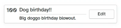
Cómo luce una Card personalizada
- Left, Kirigami.Heading: uses the
ListElement'sdateas a level 1 heading. - Middle, ColumnLayout: has a Kirigami.Heading that displays the task name; a Kirigami.Separator, which provides the horizontal line; and a Controls.Label, that displays a task's optional description. The latter two components have a visible property, which checks if the description is empty or not and displays the components depending on the result of
description.length > 0. - Derecha, Controls.Button: un botón que hará algo… ¡en breve!
Nuestra aplicación hasta ahora
Main.qml:
| |
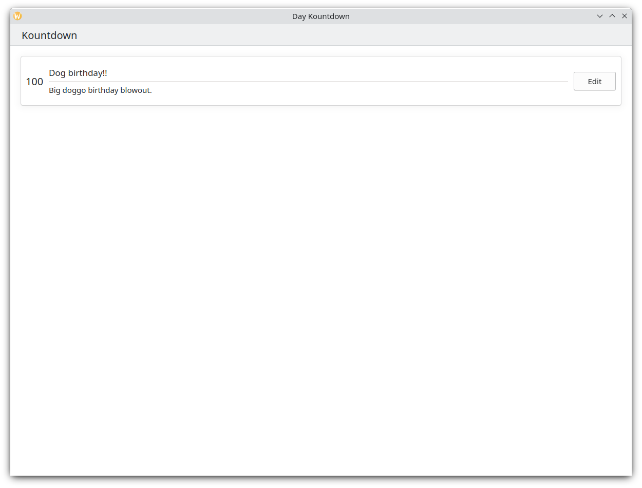
¡Así que ahí está nuestra tarjeta básica!
Con estos pasos hemos sentado las bases para añadir toda la funcionalidad a nuestra aplicación.