Uso de la Galería de Kirigami
Kirigami Gallery is a helpful friend when developing a Kirigami application. It is an application that uses core Kirigami features, provides links to the source code, tips on how to use Kirigami components, and links to the corresponding HIG pages.
Consejo
Antes de continuar, instale la Galería de Kirigami. Ya debería estar en el repositorio de su distribución de Linux.Encontrar una cuadrícula de tarjetas
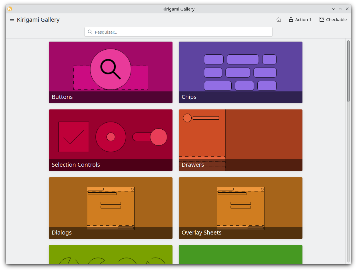
Navigating through the Kirigami Gallery application, we will stumble upon the "Grid view with cards" gallery component. This is an example that can be applied to multiple use cases, such as contact cards.
After selecting the "Grid view of cards" gallery component, if we click the "Info" button on the top right, we will get some useful information about the Card and Abstract Card types.
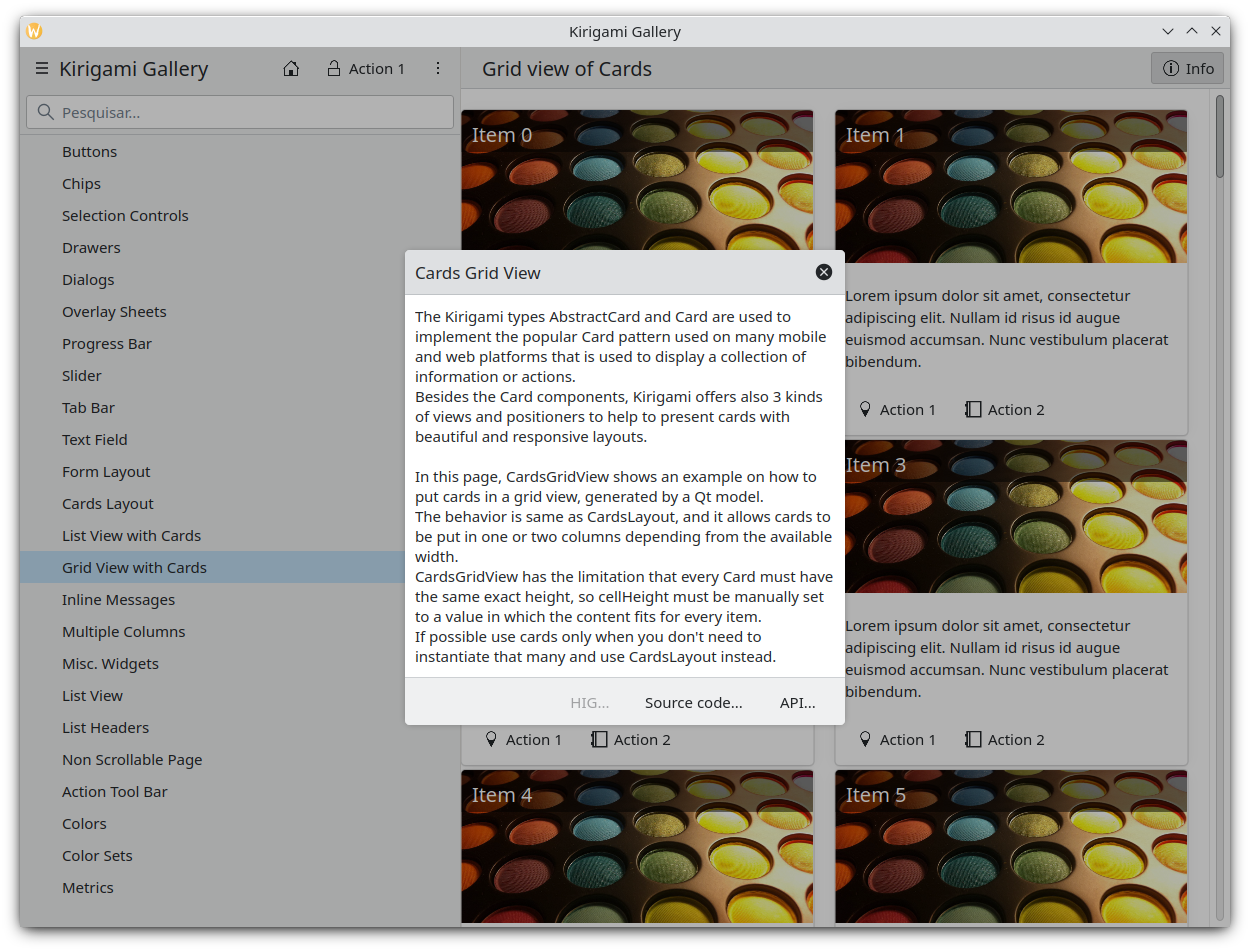
En la parte inferior de este diálogo de información también encontraremos un enlace al código fuente de la «vista de cuadrícula de tarjetas». Vayamos a dicha página.
Implementación de una cuadrícula de tarjetas
We will reuse most of the code found in the source code of the CardsGridViewGallery component. In particular, we will remove the extra parts of the OverlaySheet (which is the pop-up we used to reach the kirigami-gallery source code repository).
So, we are going to substitute the
Page
component of main.qml of our skeleton app with the below
ScrollablePage
:
Kirigami.ScrollablePage {
    title: i18n("Address book (prototype)")

    Kirigami.CardsGridView {
        id: view

        model: ListModel {
            id: mainModel
        }

        delegate: card
    }
}
Lo que hemos hecho hasta ahora ha sido crear una ScrollablePage y colocar una CardsGridView en ella, ya que queremos mostrar una cuadrícula de tarjetas generada desde un modelo. Los datos de cada contacto los proporciona un ListModel, mientras que el delegado de la tarjeta es el responsable de la presentación de los datos. Para más información sobre modelos y vistas en Qt Quick, consulte aquí.
Now let's populate the model that will feed our grid view with data. In the definition of Kirigami.ScrollablePage , just after:
      delegate: card
    }
añada lo siguiente:
Component.onCompleted: {
    mainModel.append({
        "firstname": "Pablo",
        "lastname": "Doe",
        "cellphone": "6300000002",
        "email" : "jane-doe@example.com",
        "photo": "qrc:/konqi.jpg"
    });
    mainModel.append({
        "firstname": "Paul",
        "lastname": "Adams",
        "cellphone": "6300000003",
        "email" : "paul-adams@example.com",
        "photo": "qrc:/katie.jpg"
    });
    mainModel.append({
        "firstname": "John",
        "lastname": "Doe",
        "cellphone": "6300000001",
        "email" : "john-doe@example.com",
        "photo": "qrc:/konqi.jpg"
    });
    mainModel.append({
        "firstname": "Ken",
        "lastname": "Brown",
        "cellphone": "6300000004",
        "email" : "ken-brown@example.com",
        "photo": "qrc:/konqi.jpg"
    });
    mainModel.append({
        "firstname": "Al",
        "lastname": "Anderson",
        "cellphone": "6300000005",
        "email" : "al-anderson@example.com",
        "photo": "qrc:/katie.jpg"
    });
    mainModel.append({
        "firstname": "Kate",
        "lastname": "Adams",
        "cellphone": "6300000005",
        "email" : "kate-adams@example.com",
        "photo": "qrc:/konqi.jpg"
    });
}
Nota
Observe el{} que indica que estamos añadiendo un objeto JavaScript a nuestro modelo.The model part of our implementation is ready. Let's proceed to defining a delegate that will be responsible for displaying the data. So, we add the following code to the main.qml page, just after the
Component.onCompleted
definition:
Component {
    id: card

    Kirigami.Card {

        height: view.cellHeight - Kirigami.Units.largeSpacing

        banner {
            title: i18nc("@title", "%1 %2", model.firstname, model.lastname)
            titleIcon: "im-user"
        }

        contentItem: Column {
            id: content

            spacing: Kirigami.Units.smallSpacing

            Controls.Label {
                wrapMode: Text.WordWrap
                text: i18nc("@label", "Mobile: %1", model.cellphone)
            }

            Controls.Label {
                wrapMode: Text.WordWrap
                text: i18nc("@label", "Email: %1", model.email)
            }
        }
    }
}
Following the related information on the Kirigami.Card API page , we populate a " banner " that will act as a header to display the name of the contact as well as a contact icon.
The main content of the card has been populated with the cell phone number and the email of the contact, structured as a Column of Labels .
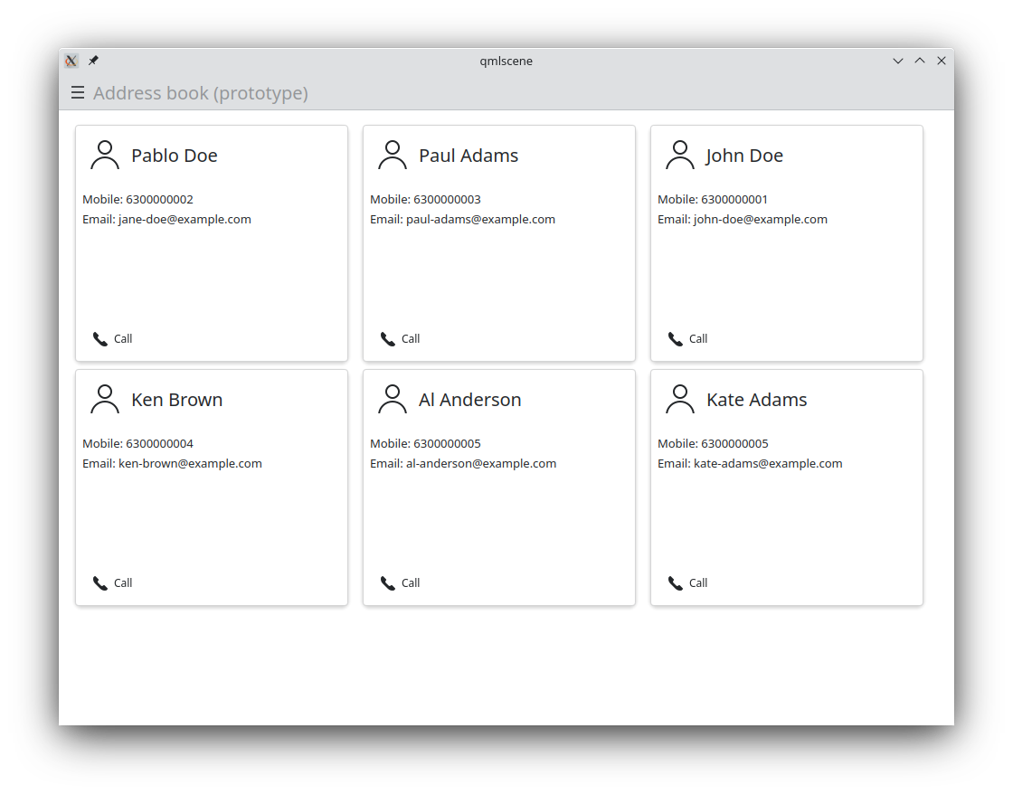
La aplicación debería parecerse a esto:
Consejo
Puede encontrar la totalidad del código fuente del tutorial en invent.kde.org.As a last step we will add some dummy functionality to each card. In particular, a call
Action
will be added. Nevertheless, instead of a real call, a passive notification will be displayed. So, let's change the card component to the following:
| |
So, we added a Kirigami.Action that, as soon as it is triggered (by pressing the action button), displays a passive notification .
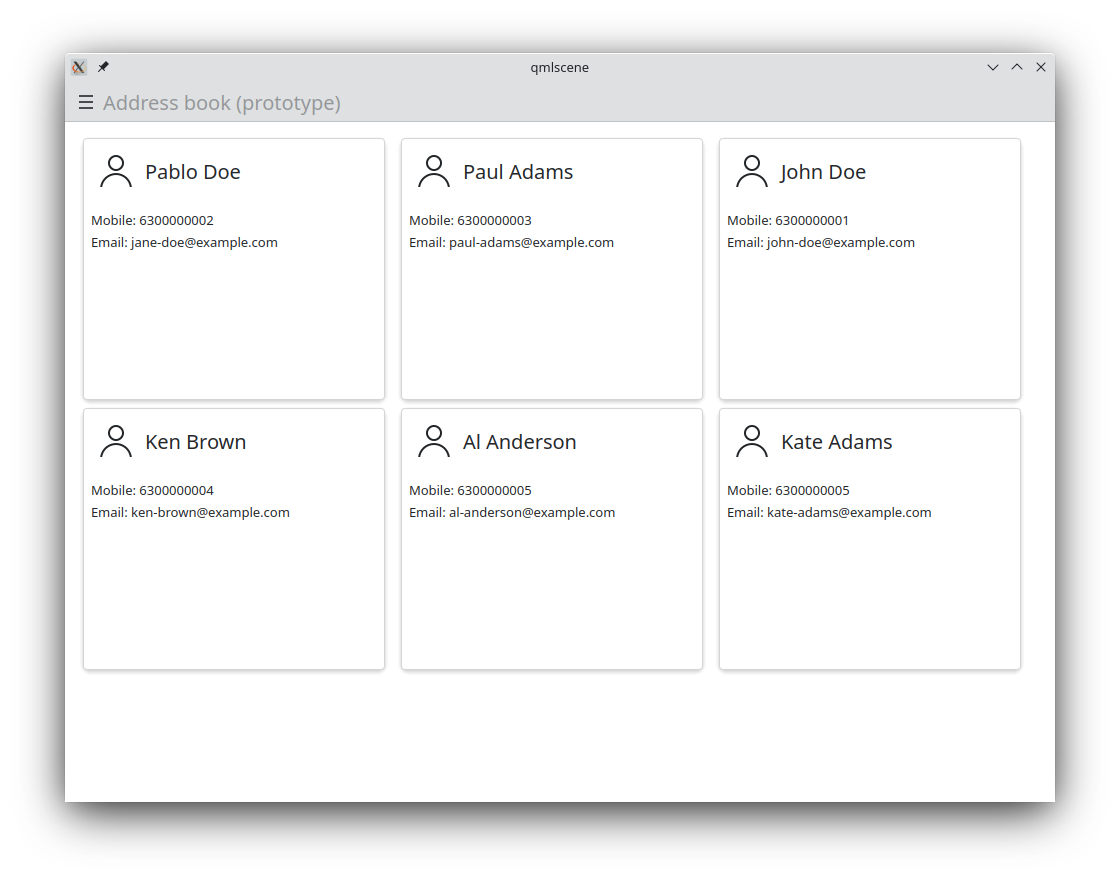
Resultado
Finalmente, nuestra aplicación debería parecerse a esto:
| |