Añadir acciones
Resumen
So far, we built a simple app that can display cards. However, there is currently no way for the user to add new cards to the card view.
En este tutorial, veremos las acciones de Kirigami. Estas nos ayudarán a añadir interactividad a nuestra aplicación de una manera consistente, rápida y accesible.
Acciones
Una Kirigami.Action encapsula una acción de la interfaz de usuario. Podemos usarlas para proporcionar a nuestras aplicaciones acciones de fácil acceso que son esenciales para su funcionalidad.
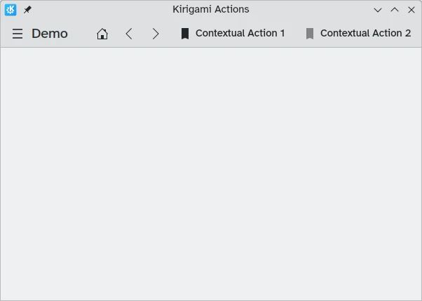
Si ha usado aplicaciones de Kirigami con anterioridad, ya habrá interactuado con las acciones de Kirigami. En esta imagen podemos ver acciones a la derecha del título de la página con diversos iconos. Las acciones de Kirigami se pueden mostrar de varias formas y pueden hacer una amplia variedad de cosas.
Añadir cuentas regresivas
Una aplicación de cuenta regresiva es bastante inútil sin la capacidad de añadir cuentas regresivas. Vamos a crear una acción que nos permita hacer esto.
pageStack.initialPage: Kirigami.ScrollablePage {
// Otras propiedades de la página…
actions: [
Kirigami.Action {
id: addAction
icon.name: "list-add-symbolic"
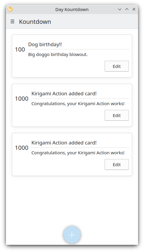
text: i18nc("@action:button", "Add kountdown")
onTriggered: kountdownModel.append({
name: "Kirigami Action added card!",
description: "Congratulations, your Kirigami Action works!",
date: 1000
})
}
]
// …
}We are placing our Kirigami.Action within our main page from the previous tutorials. If we wanted to, we could add more actions to our page (and even nest actions within actions!).
The brackets [] used above are similar to JavaScript arrays, which means you can pass one or more things to them, separated by comma:
// General JavaScript array of components:
variable: [ component1, component2 ]
// Passing an array of Kirigami actions to QML:
actions: [ Kirigami.Action {}, Kirigami.Action {} ]
Las propiedades id y text deberían resultarle familiares de los tutoriales anteriores. Sin embargo, la propiedad Action.icon heredada debería ser interesante: es un objeto con varias propiedades que le permiten mostrar ciertos iconos para las acciones. Afortunadamente, para usar los iconos de KDE, todo lo que tenemos que hacer es proporcionar la propiedad del nombre para la propiedad del icono, icon.name.
Viewing the available icons
Click here to see how to check the available icons on your system
Icon Explorer is a KDE application that lets you view all the icons that you can use for your application. It offers a number of useful features such as previews of their appearance across different installed themes, previews at different sizes, and more. You might find it a useful tool when deciding on which icons to use in your application.
Many of KDE's icons follow the FreeDesktop Icon Naming specification. Therefore, you might also find it useful to consult The FreeDesktop project's website, which lists all cross-desktop compatible icon names.
The onTriggered signal handler is the most important. This is what our action will do when it is used. You'll notice that in our example we're using the method kountdownModel.append of the kountdownModel we created in our previous tutorial. This method lets us append a new element to our list model. We are providing it with an object (indicated by curly braces {}) that has the relevant properties for our countdowns (name, description, and a placeholder date).
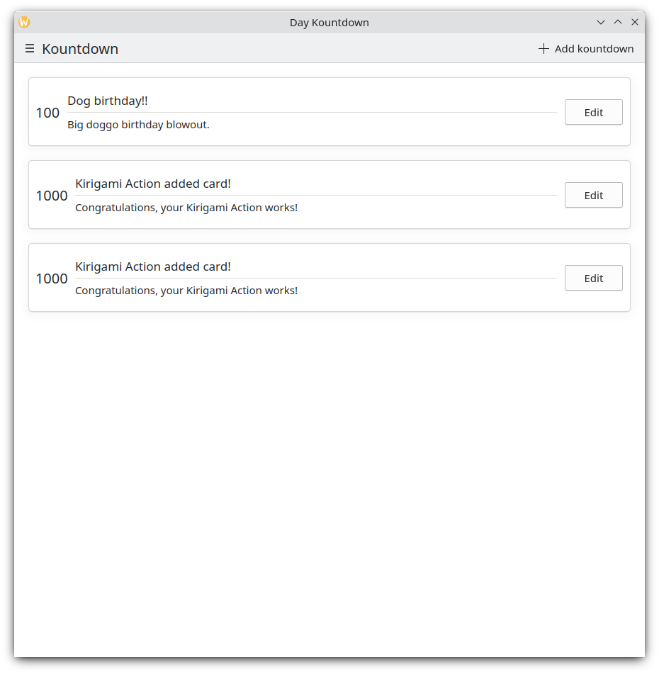
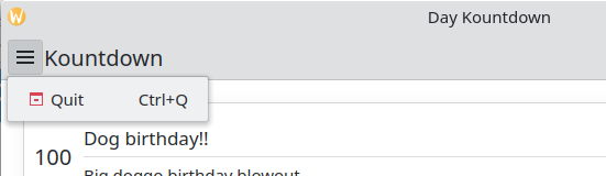
Cada vez que hacemos clic en el botón «Añadir kountdown» de la parte superior derecha, se añade una cuenta atrás personalizada.
Versión móvil
Cajón global
The next component is a Kirigami.GlobalDrawer. It shows up as a hamburger menu. By default it opens a sidebar, which is especially useful on mobile, as the user can just swipe in a side of the screen to open it. Global drawers are useful for global navigation and actions. We are going to create a simple global drawer that includes a "quit" button.
Kirigami.ApplicationWindow {
    id: root
    // Otras propiedades de la ventana…
    globalDrawer: Kirigami.GlobalDrawer {
        isMenu: true
        actions: [
            Kirigami.Action {
                text: i18n("Quit")
                icon.name: "application-exit-symbolic"
                shortcut: StandardKey.Quit
                onTriggered: Qt.quit()
            }
        ]
    }
    // …
}
Here, we put our global drawer inside our application window. The main property we need to pay attention to is GlobalDrawer.actions, which takes the form of an array of Kirigami.Action components. This action has an appropriate icon and executes the Qt.quit() function when triggered, closing the application.
Since we are keeping our global drawer simple for now, we are setting the GlobalDrawer.isMenu property to true. This displays our global drawer as a normal application menu, taking up less space than the default global drawer pane.
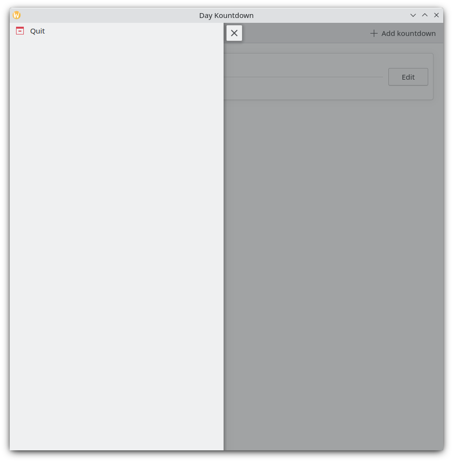
Cajón global
Cajón global como menú
Consejo
The Actions based components page of these docs provides further detail on Kirigami Actions and how they can be used.Las acciones son contextuales
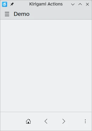
Kirigami components are designed in such a way that the place where you put Kirigami Actions is relevant. As seen above, if you add actions to a Kirigami.Page, Kirigami.ScrollablePage or any other derivative Page component, they will show up on the right side of the header in desktop mode, and on the bottom in mobile mode.
Similarly, if Kirigami Actions are added to a Kirigami.GlobalDrawer, they will show up in the resulting drawer or menu.
Otros ejemplos de acciones de Kirigami que se muestran de forma distinta dependiendo del componente padre que tengan son:
- Kirigami.ContextDrawer: Tutorial de ContextDrawer
- Kirigami.AbstractCard y derivados: Tutorial de Card
- Kirigami.Dialog and derivatives - Dialog tutorial here
- Kirigami.ActionToolBar: Tutorial de ActionToolBar
Entre otros complementos de Kirigami.
Nuestra aplicación hasta ahora
Main.qml:
| |